technical
language support
installing
testing
licensing
licensing info
shop
pricing
webfonts
students
technical
 In which font format are your fonts?
Our desktop fonts come in the OpenType (.otf) format (with PostScript outlines if you wanna know it all). Our webfonts come in several formats. Our mobile fonts come in the TrueType format (.ttf).
 Can I get the desktop fonts in TrueType format?
Sure. Although they are not implemented in our webshop, we’ve got TrueType versions of all our fonts as well, which we can deliver by email after you’ve bought a license through our webshop. Just contact us by mail.
 What about fancy OpenType features?
Sure. Every font comes with a certain amount of OpenType features. Which features are implemented depends on the design of the family, and varies throughout our library. Please have a look at the documentation of every font family itself to see which OpenType features are included.
 What is OpenType?
OpenType is a font format that has some advantages to older formats it succeeded. OpenType has 3 important aspects:
• OpenType fonts are cross-platform [same file for Windows and OSX]
• OpenType fonts can contain large character sets [no need to have a separate font for Central European accents]
• OpenType fonts can contain Layout features [like automatic ligatures or alternate figure styles for example].
• OpenType fonts are cross-platform [same file for Windows and OSX]
• OpenType fonts can contain large character sets [no need to have a separate font for Central European accents]
• OpenType fonts can contain Layout features [like automatic ligatures or alternate figure styles for example].
 What is a Variable Font?
1) The simplified answer: a Variable Font is a relatively new font format (2016), in which a font can contain several related fonts. Usually separated fonts like Light, Regular, Bold and Black, can be combined into 1 font file within the Variable Font format. Next to these 4 predefined weights, the user can also use any other weight in between the Light and the Black. One font file suddenly contains an unlimited amount of weights along the “weight-axis”. A Variable Font can also contain multiple axes. The same font can for example not only contain all styles from Light to Black, but at the same time also all styles from Condensed to Expanded.
In case you’ve heard that Variable Fonts is the font format of the future: not every font which has even been made will become available as a Variable Font. If a font has only a single display style, then there’s nothing to vary about. Don’t vary, be happy.
Some of our fonts are available in the Variable Font format. In case you’re interested to test these, just contact us.
2) The more complicated answer: watch this.
 Do you sell Variable Fonts?
Yes, we’ve been making Variable Fonts ever since the font format was announced. Two months after the introduction of this new font format, we released our font family Zeitung also in the Variable Font format. We’ve been making many other Variable Fonts since then.
But you won’t find them in our shop, because we believe any Variable Font which currently exists is still beta in practice. Tools to create them are still evolving & apps which support them are still evolving. In that perspective you could of course remove the word “beta”, but be aware that the Variable Font format is not as stable yet as OpenType or TrueType formats. Currently a cooperation between the maker and user of Variable Fonts makes more sense than offering them in the same way as any other font format. In case you’re interested to work with any of our Variable Fonts, please get in touch.
Because this new font format offers new possibilities, we’re wondering if, instead of wrapping old ideas into new technologies, new techniques also require new ideas. You can find a couple of experiments and ideas at our own Variable Font playground: very-able-fonts.com
 Where are the Small Caps?
Before you freak out: Small Caps come as separate fonts by default, but in case you prefer to have Small Caps embedded as an OpenType-feature: just drop us an email and we'll send them (in the near future clients can customize the fonts themselves in exactly the way they want). Now, take a breath, and relax. Indeed, by default we deliver Small Caps as separate fonts. Here’s why:
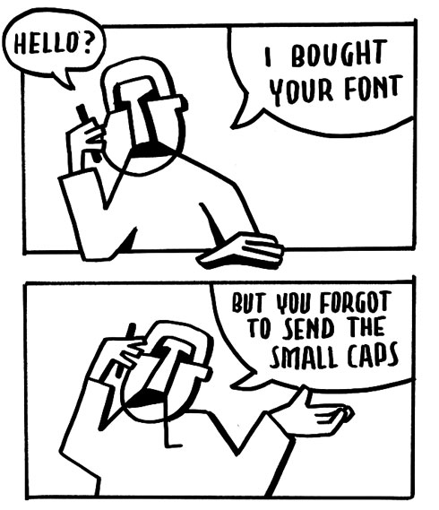
After a decade of experience with OpenType, our top-1 support question became: 'Hey, I bought your Pro font but you forgot to send me the small caps. Can you please send them?" After explaining the OpenType menu in applications like Photoshop and InDesign too often (“wow, never saw this”), we have to say that most users take a font with its OpenType features as it is. Default behaviour should be ‘good’, unfortunately too many people don't want to think about OpenType features at all, a font ‘should just work’.
Admitting that it would be handy to have small caps embedded in a font as OT-feature, apparently the interface requires too much knowledge for many average users. Due to the poor OpenType user interfaces of most current OpenType-savvy apps, the average designer doesn’t know the menu and its huge possibilities. Some other apps can’t even access the small caps feature at all. Which means only advanced users will notify or be able to use the small caps, also because it’s still not possible to inspect a typeface on the existence of small caps in a font management app for example. Even worse, not every style within a family always comes with small caps, but how do you figure that out? For some people it's really great if small caps are embedded in a font, the majority will unfortunately totally miss the presence of small caps. That’s a pity, also because we spend a tremendous amount of time in designing them. With other words: small caps are too important to leave them only for the experts, and therefore we deliver them as separate fonts. Now they are visible in the font menu. Everybody understands how that works.
In the end, build-in small caps are ideal. True. But only if the interface makes them easy to use for a large audience. We want those small cap styles to be used, and we want to create user-friendly products. With better interfaces in the future, this might change. But we are not there yet.
In case you prefer to swap the fonts you've bought to fonts with small caps embedded as an OpenType-features, just drop us a line and they will be send by mail.


 Why can’t I activate every possible OpenType Layout Feature?
A type designer can choose if he wants to apply one or more Layout Features to his font. So when a font supports OpenType Layout Features, it doesn’t automatically mean the font supports all possible features. Sometimes an OpenType font contains just one feature, ‘Swash’ for example, or ‘Ligatures’, but nothing else.
 Are the fonts cross-platform compatible?
Geeh, which era are you from? Our fonts come in the .otf format, so you can install them on OSX as well as Windows. Just use 1 font file throughout your entire workflow. We did our best to flatten out cross-platform issues as much as possible, but there will always be some crazy app developers out there who don’t make their Windows app the same way as their OSX app. We feel sorry for them, but our fonts are as cross-platform as Ronald and Frank de Boer*. The question is not ‘are your fonts cross-platform compatible?’, but ‘is your app cross-platform compatible?’.
{Please note: Windows XP users need to use the .ttf versions (instead of the .otf versions which are offered by default in our webshop; just email us). Microsoft ended their support for XP in April 2014, so may the force be with them}.
{Please note: Windows XP users need to use the .ttf versions (instead of the .otf versions which are offered by default in our webshop; just email us). Microsoft ended their support for XP in April 2014, so may the force be with them}.
 Bug in MS Office on Mac
There are issues displaying font families in the font menu of MS Word 2011 (v14+) on Mac. This is a known, reported issue of MS Word (and other Office 2011 apps for Mac). Microsoft has promised to fix this in their next major release of MS Office for the Mac. (Hopefully this comes soon) The font menu looks messed up for families which have more than the basic 4 style-linked faces. Bold and/or Italic fonts might not appear, because MSWord turns non-style-linked fonts into style-linked fonts. So a bold or italic style (wrongly) disappears from the font menu, and is only accessible through the [B]/[I] button. So in case you look for Auto Bold Italic 1: select Auto-Regular and click the [B] & [I] button. But Auto Bold Italic 2 needs to be selected straight from the font menu, and [B] & [I] buttons need to be unchecked. And euhm… switching platforms with Office apps can cause trouble on this issue, as those [B] & [I] buttons work differently on both platforms. To be clear: our fonts are according to the specs. This is a bug in the current version of Microsoft Office for Mac (2011), which Microsoft promised to solve in their next major release.
 What about Unicode?
How old are you? Seriously. Unicode was once a big improvement in type technology, but is meanwhile as obvious as a sunrise in the morning. Asking if our fonts support Unicode is like asking if your mother gave birth to you. So yeah, all our fonts support Unicode.
 Style-linking
Our fonts do not contain any style-linking by default. We chose for this approach to optimise the fonts for a design workspace and to improve cross-platform compatibility. This means that in applications which use the ‘Bold’ and ‘Italic’ buttons, you need to select every style through the font menu instead of clicking [B] and [I].
Although we are aware that style-linked fonts can be useful in office environments – where applications like MS Word are used frequently – most of our font families are not suitable for the drastic grid of 4 connected styles. Because we want to keep our library consistent, we decided not to implement style-linking.
If you’re in the situation that the lack of style-links is problematic, contact us to see if we can provide a custom solution.
 Why are your fonts named Pro?
Unfortunately there isn't any consistency across different type foundries in using “Pro” or “Std” names, and what to expect from fonts using these names. A “Pro” font from one foundry, might support completely different languages and contain a different amount of OpenType features than a “Pro” font from another foundry. You need to read the documentation of every foundry (or every typeface) to understand what the “Pro” and “Std” extensions mean.
Since the complete Underware font library has been upgraded in April 2013, all Underware fonts are named Pro. They are named Pro because they have a large language support (200+ languages), contain multiple OpenType-features, better cross-platform compatibility and have a much better screen performance. Next to that, it’s handy to quickly distinguish these new fonts from their previous, inferior versions.
Since the complete Underware font library has been upgraded in April 2013, all Underware fonts are named Pro. They are named Pro because they have a large language support (200+ languages), contain multiple OpenType-features, better cross-platform compatibility and have a much better screen performance. Next to that, it’s handy to quickly distinguish these new fonts from their previous, inferior versions.
 Why is the Glyphs palette so messy?
Some applications allow you to view all glyphs within a font through a Glyphs palette. This can be quite handy sometimes, when you’re looking for a very specific ornament to finish your design or for that alternative ampersand to boost your logo. There are dozens of occasions a Glyphs palette comes in handy.
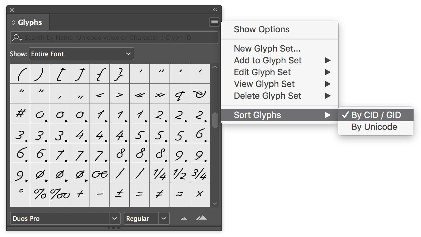
The order in which the glyphs appear will vary per font. We manually define a logical order for each font family, to make it easy for our users to find a certain glyphs quickly in a logical place within the glyph overview. However, sometimes the glyph order can look really messy in applications, like InDesign, which have several sorting options. Messy situations can be avoided by switching from sorting by Unicode to sorting by Glyph ID (GID). GID is the logical order we manually defined ourselves, and which can save you another crazy 30 seconds in your life.
The order in which the glyphs appear will vary per font. We manually define a logical order for each font family, to make it easy for our users to find a certain glyphs quickly in a logical place within the glyph overview. However, sometimes the glyph order can look really messy in applications, like InDesign, which have several sorting options. Messy situations can be avoided by switching from sorting by Unicode to sorting by Glyph ID (GID). GID is the logical order we manually defined ourselves, and which can save you another crazy 30 seconds in your life.

 Report a bug
Contact support@underware.nl in case you experience a technical problem. You don’t have to pull a ticket in a complicated system, remember super-safe-passwords or anything like that. Just mail us and we’ll try to figure it out together. Easy.
However:
1) Make sure the fonts are correctly installed
Before you mail us, make sure you’re fonts are installed correctly. We extensively test our fonts in as many circumstances as possible. So there is very little change that there is a problem with the font software. You might actually experience a problem with a font management application. If so: install the fonts directly in your system ‘Fonts’ folder. And restart your computer. Likely your problem is solved now.
2) Send a proper report
In case you want to report a bug, please mention:
• the operating system
• the version number of the operating system
• the application(s) you’re experiencing the problem
• the version number of the application(s)
• the version number of the font software
• a list of the font styles you experience the problem with
• precise description of the problem your experiencing, and mention everything you’ve tried so far to solve the problem
• include a screenshot where things go wrong
We know that technical problems can be frustrating, but try to put your emotions aside for a moment. And just mentioning that “the fonts don’t work on my computer” does not bring us any closer to a solution for your problem.
© 1999 — 2025