09 may 2025 — publications
New publication: Time to play
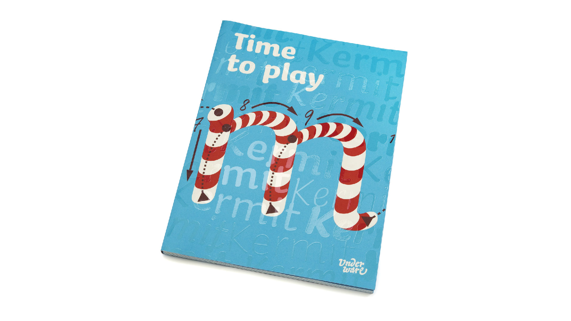
We are pleased to announce a new publication: Time to play. This publication focuses on the font Kermit, which we designed for Microsoft. This font was developed for kids, so it makes sense that this publication has a playful approach. In addition, Kermit is a writable font, with the time dimension designed and added to the font, which functions best if a play button is incorporated in the interface. In short: it’s time to play.
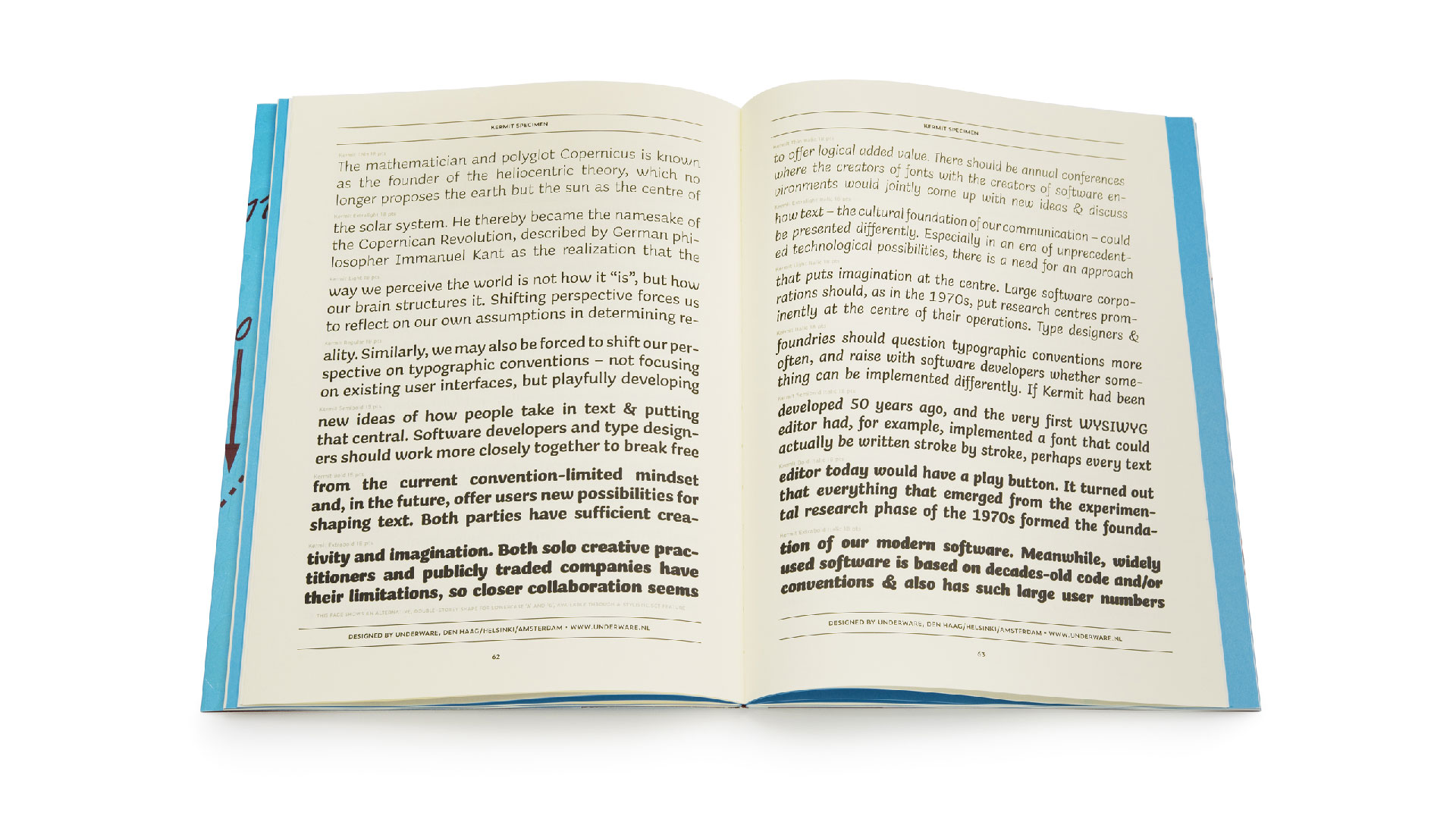
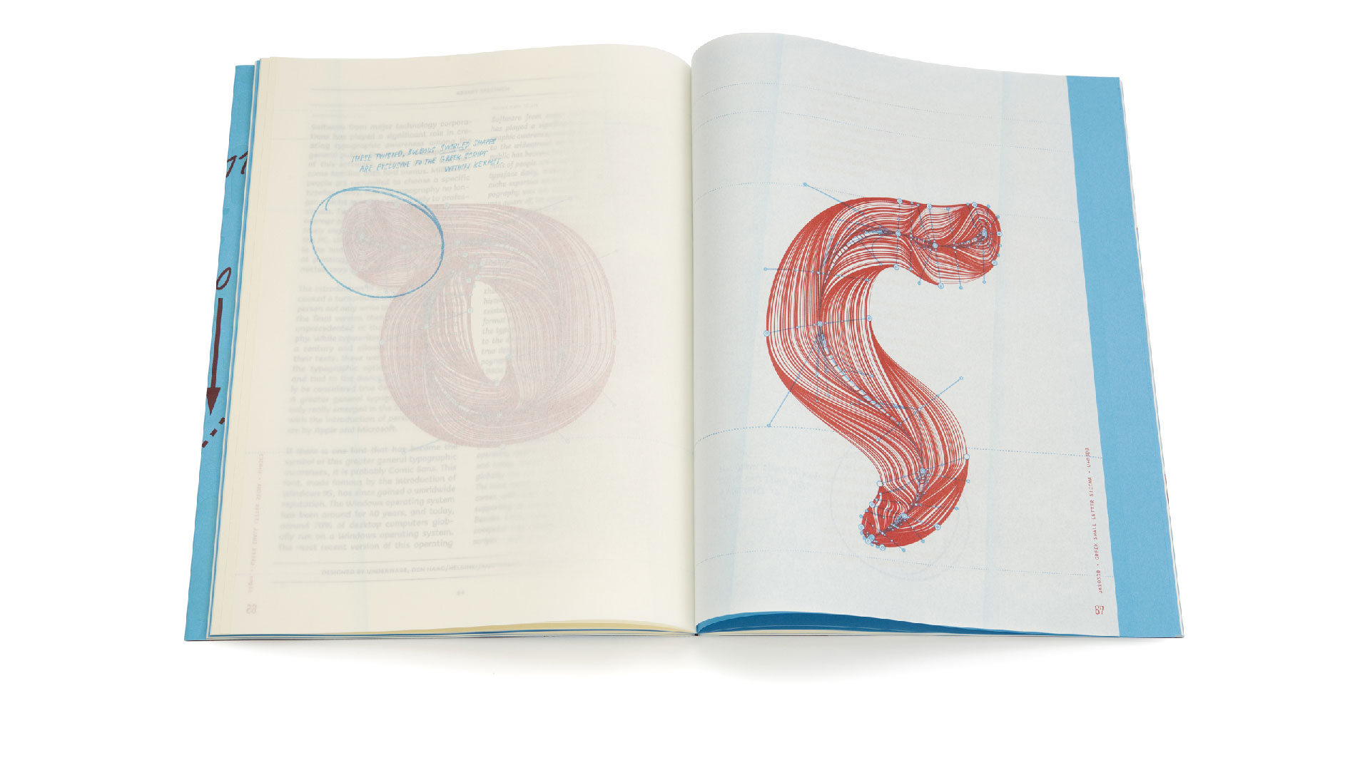
The publication consists of 3 different parts: an editorial where 3 articles place the genesis of Kermit in the context of historical and contemporary typographic developments. The articles are written by Rob McKaughan (Microsoft), Underware and Gerry Leonidas. In addition, there is a second section consisting of a traditional type specimen of the Kermit family. And there is a third part consisting of grammatographic anatomical illustrations. Each section is printed on a different type of paper, and these 120 pages are playfully mixed together by means of a clever imposition scheme. The whole edition was printed in 4 PMS colours, the cover fitted with an extra glossy silkscreen print, and all this was finished by means of a Swiss binding. You want to feel this tactile tickles in your hands. We have spared no expense to make this a playful publication.
The publication Time to play can be ordered from today via our website.
25 april 2025 — out now
New font: Kermit
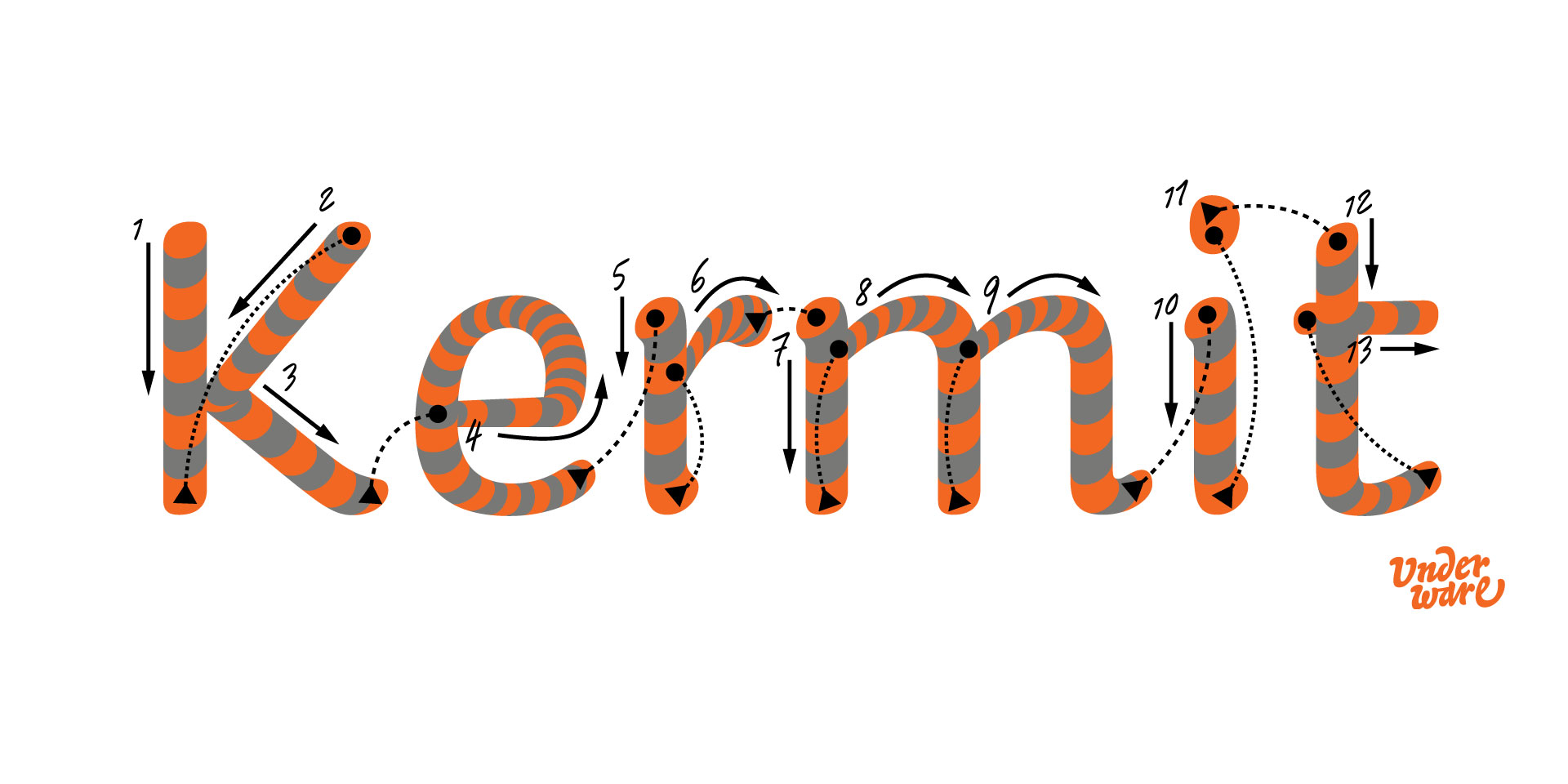
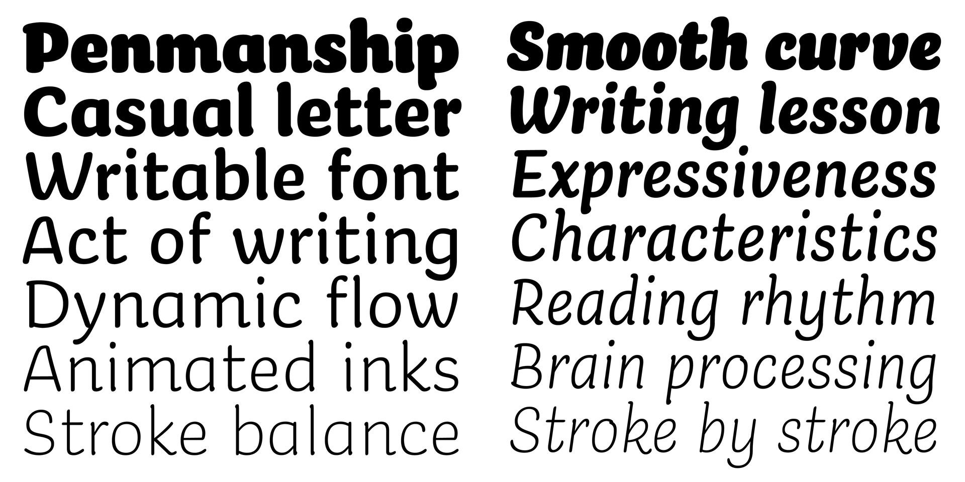
Today we’re happy to introduce Kermit, a friendly-looking, informal font family. On closer inspection however, it’s a combination of unique aesthetics & state-of-the-art technology that leads to a new way of writing.
Kermit was commissioned by Microsoft, who develop additional tools for their software for kids which have trouble learning to read. Kermit is a writable font – a typeface that can be written as one writes by hand: stroke by stroke, in the correct order, at the right speed, at the right time – and that might improve text comprehension for some kids. This innovative design enables new digital reading experiences, for example as support for learning to read.
All Kermit fonts – writable, variable and static – come in 7 weights, 3 different widths, with support for Latin, Greek and Cyrillic. In case you want to experience the writable fonts yourself, or read more about Kermit’s background, visit the dedicated mini-site kermit-font.com
Where to get Kermit?
Because Kermit was commissioned by Microsoft, it’s now available for Microsoft 365 customers for both Windows and Mac. You can find it in the font menu as a cloud font, and it will automatically install when selected. And thanks to our partnership with Microsoft, we are pleased to now offer commercial licensing for Kermit in our webshop. Kermit comes as writable, variable and static fonts, which are not just for kids, but the static fonts are now available to anyone. Get Kermit.
Special introduction offer
Buy one, get one Kermit for a friend for free. In case you buy a license of Kermit before the 1st of June 2025, you can give away a similar license for Kermit to a friend for free. We’ll contact you by email to arrange the details in case you ordered before the 1st of June.
31 march 2025 — presentations
Space-Time Tour 2025
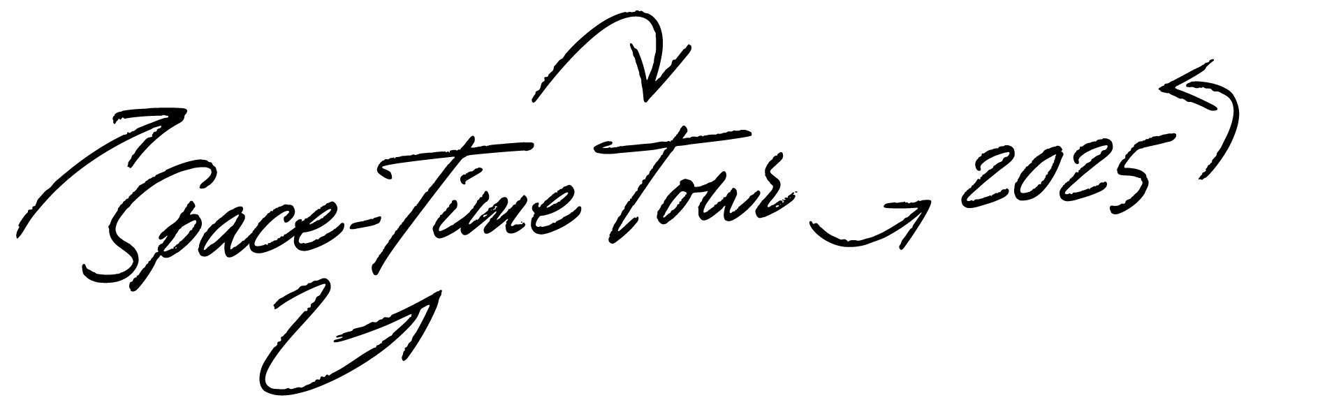
The coming weeks we’re gonna make some public appearances again for a few lectures and exhibitions during our Space-Time Tour 2025.
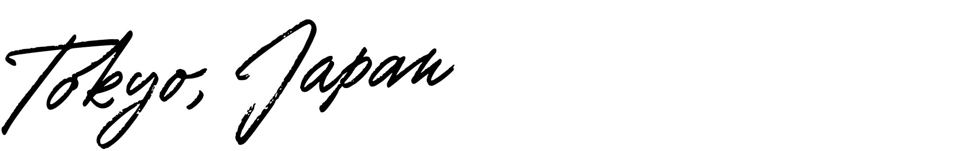
4 april • Tokyo, Japan
Our exhibition Sensorium Motorium in Print Gallery in Tokyo will open, introducing a new writing instrument: the fluxographer. And because Flux, our paradimensional typeface, won a TDC Tokyo award, it will be part of the TDC Tokyo exhibition at the Ginza Graphic Gallery (ggg) in Tokyo this weekend. And on 5 April we’ll give a lecture at the TDCDAY in Tokyo, on Sunday 6 April at 18:00 everybody is welcome for some drinks at the Sunday Soiree at our exhibition in Print Gallery.
TDCDAY • Print Gallery
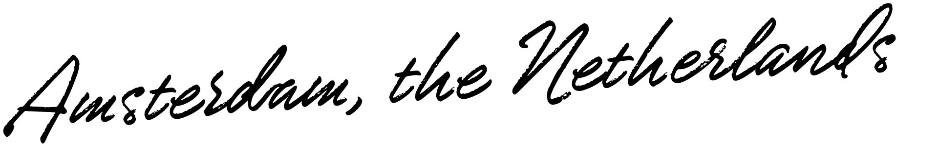
23 April • Amsterdam, the Netherlands
On Wednesday 23 April we’ll give a lecture called “How many days too early?” at the 56th installment of Letterspace in Amsterdam. Doors open at 19:00. Free entry, but RSVP.
letterspace.amsterdam
24 April • Hamburg, Germany
On Thursday 24 April we’ll give a lecture called “More to the letter” at the Museum für Kunst und Gewerbe in Hamburg, Germany. Free entry, starts at 19:00 o’clock.
mkg-hamburg.de
25 April • Copenhagen, Denmark
On Friday 25 April we’ll give a lecture called “Kaleidoscopic Entanglements Reflect Meaning in Type” at the ATypI conference in Copenhagen, Denmark. Tickets for the conference are required.
atypi.org
28 April • Stockholm, Sweden
On Monday afternoon 28 April we’ll give a lecture called “Paradimensional writing” at Konstfack University of Arts, Crafts and Design in Stockholm, Sweden. The lecture starts at 16:00 o’clock.
konstfack.se
01 May • Kolding, Denmark
On Thursday afternoon 1 May we’ll give a lecture called “Writing space in time” at the Kolding School of Design in Kolding, Denmark. The lecture starts at 15:00 o’clock.
designskolenkolding.dk
12 June • Trondheim, Norway
We’ll end our Space-Time Tour with a lecture at Thursday afternoon the 12th of June (17:30 o’clock) at Grafill in Trondheim, Norway. Please join us for our lecture “In how many dimensions can we work, watch or write?”. Tickets & details
grafill.no
31 march 2025 — presentations
Sensorium Motorium
Underware exhibition at Print Gallery Tokyo
April 2025
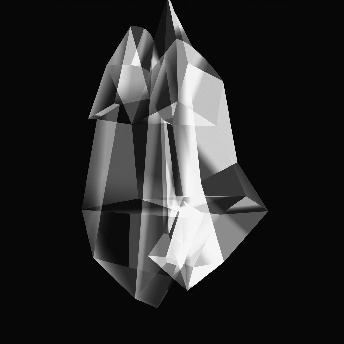
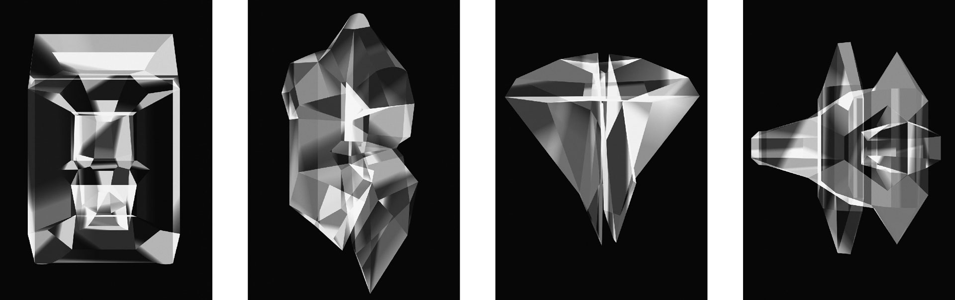
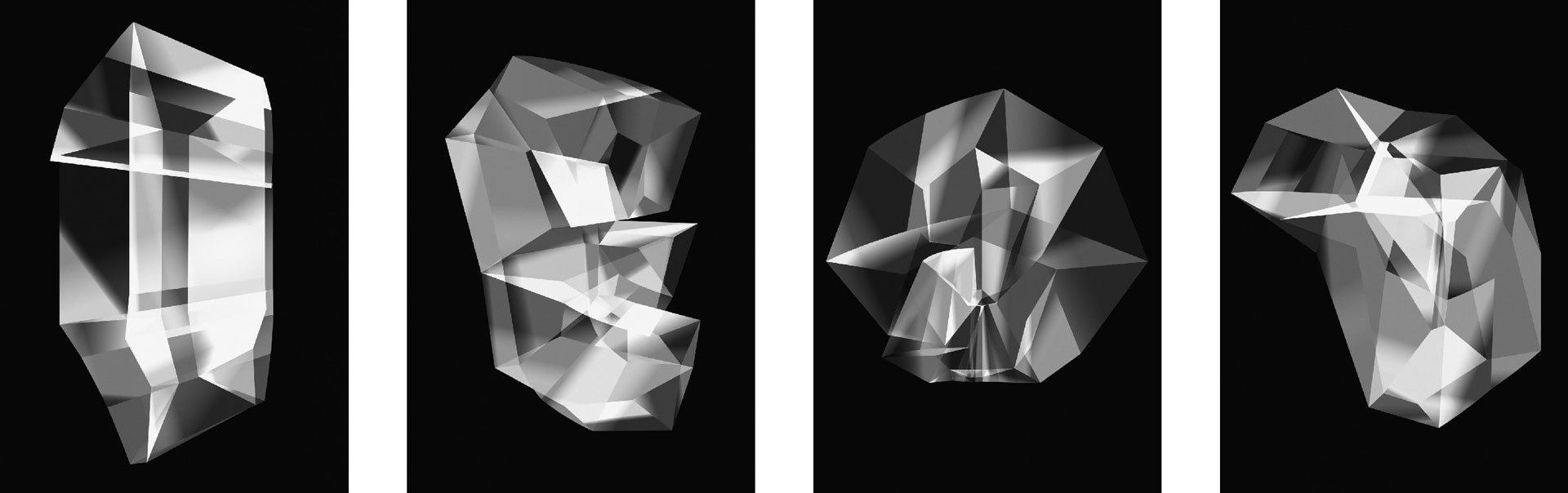
What if writing could be experienced not just visually, but physically and sonically, too? In Sensorium Motorium, Underware introduces a new kind of writing instrument – playful, experimental, and rooted in cybernetic theory.
In his essay Cybernetics of Epistemology, Austrian-American scientist Heinz von Foerster (1911 – 2002) introduces two foundational propositions for the acquisition of knowledge, grounded in the interplay between the sensorium (the system of conscious sensations) and the motorium (the regulated sequence of motion):
1. The meaning of the signals from the sensorium is determined by the motorium; and the meaning of the signals from the motorium is determined by the sensorium.
2. The laws of physics – the so-called “laws of nature” – can be described by us. But the laws of brain function – or, more broadly, the laws of biology – must be formulated in such a way that the act of writing them is itself derivable from them. In other words, they must be self-writing.
A few years earlier, von Foerster conducted the research project Mechanisms of the Perception of and Formation of Internal Representations of the Spatial Fourth Dimension (1971/72) with student Phyllis Arnold at the Biological Computer Laboratory in Illinois, USA. This experiment was motivated by the belief that dimensions higher than three could serve as an ideal means to separate newly assimilated information from past experiences. In doing so, participants might encounter a moment of pure understanding – understanding understanding, as von Foerster called it.
Sensorium Motorium
With Sensorium Motorium, Underware builds upon this historical body of research and connects it to the cultural domain of writing and sign-making. To explore this intersection, they developed a new, higher-dimensional writing instrument: the Fluxographer.
This multi-sensory grammatographic device enables the writing and experiencing of higher-dimensional signs through the simultaneous integration of haptic, auditory, and visual stimuli. More than a speculative tool, the Fluxographer offers a reflection on writing itself – how we write, how we read, and how the act of writing shapes perception and thought.
At the same time, it was also created with a playful spirit: an instrument designed to invite curiosity and joy. Something to explore, to try, to play with. Visitors are encouraged to interact with the Fluxographer – to write, to listen, to feel. The experience is as much intuitive and sensory as it is conceptual. Sensorium Motorium at Print Gallery Tokyo marks the world premiere of this new instrument.
The Fluxographer
The Fluxographer consists of a high-resolution touchpad device with a custom keyboard layout, the higher-dimensional typeface Flux (recipient of the TDC Tokyo Award 2025), an MPE (MIDI Polyphonic Expression) synthesizer, and a bespoke tool that connects all three into one coherent, multi-sensory system. The Fluxographer captures users’ gestures with precision and renders them into higher-dimensional forms – both visual and sonic. The exhibition also features a series of unique A0 Fluxograms (created using the Fluxographer).
This is Underware’s second solo exhibition at Print Gallery in Tokyo. Parallel to Sensorium Motorium, their award-winning project Flux is also on view at the ginza graphic gallery in Tokyo.
About Underware
Underware is a pan-European design collective specializing in type and writing systems. Known for pushing the boundaries of typography, their work blends graphic design, linguistics, technology, and performance. With projects ranging from experimental typefaces to conceptual installations, Underware investigates the cultural, physical, and emotional dimensions of writing. Their work has been exhibited internationally and is part of several public and private collections.
underware.nl
About Print Gallery
Print Gallery Tokyo is an independent exhibition space dedicated to contemporary graphic design and visual culture. Known for its focused programming and intimate setting, the gallery offers a platform for experimental and conceptual projects that push the boundaries of print and typography. Its curatorial approach – bridging design, art, and research – has made it an important site for international designers and artists to engage with a thoughtful and design-savvy audience in Japan.
printgallerytokyo.com
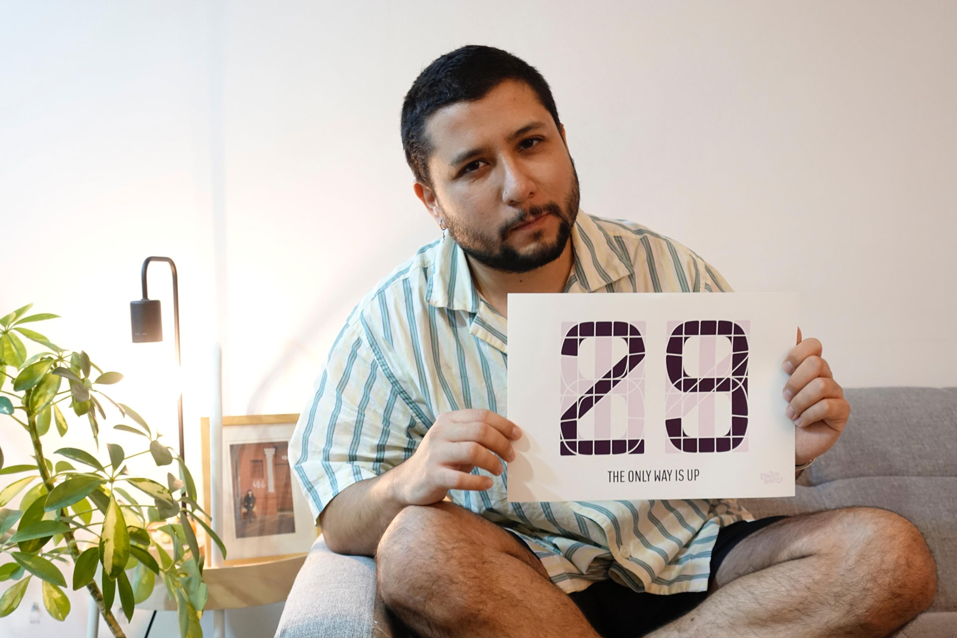
13 march 2025 — walhalla
The only way is up
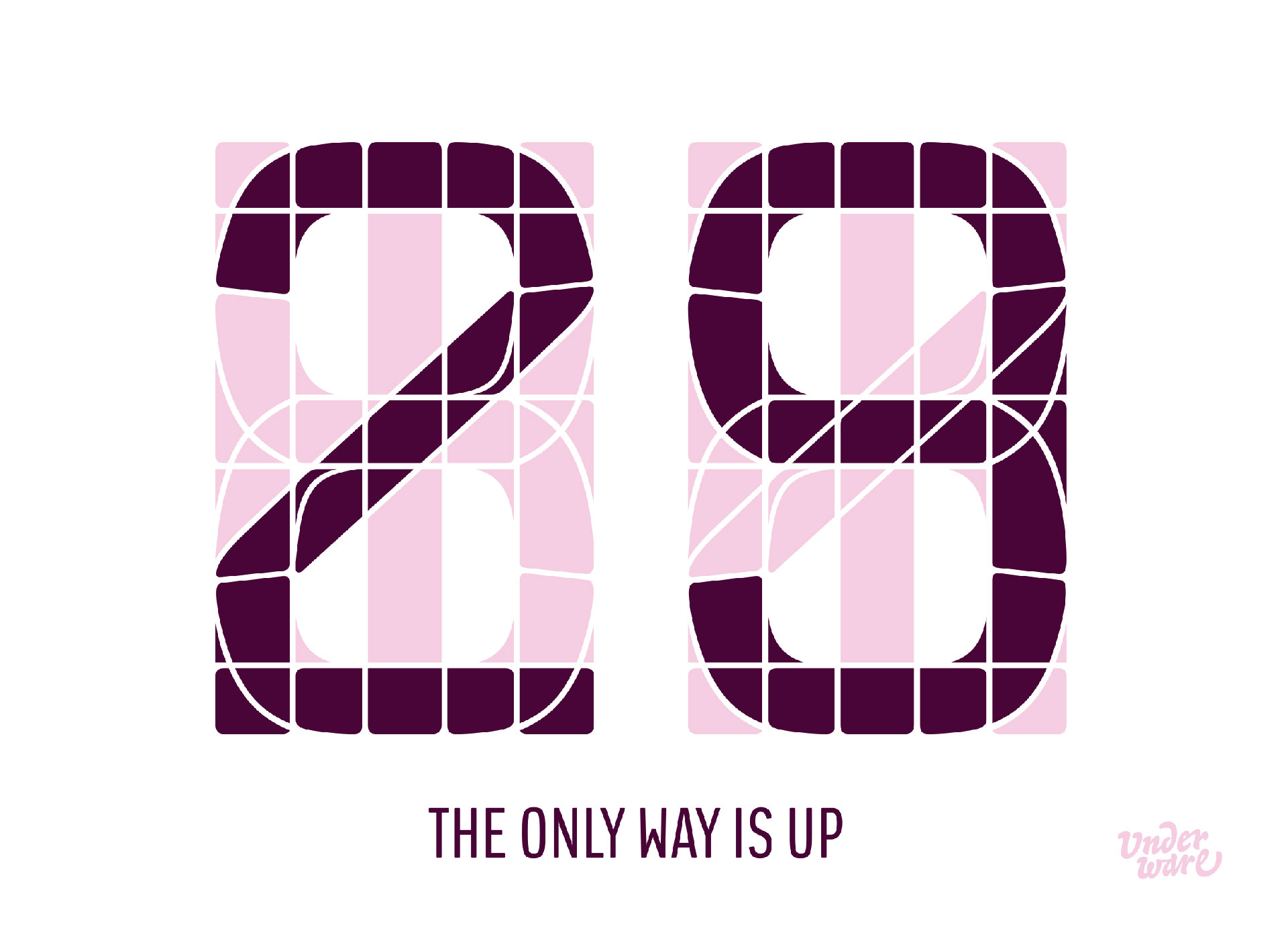
It’s so nice to receive emails from people who are enthusiastic about our work.
Hello! I found your type foundry because my boyfriend reaaaaally likes the typeface in the elevator of the building where he lives. I know it might be extremely late for a christmas present, and I imagine it’s not possible to buy the typeface since its made for the brand, but I’d like to ask: Is it possible to get the segmented numbers to frame them?
Thank you very much for reading! I have been thinking about sending this email for several months every time I get in and out of the elevator.
Greetings and happy holidays :-)
Carla Jaña Matus
There is only one right way to answer to such a nice message: we sent René Morales-Sánchez something to frame. Life is a building, each year you go one floor up. Every day when René gets home, and once he left the Kone elevator, he ends up in his apartment on level 29, as your own age is likely the equivalent of the level of your life. Enjoy René & Carla!
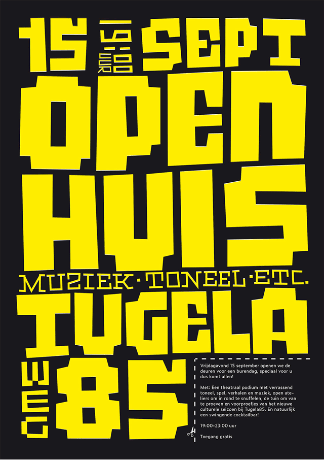
16 february 2025 — walhalla
Vrijmibo
Next Friday everyone is welcome to the Friday afternoon drinks at Tugela85, the building where our Amsterdam studio is located. According to good Dutch custom, the working week ends with a drink where you can meet old acquaintances and new strangers. Tugela85 opens its doors this Friday, exhibiting various posters made over the past 10 years for the monthly activities in the building. Some posters handmade by us will also be on display. These posters are quick-and-dirty, drawn in no time because before you know it, the next activity is right around the corner. Nice wallpaper for some drinks, though. If you’re in the area, feel free to stop by on this vrijmibo. Kladiladi.
Tugela85 presents Tugela85
Friday 21 February 2025
Doors open: 17:30
Opening: 18:00
Address: Tugelaweg 85, Amsterdam
13 january 2025 — fonts in use
You gotta love local culture
Three men on a stage. One is dressed as a woman who seems to have walked out of a Norse saga, the other seems to be wavering between a jaunty prince and ballet dancer, and the third looks like a Russian tsar who actually wants to be a peacock. Together they sing a samba song on a stage, and then unveil their new banner, all this broadcast on national television. Anyone who thought Japanese TV can sometimes be bizarre should watch carnival TV. The year 2025 is less than two weeks old, but Germany is already giving us the best fonts-in-use sample of the year. You gotta love Bello, you gotta love local culture.
(Thanks Peter Buennagel for spotting)
03 october 2023 — presentations
Watch the Scribo, ergo sum lecture
Since a few years we’ve been designing and producing writing fonts, fonts which have their writing dynamics included in the font file. As these are something new in the industry, some people wonder what they are and how they function.
In May 2023, when we released the type family Scribo, we gave a lecture at the ATypI conference in Paris. Because the starting point for Scribo was to design the dynamics of handwriting, we took the opportunity of this lecture to explain what details are involved in the making of writing fonts. For example: new terminology is required once type is designed in time, because how fast is a “default” speed and is there a unit to describe this? There are a lot of conventions for relations in space (like kerning), but there is a need for similar terminology for relations in time (like tuning). This, and much more details, are explained in this lecture, which of course also includes live action writing for an empirical experience.
Often these lectures are only accessible for registered attendees, but we’re happy that a recording of this lecture is now available to anybody.
18 september 2023 — presentations
Deep Writing Tour 2023
This autumn we’ll make a small tour across France, Germany and Switzerland with some lectures and workshops at educational institutes, festivals and symposiums. We’re looking forward to meet old but also lots of new friends, so hopefully we’ll see you on one of these occasions.
5 October — Nancy
Lecture “Beyond Unicode” at Atelier national de recherche typographique, Nancy France.
5-6 October — Nancy
Two-day workshop “Beyond Unicode” at Atelier national de recherche typographique, Nancy, France.
9 October — Strasbourg
Lecture “From Chirography to Grammatography” at Formats Festival in Strasbourg, France.
11 October — Zürich
Lecture “Deep Writing” at Zürcher Hochschule der Künste, Zürich, Switzerland.
13 October — Basel
Lecture “Is it U+2047?” at Hochschule für Gestaltung und Kunst Basel HGK, in Basel, Switzerland.
6-10 November – Geneva
Five-day typeworkshop “Signature moves” at HEAD, Geneva, Switzerland
15 November — Paris
Lecture “The coding hand, encoding the hand” at Font and Faces #10, Campus Fonderie de l’Image, Bagnolet, Paris, France.
18 November — Munich
Lecture “Look backward, write forward” at Dynamic Font Day, Munich Germany.
21 November — Stuttgart
Lecture “Vorwärts schreiben, rückwärts schauen” at Merz Akademie, Stuttgart, Germany.
13 june 2023 — walhalla
Personalising devices
Using a device while not using it is an interesting concept. “Using” is an elastic concept. When do you not use something, or no longer use it? A clock hanging on the wall is used. But a utensil that has much more potential than just displaying the time, that is hung on the wall to display only the time, is it used?
That hardware manufacturers are now, like Apple, deliberately adding a new mode to their devices when they are semi-used is a fascinating step. Apple recently introduced StandBy Mode for iOS17, a full-screen mode while charging your iPhone or iPad. Probably of all the new features in that StandBy Mode, the clock is the most interesting and useful, as that feature is the closest thing to non-use. A clock is only to look at casually, not to interact with.
(more…)