
12.2021
Dynamification of typography
Dynamification of typography
Dynamification of typography (12.2021)
05.2021
KONE custom fonts
KONE custom fonts
KONE custom fonts (05.2021)
10.2020
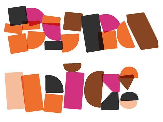
Grammatography
Grammatography
Grammatography (10.2020)
04.2018
Higher Order Interpolation
Higher Order Interpolation
Higher Order Interpolation (04.2018)
Subpixel ASCII+ Art (06.2017)
12.2015
Everything is black and white
Everything is black and white
Everything is black and white (12.2015)
03.2015
Webtypografie klinkt goed, maar ziet er niet uit
Webtypografie klinkt goed, maar ziet er niet uit
Webtypografie klinkt goed, maar ziet er niet uit (03.2015)
11.2014
Notes on Latin Plus
Notes on Latin Plus
Notes on Latin Plus (11.2014)
03.2010
Randomness versus Cleverness
Randomness versus Cleverness
Randomness versus Cleverness (03.2010)
01.2009
New logotype for MyFonts
New logotype for MyFonts
New logotype for MyFonts (01.2009)
12.2007
New logotype for Daimler
New logotype for Daimler
New logotype for Daimler (12.2007)
05.2007
Customized fonts for European banks
Customized fonts for European banks
Customized fonts for European banks (05.2007)
Case study: From ASCII Art to Subpixel ASCII+ Art
June 2017
When the character encoding standard “American Standard Code for Information Interchange” was introduced in 1963, hardly anybody could foresee that a little more than a decade later the world would loose itself in an early digital hype: ASCII art. Originally started as an underground movement, but not much later a major hit. For the younger generation not known with ASCII art (logically, that’s a pre-internet thing): ASCII art is an image displayed using letters. And not any possible letter, but just one of the 128 letters which are part of a character set called ASCII. That’s why it’s called ASCII art. This kind of visual art is not just made with any font, but with monospaced fonts. The uniform width allows for a pixel grid of a complete text paragraph. This matches the text directly with the pixels. If you say ASCII art, you automatically say monospaced fonts.
While looking closer at the name itself — ASCII art — the question arises, what's the art within ASCII art: the result as such, or perhaps much more the process behind. The act of using letters for something they are not made for. And approaching it from a more formal perspective: ASCII art was invented and applied primarily by designers & computer nerds. Why didn't they call it ASCII design? The situation could be of course clarified by finding out who coined the term, and what was the deeper meaning behind. But at the same moment we can also just approach it the other way around, and ask ourselves if ASCII art is actually a good name for what it is. The danger herby lies in the possibility that based on the practise of the person (designer or artist) the answers could be yes but also no.
ASCII art is a versatile art, any possible image can be used, and meanwhile there are also several versions of ASCII art. Some more recent ways of creating ASCII art also include colours for example. But the early, should we say original ASCII art was plain black and white and strongly characterised by heavy limitations. The limitations of the early computer days were an important factor of the success of ASCII art. In the early computer days support for pictures was limited. The easiest way to create a picture back then, was to build it up out of letters yourself. Comparable to oversized emoticons. This method later on developed into photos which were automatically converted to letters, currently known as the most common form of ASCII art around. When computers progressed in the 1990s, more possibilities became available, the graphics improved and more non-monospaced fonts became at user’s disposal. Nice improvements, but bad for the ASCII art movement. ASCII art slowly lost its popularity. Meanwhile ASCII itself has been surpassed by Unicode. ASCII art itself has been declared dead by Microsoft in 1998, in favour of other formats like JPG and GIF and the promotion of proportional fonts. But ASCII art is still alive as ever, at least in our own studio. We love ASCII, we grew up with ASCII. We are ASCII kids. However, current technology allows for much more advanced ASCII art than in the 1970s. This is why we imagined to develop “subpixel ASCII art”. Same simplicity, but much more precise results.
20th century ASCII art
The traditional way of creating ASCII art is simple and straightforward. Every letter within a font has a certain greyscale value. While converting a pixel based image into text, the greyscale value of the pixel will correspond with the greyscale value of the glyph. A dark grey pixel will be converted into a glyph with a large surface (for example @), while a light grey pixel will become a character with a small surface, for example a punctuation mark like the comma. Easy. Sounds logical. All cool. No problem.
This image shows how only 2 pixels are converted to text. If you would apply the same conversion for much more pixels, you’ll get the results of traditional ASCII art. Like this cat for example:
21st century ASCII art
Current technology allows for a more sophisticated way of creating ASCII art. Only think of the possibilities of colors, combining different styles of the same font family, or subpixels. Just in case you have never heard about subpixels: every pixel on your screen actually consists of three pixels next to each other: red, green & blue (therefore it’s called RGB). Together they can make every color, including black (when all pixels are off) and white (when all pixels are on). By switching those subpixels on and off individually the resolution can be virtually tripled and used to render text sharper. Can the same approach of using parts of a pixel also be applied to ASCII art? We think so.
If only the overal color of a pixel is considered, two almost similar pixels can give very different end results. This T and 7 have more or less an identical grayscale, so both letters could be used to render both pixels, and many other letters could probably be used as well.
However, the end result varies a lot. For an image it could make a big difference if the T or the 7 gets placed. Observing the subpixels could help in identifying the most optimal character for each pixel. Once a pixel is divided in 9 subpixels, pixels with a similar overal color suddenly show large mutual differences.
In contradiction to subpixels in screen typography, this technique works in both directions, horizontal and vertical. So a L is selected for example for a pixel which is dark on the left and the bottom, and a T for a pixel which is dark on the top and in the middle. Although the overall color of these 2 pixels is similar, the end result of the pixels is different, and therefore the end result of the complete image will be significantly different between the old and new technique. Taking subpixels into consideration nonuples the actual resolution.
Applying this subpixel technique to an image, in this case a white k on a black background, shows the advantages of this new technique. The diagonal stroke is displayed using a capital L, which automatically creates a diagonal line towards the right bottom. The shape of the L perfectly fits this location of the original image. Compare it to the diagonal stroke on top for example, which is displayed using ”. This glyph automatically creates a diagonal line towards the right top.
From ASCII to ASCII+
Fonts in the 1960s had a very limited character set, ASCII for example. Due to Unicode contemporary fonts include many more than 128 characters, offering a wider palette to select exactly the right character for each occasion. Having many more characters to choose from for each pixel contributes to a higher precision of the end result. So technically it’s not exactly ASCII art, but as described on Wikipedia the term ASCII art is also loosely used to refer to text based visual art in general. The term ASCII art became a byword for text based art, so to avoid confusion it’s wise to stick to that term. But because we cannot really speak any longer of ASCII art with this new technique, we named it ASCII+ art instead.
The same tree, two different methods for text-based visual art. The tree on the left is made with the 20th century method; The tree on the right uses the new, subpixel method. Every trained typographer will recognise that the letters within the ASCII illustrations are not only selected by their overall color (like in traditional ASCII art), but also by the color of the subpixels. This will result in much more visible details of the final art.
Especially graphic line art easily looses all sensibility in traditional ASCII art. This image full of curly lines is a thin wordmark (yes, it reads Underware), a good testcase to compare the different results.
This is how the original image would look like in traditional ASCII art. Many details are lost, which makes the image – already hard to read – even harder to read.
This text has exactly the same point size, the total amount of letters is identical. The traditional ASCII art destroys all the details & contrast, but with the subpixel generator everything looks great. Not only has the line itself a better appearance, even the contrast within the line remains visible.
Subpixel ASCII+ Art Generator
So far the theory. Practice is much more fun. Stay cool, and experience the difference between oldschool and contemporary text-based visual art yourself with a simple drag-and-drop tool. This tool has been optimised for Zeitung Mono, the monospaced font in the Zeitung font family. Go and play with the ASCII+ Art Generator.
Want to read more about Subpixel ASCII+ Art, Zeitung Mono, web typography & more? Read the Zeitung newspaper.