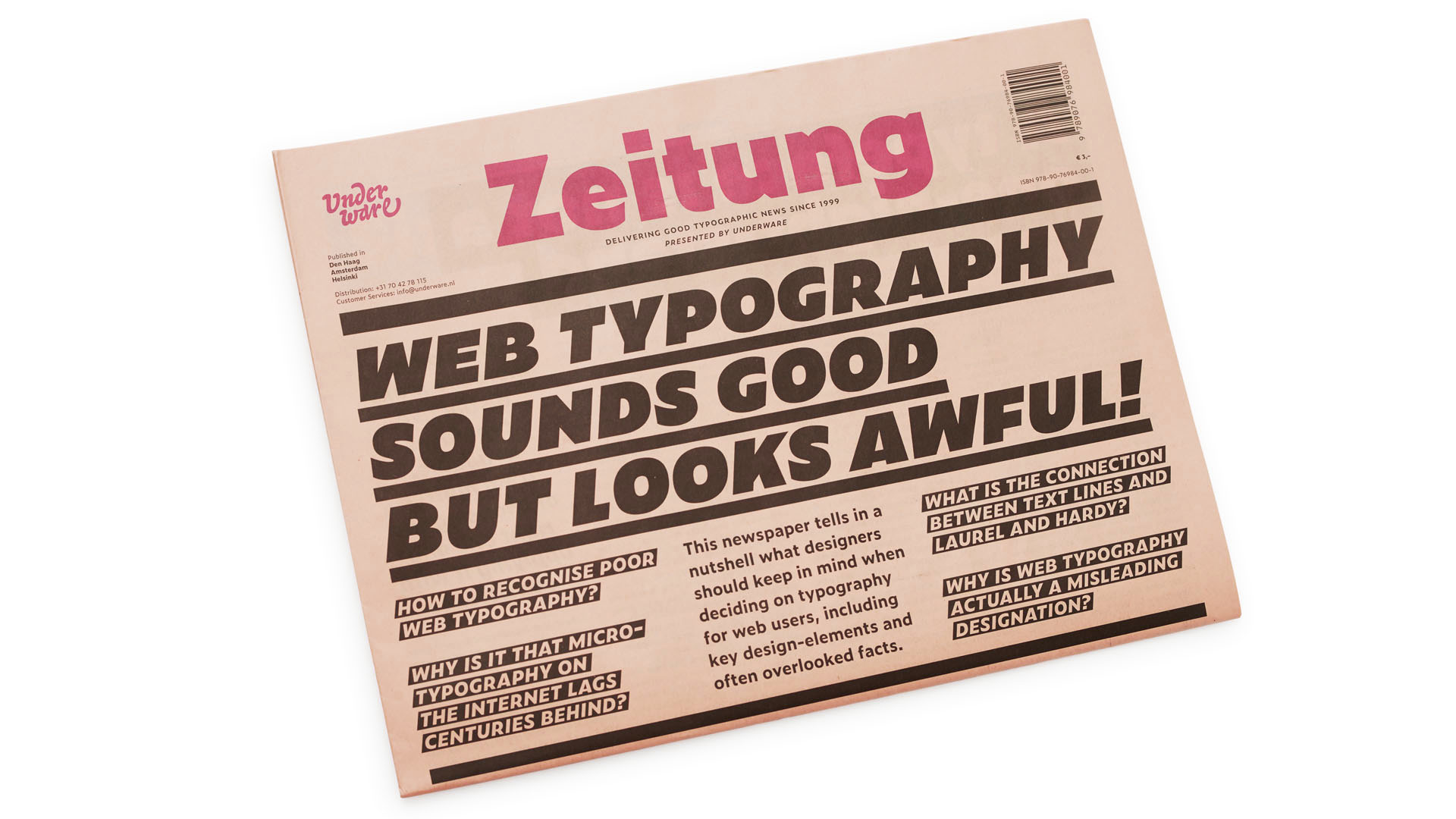
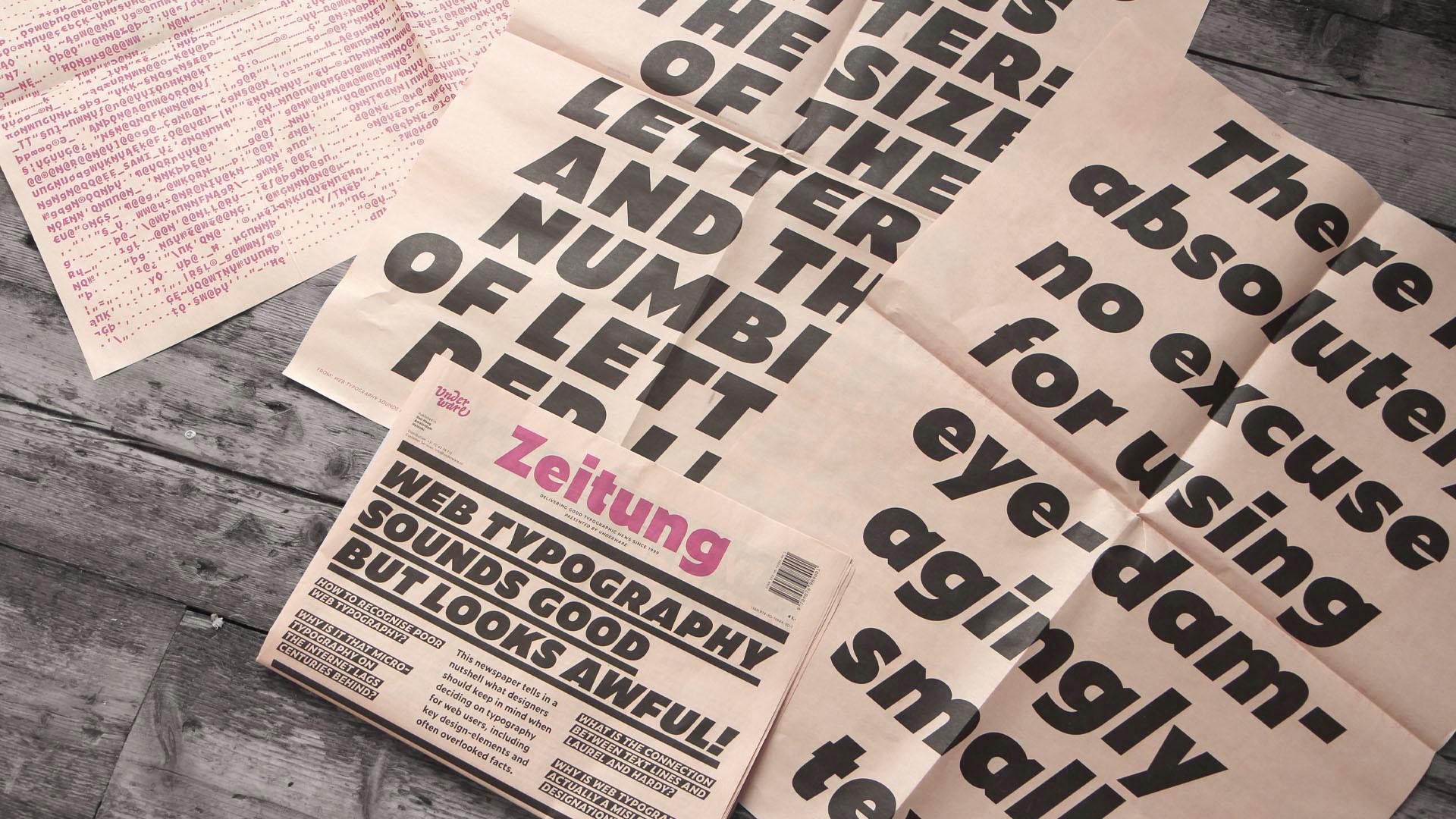
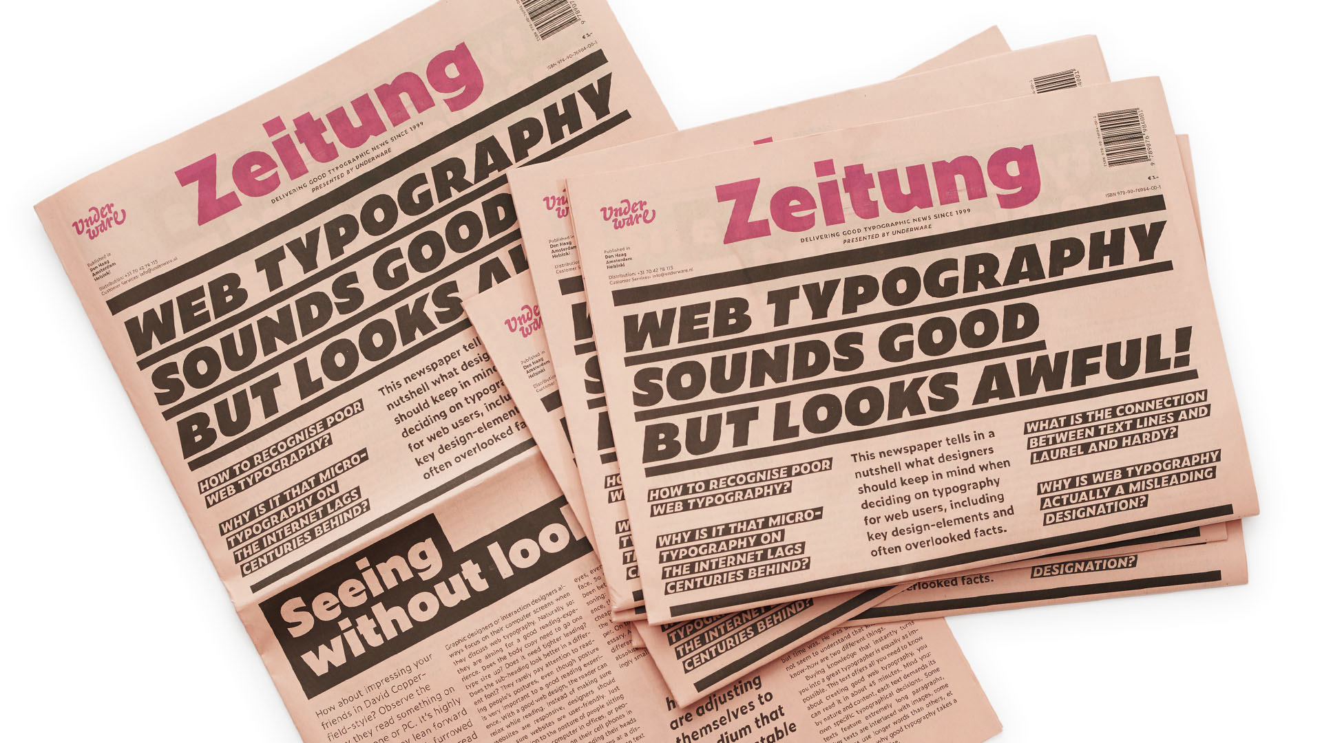
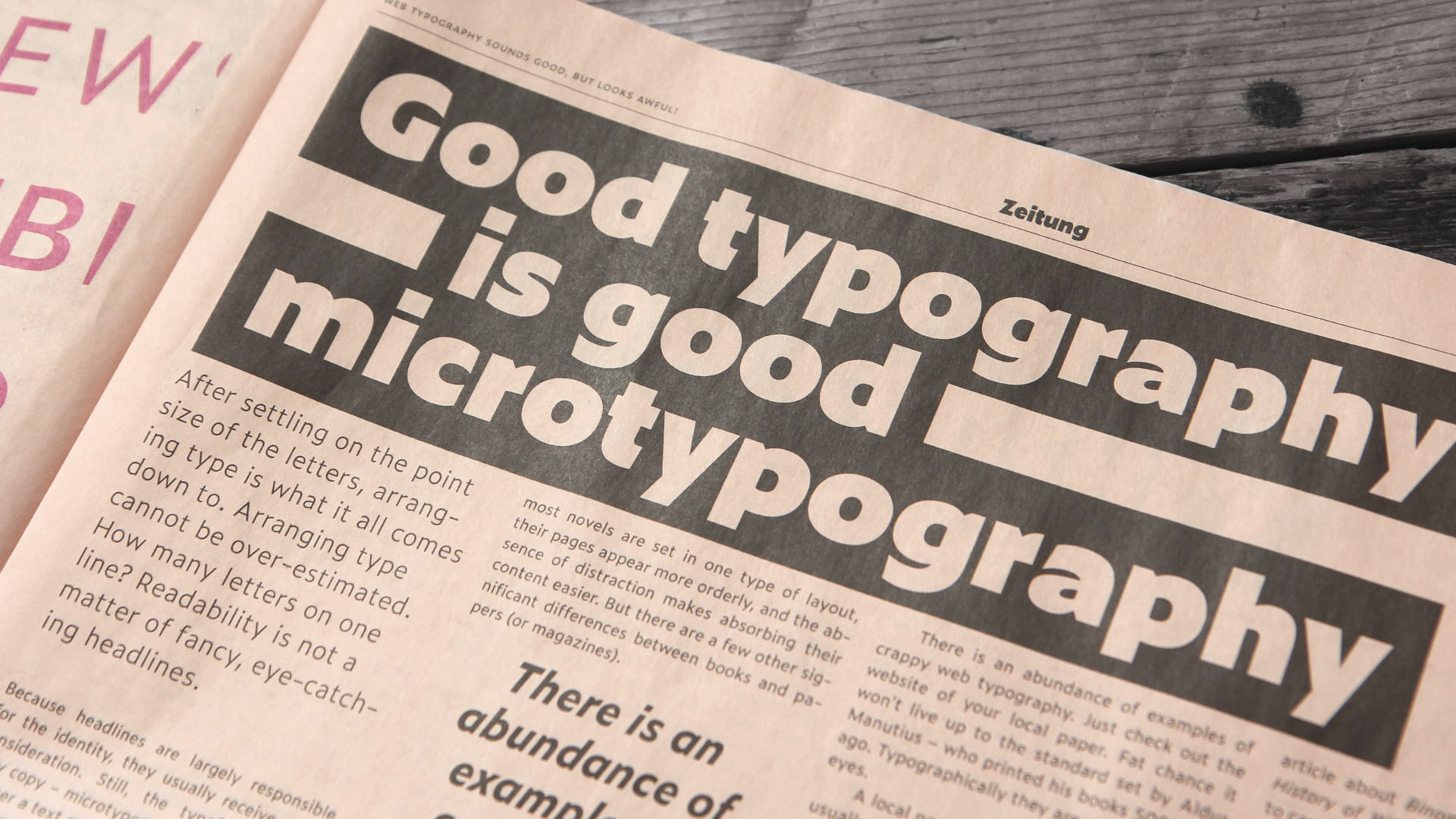
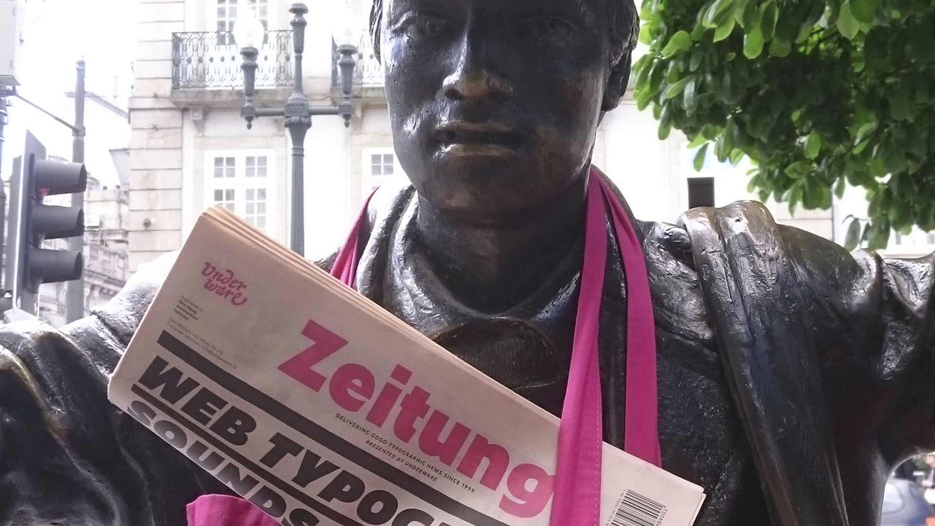
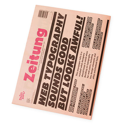
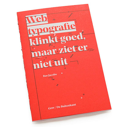
Zeitung newspaper

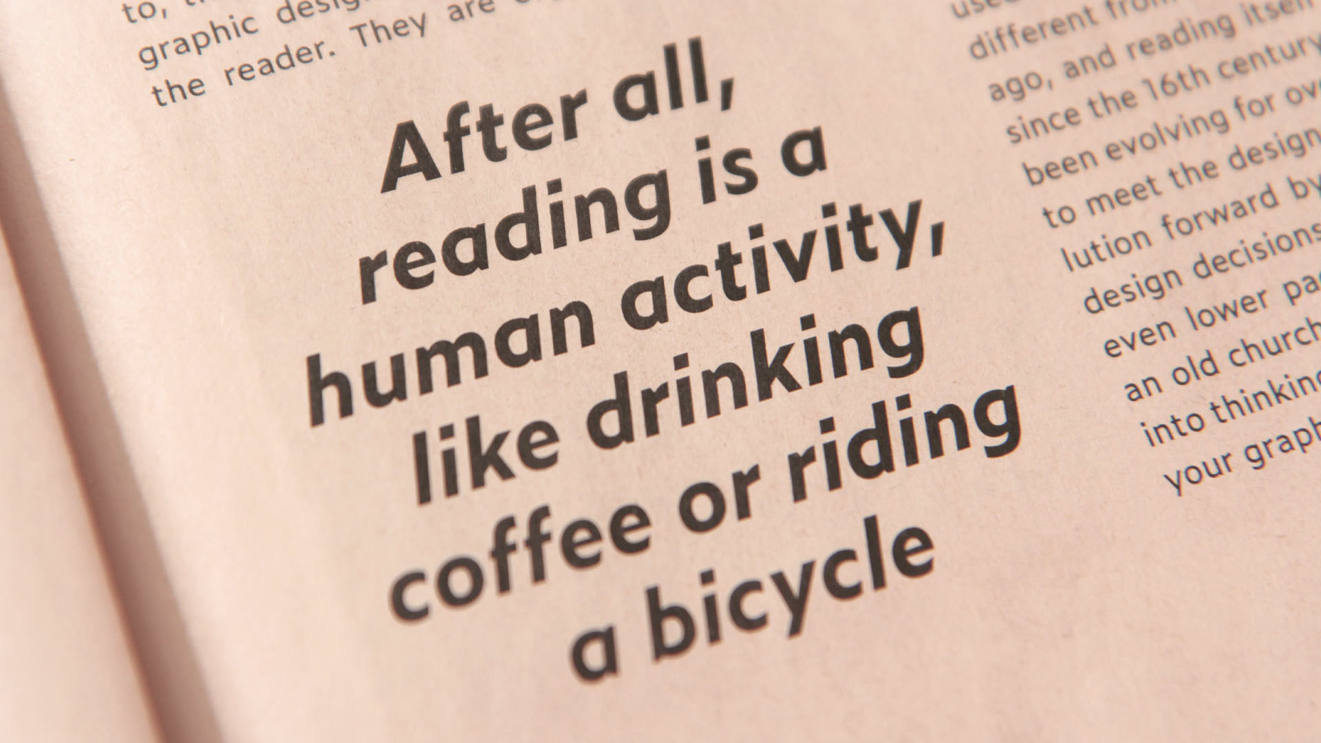
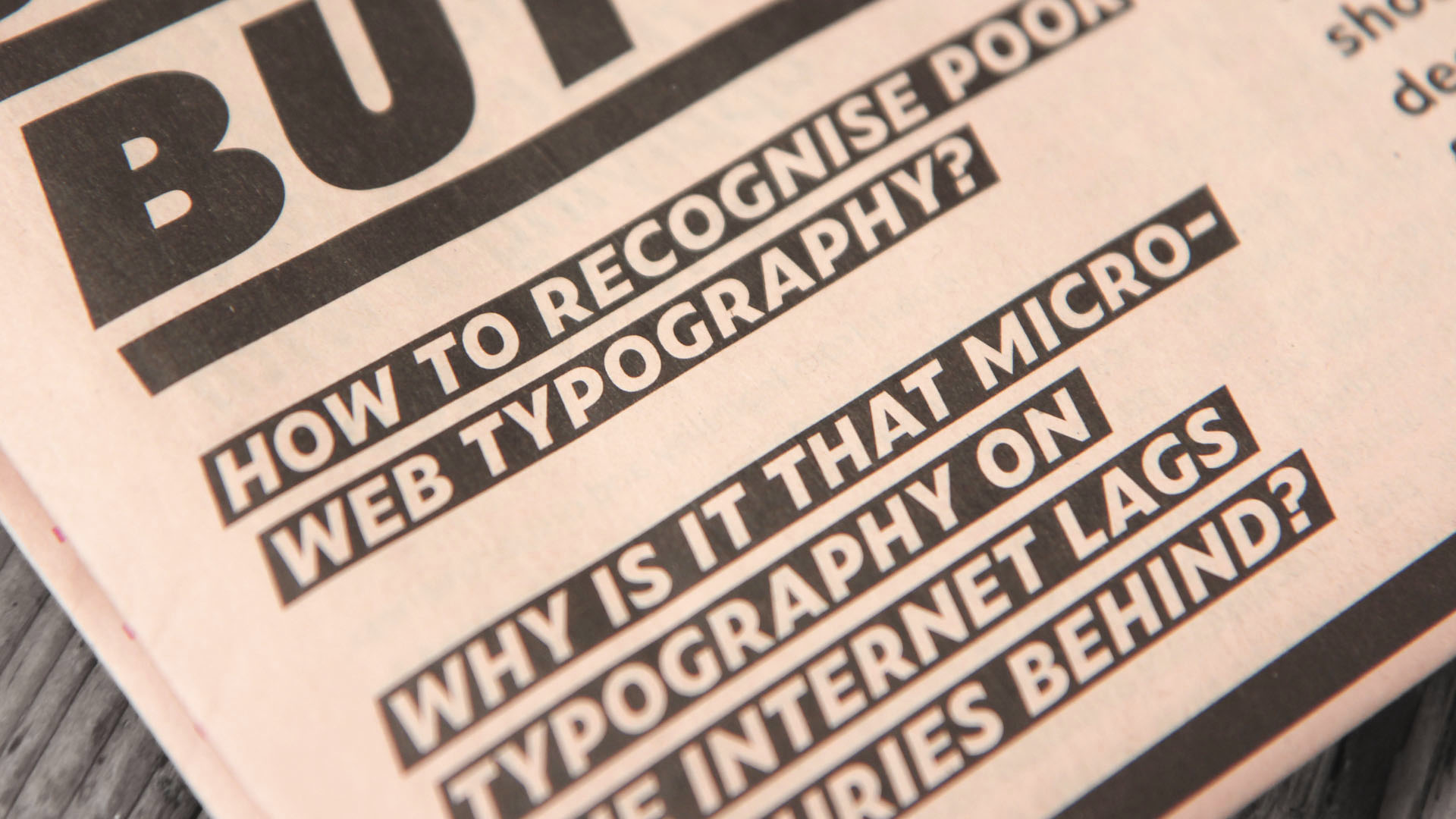
Web typography? Sounds good, but looks awful! How to recognise poor web typography? Why is it that micro-typography on the Internet lags centuries behind? What is the connection between text lines and Laurel & Hardy? Why is web typography actually a misleading designation?
This newspaper tells in a nutshell what designers should keep in mind when deciding on typography for web users, including key design-elements and often overlooked facts.
title Zeitung newspaper
size 320 x 480 mm
pages 24
printing Black + Magenta
design Underware
text Bas Jacobs
translation Roelien Plaatsman
language English
ISBN 978 90 76984 00 1
published June 2017
price € 3,–