12.2021
Dynamification of typography
Dynamification of typography
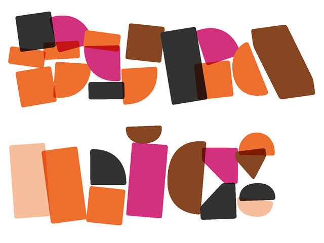
Dynamification of typography (12.2021)
05.2021
KONE custom fonts
KONE custom fonts
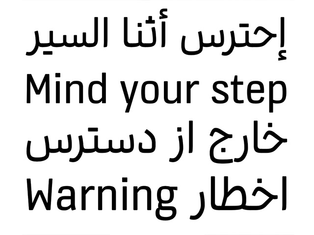
KONE custom fonts (05.2021)
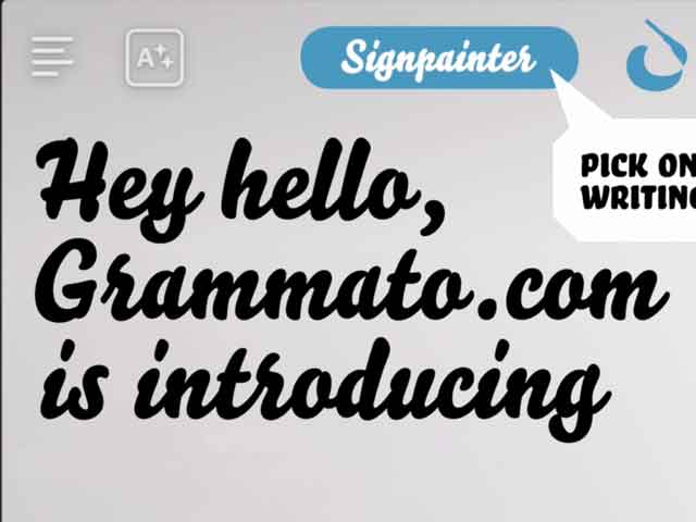
Grammatography (10.2020)
04.2018
Higher Order Interpolation
Higher Order Interpolation
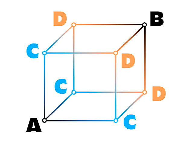
Higher Order Interpolation (04.2018)
06.2017
Subpixel ASCII+ Art
Subpixel ASCII+ Art
Subpixel ASCII+ Art (06.2017)
12.2015
Everything is black and white
Everything is black and white
Everything is black and white (12.2015)
03.2015
Webtypografie klinkt goed, maar ziet er niet uit
Webtypografie klinkt goed, maar ziet er niet uit
Webtypografie klinkt goed, maar ziet er niet uit (03.2015)
11.2014
Notes on Latin Plus
Notes on Latin Plus
Notes on Latin Plus (11.2014)
03.2010
Randomness versus Cleverness
Randomness versus Cleverness
Randomness versus Cleverness (03.2010)
01.2009
New logotype for MyFonts
New logotype for MyFonts
New logotype for MyFonts (01.2009)

12.2007
New logotype for Daimler
New logotype for Daimler
New logotype for Daimler (12.2007)

05.2007
Customized fonts for European banks
Customized fonts for European banks
Customized fonts for European banks (05.2007)
Case study: Grammatography
A 15-minute introduction to grammatography, a new way of writing
October 2020
What?
This movie is a recording from the presentation “Grammatography FTW” by Underware for the online conference Typewknd, broadcast on 25 Sept 2020.
Why?
The text below is not a transcription, but merely a summary without (!) some essential images and videos. The recorded presentation will give the full story, this quick write-up is a partial account for those occasions when the movie can’t be watched. But it is better to spend 15 minutes watching the movie for full comprehension, than reading for 5 minutes and staying puzzled for a week.
Who?
If you’ve never heard about grammatography, and if you’ve never heard about Underware, but if you are interested in writing, fonts, scripts, or typography, then this presentation is for you.
GRAMMATOGRAPHY FTW
This introduction shines some light on explorations with letters during the past couple of years by the European type design collective Underware. We’ve been designing fonts and drawing letters for over 20 years, but this is not a portfolio presentation. In case you want to know more about us and see the fonts which we make, check out our website. In this presentation, we raise some questions about the current state of type design, and we shine some light on our journey which hasn’t reached its final destiny at all.
▶ PROLOGUE
Why are we using the centuries old technique of movable type in a digital environment which offers so much more possibilities? Why do we limit ourselves so strongly because metal type was invented 550 years ago? We visited the moon more than 50 years ago, but our highly advanced computers from today use a 550 year old technique – based on metal type – and controlled by a QWERTY-keyboard which was invented 150 years ago to avoid undesired mechanical key jams of a typewriter. That’s… strange, considering the advanced options our current technology offers. This was already strange in 1969, for computers which brought us to the moon. But it’s even stranger considering the fact that computers have heavily evolved in the past 50 years, except for the way we deal with text.
▶ PART 1: 2020 ≠ 1969
Maybe you’ve heard about variable fonts before? This new font format was introduced 4 years ago, in 2016, and is often described as a way to include a complete font family in a single font file. So you can have Regular, Thin, Bold and Black all inside one font file. You install one font, but can use all styles within that family.
But in the end, if you look at what a variable font really is, it is technically not a family of fonts. It only contains the outline of a single font (which is the starting point) plus directions where to go from there. Go there to make it look Black, go there to make it look Thin, go there to make it Condensed. All those directions are interpolations, and are always straight lines. So type designers are not only designing the outlines any longer, but are basically designing interpolations.
Because Variable Fonts are essentially all interpolations based on one outline, it’s very limiting if those interpolations can only be straight. Compare it to the early digital letters, which only consisted of straight lines. This hasn’t been accepted for a long period, and quickly a method was found to create curves as well. For the same reason we introduced HOI – Higher Order Interpolation – which allows you to make any kind of interpolation within a variable font, also non-linear interpolations. This allows for a new way of designing letters, freeing ourselves from the limitations of linear interpolation. Actually, these days the aim for type designers is to design the relation between letters, instead of designing the letters themselves. The craft of type design is slowly changing. Without HOI, lots of manual work is required to animate letters fluently and naturally. With HOI, this happens automatically, heavily reducing the amount of manual work and making the complete process scalable. Because we can now interpolate on curves, this process can be applied to any kind of style. (yes, you can see some examples in the video)
▶ PART 2: EXPRESSION
Isn’t it strange that despite the fact that we’re living in a completely different world than in the Renaissance, we’re still using the same methods to express ourselves? Gutenberg’s invention of movable type wasn’t only a technological achievement, but also had a major impact on society and the way people could express themselves through writing. But maybe meanwhile we also need other ways to express ourselves while writing?
New times demand new ways of expression. Think of music, fashion, and yes, also in writing. One day there will be *something* next to typography, in the same way as typography came next to handwriting. We are wondering what this ‘something’ could be.
In typography, since Gutenberg, letters have always been predefined, they have been fabricated before being applied in writing. In contrast to handwriting, where the letter is created while writing. But now, with our current technology, we can start to free ourselves from the prefabricated letter, as we can now make letters that react to a user, or a reader, and only get their final shape while being written. This leads to a new way of writing. A writing with letters which may react to the user and reader. Therefore we call this something ‘grammatography’, writing with letters. A writing which gives more room for personal expression because it is dynamic on the level of the letter itself.
▶ PART 3: LOGIC
Text has always been static, as it was written or printed on a page. That changed with the introduction of the computer. Since text became digital, it turned from static to dynamic. But letters remained static. But now, and the introduction of variable fonts allows this, letters are dynamic too. So we can have dynamic text written with dynamic letters. That is a new model.
At the moment, we accept a logic that says A ≠ B, meaning: A and B are two different letters. But in our new model this logic is replaced by a form causality, meaning that a letter is what it becomes.
In the video, you’ll see a simple example where A = B, as well as a demonstration of this same principle in the context of words, by using more simplified shapes “water” is turned into “wine”. Note that the first letter of the word is actually still the same letter, but because it’s variable it can change into any other letter. So the question is: which letter is that actually?
And what do we call this kind of writing? Can it still be named typography? Typography = writing with prefabricated letters (typos = typified, graphia = writing). As we can now write with letters which can react to the user and/or reader, this definition is not sufficient for this kind of writing. Typos are no longer being used, letterform has become flexible, variable, interactive, dynamic. Grammatos is a more appropriate term. Therefore we call this new way of writing
▶ PART 4: TIME
Our speech is linear due to the time-based character of sound. Although our writing is also linear, the time-based character of our speech is not included in our writing. This aspect got lost in typography, but it’s no longer necessary to accept that limitation. The variable font format also finally allows for the inclusion of the dimension of time.
Once time is added as an additional dimension, new dynamics can be included in the design of letters. As this new kind of writing always contains digital processing, it can be fully controlled. The way letters are written is controlled in any aspect. Features like the writing direction (“write faster if the pen moves towards the body”) or curvature (“a straight line is written faster than a curve”), can be defined by the designer, and can influence the writing speed of every part of a stroke. Also the duration a pen travels across the air, after finishing a stroke and before starting the next stroke, depends on the distance between those two points. This distance is calculated automatically, and also included in the design of the letters for a more natural flow. All these elements are already included in the grammatographic fonts we created in the past couple of years. . Finally, a type designer can design his/her letters in time, allowing a user to write time in time.
Because digital processing is always involved, other elements, like randomizing, can also be included. Every aspect can be fully controlled. This can also be considered a kind of craftsmanship. Once that’s combined with the craftsmanship of writing (the good old penmanship), and with the craftsmanship of a type designer, it could create a new writing machine which allows another way to express ourselves, which is much more precise but at the same time much more expressive than some of our current writing tools. So this could lead to a kind of writing which is a symbiosis between a human and a computer, a writing machine which writes more beautifully than a human could do.
▶ PART 5: INSTRUMENT
A new of way of writing not only requires new methods of designing these letters (and new software to create those letters), but also requires new tools to write with those letters. What should those tools look like? Well, that still has to be discovered. Our current tools as we know them today are too limited. Why can’t we express ourselves in writing in a similar way as we express ourselves while playing a musical instrument?
New writing tools have to be invented. In the presentation, we demonstrate 2 examples of a new writing tool, a new writing instrument. These new writing instruments will look very different to the tools we know today. For example: if sliders are replaced by the valves of a trumpet, we can suddenly play with letters, just like we can play on a trumpet. This new tool, some people describe it as “that stick in the cube”, is called a trumpen. Another new writing tool is a penstrument, which is a more versatile writing instrument. Both tools are essentially new instruments, and as with any instrument, lots of practice is required before one masters the tool. For handwriting we use a brush or a pen, for typography we use a keyboard, for grammatography we need new instruments.
▶ PART 6: GRAMMATOGRAPHY
Next to handwriting (chirography) and writing with movable type (typography), a third way of writing emerges. Writing dynamic text with dynamic letters, letters which can react to the user and/or reader. Letters which have multiple dimensions, from which every dimension is designed and included in the fonts. This new way of writing allows for beautiful digital animated text for example, but also many other applications. Above all, this new way of writing offers a new way expression.
In the presentation, you’ll see a few examples of how this new way of writing can already be applied today (think of operating systems or apps, for more examples and information about this, visit grammato.com), but in the future many less obvious methods will appear.
Variable fonts actually allow for many more things than its creators have foreseen. The conclusion is that the underlying technique of variable fonts actually requires a new way of thinking about designing letters. The question is: is our brain ready for that?
Grammatography, a new way of writing:
- Scalable, in production and implementation.
- Any style, from handwriting to blackletter and anything in between.
- All scripts, not limited to a specific script, but works for Cyrillic, Latin, Greek, Chinese and any other script.
- Supported on all operating systems and browsers.
- Dynamic text: because it’s Unicode based, text remains accessible for search engines, automatic translations, etc.
Grammatography is ready.
Post scriptum:
Grammatography is ready, but never finished. We first presented grammatography last year at the ATypI conference in Tokyo. Since then, we’ve proceeded in making these letters much more advanced, more advanced in what they are capable of, more advanced in what they can look like, and mostly more advanced in how they can be controlled or directed. This journey hasn’t reached its final destination yet. The examples shown in this presentation are only the beginning of a new development, a development which will continue for a longer period in our near future. A development which can have many different answers to the question “what will there be next to handwriting and typography”? If you’re interested to know more, just contact us.
