12.2021
Dynamification of typography
Dynamification of typography
Dynamification of typography (12.2021)
05.2021
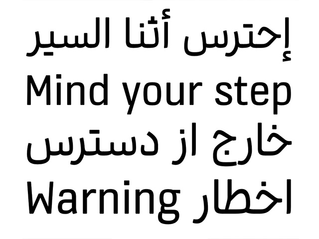
KONE custom fonts
KONE custom fonts
KONE custom fonts (05.2021)
10.2020
Grammatography
Grammatography
Grammatography (10.2020)
04.2018
Higher Order Interpolation
Higher Order Interpolation
Higher Order Interpolation (04.2018)
06.2017
Subpixel ASCII+ Art
Subpixel ASCII+ Art
Subpixel ASCII+ Art (06.2017)
12.2015
Everything is black and white
Everything is black and white
Everything is black and white (12.2015)
03.2015
Webtypografie klinkt goed, maar ziet er niet uit
Webtypografie klinkt goed, maar ziet er niet uit
Webtypografie klinkt goed, maar ziet er niet uit (03.2015)
11.2014
Notes on Latin Plus
Notes on Latin Plus
Notes on Latin Plus (11.2014)
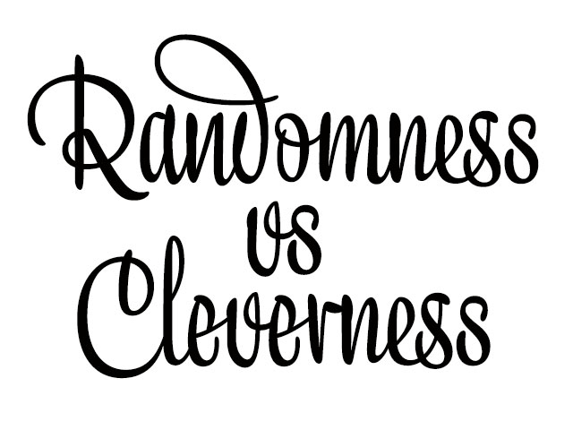
Randomness versus Cleverness (03.2010)
01.2009
New logotype for MyFonts
New logotype for MyFonts
New logotype for MyFonts (01.2009)
12.2007
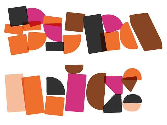
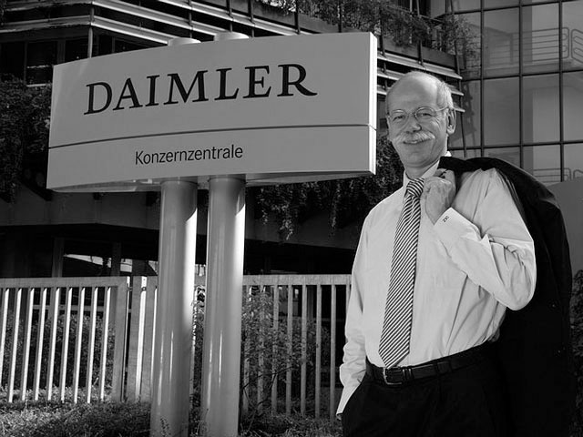
New logotype for Daimler
New logotype for Daimler
New logotype for Daimler (12.2007)

05.2007
Customized fonts for European banks
Customized fonts for European banks
Customized fonts for European banks (05.2007)
Notes on programming OpenType features
22 March 2010
Why took the development of the typeface Liza 5 years? A frequently asked question. Only when we reveal the story behind Liza into detail, people seem to understand. After answering this question regularly, we thought it makes sense to write a short text about OpenType-randomness based on the making of Liza Pro.
Let us first lift the carpet a bit: it was an endless process of going back and forth from the outlines, to programming, to production work and developing additional ideas, and back to the outlines, etc. Recently we found an email from Sami stating he was going to do “the latest bit of fine-tuning” including the “the final beta version” of the typeface. This email was dated February 2006. After this email, it still took us more than 3 years (and 2000 emails) to really round things up. Only by then we got the feeling we couldn't improve it anymore. This was the best we could do. Continuing on the typeface would only add mistakes. On this road we got some valuable help by great people (like Tal Leming, Adam Twardoch, Karsten Luecke, Henk Gianotten, Martin Pecina, Michal Tornyai and many others), helping us to clear the jungle path.
One of the fundamental targets: keep Liza Pro as simple as possible for the end-user. Complex and technical details are hidden under the bonnet, as Liza should speak for itself. But for those interested, we explain here some thoughts we had during the production of the type family.
OpenType randomness
Many words have been written in the last decade on OpenType randomness. But what is much more important than being random? Being clever. Being random alone does not guarantee a script typeface to get a realistic handmade look. A sign painter can be clever enough to optimize the look of your words, in every specific situation. So should a typeface be. A typeface should not only always look different, but should also always look good. That's a major difference.
The brightness of a script typeface does not only concern OpenType programming. Outlines which connect in an intelligent way are helpful. Also: the amount of glyphs in a typeface won't tell you how 'handmade' the final text may look like. It's possible that a typeface contains 10.000 glyphs, but still looks computerized. While another typeface with only 500 glyphs can look much better, but only if those 500 glyphs work together in a very smart way. Nevertheless, we will limit ourselves to the OpenType architecture for now.
Let's first start with randomness. Basically there are 2 points of departure which slightly differ. One way to define a random look, is to look at the characters' visual context. Simply said: make groups of characters based on their appearance, and those groups influence each other. Another way to approach an OpenType random look, is to base it on linguistic data. Every language has specific behaviour, and that could manage the look of your letters.
Let's focus on these two issues: OpenType randomness based on shape & based on language.
#1 OpenType randomness based on shape
A keystone of a script typeface: it should look handmade. That ain't easy for something as stupid as a typeface. Let's start easy: a script typeface should look as random as possible. The big bugbear: OpenType technology doesn't allow randomness. So you have to think about a poka-yoke system which looks convincingly random. Several ways lead to Rome.
Example only showing a 1-2-3 system. Contains lucky (l) and unlucky (e) consequences.
One option, and a logical first step, is to have a 1-2-3 system (-1-2-3-1-2-3, etc), also named Rotator (or 1-2-3-4-5 or even more). But it won't take long until you meet occasions where this system isn't sufficient for a script typeface. Repetitions will appear.
There are dozens of options to improve this random system. Every system has its limitations. And every system needs lots of testing to have a good view on those limitations. One option is not to rotate at all, but only swap. Or, even better, do both.
After testing several possibilities, we created the Swapper to work on top of the Rotator. The Swapper looks back along the line to check if unlucky repetitions appear. If so, it'll correct the repetition of identical glyphs (in direct neighbourhood).
Example of a 1-2-3 rotating system, where unlucky repetitions of identical glyphs are being corrected by the Swapper.
The power and size of the Swapper is, like any other OpenType feature, limited. The size of the complete OpenType-code defines how many characters the Swapper can look back. If the Swapper has to look back 100 characters, the code becomes too long and impossible to embed in a typeface. You've reached the limitation of OpenType, and will experience an overflow.
Time to think about additional workarounds. For example, the 'space' can be a transporter for information. A temporary placeholder. The Swapper could look back only 10 characters (= short piece of code only = okay = workable = fits into font ≠ overflow), and then tells the 'space' which kind of 'a' was used in that word. Even if the next eleven words don't contain an 'a', the thirteenth word in a line knows which 'a' to present. It receives this info from the 'space', and inserts a different 'a' than presented in the first word of the line. Although such a setup doesn't work for words longer than around 10 letters, it works on extremely long lines of text. This way the radius of the Swapper could be dramatically extended. Technically possible (yoehoe!). Unfortunately the total amount of code also dramatically exceeds its limits. Another dead end.
At a certain moment the Swapper had a maximum scope of looking back 45 characters (which worked in a generated font). But randomness can be boosted by other, supplementary features. Avoiding similar ascenders is an option. A word like 'alphabet' can end up with three rather similar ascenders, as they belong to three different characters. A separate feature to correct comparable ascenders can be created.

Example of a system which only focuses on swapping the ascenders.
Probably this still ain't enough to look convincingly random. Other features can be added, like initials and ending glyphs. Swashy end glyphs for the end of a word, and extraordinary end glyphs for the end of a line. The bar of the 't' and the loop of the 'y' are visual elements which can vary a lot, depending on their context. Ligatures of course. Or course all these features work simultaneously, and all influence each other. But that's still not enough to look convincingly handmade.
Along the road we got one more brainy idea: the infamous 'out-of-ink' feature. Every character has a certain value, representing how much ink it uses. Letter after letter these values are added up, until a maximum value has been reached. Then you're out of ink. You need to raise the brush from the paper, and dip it again in the paint pot to grab new ink. The next letter, with new ink, won't connect to the previous letter. This will naturally cause an interruption in the ongoing script stroke, as the brush is lifted from the surface. Depending on the shape & surface of a letter, Liza will be out of ink after 3 to 8 letters. At that position a character will be inserted with an interrupted design, and the out-of-ink counter is set back to zero.
Production test of combining features. They all influence each other and work simultaneously. See the end result of Liza's features here.
Adding all these extra features likely causes an overflow, which means features have to be shortened (the scope of the Rotator has to be reduced), some features were again deleted in Liza Display Pro, others were deleted in Liza Text Pro. Balancing all features is a sensitive, time-consuming issue. Regrettable but essential.
Beyond randomness
But that's the moment where cleverness takes over from randomness. If the OpenType features of a typeface can support and complement each other, they can play a whole new game together. A game which goes beyond randomization, and give the font a high IQ. Being different is not enough. A typeface should know how your word(s) can have the best look, optimized for that situation. Just being random is not enough; sometimes you want to have a ligature instead, or the loop of the y may take more space, and oeps… suddenly you're out of ink, etc. Building a smart combination of OpenType features, can provide the typeface with artificial intelligence.
Liza's system ain't the ultimate solution for every script typeface. The most appropriate 'handmade-look'-system heavily depends on the design of the glyphs and your character set. This is just the maximum achievable result for this specific typeface. And hey: Liza Display Pro even has a different system than Liza Text Pro, both focus on different aspects. And of course Liza Caps Pro has again a different system.
All these features together create a visual look which is as handmade as possible. If OpenType would offer a real random function, life might have been much easier. Maybe. But for now this is the maximum handmade look achievable.
#2 OpenType randomness based on language
The handmade look of a typeface can not only be controlled by the shape of a letter, but also by which letter it is. Based on language. Based on day-to-day use, based on frequency. A traditional typeface is static. No intelligence required, it always looks the same. Dynamic typefaces can visualize language differently all the time. As soon language and its (dynamic) form have to go hand in hand, 'data' is necessary. A simple example is the appearance of a ligature. If a script typeface should look as manual as possible, it's essential to implement some ligatures. However, if a specific letter combination appears very often in a certain language, and if it would always look the same = it would be visually dominating = computerised = annoying. That specific combination would then always look the same. Very often, over and over.
To avoid this behaviour, it's essential to know how often this ligature appears. Probably nobody minds if an occasional letter combination always looks the same. It can always be replaced by a ligature. But frequent letter combinations might need additional rules. 'Only substitute these 2 letters with a ligature if they are preceded by letter x' for example. So the next step is to know the context of every ligature in daily use. And how often does it appear at the end of a word? Or in the beginning? Or in between other letters, and which letters? This might all influence the design of the glyph and the code.

Examples of different kinds of data research. Long lists of numbers, in text and graphs. Bloeps…
A typeface needs rules to achieve the desired, controlled behaviour. To be able to define these rules, it's vital to know how often 'something' happens in a language. Data is required. For every language. Not only English, but also French, Spanish, Polish, German, etc. Any European language. During the development of Liza Pro, tools have been written for each specific research. The results of all these linguistic researches have been embedded in specific features and influenced the design of the typeface.
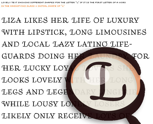
Here's one example of a very specific linguistic research, essential to develop an OpenType feature called 'The Penetrator'. Characters in Liza Caps Pro can have many different shapes. One specific shape of each letter is designed to appear in the beginning of a word only, like the 'L' in the magnifying glass. But in case this shape would appear every time at the beginning of every word which starts with an 'L', the text wouldn't look handmade anymore. Logical. Repetition of identical glyph shapes should be avoided as much as possible.
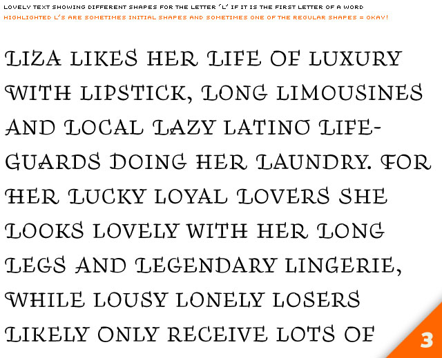
Here is an extreme text, not very likely to happen, just to demonstrate the function of this feature:
Look at the words which start with an 'L'.
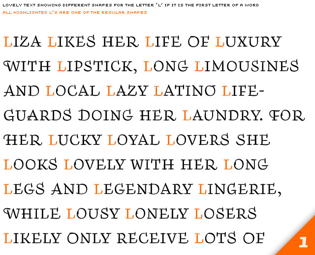
[1] Every L has a regular form. (= not very good)
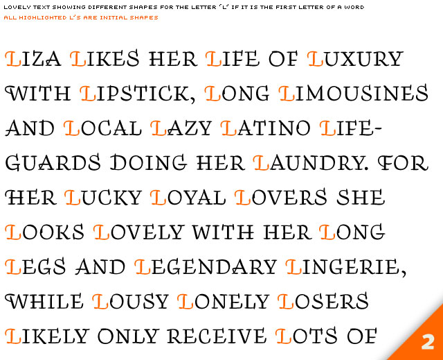
[2] Every L has the initial shape. (= not very good either)
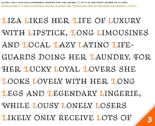
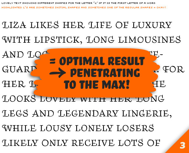
[3] L has sometimes has an initial shape, and sometimes one of the regular shapes (= ideal result = penetrating to the max).
[1] Every L has a regular form. (= not very good)
[2] Every L has the initial shape. (= not very good either)
[3] L has sometimes has an initial shape, and sometimes one of the regular shapes (= ideal result = penetrating to the max).
Avoiding repetition is possible. Just define in which case an 'L' gets the initial-shape if it's the first letter of the word. In Liza Caps Pro this behaviour is controlled by the last letter of the previous word. The last letter of the previous word defines the shape of the first letter of the next word, and vice versa.
If, for example A-G would be 50% of the time the last letter of a word, then H-Z would be the other 50%. One could then define that the L only turns into an initial L if the last letter of the previous word would be A-G. In that case the L would appear ±50% of the times as an initial L, and 50% of the cases as one of the other shapes.
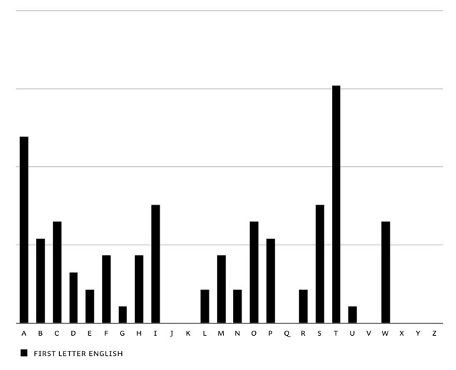
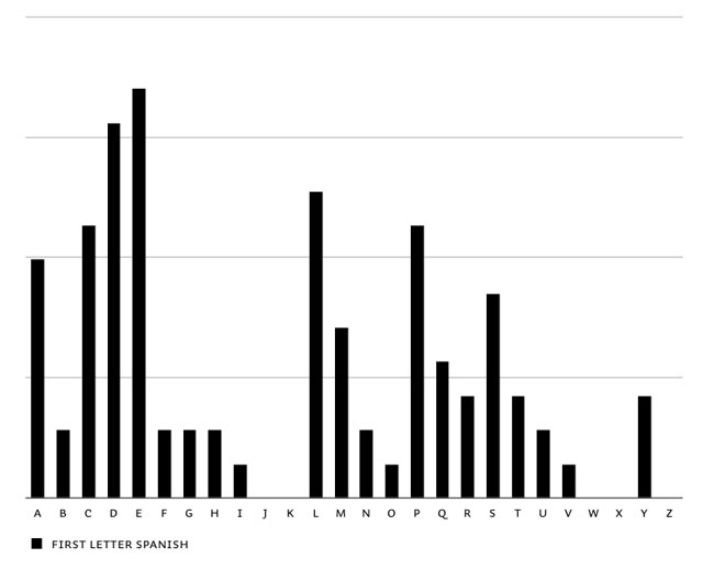
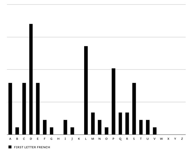
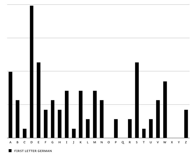
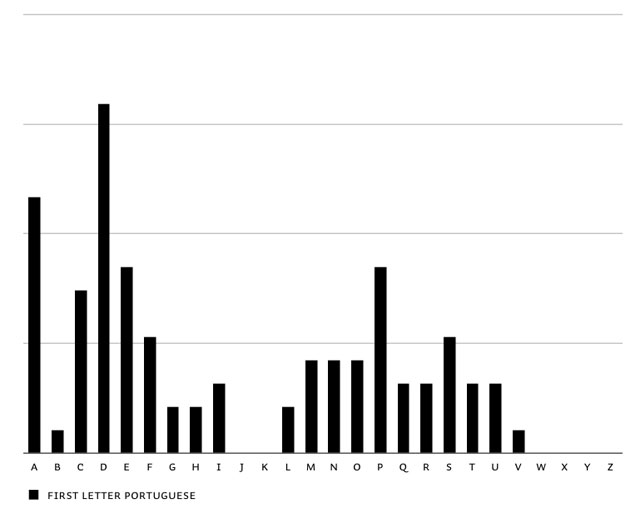
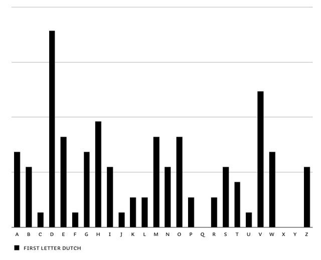
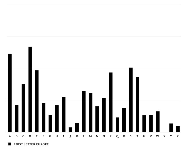
The first step to have optimal control on this matter, is to know the frequency of the first letters of words: first letter frequency research. This is based on researching real-life frequency (long sample texts in all languages), and not based on theoretical frequencies of dictionaries. It needs a realistic frequency result to start with. You'll notice extreme dissimilarities between different languages. English words often start with a T, in contradiction to other European languages. The opposite is true for the letter D. Before continueing with the feature, all languages were balanced in the end to make Liza look as good as possible in all European languages.
Overview of first letter frequency in English, Spanish, French, German, Portuguese, Dutch & summary of all European languages.
Another aspect is that some (initial) glyphs in Liza Caps Pro have very outspoken shapes, others are more timid. General guideline: the quirky glyphs shouldn't appear as often as the more unremarkable glyphs. So we defined a certain value for every glyph: the Eye Shock Factor (copyright WAD). Glyphs with a high Eye Shock Factor will be shown scarcely, at least not so often as the less dominating glyphs with a low Eye Shock Factor.
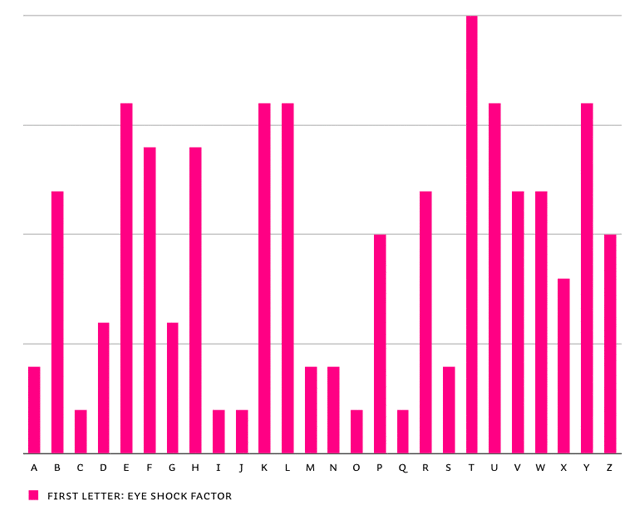
Eye Shock Factor of first letter shapes in Liza Caps Pro. You can see that the T has a high Eye Shock Factor, it visually catches lots of attention.
The frequency & the Eye Shock Factor together define how often a first letter of a word turns into an initial shape (or otherwise has one of the normal shapes randomly applied).
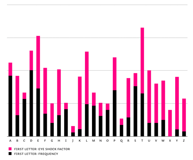
End result for the Penetrator: Eye Shock Factor + frequency of first letter shapes in Liza Caps Pro
In the chart above you'll see that the letter T has the highest value, which means the Penetrator slows down this letter the most. Simply said: the letter T appears rather often & its initial shape is very eye-catching. The Penetrator feature will take care this shape isn't spoiling the party, and won't show up too often.
The example above clarifies the frequency of first letters in a word. The same analysis has been done for the last letter of words of course. In every European language. And together they supply the data for just one of the OpenType features in Liza Pro.
The point is: designing a dynamic typeface requires drawing- and programming-tools in one hand & dictionaries in the other, in order to make the typeface balanced and widely usable.
#3 Think different? Think clever!
Instead of focusing on how to make the letters look different all the time, it's much more important to create a clever cooperation between all features, features which are supporting each other. Finding a balance between all features is one of the hardest things to achieve, as that's something that can't be defined in advance. You only know how the Ligatures relate to the Rotator if you test this in practice. When a third feature comes on top (eg. out-of-ink feature), a new balance has to be found again between these 3 features. Most likely the behaviour of the first 2 features has to be modified when a 3rd comes in.
In the end there are more than 10 features in Liza Pro, all influencing each other. Some features focus on the shape of glyphs, other features are build on the linguistic aspect of a letter. But all these features have to be perfectly related to each other. This is something which can't be defined in advance, but needs lots of testing and real-life usage to define. Meaning: the features have to be designed as well. Properly designed and balanced features can push the typeface from being random to being clever.
In the end Liza Pro is maybe more a lettering-tool than a typeface. It allows non-craftsmen or non-technical people to easily create a unique piece of lettering. Still simulated, but as close to real hand lettering as technically possible.
