12.2021
Dynamification of typography
Dynamification of typography
Dynamification of typography (12.2021)
05.2021
KONE custom fonts
KONE custom fonts
KONE custom fonts (05.2021)
10.2020
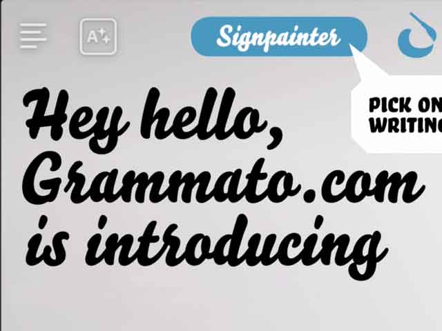
Grammatography
Grammatography
Grammatography (10.2020)
04.2018
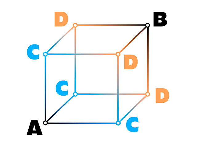
Higher Order Interpolation
Higher Order Interpolation
Higher Order Interpolation (04.2018)
06.2017
Subpixel ASCII+ Art
Subpixel ASCII+ Art
Subpixel ASCII+ Art (06.2017)
12.2015
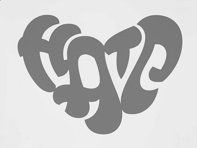
Everything is black and white
Everything is black and white
Everything is black and white (12.2015)
03.2015
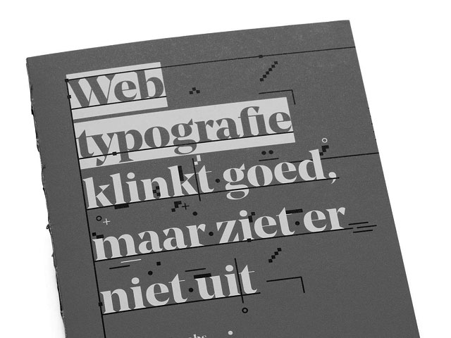
Webtypografie klinkt goed, maar ziet er niet uit
Webtypografie klinkt goed, maar ziet er niet uit
Webtypografie klinkt goed, maar ziet er niet uit (03.2015)
11.2014
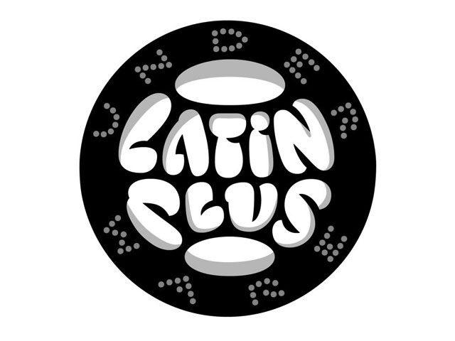
Notes on Latin Plus
Notes on Latin Plus
Notes on Latin Plus (11.2014)
03.2010
Randomness versus Cleverness
Randomness versus Cleverness
Randomness versus Cleverness (03.2010)
01.2009
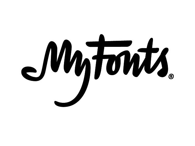
New logotype for MyFonts
New logotype for MyFonts
New logotype for MyFonts (01.2009)
12.2007
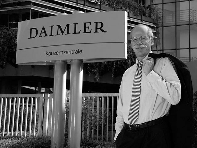
New logotype for Daimler
New logotype for Daimler
New logotype for Daimler (12.2007)
Customized fonts for European banks (05.2007)
Case study: customized fonts for European banks
May 2007
download PDF (0.4 MB)
May 2007
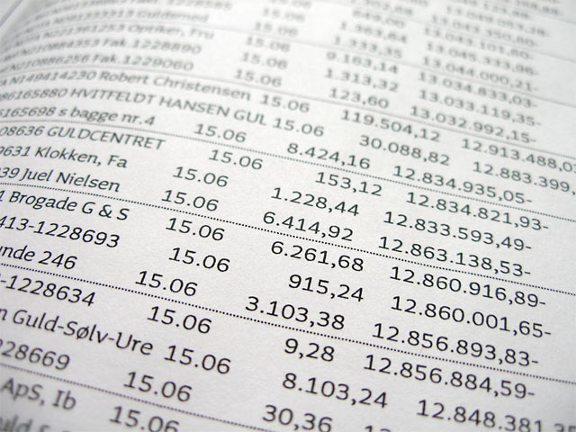
Recently two financial institutions have improved their corporate design by asking Underware for the creation of individual typefaces. For both European banks Underware customized their retail fonts, optimizing them for their specific usage and ending up at making an accompanying monospaced family. Using fonts is like driving cars: most drivers are satisfied with the car they buy at the dealer. But in some cases extra fine-tuning of the standard car is needed. This case study describes how the same thing works in practice with typefaces.
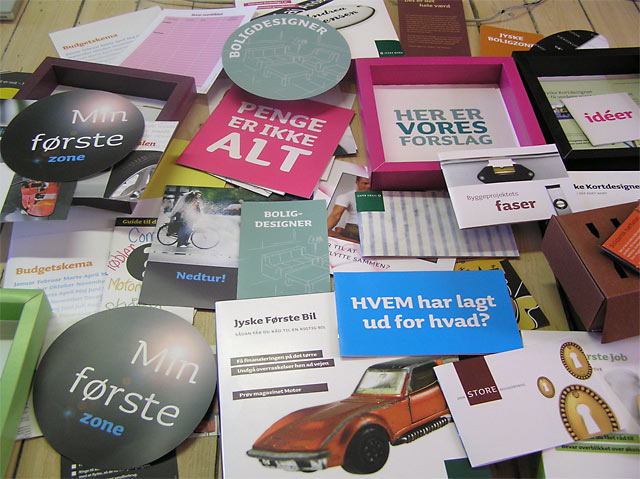
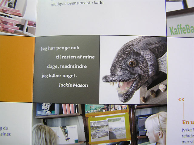
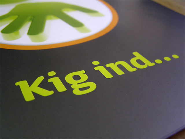
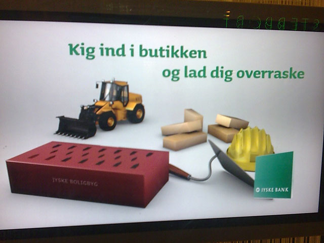
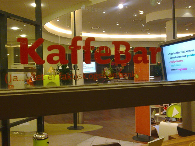
The Danish Jyske Bank wanted a new look for their company and its 4000 employees. A huge operation called ‘Jyske Differences 2nd generation’ was the starting point to change the way the bank operates. If a bank implements radical changes in management, structure and marketing, it also wants to look different. So part of this operation was creating a new graphic look. This new look should affect all media and should become visible in all material. ‘After having the same corporate identity for more than 15 years, a new design was needed to change the style of the whole company’, explains Jan Rudolph Michelsen from Jyske Bank. Part of the new appearance was the choice of a different typeface. ‘As the previously used typefaces, Garamond (for display) and Palatino (for text) appeared very friendly, the new typeface had to remain friendly as well’. The Danish advertising agency Normik was asked to visualize this new look and choose the typeface Sauna as the new corporate font for their client. ‘Jyske is a very unusual bank in many ways, they do everything different than others’, explains art director Sune Lindeskov from Normik. ‘They have round tables for example, so the client doesn't side on the opposite side, but side by side. Their financial products became physical packages, or each bank branch features a cafe for example. It's very unusual for a bank to have a typeface like Sauna, and that's what they like. Sauna is a very unique typeface, I haven't ever seen anything like it, and therefore it fits for Jyske Bank.’
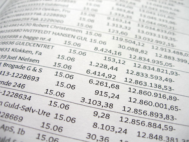
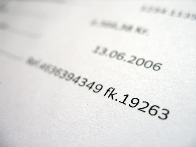
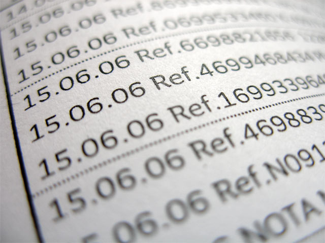
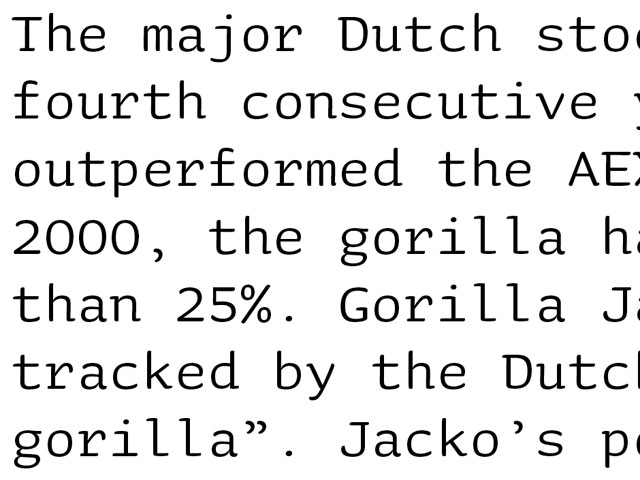
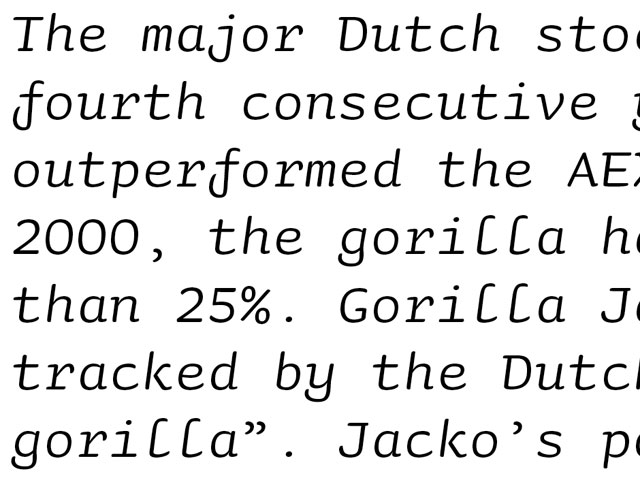
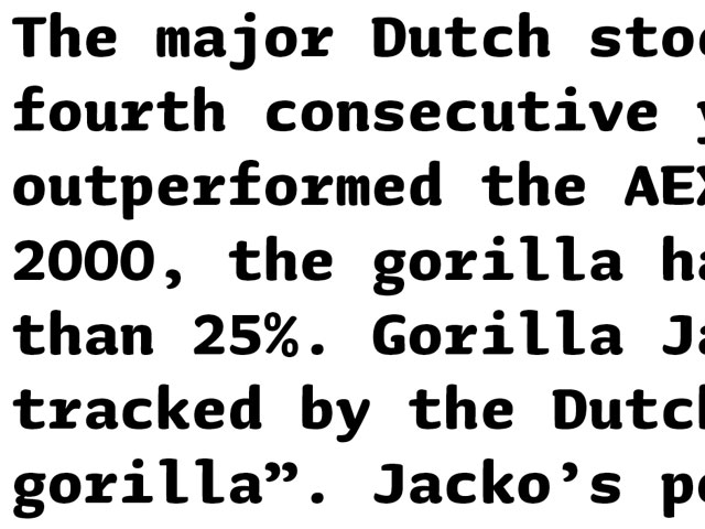
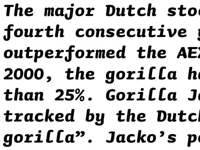
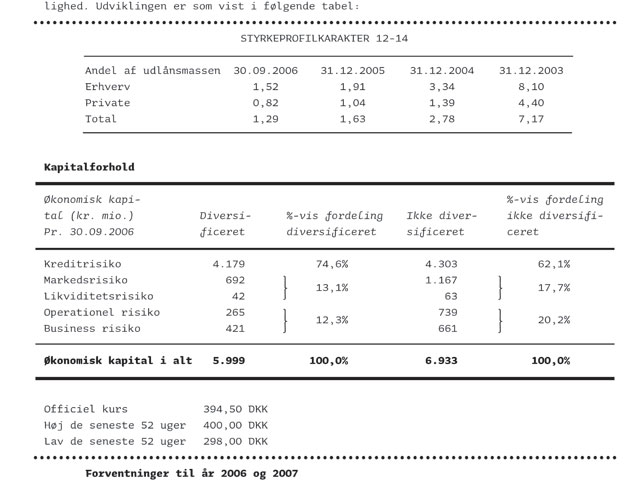
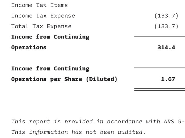
Underware customized the typefaces for the needs of Jyske Bank. Starting with new lining figure styles and expanding the character sets to cover the Western and Eastern European languages, necessary for a company like Jyske which operates also in Poland. Additionally Underware ended up at making a monospaced version of Sauna. A monospaced version of a slightly round, organic typeface like Sauna might sound impractical or far-fetched. However, while aiming to let the atmosphere of the new corporate identity breath through all notifications, it makes sense to use the same typographic style in statements of bank accounts as on the website or in printed matter. Therefore the monospaced version of Sauna, equipped with italics and different weights, allows to visualize this new look even when their clients check their personal monthly bank account overview. Admitting that an organic typeface like Sauna is not the most obvious typeface to make a accompanying monospaced version for, the consequence is that this monospaced typeface has some extravagant and exotic characteristics. Especially well visible in the italic fonts, characters like 'f', 'j' and 'l' cause an unusual flair for a monospaced font. The stereotypical idiom of a programming-typeface is left behind, and exchanged for a more human atmosphere.
Changing a corporate identity for a company of this size is a massive operation. ‘Implementing our new corporate identity, with this new typeface, started in the end of 2006, but will most likely take at least one more year before it's been totally carried through and fine-tuned in all media, like websites, movies, packaging, statements of bank accounts, annual reports, posters, etc.', Michelsen expects.
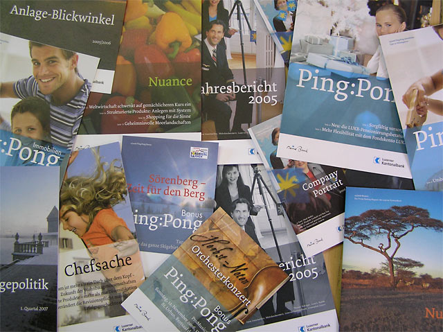
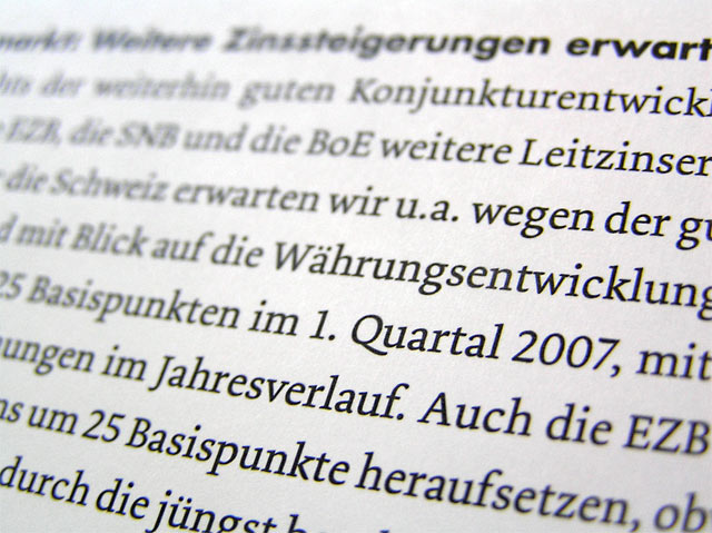
Next to this Danish financial institution, Underware customized their fonts for a Swiss financial institution as well. Recently the Luzerner Kantonalbank acquired the typeface Dolly. As the responsible graphic designer Beni Sutter explains: ‘Dolly is a font which works well in body text. It has its own particular character which sets it apart from other fonts, without appearing contrived. Alongside the rather severe Futura font, I think Dolly provides a refreshing change in document layouts. It was also important to me to find a new font, rather than use one of the old classics one sees everywhere.' The Luzerner Kantonalbank is meanwhile using Dolly for the body text in their newsletters, annual and financial reports, magazines and other customer periodicals, mentions the Advertising Director of the Luzerner Kantonalbank Edith Walthert. ‘In practice the font works good. Dolly is very well readable’.
‘I came across Dolly because I used another Underware font, Sauna, for a different job’, Sutter continues, ‘and then I noticed Dolly on the company's website. I am always on the lookout for great new fonts, and I think Dolly is a fantastic find’. In the end Underware also customized the typeface Dolly for the Luzerner Kantonalbank, creating additional lining figures and accompanying mathematical and monetary glyphs. Sutter concludes: ‘As far as I can judge, Dolly performs extremely well as a body text font for print media and is easy to read’.
Taking advantage of being a small scale type foundry, Underware is eager to stay in direct touch with the users of their fonts. This makes it more satisfying for Underware as well as for designers. And modifications, additions or other custom work to the typefaces can then be discussed very easily in an early stage because of this.
For more information, please contact the Underware Custom Type Dept.
This case study is also available as a PDF file.
view onlinedownload PDF (0.4 MB)
