12.2021
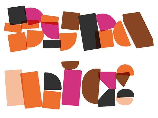
Dynamification of typography
Dynamification of typography
Dynamification of typography (12.2021)
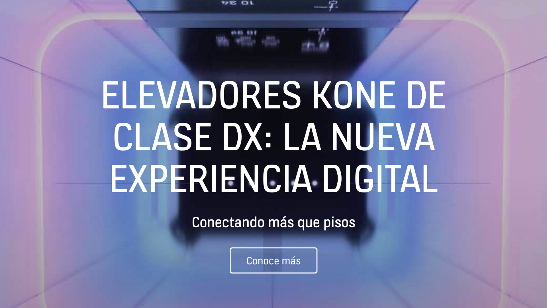
KONE custom fonts (05.2021)
10.2020
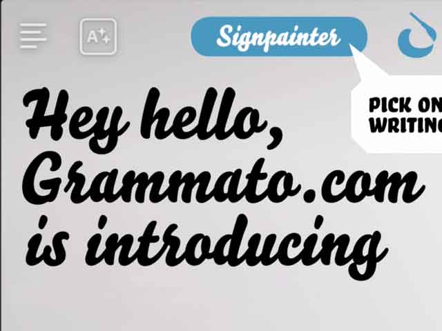
Grammatography
Grammatography
Grammatography (10.2020)
04.2018
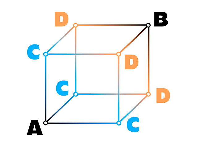
Higher Order Interpolation
Higher Order Interpolation
Higher Order Interpolation (04.2018)
06.2017
Subpixel ASCII+ Art
Subpixel ASCII+ Art
Subpixel ASCII+ Art (06.2017)
12.2015
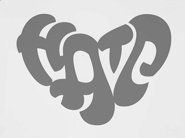
Everything is black and white
Everything is black and white
Everything is black and white (12.2015)
03.2015
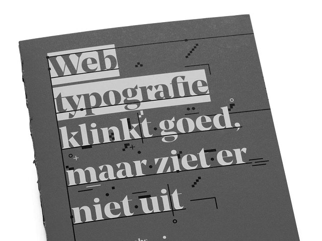
Webtypografie klinkt goed, maar ziet er niet uit
Webtypografie klinkt goed, maar ziet er niet uit
Webtypografie klinkt goed, maar ziet er niet uit (03.2015)
11.2014
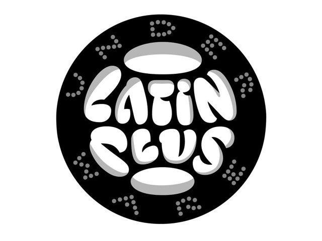
Notes on Latin Plus
Notes on Latin Plus
Notes on Latin Plus (11.2014)
03.2010
Randomness versus Cleverness
Randomness versus Cleverness
Randomness versus Cleverness (03.2010)
01.2009
New logotype for MyFonts
New logotype for MyFonts
New logotype for MyFonts (01.2009)
12.2007
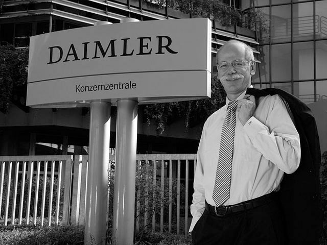
New logotype for Daimler
New logotype for Daimler
New logotype for Daimler (12.2007)

05.2007
Customized fonts for European banks
Customized fonts for European banks
Customized fonts for European banks (05.2007)
Case study: KONE custom fonts
05 May 2021
The evolution of KONE’s custom fonts:
From elevator signalization to a universal typographic voice
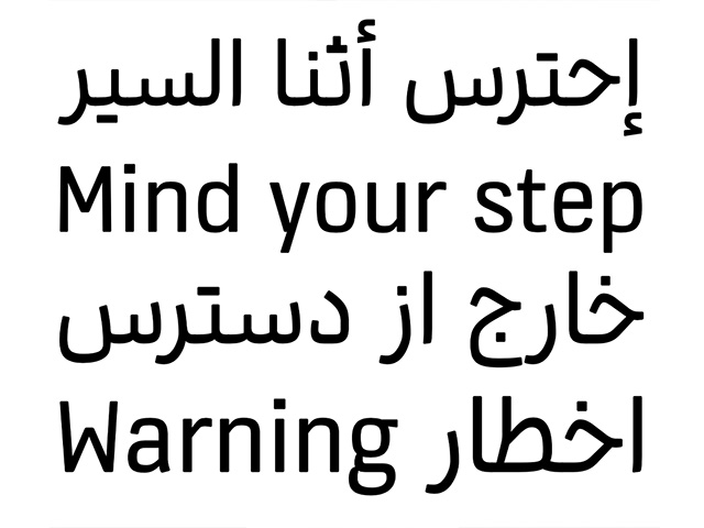
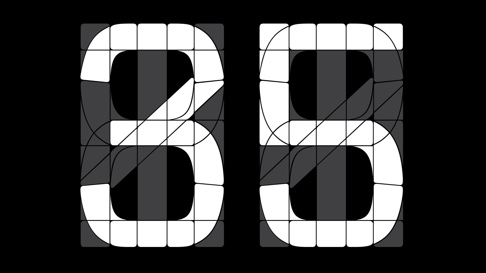
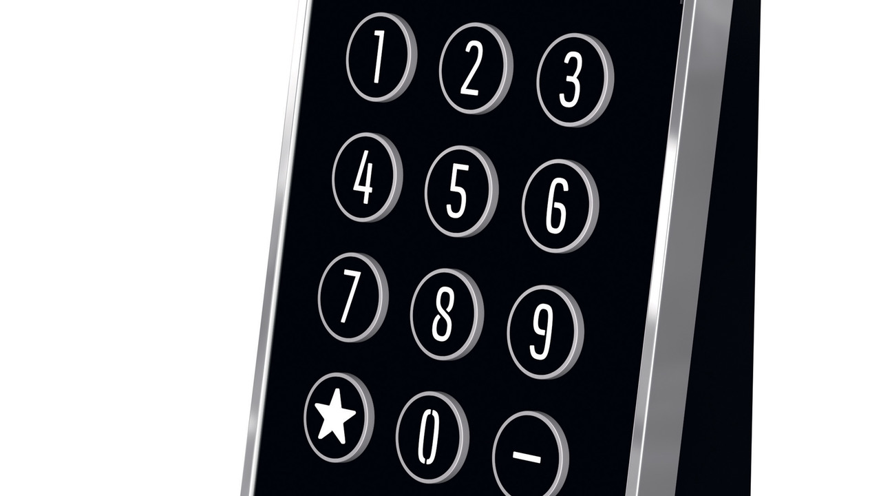
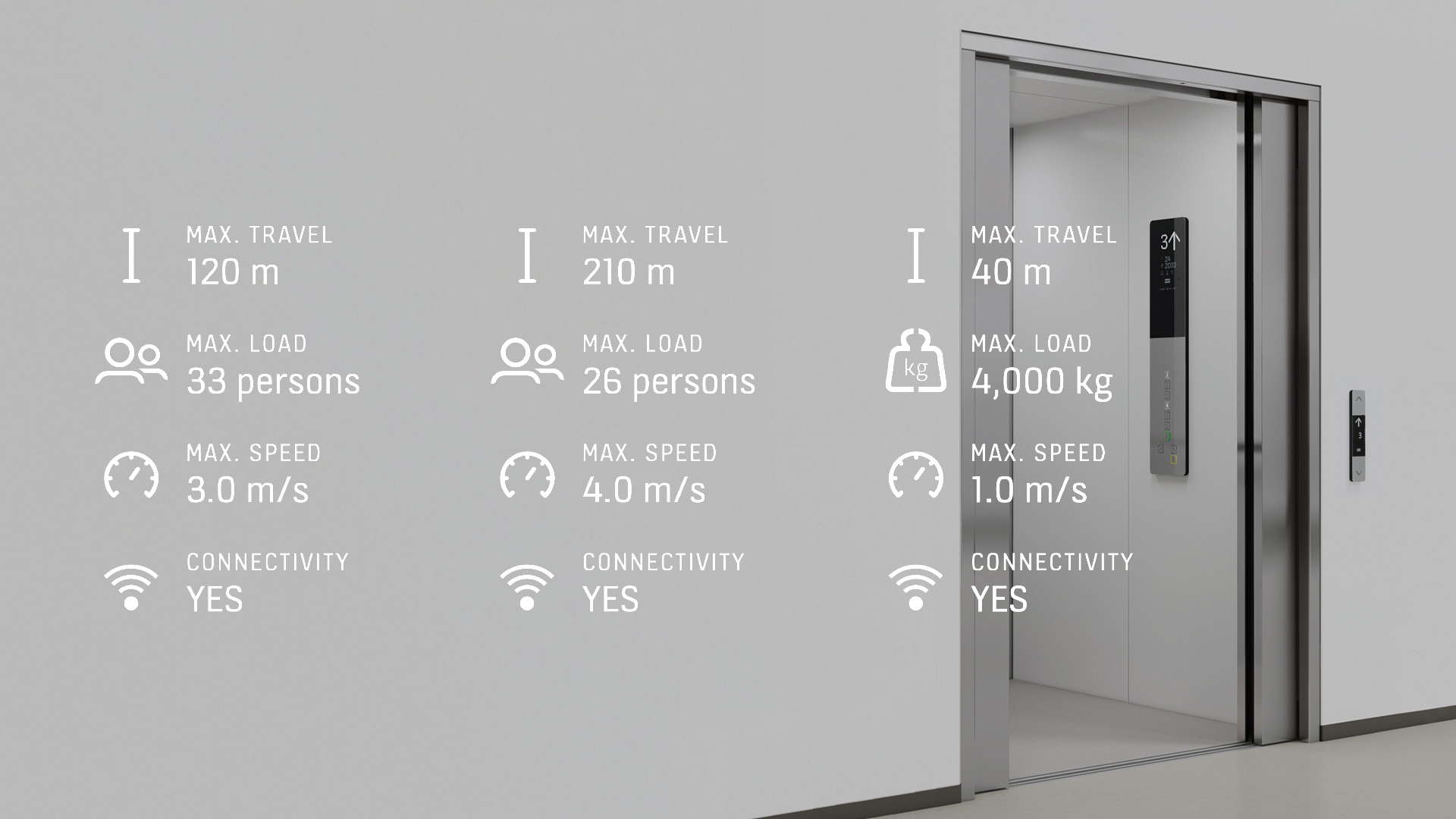
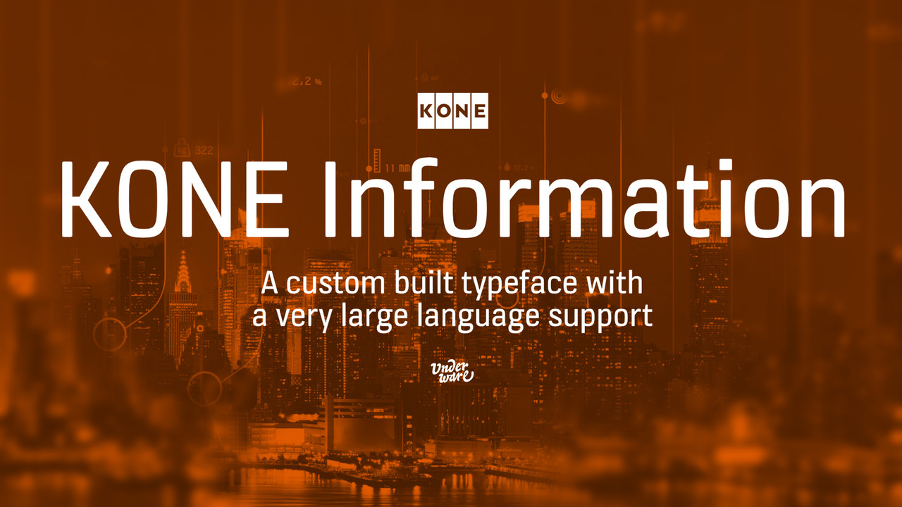
During our decade long partnership with KONE Corporation, one of the world’s largest companies in the elevator and escalator industry, we have developed a whole range of typographic tools. Initially we’ve developed a set of custom fonts to unify their products: from tactile elevator buttons to floor numbers on info panels for example. Every letter & number inside every KONE elevator breathes the same atmosphere due to a set of custom fonts we have developed for them since 2010. But meanwhile the strongest and most recognisable custom font is the KONE Information typeface, which is meanwhile applied throughout their entire company.
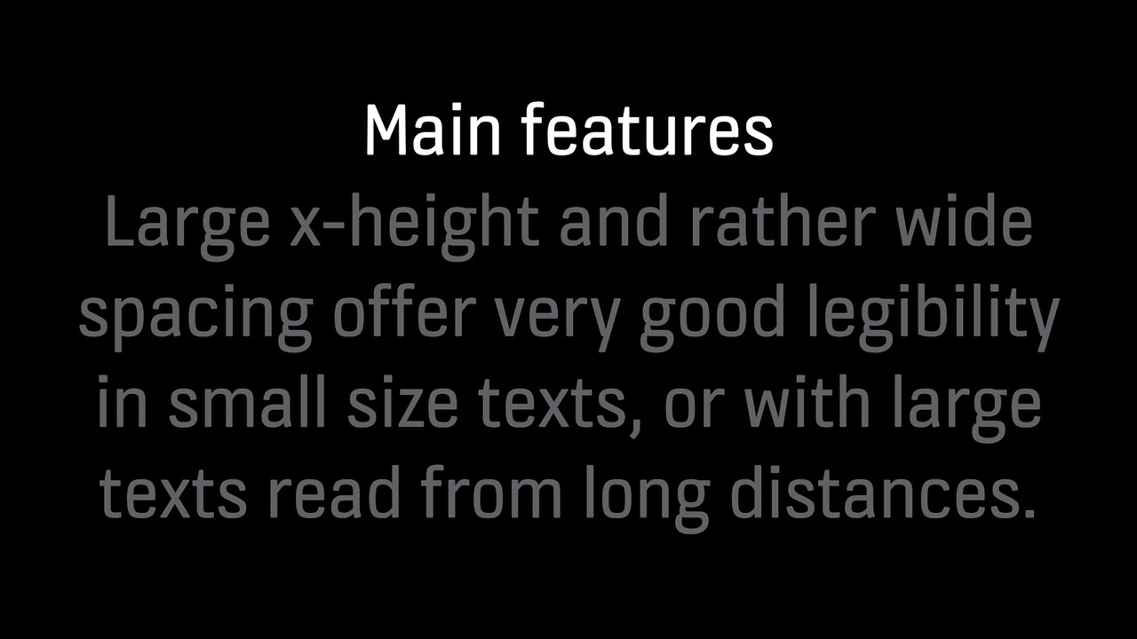
KONE Information was originally built to complement the signage on elevator panels. Such a typeface has the challenge which many custom fonts face: carry its own unique voice (= hey, look it’s me!), but at the same time be as accessible, legible, clear and trustworthy as possible (= the risk of becoming a general, exchangeable, bland typeface). KONE Information has proven to work: it has become a main branding tool for KONE, and turned into a key ingredient of their corporate identity. This custom font has meanwhile not only a strong visual presence in elevators, but also on company websites, mobile apps, displays and signage systems, truck letterings up to annual reports and beyond. A project which originally started to unify the look of elevators, turned into an own typographic voice throughout the entire communication of this global company. It became a universal and valuable branding tool.
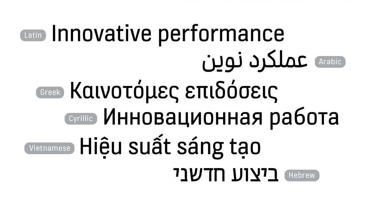
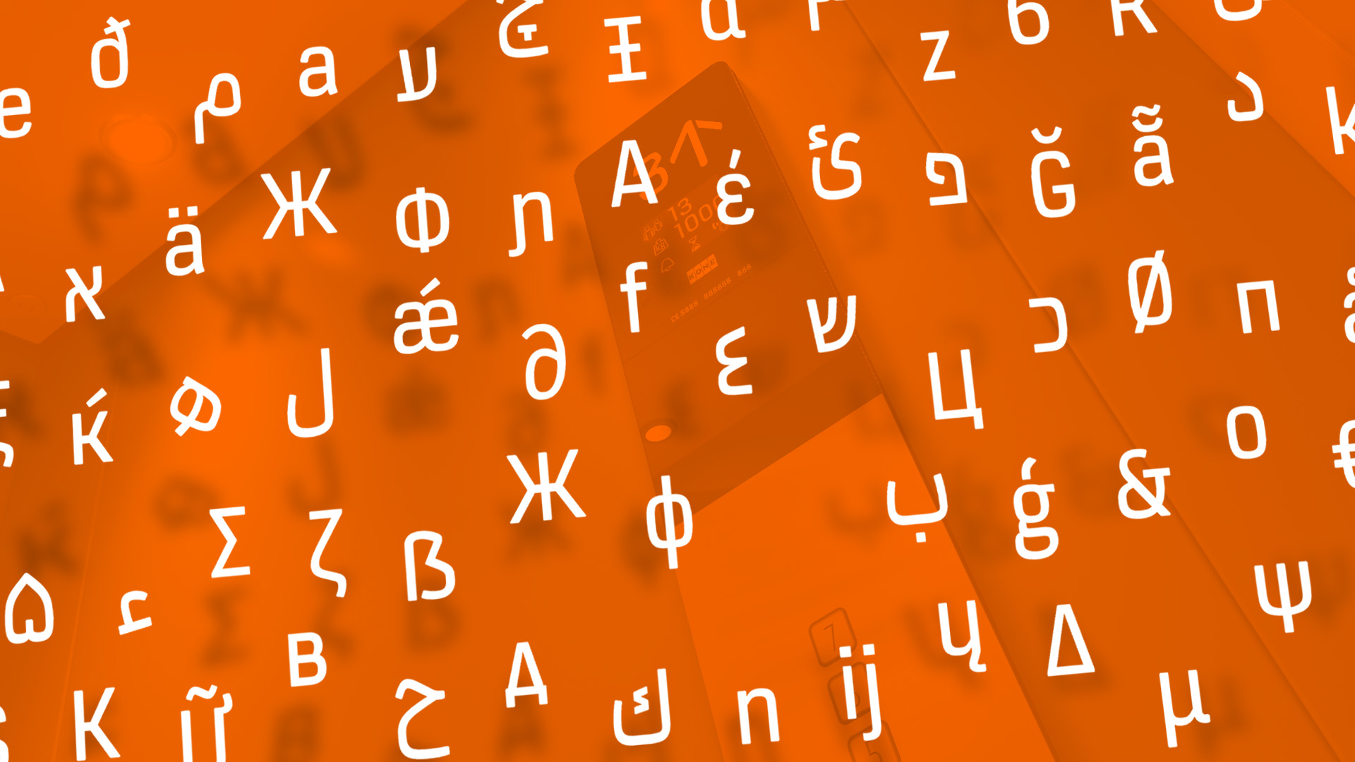
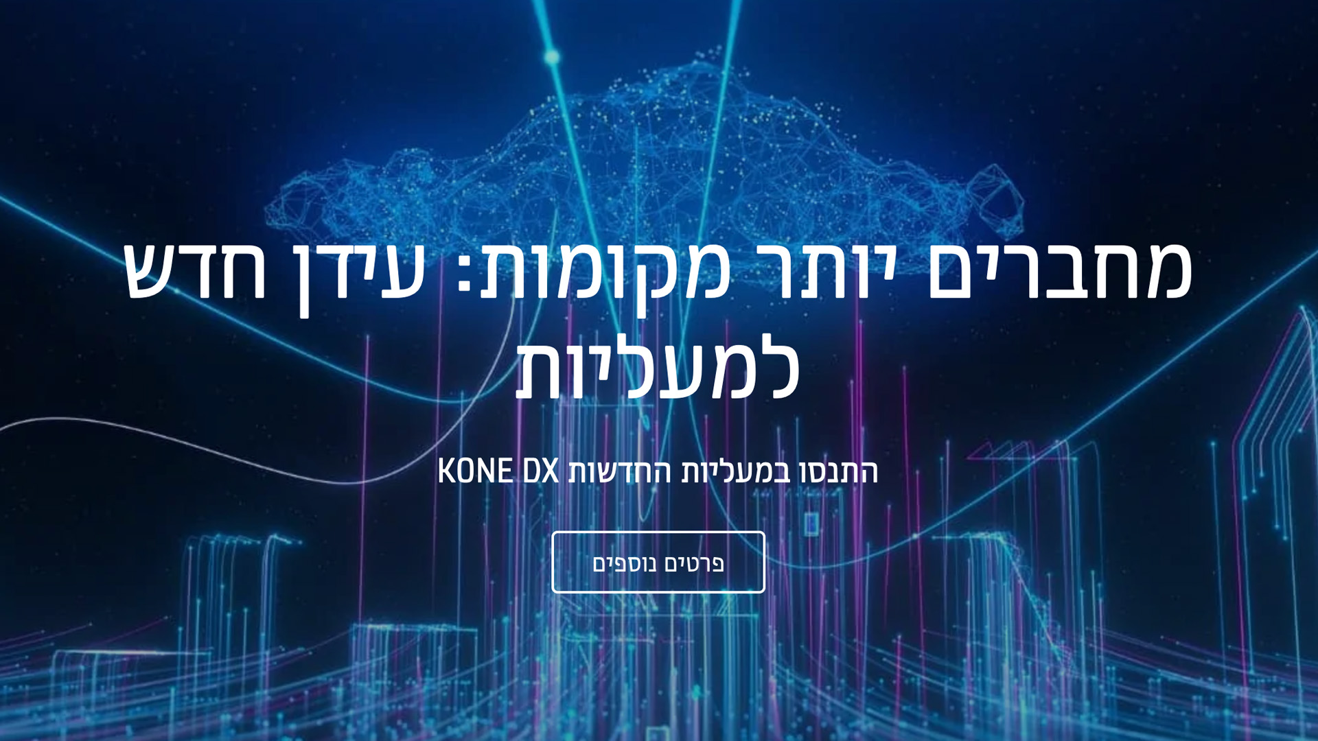
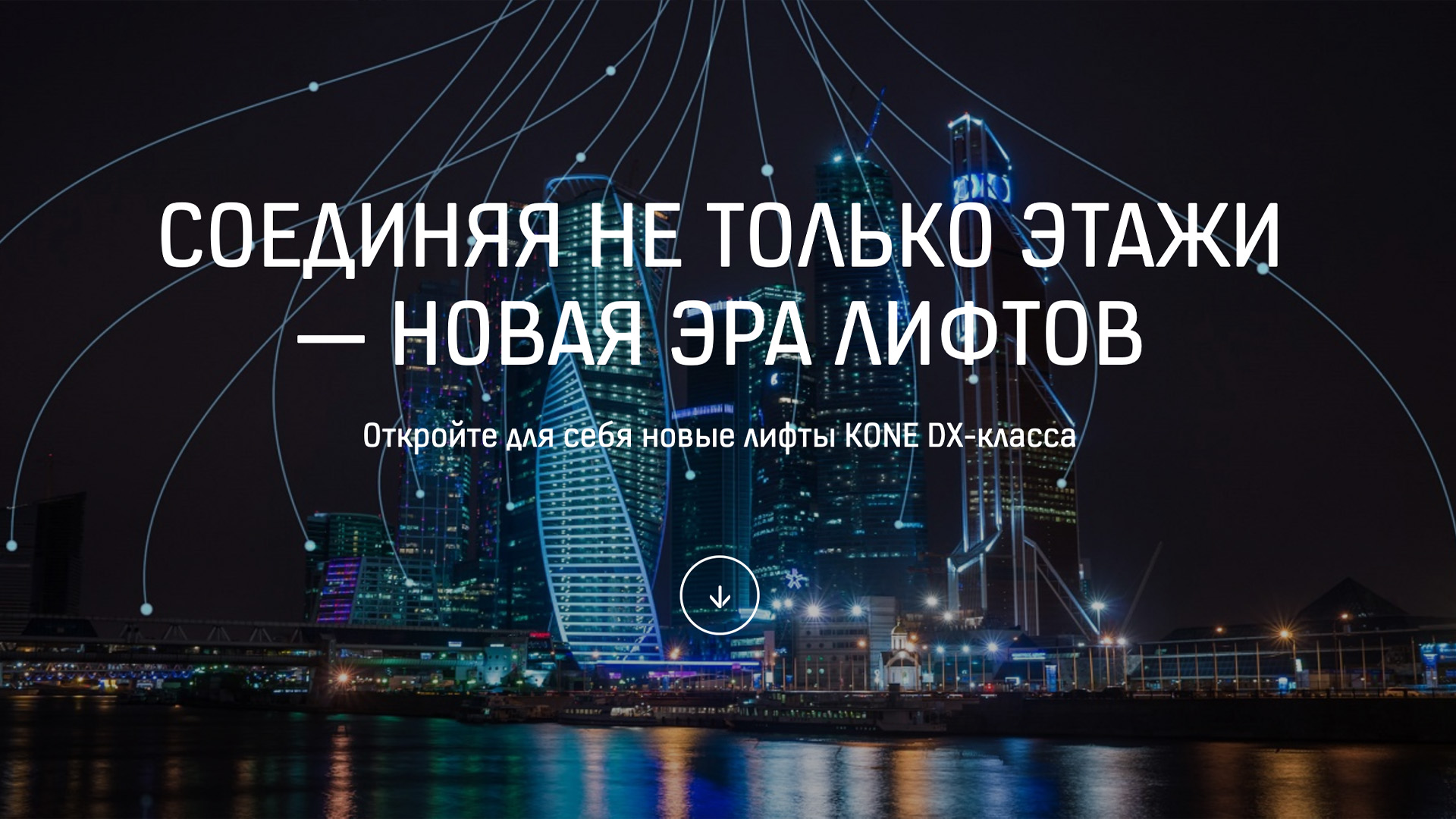
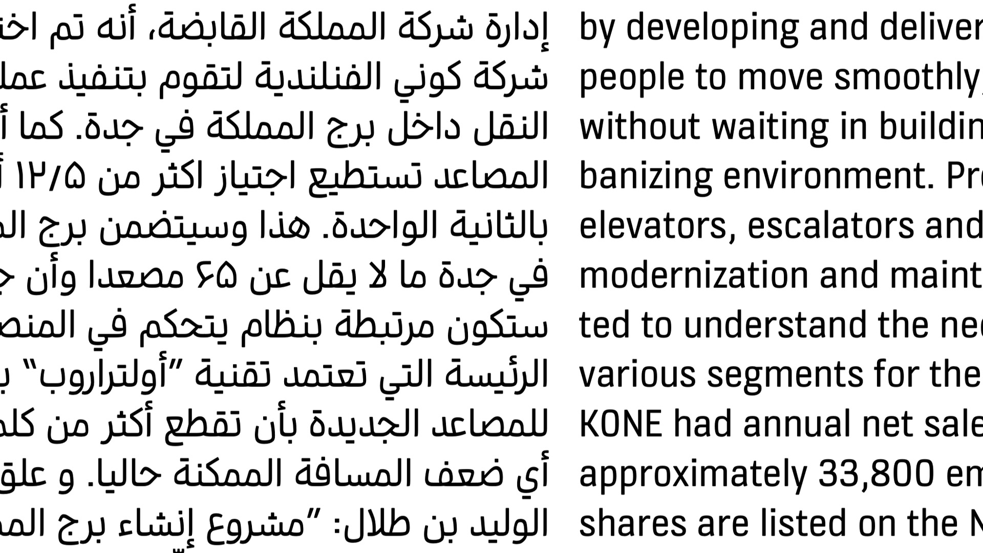
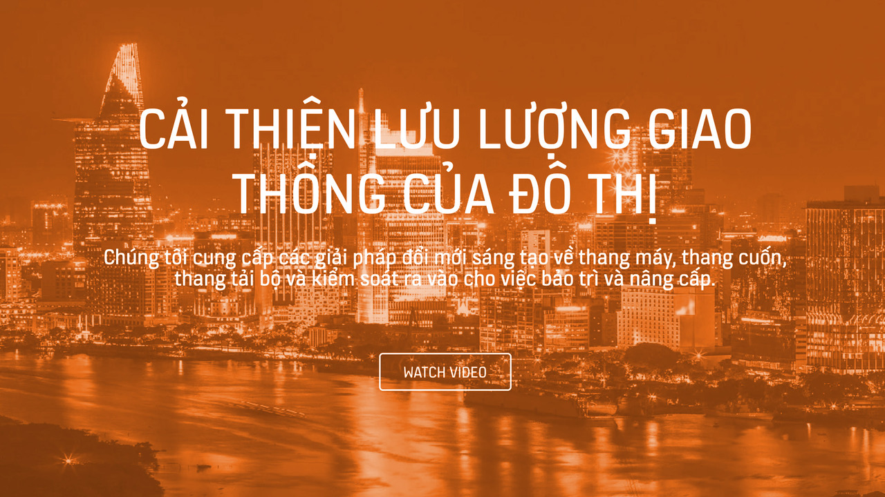
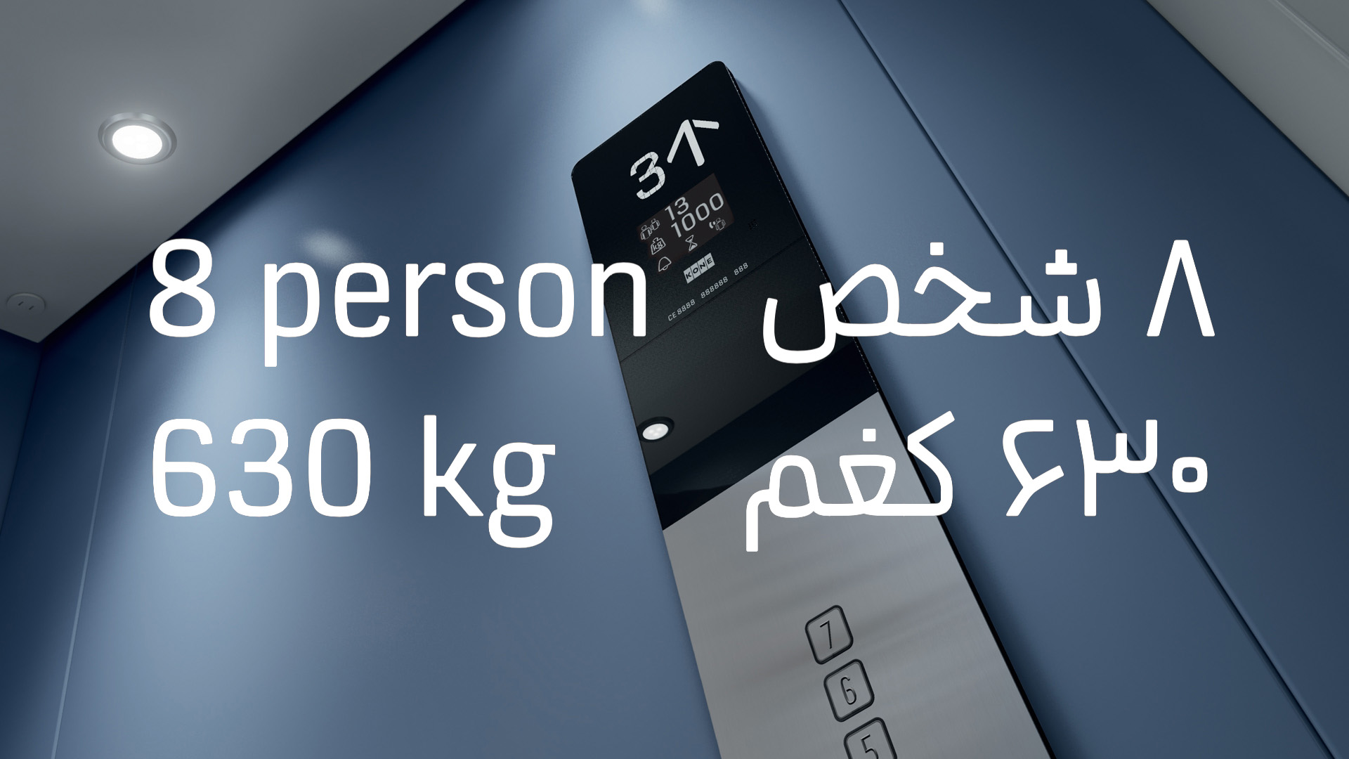
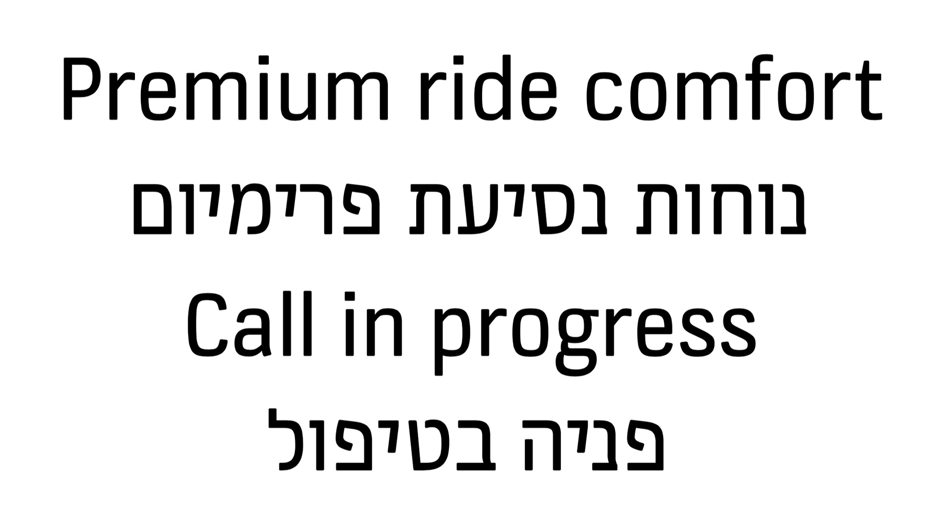
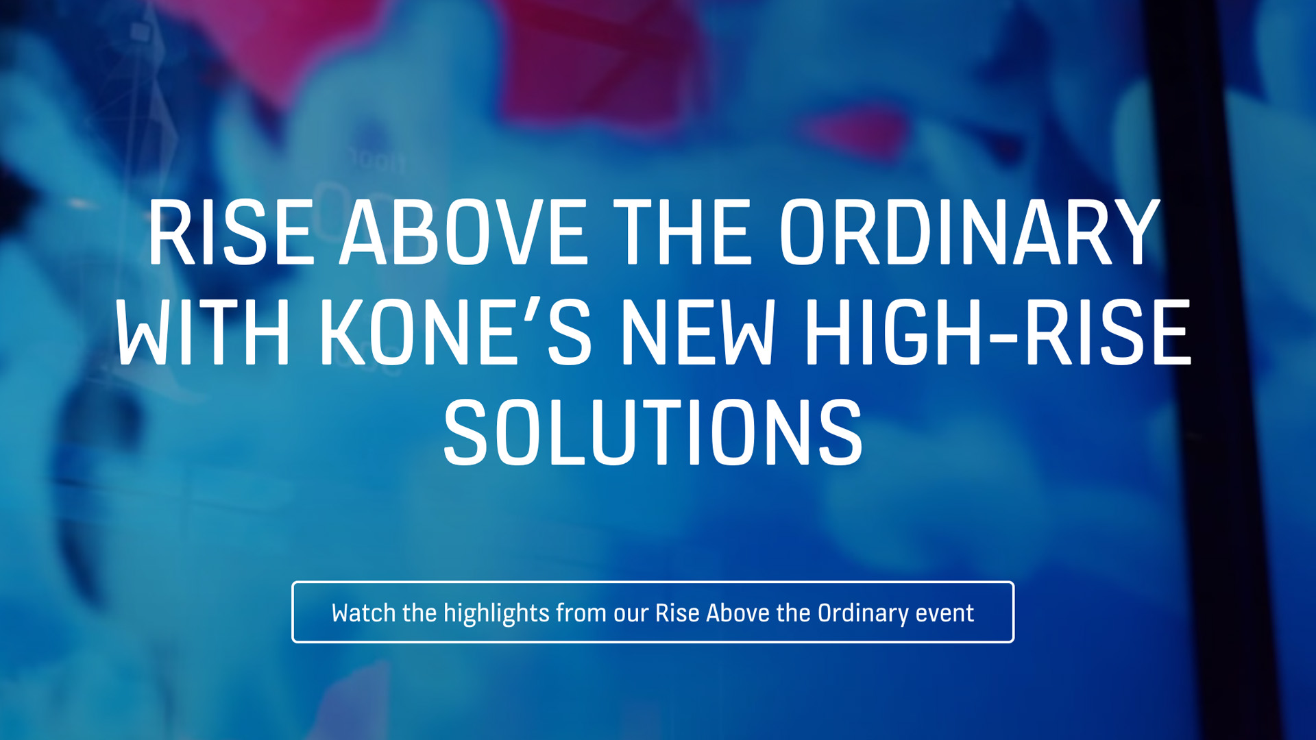
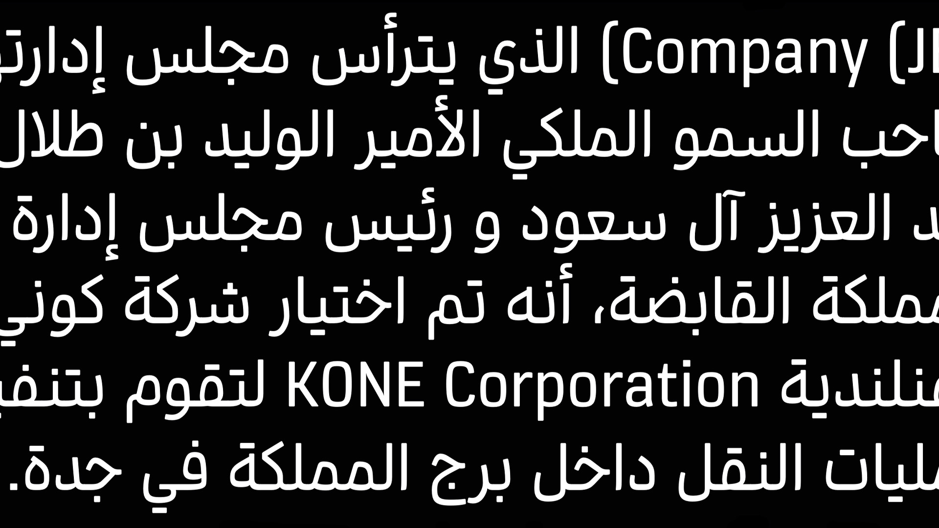
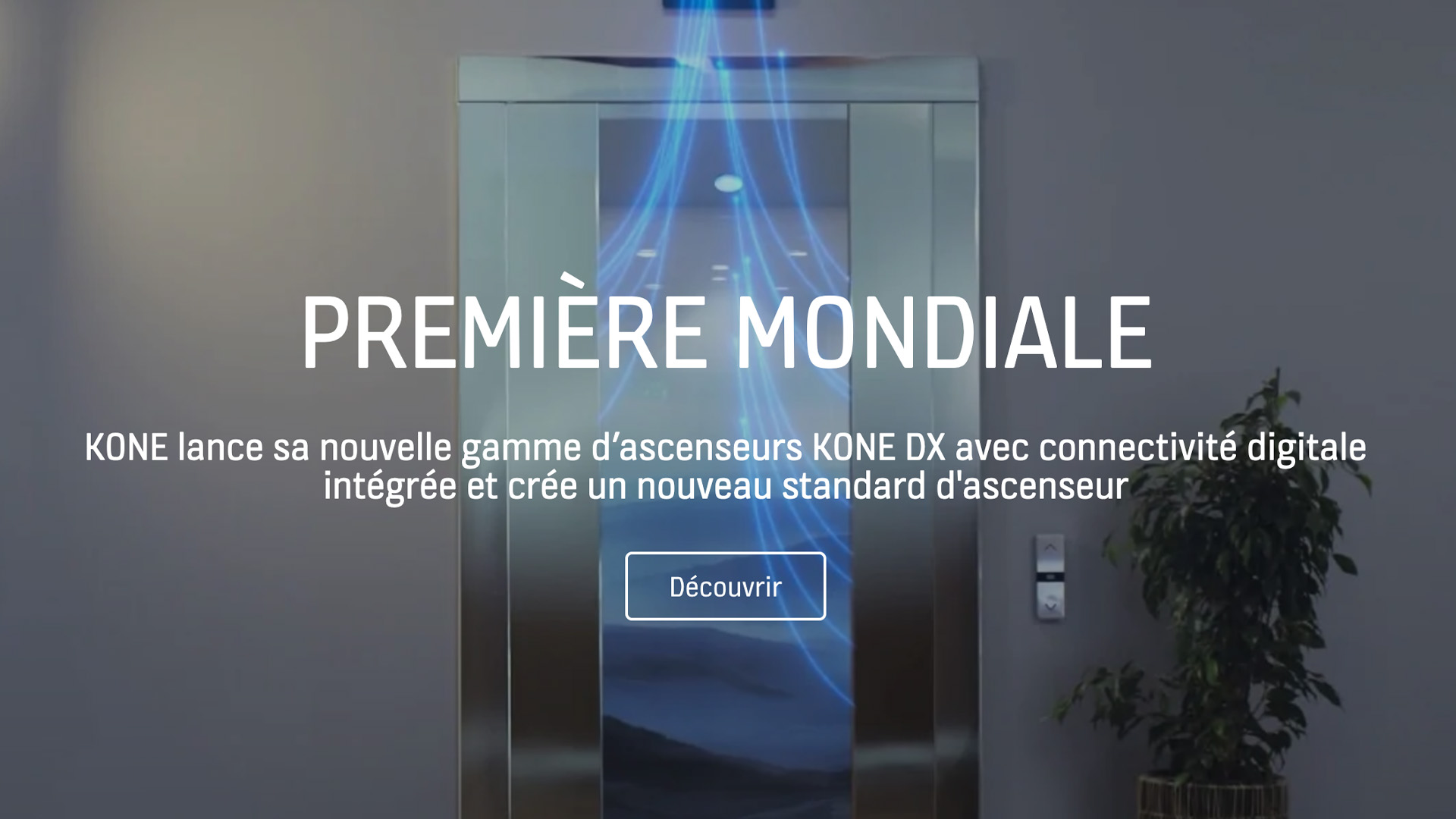
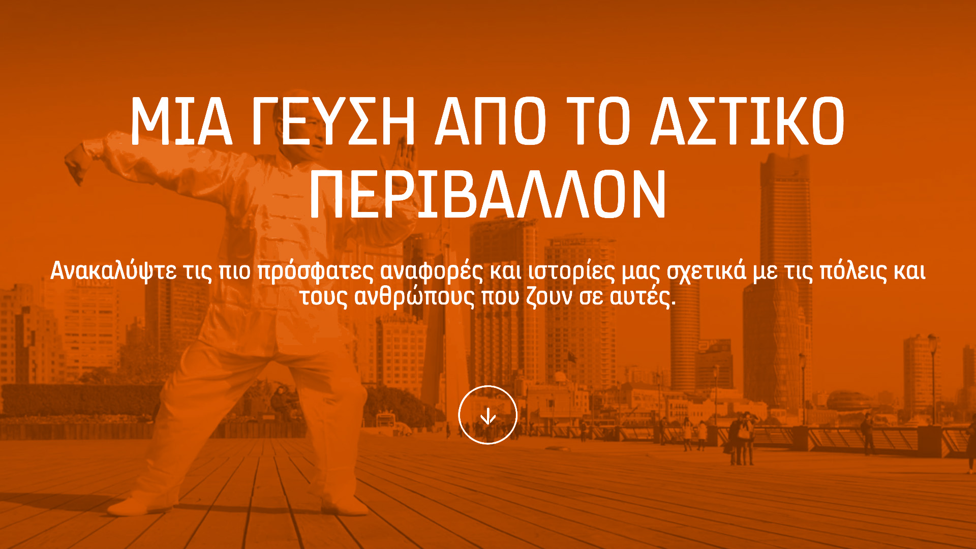
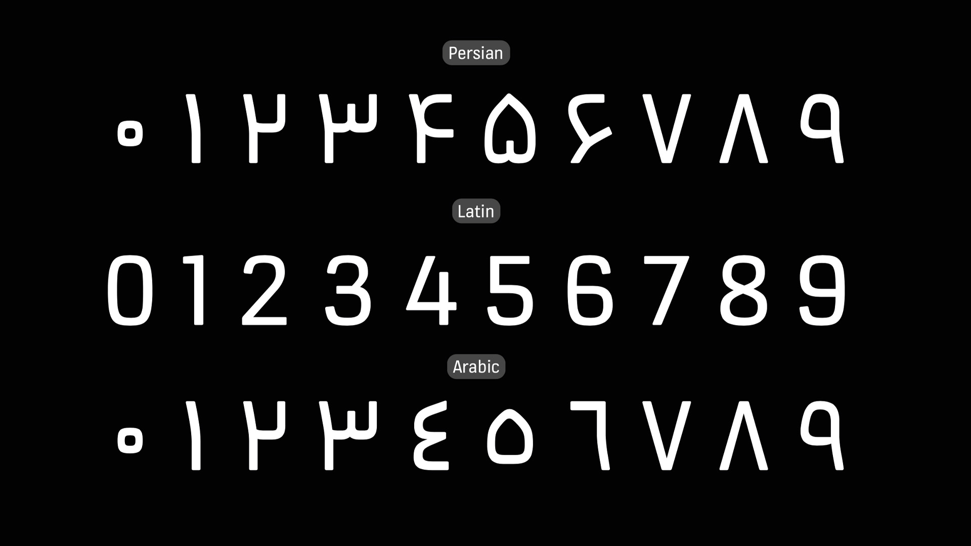
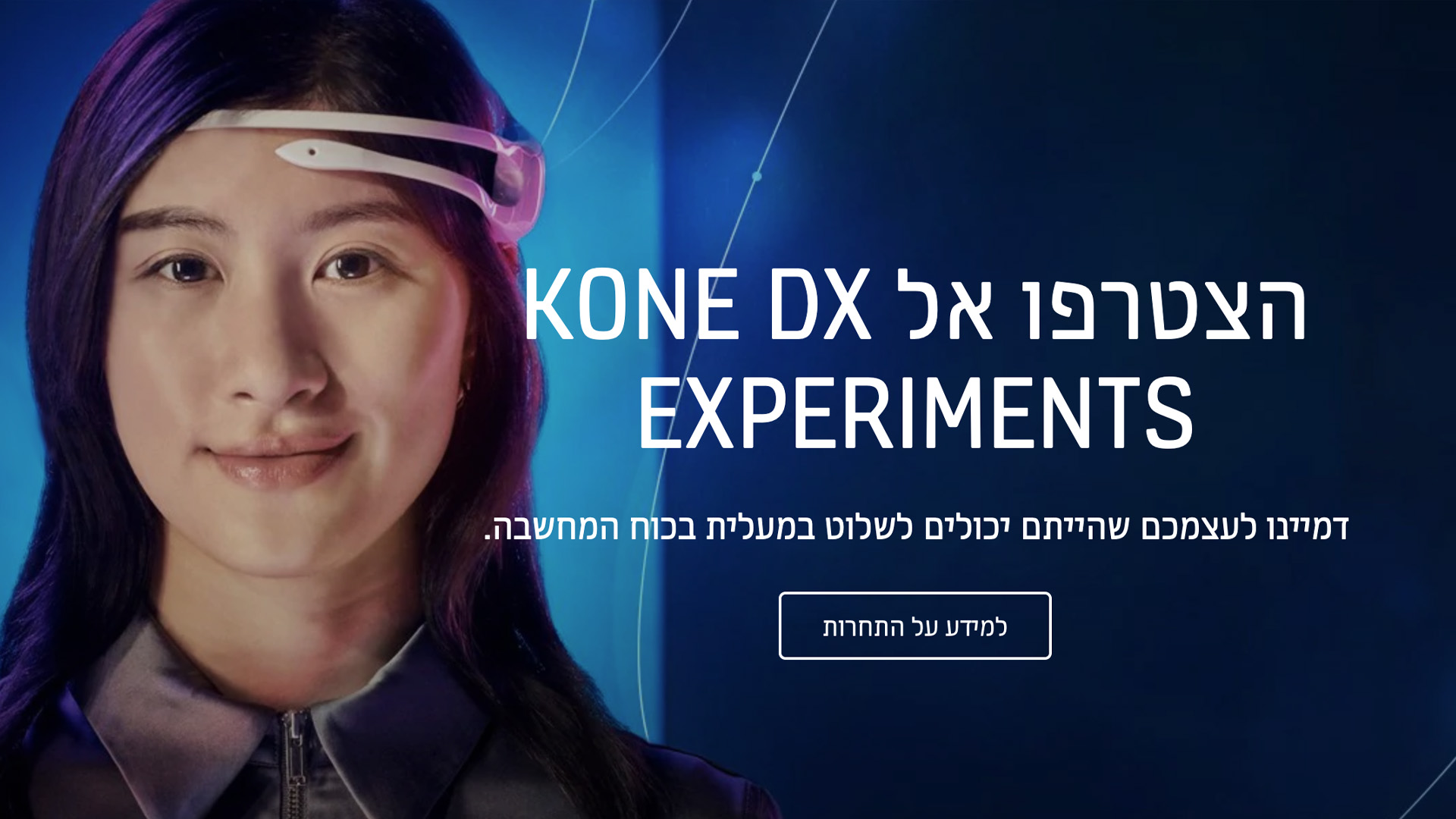
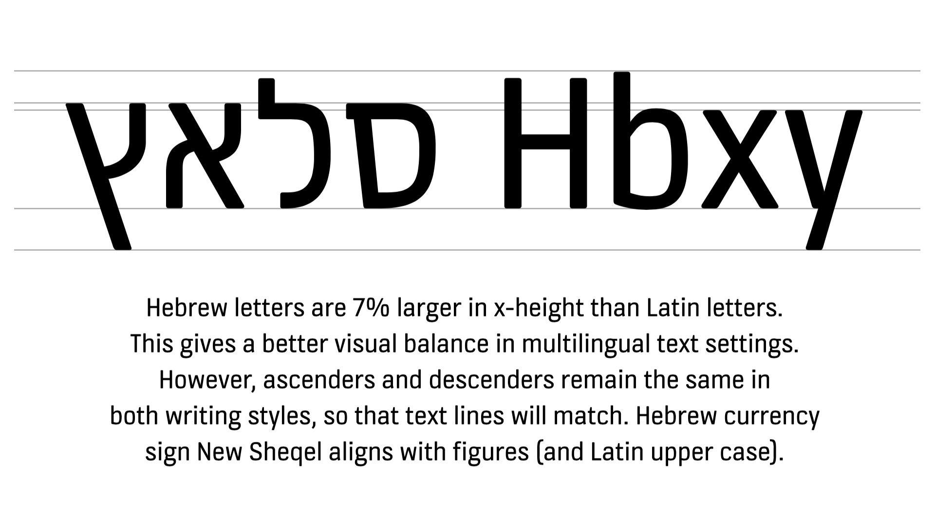
Since their change of design, which led them to several awards, KONE’s new typographic voice gently expanded across the globe. This typographic success story did not happen in one night. In fact we’ve been building these typefaces and their language support gradually, in small steps from Latin to Cyrillic to Greek, and soon after added support for Vietnamese. Over the years we added even more scripts so that this custom font now supports 5 different scripts: Latin, Cyrillic, Greek, Hebrew and Arabic. With this project we received great help from a great team: Bahman Eslami (Arabic), Hanna Hakala (Cyrillic), Irene Vlachou (Greek), Liron Lavi Turkenich and Yanek Iontef (Hebrew) and Nhung Nguyen (Vietnamese). This large language support allows KONE to communicatie with over 2,7 billion people in their mother tongue. These images show how KONE Information works from left to right and from right to left, in company headlines around the globe.
A brand is never finished and needs permanent maintenance, just like a garden is never finished. Building up a long-standing relation with a type designer helps to constantly improve the quality of your custom fonts, and to continue to strengthen a brand. If you’re also interested in having your own unique voice throughout any text you write and present anywhere in the world, consider a custom font family. Compared to generally available retail fonts, a set of unique custom fonts is a powerful, cost effective and valuable tool for building recognisable world-class brands and identities. Our very flexible Enterprise Licensing meets the demands of the current time for large corporations, offering the largest freedom possible and is therefore more risk free for large corporations. And remember: custom fonts don’t have to be mediocre to do their job! Contact us for more information.
