Pts. - How it started
When Pts. started halfway the nineties, it wanted to boost typographic consciousness on the Maastricht art academy. The students needed more information, a broader view on the subject. A thing so widely used as typography was in the shade of the Almighty Imagery. It was concieved as "not sexy".
Edwin Smet, who had just graduated, and Bas Jacobs, still studying there at that time, had the feeling that there had to be more attention for typography, its beauty and possibilities. To achieve this, they started to organize exhibitions and lectures, as well as setting up the Pts. magazine. A lot of the input came from attending the ATypI-conferences; the printed result was focusing on various typographic areas.
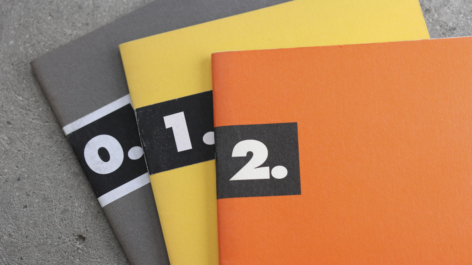
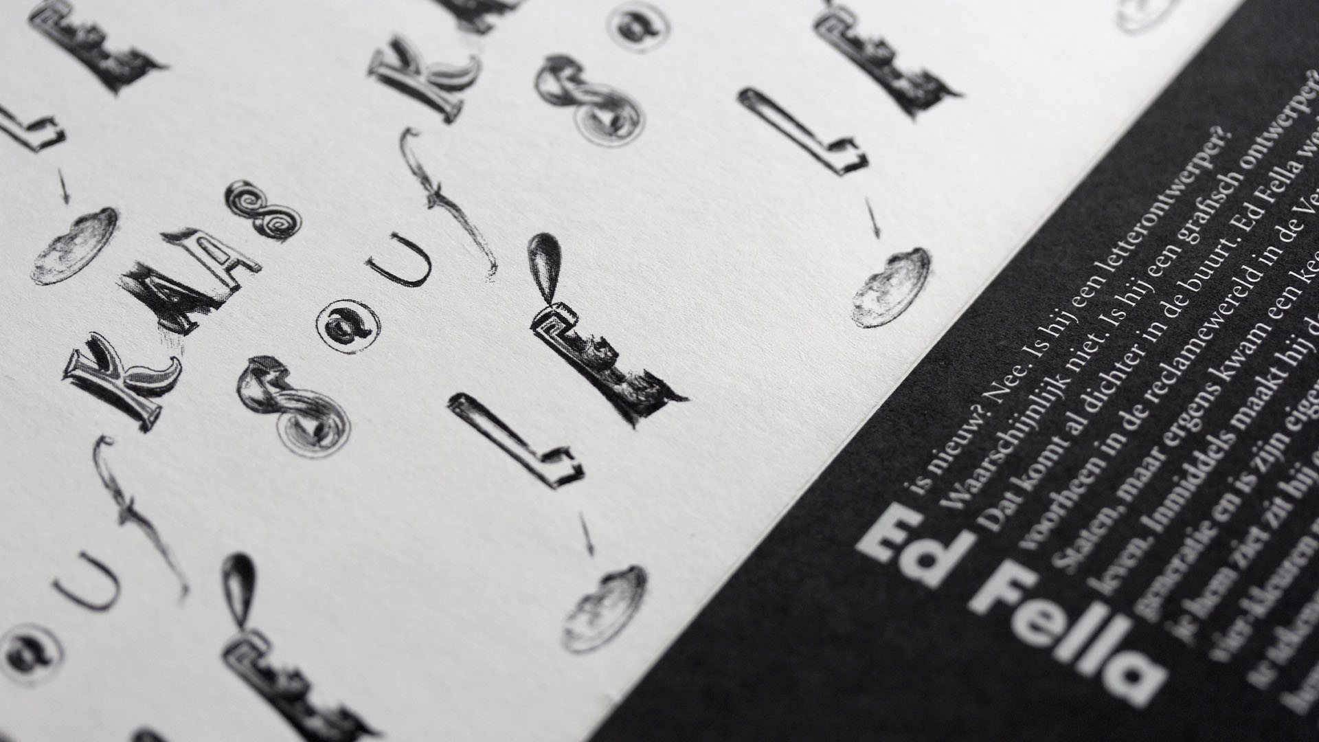
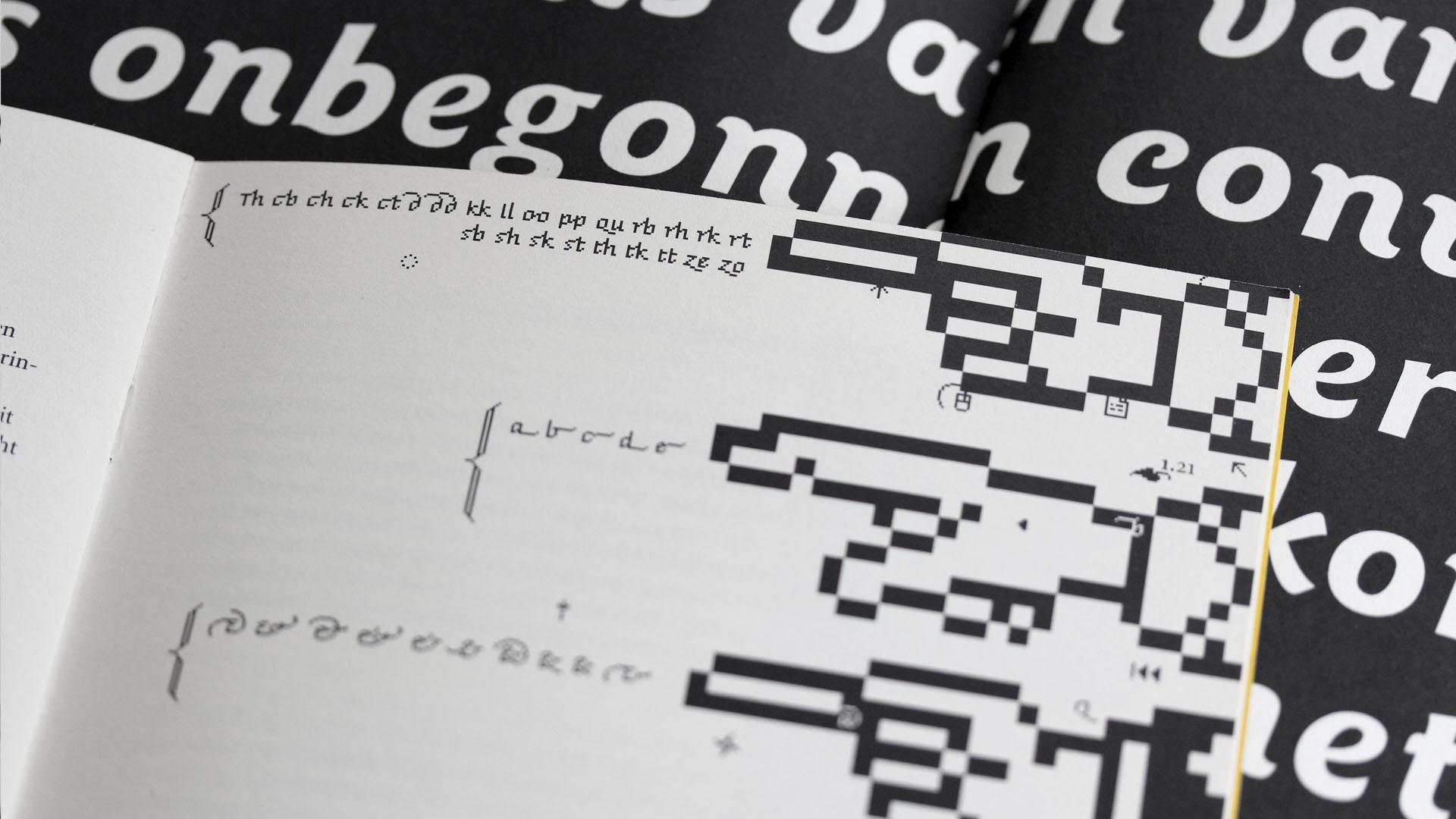
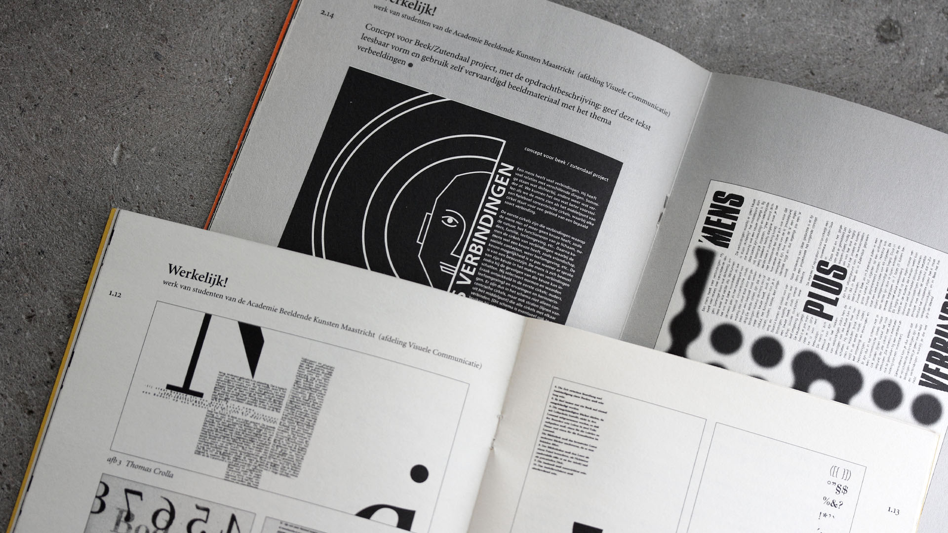
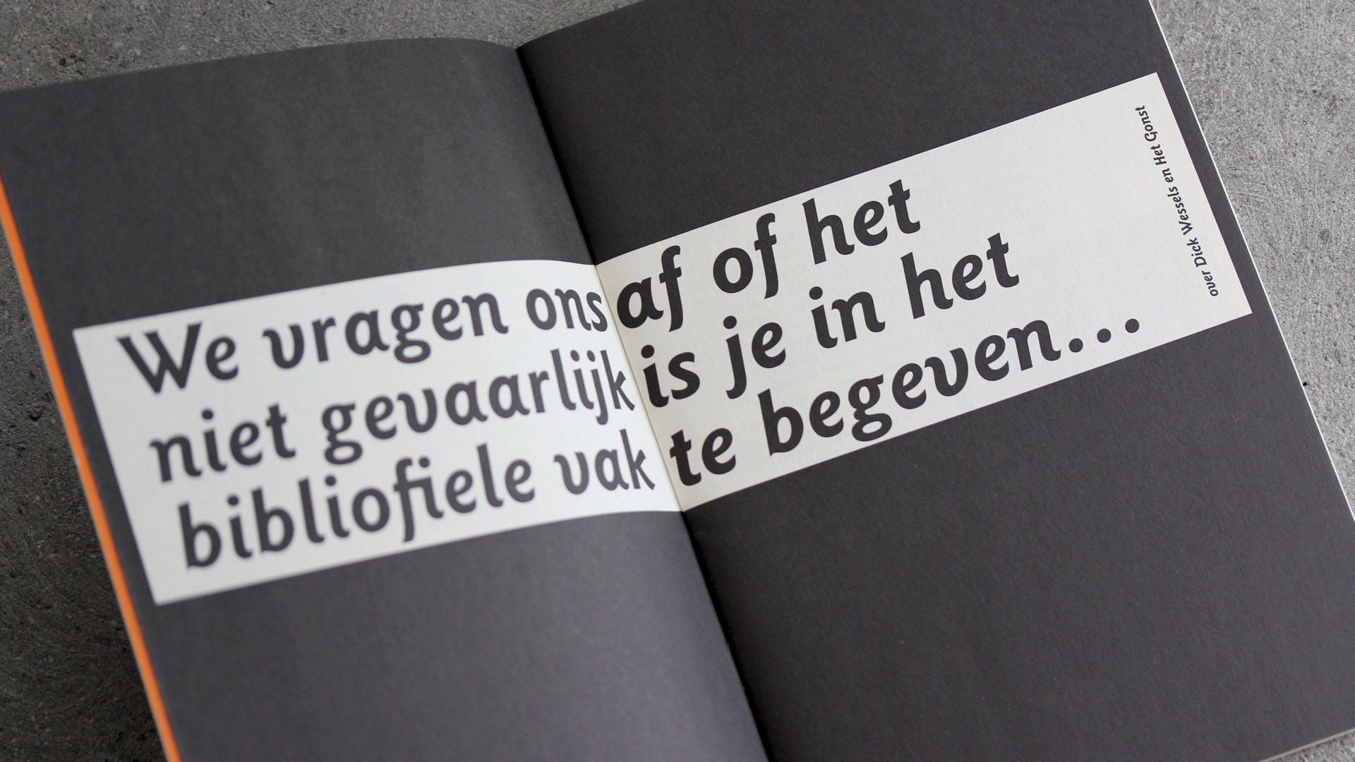
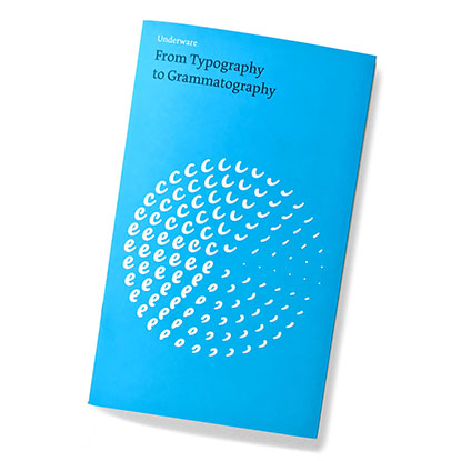
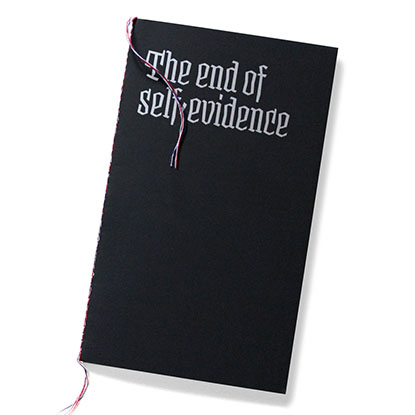
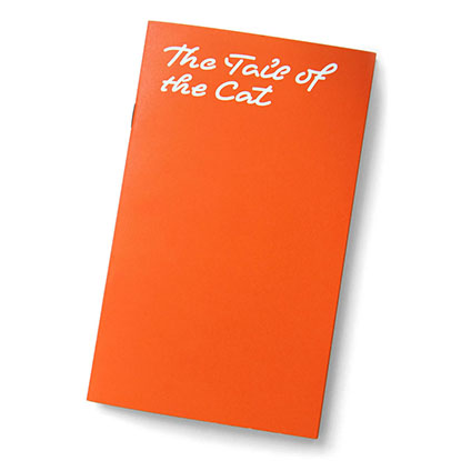
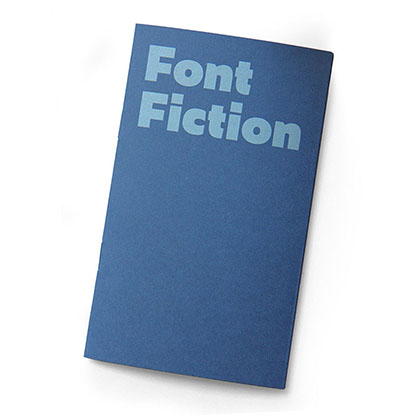
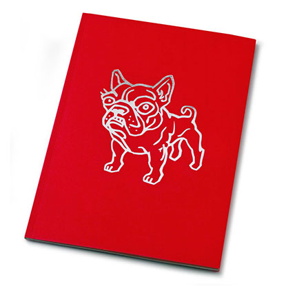
The pilot issue, 0 Pts., came to life in may 1998. During the two following years two more issues were published. These magazines contain articles written by Robin Kinross, Fred Smeijers, Evert Bloemsma, Joep Pohlen, Frank Blokland and many others. Alongside that, the two editors published the results of their own research, based on interviews, lectures and books. One part of the magazine was also reserved for students from the Maastricht academy. By doing this, a library of type work would be documented in this magazine.
After 3 issues both editors had the feeling that the effect of this pile of paper should and could be bigger. Concerning the amount of time and energy they had put in, it would be a pity if it was only read inside one art academy. As it turned out, both Edwin and Bas were too occupied running their own business, and didn't find the time and energy to make a new start with the magazine.
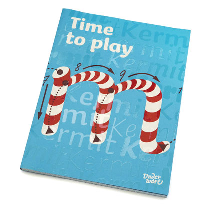
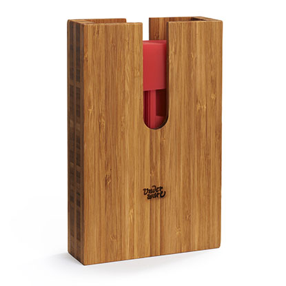
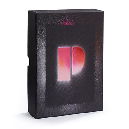
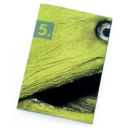
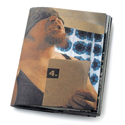
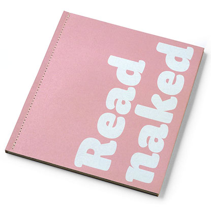
But the good news is: the magazine got a refreshed approach from 4 Pts. on. A new issue is now made whenever there is time, inspiration and energy. Don't count on it, but when you get it in your hands, read it. Pts. will be infrequently published, with an adapted design. World-wide being sold in specialized bookshops and available on-line, Pts. is no longer restricted to -and would not have it any other way- the typographic few.
