


concept

tour

OpenType features

make it work

dingbats

character set

language support

font packages

font formats

webfonts

PDF

play

color

PlakatoOneTwo

PlakatoMoire
Plakato, a stencil love affair
Plakato is a family of display fonts, consisting of various eye-catching styles, each of them very bold. Plakato is an identity toolkit, a heavyweight building block in case you need a strong personality, a small stencil font family to cut out your best ideas and grab all the attention. But just as with many other creations, its outcome is as divers as its multiple origins.
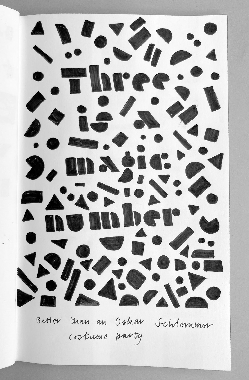
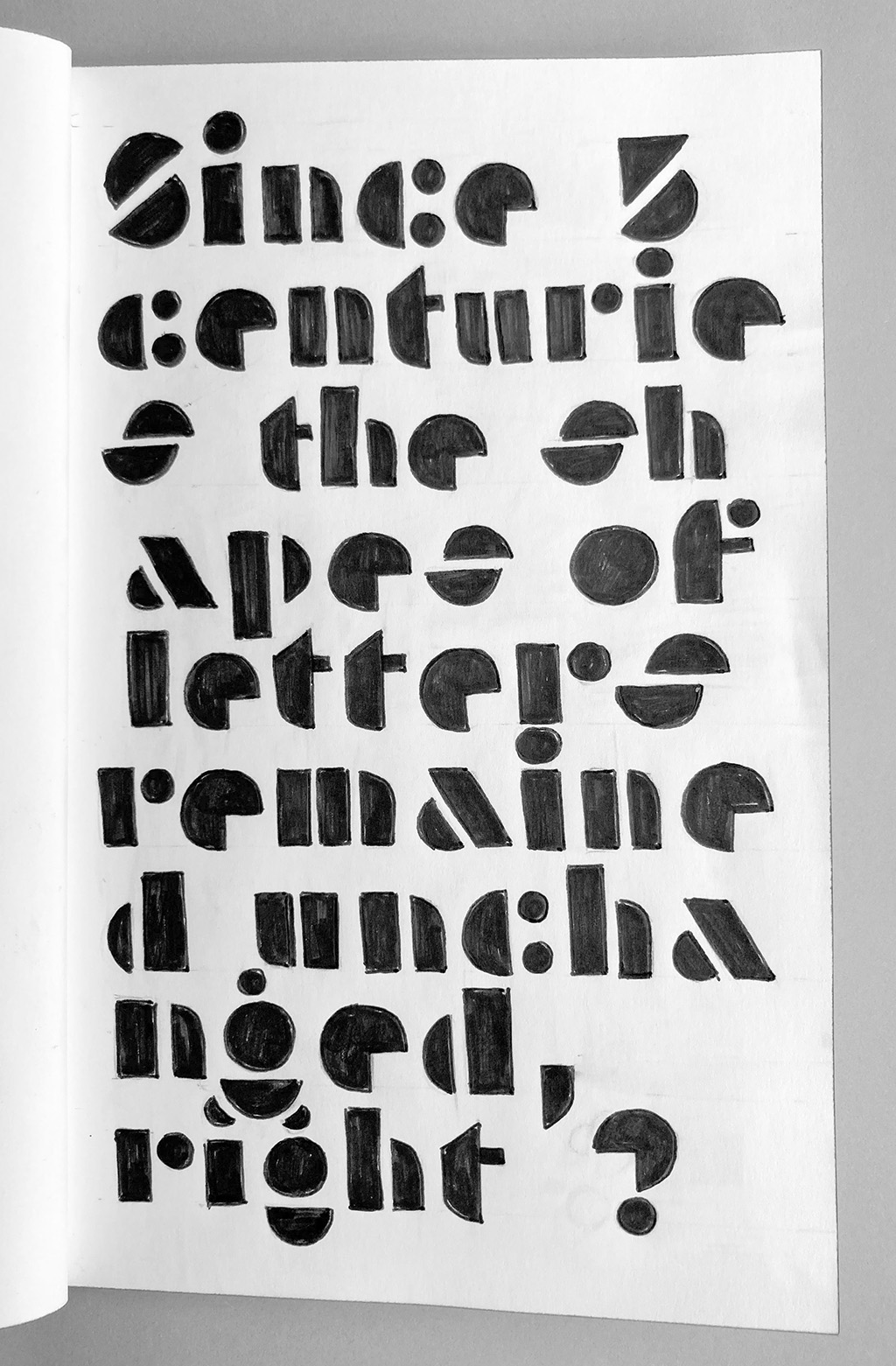
Sketches vary from detailed, elaborate drawings, to rough scribbles. Above some sketches made in a moving train.
Plakato was born out of a love for stencil letters, and subsequently combined with a curiosity to explore unknown typographic possibilities. Usually a lot of playful experiments, scribbles and sketches precede the start of a design process. And because we love the physical aspect of stencils, as well as the challenge of working within limitations, we created quite some stencils in the past for small matters.
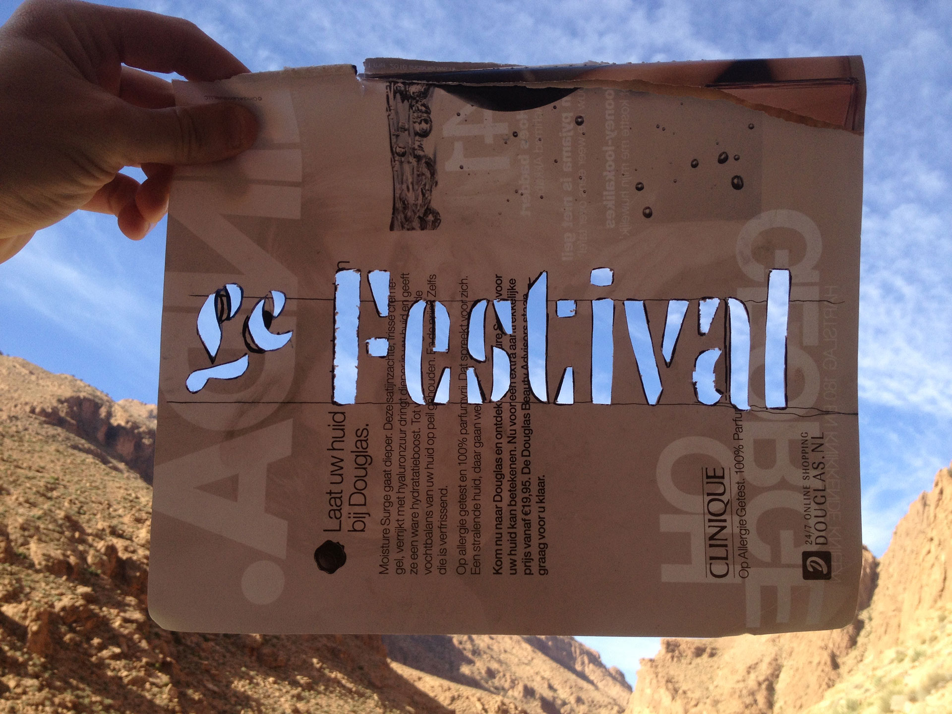
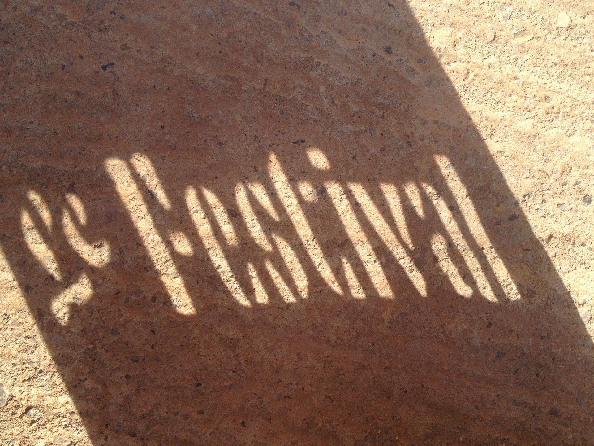
Example of a handmade stencil in the Moroccan Atlas mountains. Only a pen and magazine cover were present, even a knife was knowhere to be seen. Made to surprise the friendly owner of hotel Le Festival, and to pass some morning hours. With hardly any means a stencil can still be created.
Quick & dirty. Two examples of handmade posters for T85, using stencils and spraycans.
We’ve been making stencil letters for decades, released another stencil font family before (Tripper, 2015), and apply stencils in various projects, from logotypes for companies to small personal projects, up to handmade posters for our Amsterdam studio building T85. These monthly posters were only to announce a single event, and had to be produced quickly. Stencils are ideal for a quick design & production process.
Detail of another handmade poster for T85, using stencils. This unconventional ‘a’ is likely still readable in the context of the word DAG.
The design of those posters allow for lots of freedom, and leave to room to experiment and play. Is this glyph still readable as an ‘a’? A single lettering for a poster also allows for much more freedom than a typeface, as the context of a certain glyph can constantly vary within dynamic text and therefore a specific shape might not work any longer. While making posters the absence of this system is not relevant. If it works, it works. And that brings sometimes unexpected results, shapes we wouldn’t draw while sketching a typeface. After making a monthly A1-sized poster for this building over 4 years, of which many were handmade by using a stencil, we took a few of these ideas and experiments as a starting point for a small display font family. Some of these rather unusual shapes made it to the final font family, delivering its own character to this established genre.
Convinced. Let’s do this.
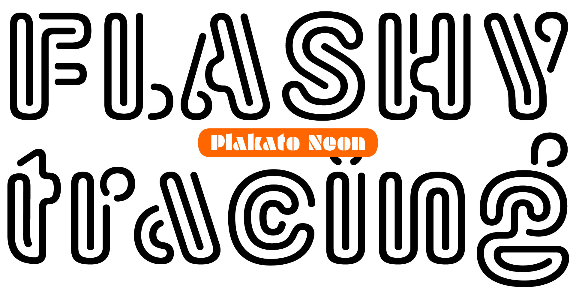
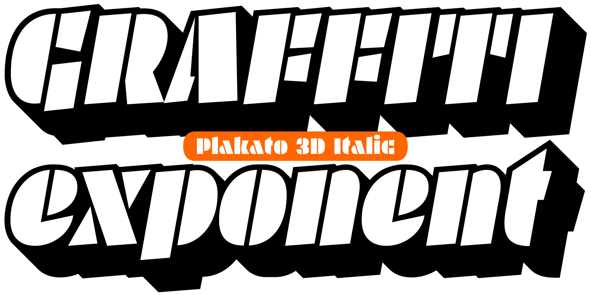
As in any love affair, the end result is unpredictable. Plakato turned out to be our declaration of love to vibrating letters. The 2 very fat stencil fonts – yes, a lively italic accompanies the roman style – were the starting point for further typographic explorations in that same Plakato style. They both have 2 variations: a 3D version and a stencilized version. (A stencilled stencil font, can we say that? Yes, we can say that) This stencil version automatically creates borders around the text, putting a text into a graphic stencil in this way. The Inline version is an optical play with black and white lines, and the neon version looks like, well, it’s made of neon. The paper version is a paper torn version with that manual look.
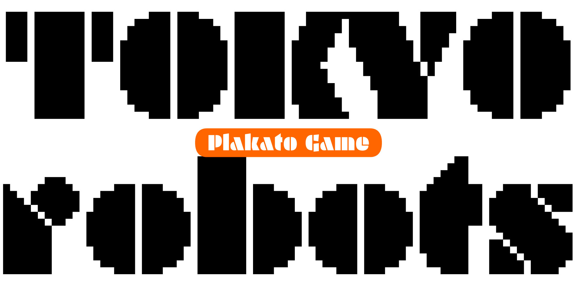
Sami demonstrating his Plakato type design process on an old Commodore 64 during a Skype session with Bas.
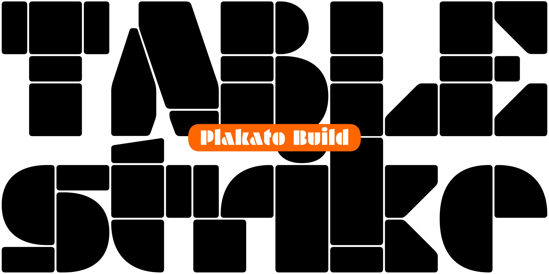
Plakato Game, which is made by recreating Plakato on an old Commodore 64 and porting that design including all its restrictions back to a modern computer, is digital nostalgia; Plakato Build is entirely constructed out of a few different building blocks, approximating the Plakato style. All in all certainly not the result we expected when we started this relationship.
Some examples of unforeseen styles that only came into existence during the design process.
The 16 different styles of Plakato create a versatile palette for display typography. Plakato, the happy chap, is a no-nonsense stencil font with a lot of additional powerful friends.
Get in the Plakato mood:
▶ try Plakato
▶ watch the gallery
▶ overview of all styles
▶ download Plakato PDF