03 march 2015 — walhalla
50 kg of Underware
We don’t like superlatives that much, but it’s hard to avoid them while receiving this present. Underware cut into stone.

This stone was cut by hand by Dennis Biemans of Studio Baak in the Netherlands. Besides of making furniture and interiors, stonecutting is one of Studio Baak’s favourite activities. Because Tripper became more or less their corporate font, they already applied the typeface throughout their studio. But what’s better than turning it into not so temporary? Something 3D not so temporary, of course.

What goes beyond “Thank You!“? Well, we’re… euhm, speechless. 2015 is already now perfect like it is.
If you are in the mood as much as Baak is, you cut your own name into stone too of course. Boy, they were lucky with only straight lines in the typeface.

In case you’re interested in receiving your own text cut into stone like this, just contact Studio Baak. They will be happy to help you further:
27 february 2015 — publications
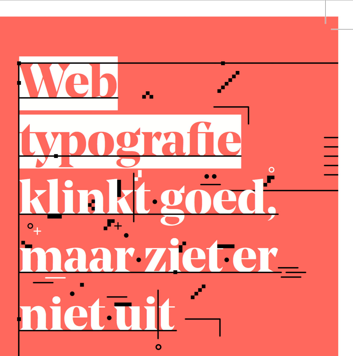
New publication: Webtypografie klinkt goed
This one is for the Dutch only. Sorry. We wrote a short text on web typography, from obvious questions to often overlooked issues. Luckily the complete text is available online, so Google Translate yourself crazy.

Wat hebben Laurel & Hardy met regellengtes te maken? Hoe kan het dat microtypografie op het web vijf eeuwen achterloopt? Is er dan nog hoop? Jawel. Letterontwerper Bas Jacobs behandelt als een snelheidsduivel in vogelvlucht de belangrijkste elementen van typografie op het scherm, van welbekende inkoppertjes tot vaak over het hoofd geziene zaken.
Omdat de tekst het verschil aanhaalt tussen lezen van een scherm versus lezen van papier, is de tekst op beide media beschikbaar.
19 february 2015 — read more
The making of Tripper

The making of Tripper: the story of an accident
This typeface came about by accident. It all started with an accident too, when Bas – unluckily – fell out of a tree. He was strapped to a stretcher and transported by ambulance to the hospital, where he heard the good news: it was ‘just’ a broken collarbone. Could have been worse. Unluckily for him, it was his right arm. Being right-handed and an avid sketch artist, well… it’s a disaster if you can’t use your favourite hand anymore.
18 february 2015 — presentations
Web typography sounds good
Coming monday we will give a lecture at a seminar on the future of web typography. This seminar takes places at the Brakke Grond in Amsterdam. In our lecture ‘Web typography sounds good, but looks awful’ we will highlight some often overlooked elements of web typography. The unsurpassable Frederik Berlaen will also give a presentation, and you can do a crypto typeface game with the madmen of Autobahn. If you are Dutch, concerned about type, screens, interfaces and ergonomics & want to flex up your brains, come over. Organised and presented by Grrr, what else should we say? Be there or be square.
Monday 23 Feb, 20:30 o’clock
Beeldmakers #1; with Frederik Berlaen, Underware, Autobahn, Jort de Vries (Blendle)
Vlaams Cultuurhuis de Brakke Grond
Nes 45, 1012 KD Amsterdam
Entrance at door €7,– / Online €5,–
05 february 2015 — out now
New font: Tripper Pro

Please welcome Tripper. He is not that friend you want to marry and wake up next to every day. You don’t want to discuss your financials with him. No, Tripper is that friend you invite when you want a really good party, when you wanna have a good time, when you want to impress your neighbours or family. But hey, who doesn’t want to have a really good party every now and then?
Tripper, a set of rock-hard stencil fonts

Introduction offer
Buy Tripper and give a free license to your friend. Make somebody happy, for free. Double-dipper pleasure! (runs till 01 March 2015)

Tripper comes in several flavours. Next to the plain style, there is a rough version (with that random look), a reversed stencil style (with automatic borders), and the multi-coloured font (tricolor). If that ain’t enough, Tripper Ornaments offers enough to play around with for the rest of the year. Take the Tripper tour

08 december 2014 — walhalla
Spring 2015 internship
After a decade of not offering apprenticeships in our studio, we have room for one intern in Spring 2015 (Feb–April).
If you know how to design type, dream Adobe CS, talk PHP & Python, then you might be the match we’re looking for.
For this paid internship you’ll be working 4 days/week on 3 different projects. (Three days a week in our Amsterdam studio & one day somewhere else on earth)
Interested? Mail bio, portfolio, motivation & questions before 15 December to: bas@underware.nl
26 november 2014 — read more
Notes on Underware Latin Plus

Recently we introduced Latin Plus, which is at the heart of our production line. Everything we do is based around this standard. Not only all our fonts, but also some upcoming tools are based on this touchstone. Because you’ll encounter this term more often in the future, here is the background story of Latin Plus and its languages.
Interested in how the overview was constructed, orthographic troubles, native speakers and local culture? Make a coffee, and read the story behind Latin Plus in the case-study Notes on Latin Plus.

25 november 2014 — out now
Underware Latin Plus
![]()
Language support is one of the most important aspects of a font, together with the look and feel as well as the technical state & performance of course. You do not only want to know if a font supports a certain language, but also if it looks any good in that language. Those two can vary quite a lot.
After years of researching and improving our own character set with its accompanying language support, we are happy to reveal Latin Plus today. Well documented, pairing diacritics to languages, translated sample texts and offering the possibility to explore which of the Latin Plus languages are supported by the fonts on your computer.
Welcome to Latin Plus.


18 november 2014 — out now
Hosted webfonts at Webtype

It’s been nice to see our fonts being used across the internet since we started selling webfonts some years ago. Our self-hostable webfonts are finding their ways from the happy medium up to the corners of the web. Meanwhile we are developing more tools to let you customize webfonts in a way which fits best to each specific occasion. Our recent library upgrade already reckoned with more of such possibilities. Eventually these tools will become automatically available in your account.
Underware Is Now on Webtype
While some prefer self-hosted webfonts, others might prefer a hosted service. Those people will be happy to hear that this is reality as of today. A hosted service also paves the way for easy accessible free trials, for testing the real font files in a real-life environment in your upcoming project. Therefore we are pleased to now offer hosted webfonts through Webtype.
08 october 2014 — walhalla
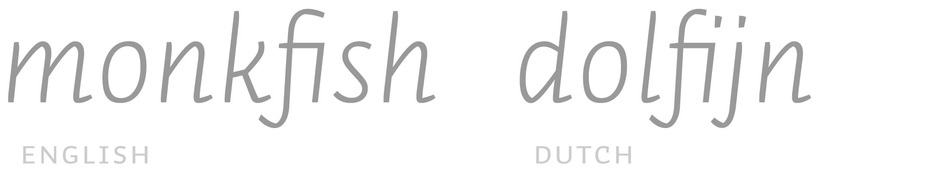
Typesetting the Dutch IJ
Now. You are a typographer and do your best to achieve ultimate precision in details. You want to set a text in Dutch, as good as possible. You need to master the curious case of IJ.
The Dutch IJ
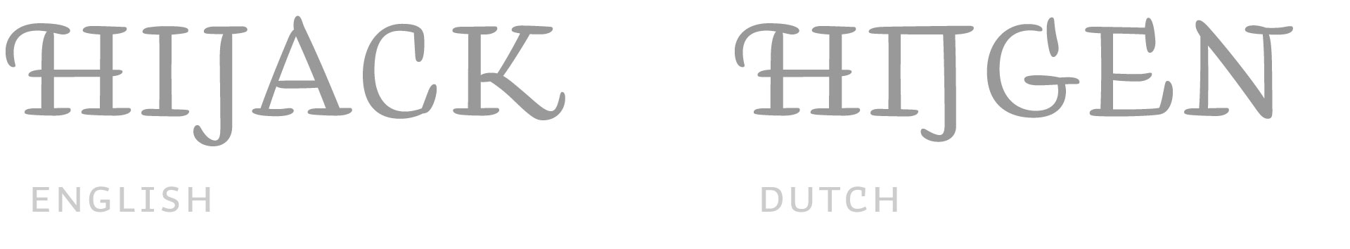
There is a difference between typesetting Dutch and other languages regarding the ij. In Dutch the ij is a digraph, or – if you prefer – a ligature. We don’t care how you call it, as long as you consider the IJ as one letter. So in case you set a text vertically, you’ll have to put the I and the J on the same line.
This Dutch IJ might require a special design, depending on the design of the font. Most roman sans serif fonts can live with a regular ‘I’ and ‘J’ combination. Although not always perfect, that’s quite often acceptable. But in swashy fonts the need for a specially designed ‘IJ’ is obvious. A swashy I followed by a swashy J is a nightmare for the Dutch IJ. It needs a special glyph included in the font. And please remember to select the right language for your text, as these IJ’s only (should) show up in Dutch texts.
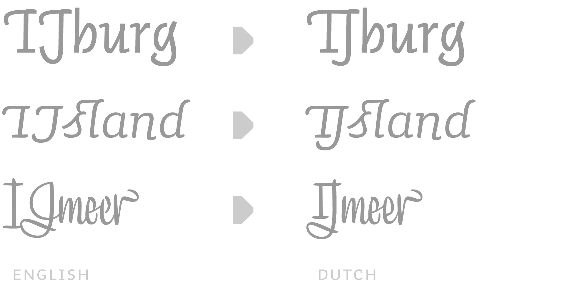
The missing dot
Okay, the ij is cleared. From now on you only work with fonts which have a special glyph for IJ and ij. But then the trouble starts in lowercase. Because fi-ligatures often remove the dot on i, the ij does not look like ij anymore in Dutch. In case the lowercase ij shouldn’t look like a handicapped, amputated lunatic, it needs two dots. To be able to have a nice f+i connection as well as two dots on the ij, you’ll need an additional ligature in your fonts: f+ij
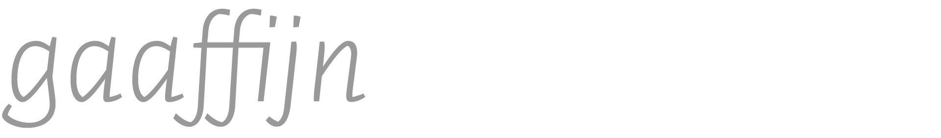
Because some people love to cook their own words, an additional bonus ligature could be included to make sure any imaginable Dutch word looks perfect: f+f+ij
Oh, oh. Exceptions
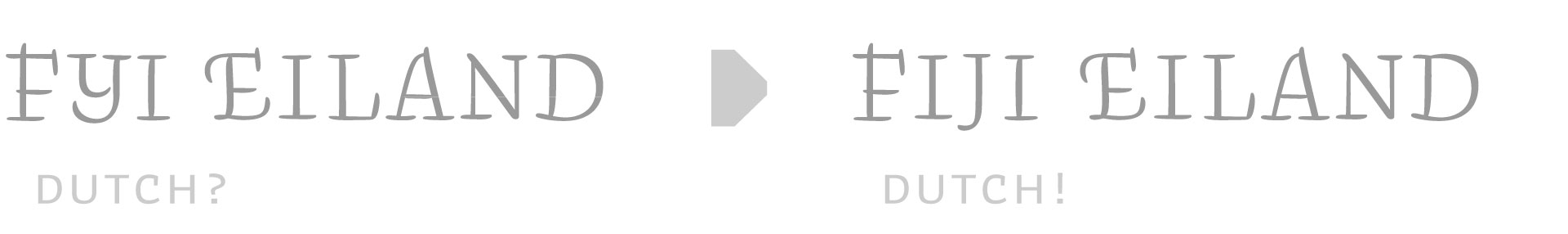
However, not every i+j in Dutch should become ij. There are some Dutch words which would have their hyphenation in the middle of i and j. There is currently not a beautiful solution for this, so all official exceptions have to be hard coded in the OpenType code of the font.
IJ-acute
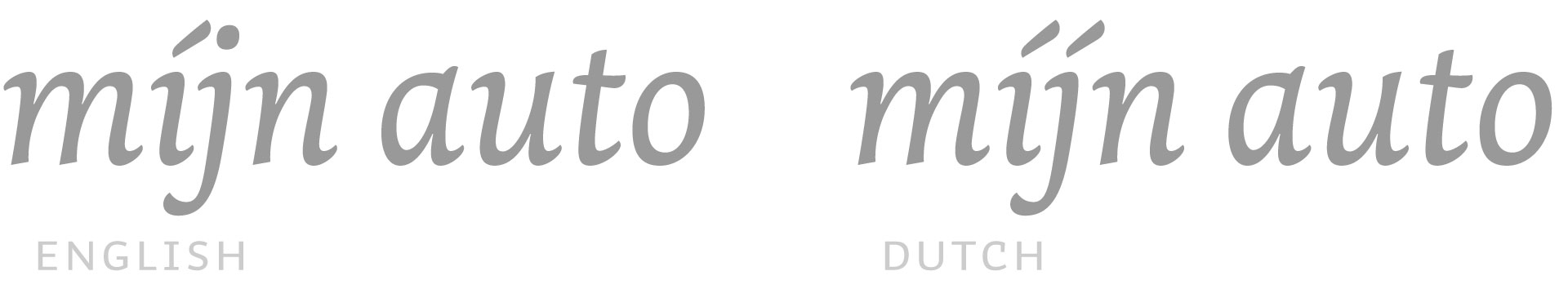
In case you want to stress a word, both letters of ij need an acute. Although one cannot enter a j-acute on a keyboard, the typeface should automatically create both acutes once an i-acute is followed by a j. This should of course only happen in Dutch. So make sure you’ve got your text set to the correct language, and you will have the ij-acute in your Dutch texts.
Our recent library update takes all these Dutch sensitivities into account, making all our fonts suitable for precise Dutch typesetting. All goes automatically, you don’t have to think about all this. Which means you can forget everything you just read.