


concept

tour

OpenType features

figures

ampersands

ornaments

characterism

how does it work

font formats

webfonts

making of

character set

language support

PDF
The making of Tripper: the story of an accident
5 May 2015
This typeface came about by accident. It all started with an accident too, when Bas - unluckily - fell out of a tree. He was strapped to a stretcher and transported by ambulance to the hospital, where he heard the good news: it was ‘just’ a broken collarbone. Could have been worse. Unluckily for him, it was his right arm. Being right-handed and an avid sketch artist, well… it’s a disaster if you can’t use your favourite hand anymore.
Bas took it as an opportunity to develop and strengthen his weak left hand. The weak hand picks up new skills surprisingly fast. Writing, typing, eating, brushing teeth; it takes just two weeks to reach a somewhat acceptable level. But one thing didn’t work out quite as well with the left hand: that is, drawing outlines on a laptop’s trackpad.
Drawing beziers-outlines on a trackpad requires carrying out multiple tasks simultaneously. Click and hold your thumb in the right position for the oncurve point, and – while holding your thumb down – draw the offcurve point with your index finger. This is the way to draw curves in any bezier-outline application. Writing on paper with your weak hand seems difficult, but wasn’t a problem for Bas; he just didn’t manage to draw nice bezier outlines, which seemed much easier to start with. There was only one option left: draw without any curves. Just click, click, click, and draw only straight lines. That’s how Tripper ended up in a type family without any curves at all.
As the recovery of a broken collarbone takes a couple of weeks, Bas had quite some time to sketch a new typeface which doesn’t contain any curves. Voilà, a new typeface was born. When he showed the first sketches to Sami and explained the reason for the lack of curves, Sami – left-handed by nature – didn’t believe it. “Commercial bla-bla for sure.” If you are as sceptical as Sami about this, try drawing some nice curves on a laptop’s trackpad with your weaker hand. See? Told you.
Although we’re all natives in the digital world, all our typefaces start out as freehand sketches on paper. This font family is certainly different in that aspect. Finally. Faced with a situation in which freehand sketching proved to be
Developing a display stencil type means, in theory, solving many small puzzles. Each letter is a brainteaser in itself. Here are some sketches for the lowercase ‘g’. On top the final design, followed by 10 two-storey sketches which were all doomed to fail.

Another letter which proved to be quite a challenge was the last letter of the alphabet. Here are some sketches of both upper- and lowercase Z. The final versions are in the first and last line.

As soon as the digital realm started to settle down, we could not keep our hands off real manual stencil cutting. The straight-lines-only-concept proved its value in these first manual trials, as these stencil letters are indeed quick to cut by hand. A thick cardboard gives finer results than thin, sprayed paint leaks less.
Eventually we had two incompatible stencil fonts, which we wanted to turn into a small font family. Whereas typefaces are often bland for the sake of interpolation, Tripper was created the other way round. Starting with two incompatible fonts, and then figuring out a way to “interpolate” from one style to the other. A simple one-axis interpolation font family gave us the opportunity to play around with non-compatible interpolation. Like David Bowie sings: “You gotta move around, when you feel like dancing”. The design of a master should be as strong as possible, instead of anticipating another master in advance. Each style contains 665 characters, 136 of which are not the result of a straight, simple interpolation. This sample shows a couple of not so predictable variations between different weights.

Add in regular accents, inline accents, all figures and some fun in between by making ornaments, and suddenly two years slipped by. What started out as just killing time while recovering from physical injury, ended up as a small font family of ready-to-use stencil fonts. After puzzling over a couple of hundred letters and expanding the fonts with lots of OpenType extras, this resulted in a small but eye-catching set of display fonts. Even though the initial concept behind this font family was simply trying to pass the time sat on a couch, the final result turned out to have surprising industrial applications because of the lack of curves.
Completely in line with our mantra – 3 guys looking for new problems – we found new problems. With the intention to keep Tripper 100% digital and completely program a rough version of the stencil font, we wanted Tripper Rough to have that random look. So instead of doing this manually, this was done by “a script”. The easy part was to make a script which can handle different parameters for resolution, variations in size, accuracy, etc. Here is an early test:
The resolution in this first test is definitely not high enough, although the first fonts were already rather big in size. And it doesn’t look anywhere near random either. The following 2 tests, which have a higher resolution and different settings for many parameters, also show some completely illegible outcomes. It’s always good to explore the borders:
Same settings, but then applied to the boldest weight:
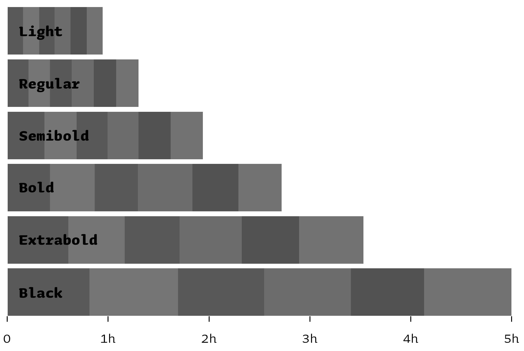
Speed issues come up quickly, especially in the bolder weights. Generating a test version could easily take 15 hours. A test version with 6 alternate shapes for each glyph takes 1 hour for the light weight, but 5 hours already for the black weight. Remember that dozens of test versions have been made, before the final fonts came out months later. Hundreds of hours our computers have been rendering the rough looking font.
Overview of rendering time 6 styles of Tripper Rough with 6 alternates for each letter:
After playing around for quite a while, the final spraying settings became more fine-tuned. Here is another test with an even higher resolution, variations becoming more subtle, and different amount of combinations to explore the visual effect of the amount of alternates per font:
Having defined the right parameters for the spraying settings is one, creating fonts with these settings is another story. While making Tripper Rough we often met the technical limitations of the font format. Sometimes a beta-version of Tripper Rough was over 20 MB (acceptable for a desktop font), and that still compiled. Pfjeuw! But using these fonts was a headache. The Finder could crash on previewing the font. Or the font worked fine, until you open MS Word. Or with other tests, once installed, resizing a simple text frame in InDesign could require more than a minute. Not ideal… Eventually we found a technical solution, individual for every weight. Another challenge turned out to trim down a 10+ MB font into a small size so that it can function as webfont too. It also means that the OpenType features for the webfonts are different than for the desktop fonts. But even within the desktop fonts the OpenType features vary across the styles. Further details of making the webfonts will be saved here, because “too painful”.
Where a font is usually less than 100 KB, the complete Tripper Rough package (all desktop fonts) is 65 MB. We didn’t foresee the consequences of such a large font family, for example for our backend and our website. Eventually a progress bar has been included in the font download section of our website, for those who don’t have that super fast internet connection. Anyway: we looked for new problems, we really got new problems.
Oh ja: one should never be afraid of too many outlines, mmmm.
Thanks to our intern Baptiste Guesnon, who wants to learn Python and found a goal for his first Python script, we now know that Tripper Rough contains more than 42 million (oncurve) points.
The Inevitable Tripper Data Porn:
styles
avg glyphs/style
avg contours/glyph
avg points/glyph
total glyphs
total contours
total points
Plain
7
642
2,97
19,08
4.493
12.756
80.836
7
642
2,97
19,08
4.493
12.756
80.836
Stencil
6
2.652
4,70
28,90
15.912
74.740
457.014
6
2.652
4,70
28,90
15.912
74.740
457.014
Rough
6
2560
92,93
2.583,98
15.358
1.555.687
42.399.435
6
2560
92,93
2.583,98
15.358
1.555.687
42.399.435
Tricolor
5
665
8,48
37,55
3.325
9.406
49.723
5
665
8,48
37,55
3.325
9.406
49.723
total
24
1.629,75
27,27
667,38
39.088
1.652.589
42.987.008
24
1.629,75
27,27
667,38
39.088
1.652.589
42.987.008
Hey, this is for the desktop fonts only. Did somebody say webfonts? For those who wonder: Tripper’s webfonts have different character sets, different OpenType codes, saving as much size as possible.
The amount of time something takes does not really matter. The amount of time a pianist needs to master a composition, could say something about the complexity of the piece of music but also about the skills of the pianist. Or both. But if the pianist needs one month or one decade, it doesn’t make the music any better. However, what started with an accident kept us finally busy for almost two years. The result is a set of stencil fonts, served in various flavours: plain, stencil, rough & tricolor. And these actually inspired us to start a complete new font family: a rounded version which has the same spirit as the other Tripper fonts, but then designed from scratch. Currently in the making.
Falling out of a tree on an unlucky afternoon can keep one busy for the following two years. That’s actually quite a relief.

Maybe it was not an accident, but fate disguised as an accident. Now, let’s wait for our next accident.