concept

tour

OpenType features

figures

ampersands

ornaments

characterism

how does it work

font formats

webfonts

making of

character set

language support

PDF
Activate Ligatures & Contextual Alternates
For all Tripper fonts: make sure “Ligatures” and “Contextual Alternates” are activated. All the automatic magic in the Tripper fonts depends on these 2 OpenType features.
Tripper Rough has a couple of alternates for each letter, to achieve that random look. A look at this picture shows that every ‘o’ in this sample is different, every other letter too. This goes automatically of course, because you want to have that random look.

If you enjoyed the grunge vibe in the nineties, this one is for you. In case you want to raise the grunge level of Tripper Rough, there are 2 options.
First of all you can create a border at the beginning and/or the end of a word. It looks like you’ve been spraying too enthusiastically. Type a double space, and Tripper Rough will automatically insert a border which fits to each letter. So be aware: different borders will appear in different occasions. It's almost like real-life.

Next to this, there are Stylistic sets for the extra grunge factor. Stylistic Set 07 (aka Grunge) will swing all characters around and randomise their spacing. Whoppa, makes those letters dance.

Stylistic Set 08 (aka Super Grunge) is like stylistic set 7, but then more extreme.

Stylistic Set 09 (aka Ultra Grunge) is like stylistic set 8, but then even more extreme.

Grunge + Super grunge + Ultra Grunge = Hyper grunge! Now comes the fun part, you can activate these stylistic sets simultaneously and gain hyper grunge level. You can activate only stylistic set 7 (Grunge), or combine that with 8 (Super grunge), or combine all three at the same moment. The usage of this combination is however very limited, and not recommended for amateurs. The sample below is just a single textbox, which contains 3 words, which have been set in just 1 style of a font family. Just a little boosted with cumulative OpenType power. Don’t try this at home!

Tripper Stencil Pro: how does it work?
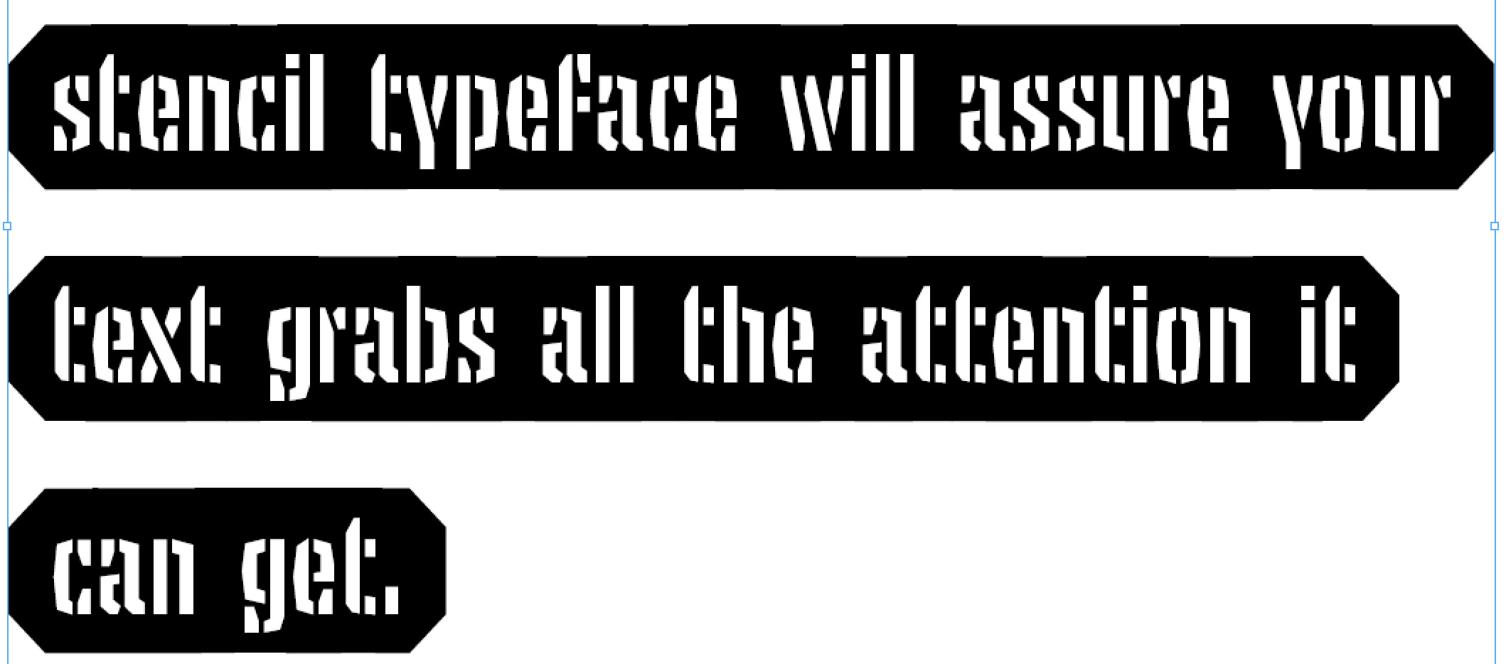
Tripper Stencil automatically creates boorders around your words or sentences. Those who want large pieces of text in Tripper Stencil, might run into a typesetting problem. There is a change that your typesetting software will automatically modify the word space per line, or the spacing of the glyphs. For a font like Tripper Stencil this can be problematic, because a letter might overlap a previous letter. Some letters might look cut off:
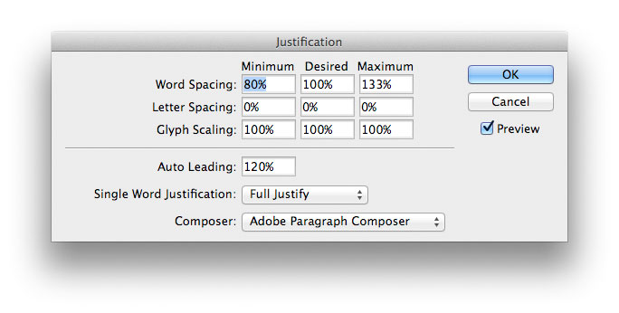
To avoid letters overlapping each other, the justification settings of the typesetting software need to be modified. Here is the default setting in InDesign:
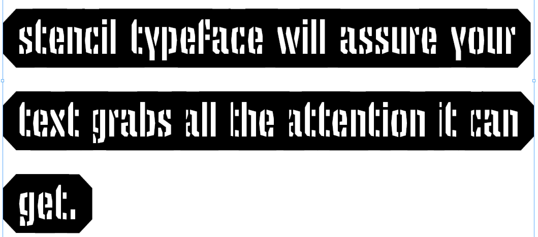
Modifying the hyphenation and justification settings will solve this. Which settings you have to use will vary in each situation, but start with enlarging the preferred word spacing (minimum, desired, maximum)
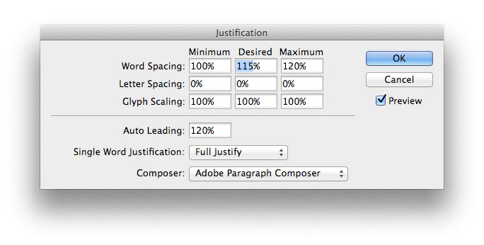
You probably have to play around a little to find the right settings for your occasion. This specific setting solves the problem in this situation: