


concept

write

figures

OpenType features

language support

font formats

type specimen

PDF
Kermit as a tool for learning to read
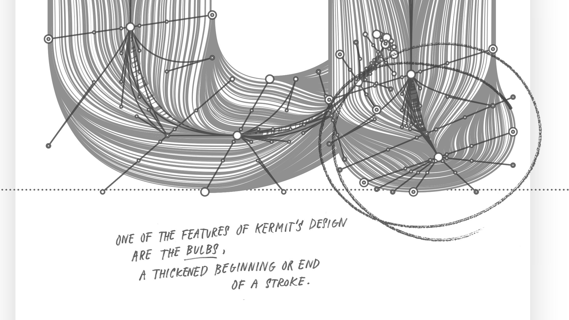
Kermit was designed by Underware and commissioned by Microsoft, who needed a friendly and cheerful font that could be helpful for children learning to read. Microsoft has been conducting scientific research on reading, learning to read, and reading problems such as dyslexia for many years. In recent years, Microsoft has built various features into their software to help even those who have extreme difficulty learning to read, such as in their Immersive Reader. Especially in beginning readers, young children, reading problems can lead to low self esteem, and reading can be a real struggle. For instance, there are children who read only four words a minute. If a letter then appears on the screen stroke by stroke the same way it is written with a pen, it might help improve text comprehension. Hence, one of the requirements was that Kermit should include a time dimension, just like the other writable fonts developed by Underware.
Kermit is not the first font specifically aimed at kids, nor will it be the last, and it’s also not the ultimate or one and only font for kids. No carpenter has just one tool in his toolbox, we’re not saying that every text in the world aimed at kids should from now on be set in Kermit. And there might be as many different reading problems as there are humans, it’s not a one-size-fits-all solution for all reading problems in the world. Kermit should also not be confused with typefaces which are aimed at learning to write by hand, which is of course related to learning to read, but still a different subject. But Kermit offers Microsoft possibilities to do more research with early readers, and help them to develop more tools for young children which have difficulties learning to read. We hope to see more useful tools for young readers in the future, as that’s a laudable goal.
At the same time, Microsoft is looking for ways to present text in a more expressive way. A new font could help them to do more research, for example on displaying prosody. To clarify this, here are two examples: one with default subtitles, and one with expressive subtitles that typographically visualizes prosody and making pitch, duration and intensity directly visible.
This expressive typography also exploits rather extreme widths of the Kermit font. The ExtraCondensed and the ExtraExpanded styles are not available as separate fonts, but are only used behind the scenes in automated applications like the one above.
Friendly and casual
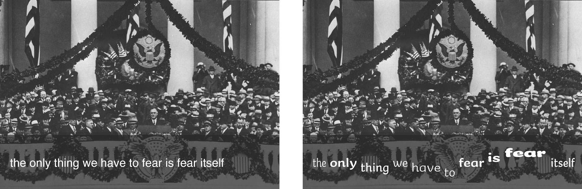
Kermit is designed so that Microsoft can develop more tools for children to read easily. An informal, friendly font with attention to legibility. This is achieved by fairly thick strokes, a relatively large x-height, generous spacing, and recognisable letter shapes that balance the informality of handwriting with the structure and convention of traditional text letters. Besides all this, it’s also just a casual, informal font where the kawaii aesthetic is high. And who is not attracted to casual, informal fonts anyway? It’s much easier to identify with a human font, than with a corporate, sleek and sterile font.
A cooperation between type designers & software developers
A collaboration between Underware and Microsoft seemed obvious. Known for their expressive and unconventional design sense, Underware has been making writable fonts for more than 7 years now, and continues to develop their knowledge and technology in that field. But a font cannot do anything on its own, and is completely dependent on a software environment to do exactly what it was designed and intended to do. Developing fonts that step outside historical conventions requires a simultaneous approach and cooperation from type designers and software developers. Microsoft, as one of the largest software developers, is thus the ideal party to implement such a writable font (and can thus celebrate its 50th anniversary in style).
Such stronger collaboration between software developers and font designers will become increasingly relevant in the future, as fonts become more technologically advanced. Kermit is not the end station of a development, but hopefully the beginning of something new.
Left: mechanical (linear speed). Right: natural (dynamic speed).
The website kermit-font.com is a mini-site dedicated to the typeface Kermit and allows anybody to experience the writable fonts already now, also teachers who want to make their own test and experiments for example. Only while working with the writable fonts, you can experience that the dynamics are as much designed as the outlines.
Making Kermit accessible
Kermit currently supports 426 languages with 3 different script systems (Latin, Greek and Cyrillic) and 7 weights (from Thin to Extrabold). Much more background information can be found in the publication Time to play, as well as on the website which is entirely dedicated to Kermit, kermit-font.com. This publication – 120 pages, 3 different papers, 2 printing techniques – contains 3 articles by different authors, each of which provides different insights into the creation of Kermit in the perspective of the current state of affairs in the world of typography. Enjoy reading!
The Kermit typeface is available for Microsoft 365 customers for both Windows and Mac. You can find it in the font menu as a cloud font, and it will automatically install when selected. And the best news is: thanks to our partnership with Microsoft, we are pleased to offer commercial licensing for Kermit. (Currently you’ll find 42 static fonts in our webshop, the variable fonts will follow soon)