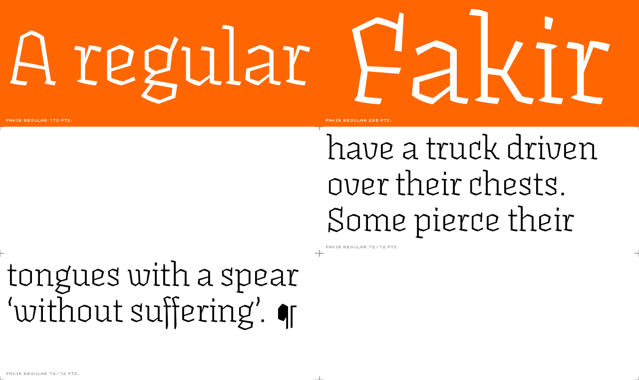
Fakir regular
Sooth your eyes with long paragraphs set in Fakir regular. Font #1 in the
Fakir Text package.
Fakir italic
The charming, enchanting Fakir italic is much narrower than Fakir Regular - the reason it stands out from the regular, even though it is so upright. Useful for magically fitting large amounts of copy into tight spaces.

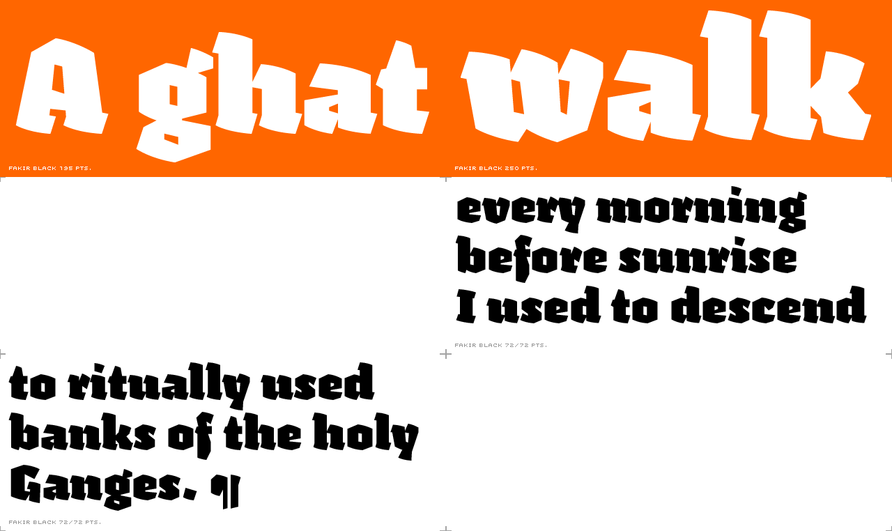
Fakir black
Fakir black works for powerful, black masses of continuous text. Fakir Black Italic is its counterpart. It also works well emphasizing words within a regular weight of text.
Fakir black italic
Fakir black italic emphasizes words within Fakir Black, or creates its own long, textural masses which are black and strong. Of course, you can also use it for emphasizing words within the regular weight of text.

Fakir small caps
The Fakir small caps are very widely spaced, and the forms are quite down to earth when compared to the normal Fakir Regular caps which are designed to be followed by lowercase letters, not other capitals. Fakir Small Caps has lining, monospaced figures for tabular settings.

Fakir Display Regular
This is a high contrast headline font with lots of self-discipline.

Fakir Display Regular Condensed
Set long headlines or mastheads with minimum horizontal space with this thin, starving fellow. Reach your typographic nirvana with this font.

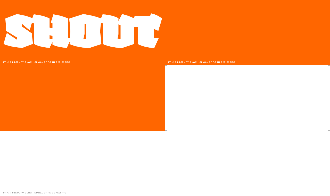
Fakir Display Black
A spellbound, devastating, completely black assertion of typographic
strength. If this is not blackletter, then what is? Gather your blackest
masses with Fakir Display Black.

Fakir Display Black Condensed
Before you send out a file set in Fakir Display Black Condensed, make sure
the printer has extra black ink in the back.

Fakir Display Black Small Caps
All characters in Fakir Display Small Caps align horizontally, which allows you to set very tight lines. It holds your breath until you have finished reading! Includes lining, proportionally spaced figures.
