


concept

tour

two families

ornaments

figures

counter forms

font formats

webfonts

character set

language support

making of

type specimen

PDF

Fakir rock
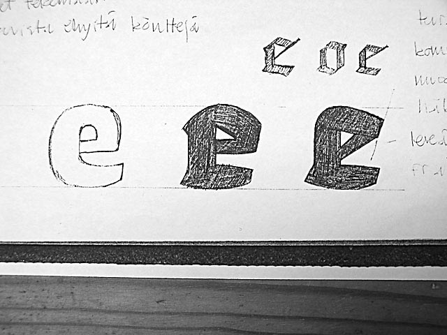
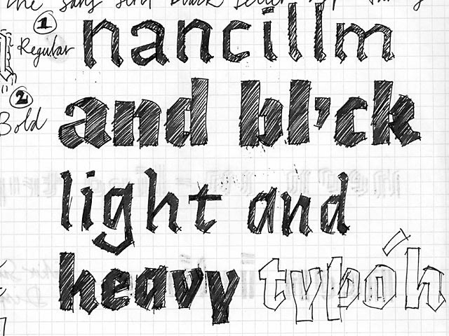
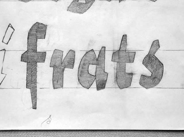
Strong, black, nail-sharp forms without a strict grid. This was the first
design idea for Fakir, before any sketches were made. We didn't go to the library to study old blackletters; instead we started with a clean slate. To
have something powerful, simple, and readable was more important than
following historical blackletters as a style or construction.
Nevertheless, we aimed to create black textural masses, just like Gutenberg
did for his bible.
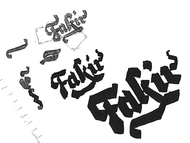
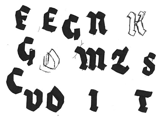
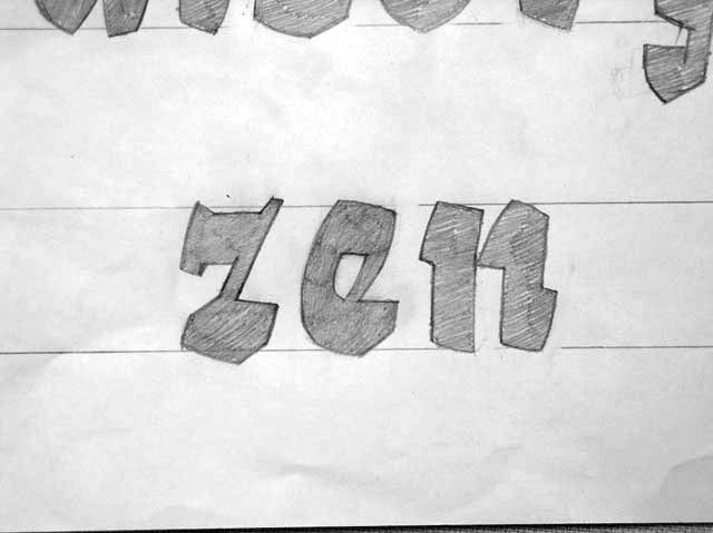
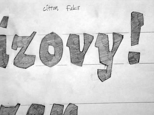
Fakir Black was the first font to manifest in our sketches. Every other font
was later made to work together with the black, although it was always
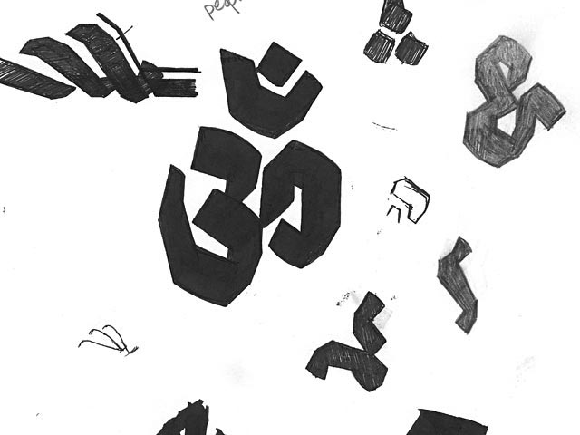
morphing along the way as well. Initial drawings had much rounder shoulders
- the capitals even had totally round curves [sketch 1].
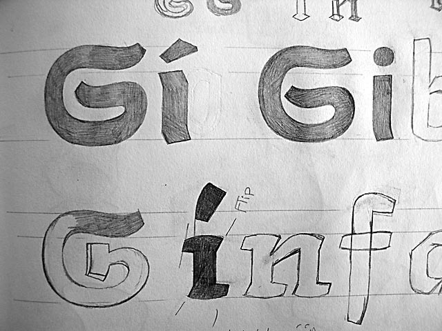
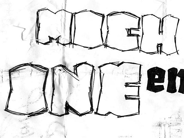
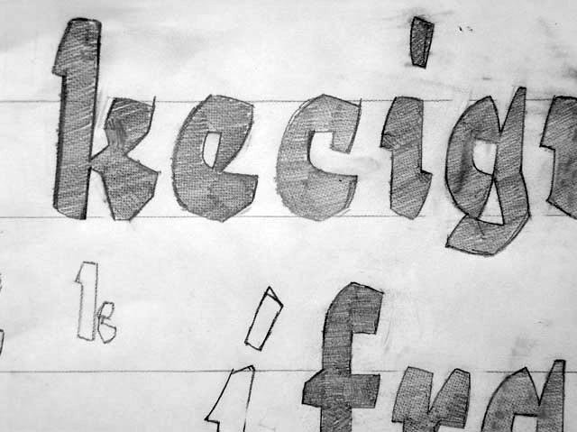
Much later, it was also easy to see that the small cap fonts would need
radical changes for its capitals, since the normal capitals were so detailed
and wild. We went to another extreme by simplifying [sketch 6], but came
back half way for the final fonts.
Fakir was developed between 2000 and 2006.