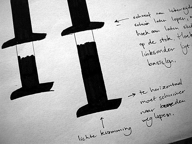
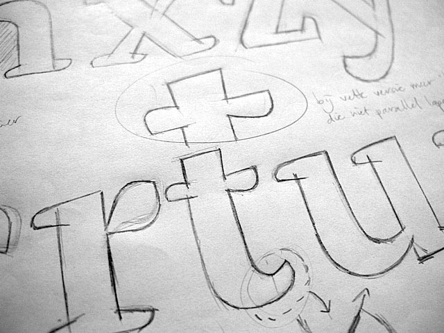
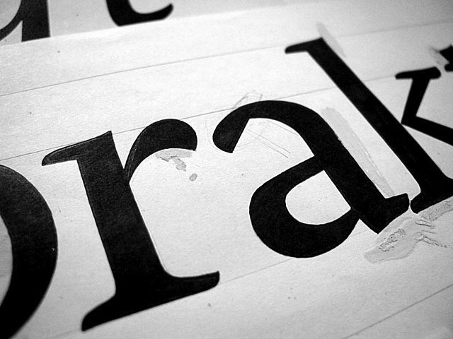
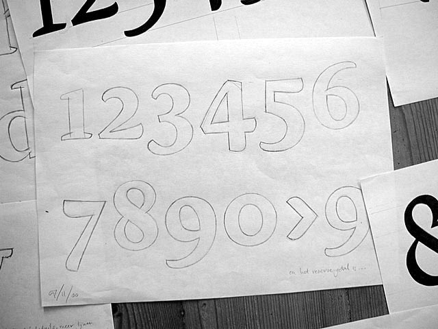
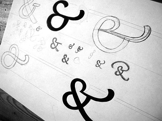
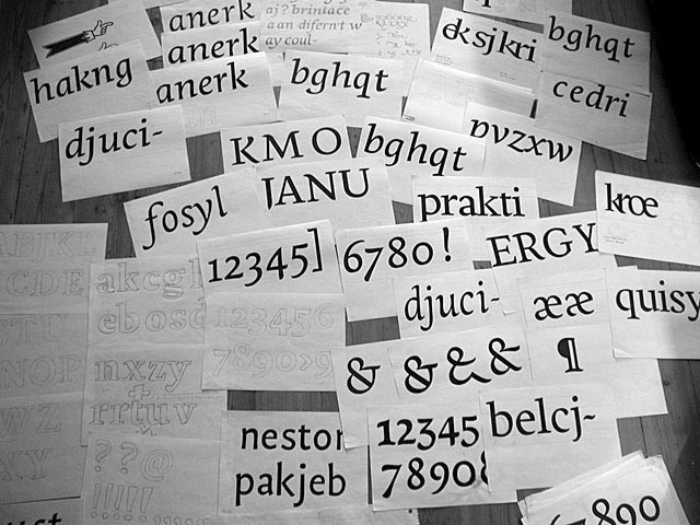
The design of a new typeface is a long-term process. We begin the design with many hand drawn sketches. To experiment with the primary forms of letters such as serifs and curves, one has much more flexibility working by hand than on screen.
The starting point of Dolly is the most used style, the roman style, which is specifically designed for 10 to 12 pts. During the design process the focus has mostly been on these point sizes, and most decisions were made by judging the fonts in there point sizes. But because of it’s very low contrast, Dolly also works well in smaller sizes.
When the primary sketching is about to be finished, we digitize the drawings and expand the character set. The process continues by testing character groupings and sample text settings while continuously fine-tuning the characters. The overal process of creating the first release of Dolly took two years. Ever since it’s initial release in 2001, Dolly has been expanded and improved, keeping her a contemporary workhorse for book typography.
