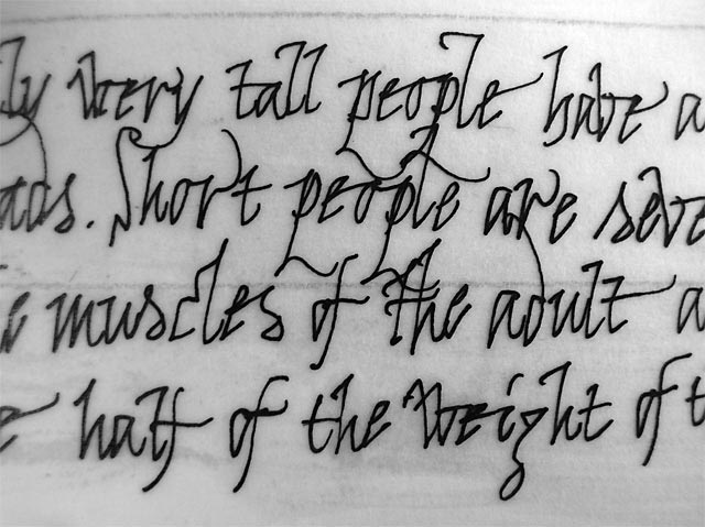
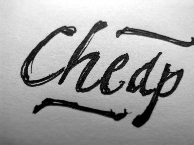
The rhythm of Bello is not based on a geometric grid or rational drawing. Rather, it is the result of much handwriting (see first photo on the left) which has left a subconscious imprint in our collective cerebral cortexes!
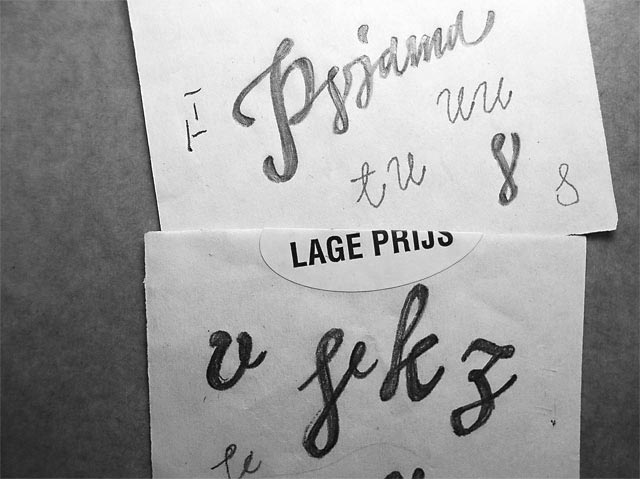
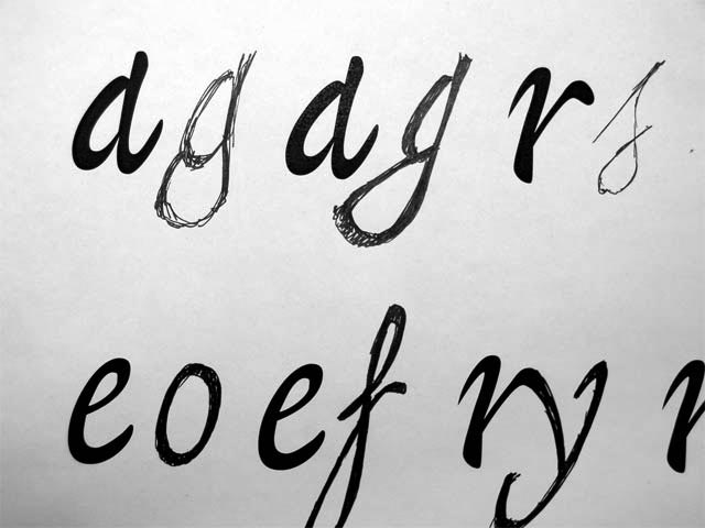
Lowercase letters were drawn first, with the capitals following after. The most common characters like 'a' and 'e' were digitized first. By printing them separately we could easily keep a constant rhythm while filling in characters. During the process the body became bolder and dominant ascender loops with counterforms were replaced by smaller, filled loops.
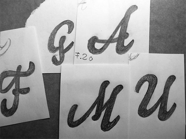
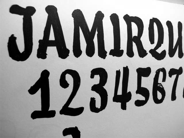
Soon it became clear that the script font needed a friend, something strong it could lean on. The sketches here show the first version of small caps which were way too ornate to provide enough contrast. Another attempt gave much better results.
