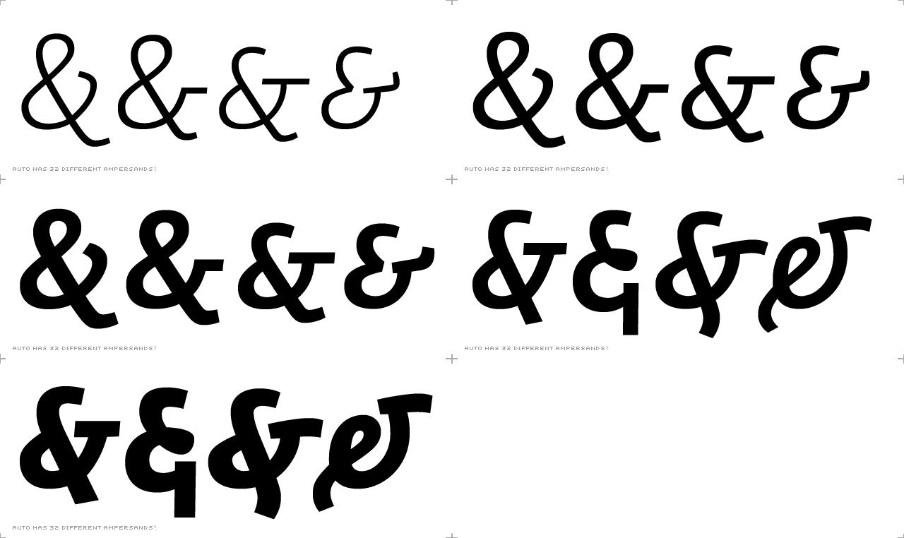
The low contrast sans-serif construction and straight overall shaping do not
have to result in dull designs; we made Auto as splendid as possible in
terms of several individual characters such as ampersands, paragraph signs
and question marks. These characters are infrequent in body copy and so we
have taken more freedom to explore new forms for these glyphs.