


concept

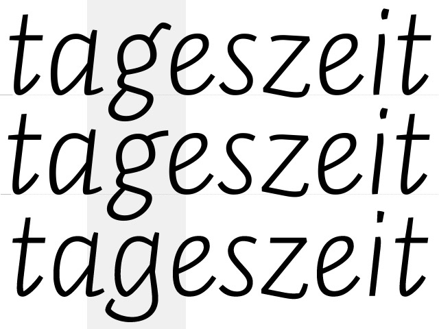
three italics

weight contrasts

small caps

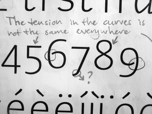
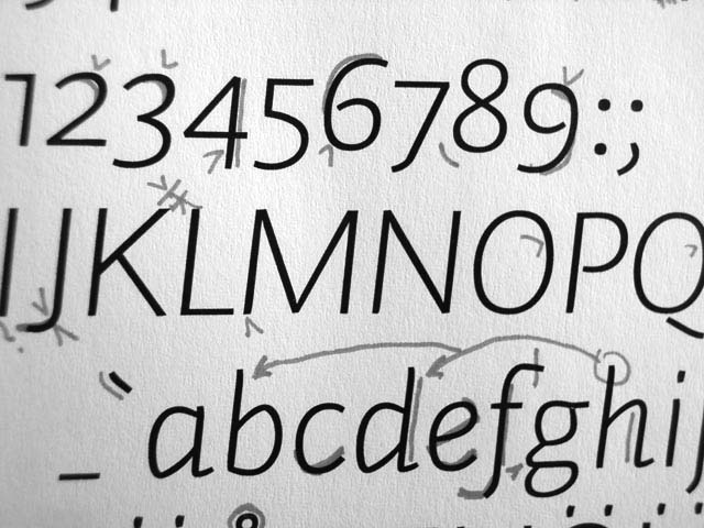
figures

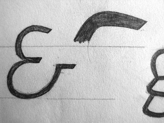
ampersands

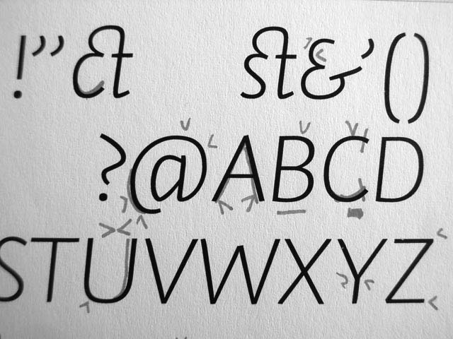
characterism

font packages

font formats

webfonts

character set

language support

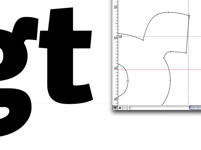
making of

PDF
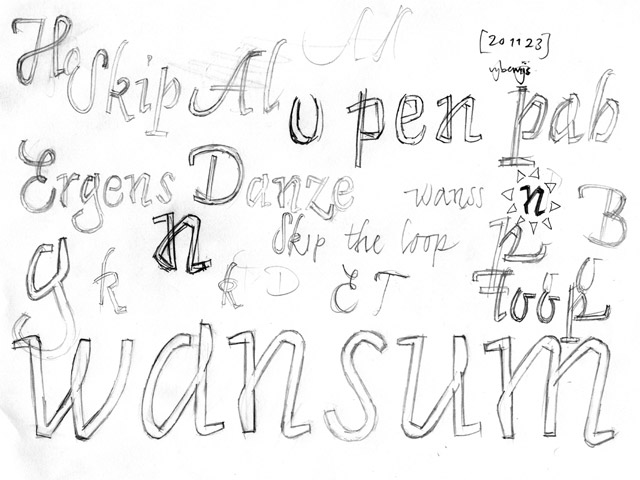
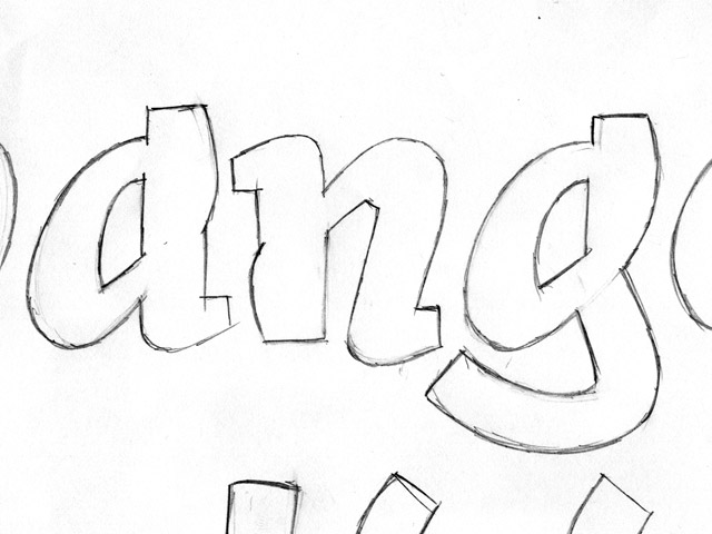
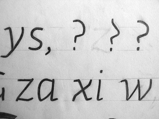
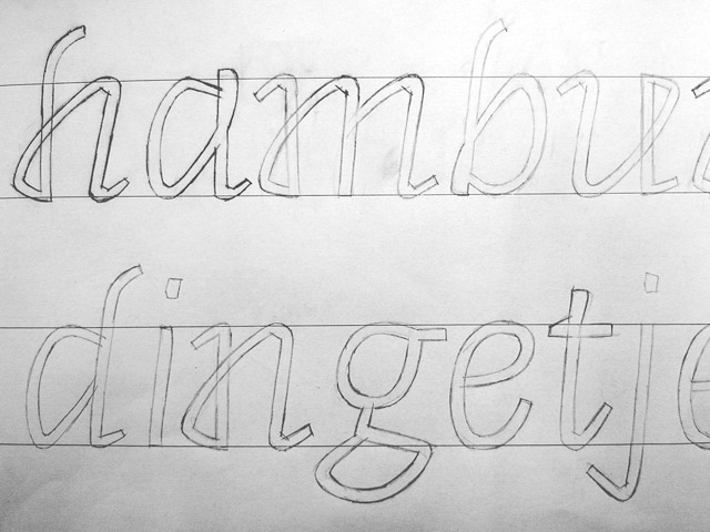
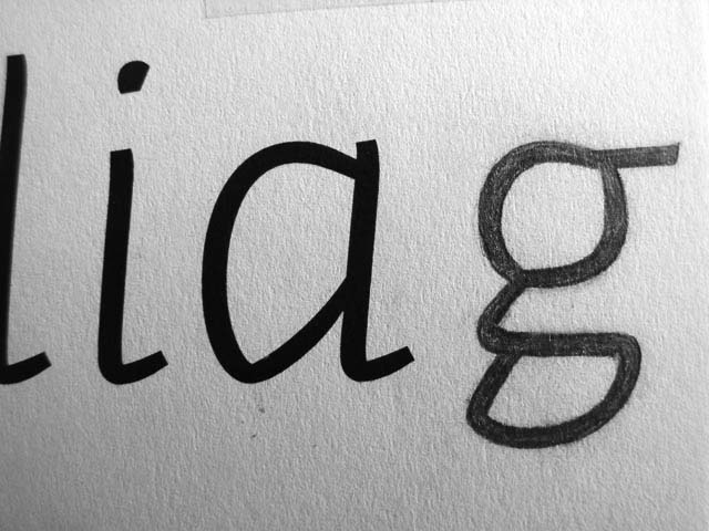
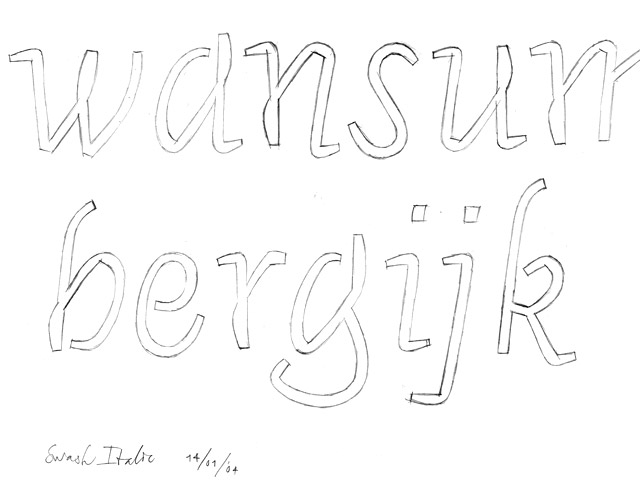
As with all our projects, hand sketches are the very first steps towards a new typeface. The size and precision of the sketches varies. Some sketches are rough, aiming to find the right direction for that third italic. Other sketches are small doodles, comments on printed proofs. And again other sketches are rather precise, having an x-height of 4 to 5 cm.
The overall production period of Auto took more than five years; first it was a custom-made mini-family of three fonts for a publication and exhibit about Maire Gullichsen in Pori Art Museum, Finland 2000.
After some time the family was developed into 12 fonts for the 50th year anniversary of Salpausselän Kirjapaino (nowadays called Aldus). This Finnish printing house desired to offer its own cast metal type for its clients, and to have its own distinct typographic identity visible in its house style.
Since that time, those 12 fonts have gone through a complete overhaul: the character set was expanded a couple of times, two more italics were designed, italic small caps were added, as well as multiple figure styles. We will continue to update and expand these fonts so that Auto remains a contemporary workhorse.