23 january 2017 — publications
New Publication: Safari Typo A’dam

Safari Typo Amsterdam is a brief typographic tour of letters in public space in the Dutch capital, presented by type designer Bas Jacobs. If you’re willing to leave the well-trodden touristic paths, let letters guide you across Amsterdam. If you have seen enough touristic traps, or don’t want to see them at all, this tour will take you to various parts of the city you would otherwise have missed. Discover how architects, artists and designers left their mark on the city by means of the letters they created on buildings, on bridges, on monuments and elsewhere. This pocket-size book is easy to carry with you as you explore the city. This book is only meant for tourists ready for a mind-expanding experience.
Filmed in Amsterdam, the Netherlands
Based on a documentary by Thomas Sipp

Part 1: Amsterdam school & its contemporaries
Lettering in public space by architects & artists
How did architects leave their typographic mark on the city during the interbellum period, and how do contemporary architects and designers respond to this? Featuring letter forms by Piet Kramer, Martijn Sandberg, Reinoud Oudshoorn, Anton Kurvers, Janno Hahn, Hijman Louis de Jong & Rene Knip.

Part 2: Letters with a story
The extravaganza uncensored tour
Can letters tell you a story which you cannot directly read from the letters themselves? The stories behind the letters are as interesting as the letter shapes themselves. This uncensored safari features letter forms by Adrian Frutiger, Jan van Krimpen, Hermann Zapf & Bert Johan Ouëndag.

Published by De Buitenkant, and presented last Friday in Amsterdam. Bookshops have it in store from today on, but it can also be ordered online in our shop.
Media coverage: local newspaper, tv & radio.
More about the publication Safari Typo Amsterdam.
22 december 2016 — walhalla
One more thing to Zeitung
Some more words on Zeitung in the OpenType Variable Font format, about Automatic Optical Size and Automatic Glyph Substitution.

The OpenType Variable Font technique is still in development, tools for making these fonts are still in development, implementation and support for these fonts are still in development. However, if you want to experience our recent release Zeitung as an OpenType Variable Font, visit our homepage www.underware.nl in a browser that supports this font format. At this moment that’s only Webkit Nightly, which explains the “Webkit Nightly Bonus” subtitle for a special section completely at the bottom of our homepage.
One more thing
The nerds, the lucky bastards and some geeks, anybody with that browser will see a demo at the bottom of the homepage which is invisible to other visitors using a less advanced browser. They can play with the tuners and experience how changing the size will automatically select the correct optical size of the font family. That’s what you’ve been waiting for, no? Some glyphs, eg. &, will automatically change shape when the point size becomes rather small. Additionally, changing the weight of the font will result in a change of shape of some other glyphs. See how the € swaps from 2 to 1 cross bar when the weight increases. Or how the tail of the Q suddenly doesn’t enter the counter anymore when its weight is too dark. This happens automatically while playing with the tuners, and happens live your browser. No fake news, no fake type. Man, this is 2016 and this is live. Not everything is bad this year.

Automatic glyph substitution depending on weight, live in your browser.

Automatic glyph substitution depending on size, live in your browser.
20 december 2016 — walhalla
The end of the lucky bag

A typeface like Liza is fully packed with technological novelties. At the time when Liza was released (July 2009), many of these were not supported everywhere yet. For example, only a couple of months after being released, Liza’s contextual alternates finally behaved nicely in TextEdit. (more…)
16 december 2016 — presentations
Safari Typo Amsterdam
An evening full of short documentaries about typography in public space & book presentation
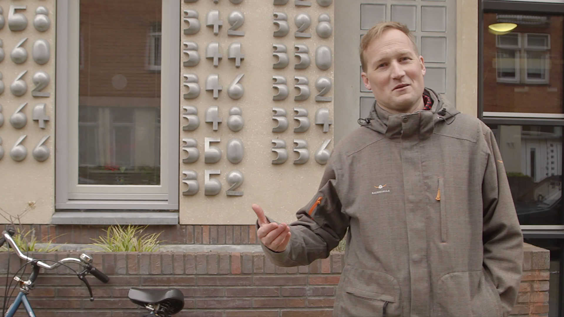
We all know the famous HOLLYWOOD lettering, but what makes these letters unique? Can the character of a city be told by the letters in public space? In which aspect is the typography in Barcelona different than in Berlin? And why do those strange, unorthodox geometric and decorative display letters perfectly fit to Amsterdam? Join us 20 January 2017 for an evening full of short documentaries about typography in public space.
26 november 2016 — walhalla
Mailing list update

Recently we experienced some unwished-for developments at our mailing list subscriptions. During the last 6 months we sometimes saw multiple email addresses from a single company domain that subscribed all at once. Because we hate spam as much as you do, we decided to clean up our mailing list subscriptions over the last half year.
In case you didn’t receive yesterday’s newsletter, you have been unsubscribed accidentally. If so, please subscribe again. We only send a newsletter a couple of times a year, only when there is something interesting we want to share with you. Hopefully you won’t regret your subscription.
24 november 2016 — walhalla
Black Friday offer

In a world full of discounts & dark horses, Underware’s Black Friday offer seems to be inevitable.
5 Black fonts for €99,–
This offer is only valid for 1 day, and ends at the end of Black Friday 2016, 25th of Nov.

17 november 2016 — out now
New font: Zeitung

Good news! Today we released Zeitung, a new sans serif font family. And that’s good news for various people.

Type lovers will have their day made when they look at that lowercase e in the Black weight, will be happy there is a new style to bring their message across, and will enjoy playing around with the interactive newspaper on our homepage.

Designers will appreciate the versatility of this extensive sans serif font family, its thorough execution, and all it’s features. If 8 weights and 5 figure styles are not enough, then maybe optical sizes or grades will meet the demands. Besides of the standard Zeitung font family, Zeitung Micro is developed especially for smaller point sizes. Screen typography requires optical sizes at larger point sizes than print, so web and app developers won’t be left in the typographic cold. Grades can be very handy for selecting the optimal weight, especially on screens. The way letters are displayed on screen can vary a lot between different circumstances. Maybe the interface of your next app requires a different grade of the text than your latest website? Zeitung allows you to change the weight of your text without any reflow of your text. Zeitung will help to bring your message across in many different circumstances, from large text in print to small type on screens. Zeitung has many features.

Pioneers, the most demanding users, the ultras, the geeks, and all those others who don’t take things for granted, will be happy to meet and greet Zeitung Flex™. With its almost endless amount of weights, Zeitung Flex™ takes you anywhere between Thin and Black. Either in case only one, but exactly that specific weight is needed, or when all weights should play a whole new game together. This game can be played not just somewhere in the future, but already today, on everybody’s computer. Flex fonts are not just supported by the most recent browser, but also by all those older browsers. Zeitung Flex brings unlimited styles all over the web. In the future, and also already today. What’s even better is that Zeitung Flex™ also brings these possibilties now to desktop apps like Adobe InDesign and Adobe Illustrator. With the help of CC-Extensions you can easily apply and combine those styles. This can be handy for selecting just a single, but exactly the right grade of text for your next project. Or this extension allows you to apply some of those fancy effects using all styles from Thin to Black on a line, paragraph or complete document. Relax, you can Flex.
Please welcome Zeitung.
29 september 2016 — walhalla
There we go

Yesterday Ben Mitchell wondered if there are examples of nice manicules which are drawn in the same style as the rest of the font.
Wanted: examples of typefaces with exceptionally nice manucules drawn in keeping with the style of the letters.
— Ben Mitchell (@OhBendy) September 28, 2016
What many people don’t know, because it’s not easy to spot, is that many type designers enjoy refining many details of their fonts. For example by creating manicules which fit to the style of a font family. A special pointing hand allows extravaganza typographic subtleties in your book, website, identity or whatever you are making.
Also our fonts are equipped with matching pointing fingers. Because we enjoy drawing them, this is a nice moment to put them in the spotlights. No manicule is the same, or even close to being similar. Because no font is the same either.
The sturdy stencil font Tripper has a sturdy stencil index:

The female hand is clearly visible in Liza:

Fakir’s manicules are as edgy as the black letters themselves:

Bello & Sauna are typographic mates, and share manicules:

09 september 2016 — walhalla
Bello goes freestyle 4
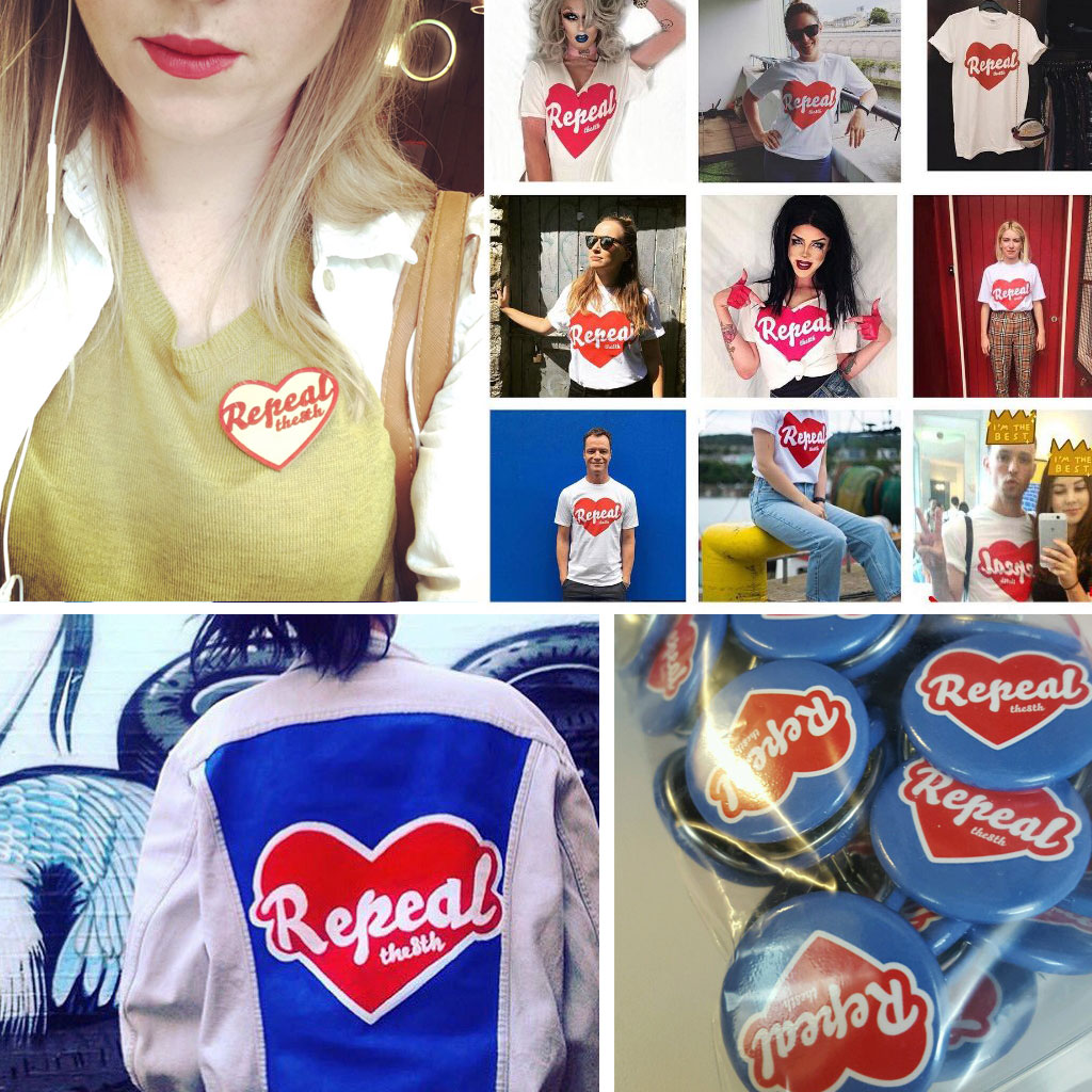
It’s been too long to remember probably. Therefore we will help you out. We had some previous episodes of Bello Goes Freestyle on this blog in the past. It all started with episode 1 in 2007, where Dutch graffiti artists interpreted Bello on a wall. This freestyle interpretation of Bello was followed 2 years later with episode 2. Then 3 years ago we posted episode 3, about a selfmade lettering in a bikeshop in Toronto. And today, oh boy, it’s 2016, we are happy to present the 4th episode of “Bello Goes Freestyle”. There are quite some do-it-yourself versions of Bello around, but this one especially appeals because of its dedication. In last weeks post you could read about the consequences of removing a mural, originally made by graffiti artist Maser. One of the consequences was that the removed mural was resurrected at other locations throughout Ireland. That’s hipper-dipper for graffitis or murals, which are temporary by nature. This mural is not vanishing, but multiplying. Some of the replicas were very smooth. This one however is a bit fluffy and chubby, but painted with lots of love. Disguised, but still Bello.

04 september 2016 — fonts in use
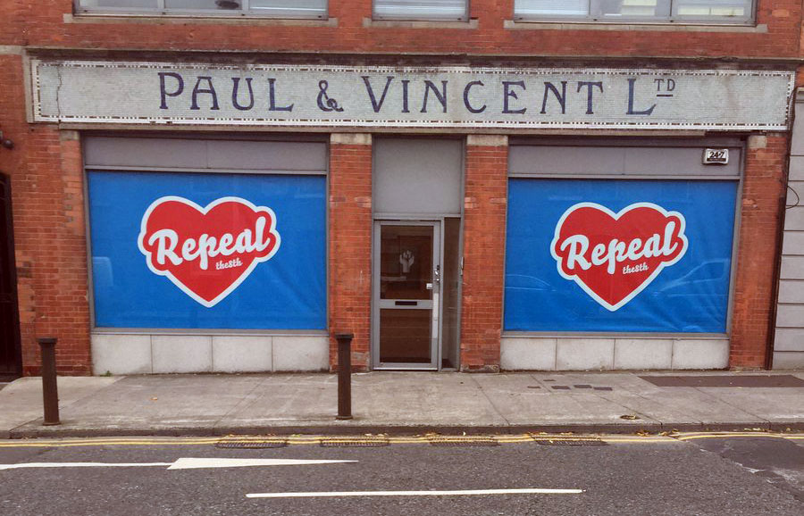
Repeal the mural
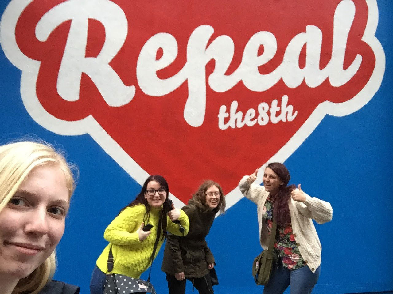
Who doesn’t know Maser, the street artist who grew up in Ireland? We wrote about Maser’s noticable murals before on this blog. One of his murals has been making the news again this summer.
During the current campaign for repeal of the Eighth Amendment (abortion ban) in Ireland, things got wild this summer after the Dublin City Council Planning Department demanded a mural from the Irish street artist Maser to be removed. His work would violate planning regulations, so they decided to paint the wall blue again.
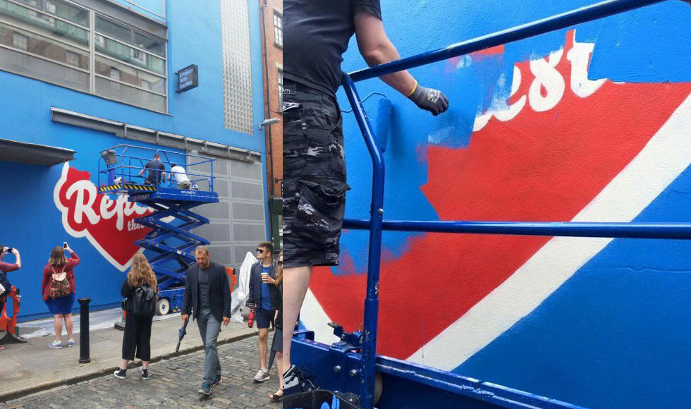
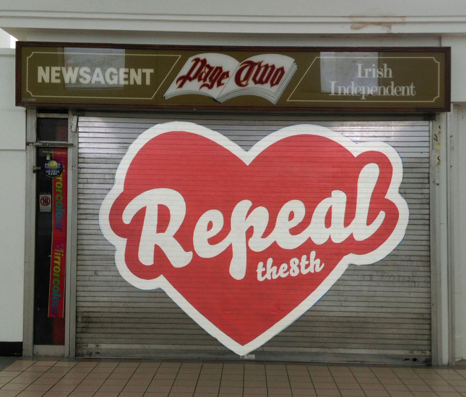
In the short time before being painted over, the mural had enough impact to stir up controversy and debate. Well, actually removing the mural and painting the wall blue again resulted in a strong and widely supported counteroffensive. Various people started to recreate the mural on other locations throughout the city, and later on throughout the country. Seriously, how many murals or grafittis have that honour?
Some replicas of the removed mural:
Some other people were clever enough to bring the mural back to its original wall, but then through augmented reality. On the pretext of “You can’t paint over an issue”, a QR-code brings back the mural if you point your phone to the meanwhile completely blue wall. Even better, the mural can virtually appear everywhere, once somebody glued the QR-print to the wall. 8mural.com: Technology for the win.
The mural ban paved to way for mementos, nicknacks, t-shirts, bumper stickers, buttons, people changing their social media profiles, all showing the removed mural. Anything which helps to keep the campaign alive and raise awareness for the 8th Amendment suddenly popped up. We don’t have any political voice in Ireland, but we are more than happy that Bello is helping the campaign with its visual voice. That feels like a small contribution after all.
More images at our fonts-in-use section.