24 may 2011 — presentations
A magazine should be done like this
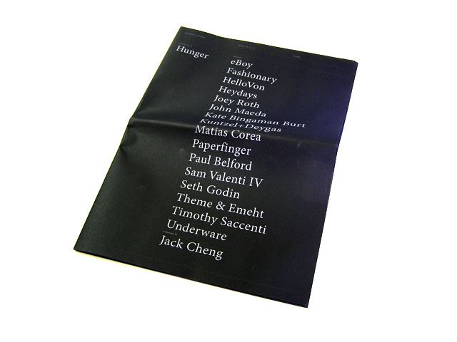
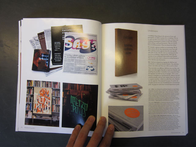
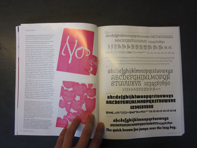
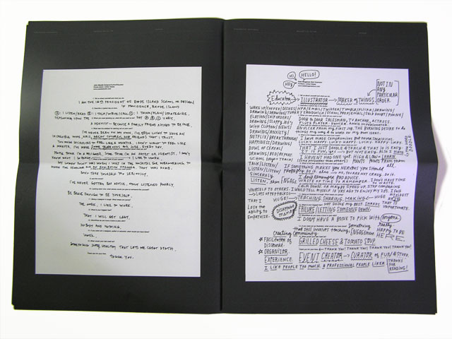
Today in our mailbox: Bracket, a magazine which stops where others continue. Printed questions with handwritten (-sketched, -drawn) answers. Bracket is an example that proves you don’t have to go all the (conventional) way to create an interesting mag. Easy does it.
Germain Chong also had a brush with Bas.
(published in Bracket Vol. 02: Hunger)
1) Tell us about yourself and what you do.
We design type.
2) Describe a typical day in the studio.
Sit on our ass in front of a screen and work our butts off.
3) When you were growing up, what did you want to be?
Comic artist.
4) What was the catalyst for starting Underware?
Due to a lack of education we had too much spare time during our studies and started to create our own projects, which eventually became our daily practice.
5) What is the biggest sacrifice you have ever made?
If you always try to make the best out of every situation, nothing feels as a sacrifice.
6) What is the biggest/most common misconception about what you do?
We had to explain civil servants too often already that we don’t sell lingerie.
7) What is the lowest point of your career?
Too many embarrassing mistakes to mention, we’re still sorry for all of them.
8) What is the best advise you have ever been given?
Never trust anyone who tells that ‘it should be done like this’, there are always multiple solutions for every problem.
9) and the worst?
It should be done like that.
10) Looking back now, what advice would you give to someone like yourself?
Alles geben.
Never give up.
11) Being a designer is tough. What keeps you going?
Scoring with soccer. I remember all my beautiful goals, even those from 25 years ago.
12) What is your biggest fear?
An obscure animal comes out of the drain, and bites off my dick when I’m sitting on a toilet.
13) Who/What do you have a bone to pick with?
God, but he is hard to reach.
14) If you were not a designer, what would you have done?
Euhm… God? Finally humanity would have a humane, self-contemplated, communicative God.
15) What would your last meal be?
All drugs I never took, just to get the experience before I die.
Thank you for your time,
Germaine

Bracket Vol. 02: Hunger features a whole bunch of talented people: @paperfinger @fashionarybook @kateconsumption @jackcheng @ThisIsSethsBlog @johnmaeda@ShopVon @VALENTI @timothysaccenti @matiascorea @heydaysstudio
13 may 2011 — walhalla
Underware goes Typerings
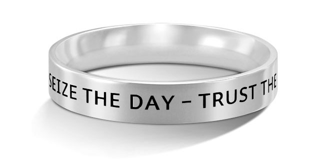
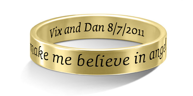
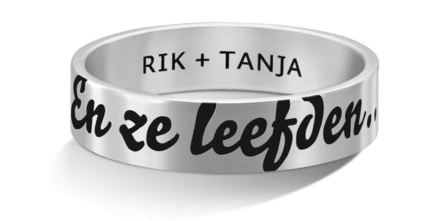
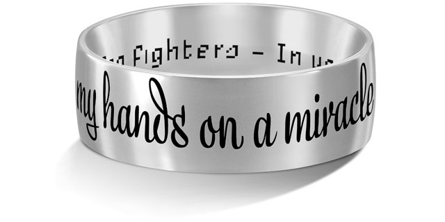
Ever wanted to have your own text engraved on a ring, but not in a clichéd Courier, Futura or Edwardian Script? Then luck is now on your side. As of today our fonts are available for superb engraving on a collection of rings, since we hooked up with the garden-fresh Typerings. Create your own ring online.
Select your ring, enter your own text, and choose from eight divergent fonts to give your words the right spirit. Yes, they’re all your favourite Underware fonts. As we always design our butts off with every curve in our typefaces, we’re delighted that the engraving on these rings looks absolutely astonishing.
Happy to share our happiness: www.typerings.com
12 may 2011 — presentations
Underware@TypeTalks2

On Sunday 19 June, Akiem will be one of the speakers at the second symposium of TypeTalks, in Poland. Tickets are available at their website, but if you unfortunately can’t make: just carry on.
27 april 2011 — offtrack
Good beginning of business

Dear Bas/Sami,
This is Pound in Yiwu, China. It’s nice to know you here.I got your information from the internet, and be tempted by your funny and attractive website. So I want to contact with you further.Our com. is specialized in the production of medium and high end seamless garments.We has become one of the largest seamless manufactures and exporters here in China mainland.
For more detailed informations, pls look through our website or contact me directly. We hope we can have a trial cooperation, maybe it’s a good beginning of business between us.
18 april 2011 — presentations
Comm Arts goes A-Z
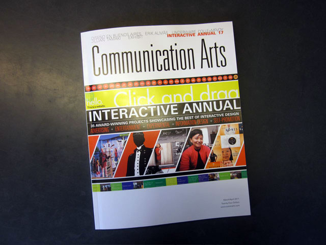
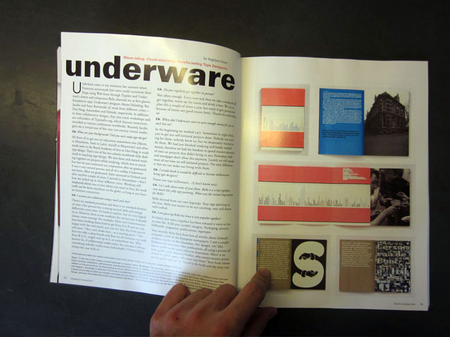
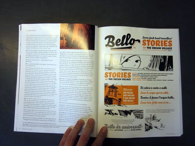
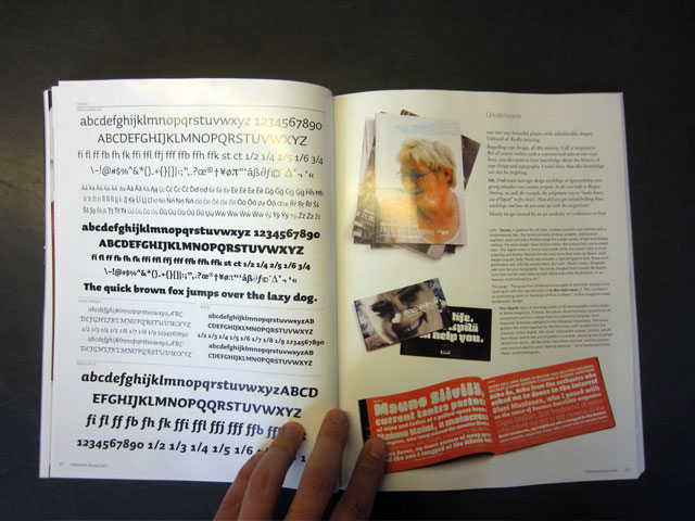
The most recent copy of Communication Arts magazine arrived in our postbox today. We didn’t expect 10 full pages on Underware, especially not after we received an email from the author that due to a lack of space ‘complete sections had to be left out’. They truly love pics, but they seem to adore A-Z. Rather surprising way to present typefaces for the ‘largest international trade journal of visual communications’. Anyway, now in the bookstore, library & online (paywall-alert).
13 april 2011 — walhalla
Siistiä! New stationery
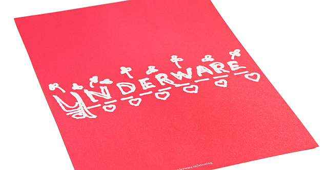
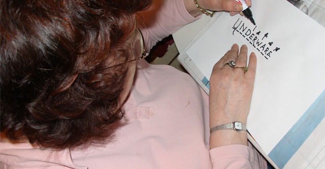
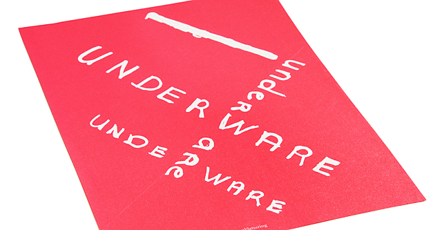
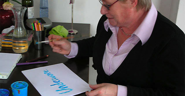
When we ran out of out letterheads a while ago, we asked our parents to design our new stationery. They probably expected their designer-sons to design letterheads for them, not the other way around. But all six came up with an original, unique approach. Connoisseurs identify national distinctions, others just notice struggle mixed with experiment. We are just proud to have our own letterheads designed by our own parents.
See them all: http://underware.nl/lettering
18 march 2011 — publications
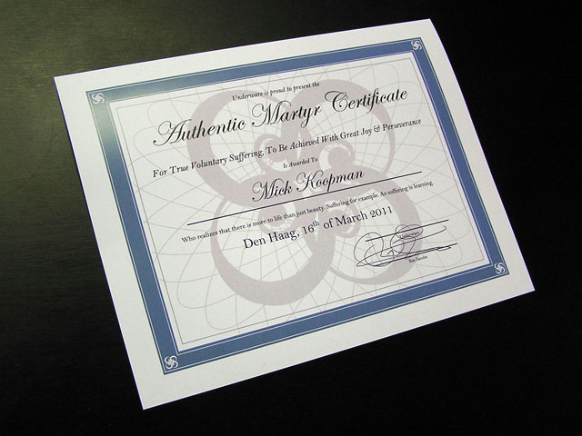
Authentic Martyr Certificate
The ‘Book of war, mortification and love’ contains a little note:
Wanna get the full voluntary suffering experience?
Step 1: Write down the page numbers of every page in this book containing the word ‘pain’.
Step 2: Send the page numbers to the publisher and earn the Authentic Martyr Certificate.
A while ago we received this handwritten letter:
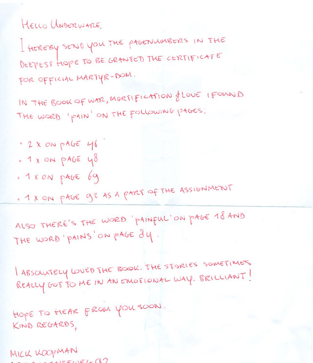
Dear Mick, thanks for your letter.
We received plenty of emails which mentioned the correct page numbers, but as a true martyr you were the only one who candidly understood that real sufferers don’t send emails. They write a letter by hand instead. Well done, our compliments.
Additionally we should compliment you with the correct page numbers, you passed the test. Furthermore we appreciate your use of language, deepest hope to be granted the certificate for official martyr-dom (which actually should be martyrdom, but we’ll turn our blind eye to that). If that ain’t enough, you send us your compliments: I absolutely loved the book. The stories sometimes really got to me in an emotional way. Brilliant! We forgot to tell we don’t like to receive compliments, we like to suffer as much as we can. These 2 sentences almost destroyed your achievement, but we will be generous with you.
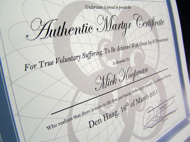
Handwritten & correct page numbers & correct language. Well, well, well. Scoring 3 out of 3 means you’re the only person ever to sincerely deserve the Authentic Martyr Certificate. Please find it enclosed in this envelop. In case you’re hoping to receive a nicely designed certificate, you should have known better. True sufferers are proud to have a Microsoft Word template on their wall, which reminds them every day of their god damn life that suffering is learning.
Keep suffering!
Underware
06 march 2011 — presentations
New Underware
All we ever wanted was a search engine… What started with ‘Hey, shouldn’t we add a search engine to our website?’, ended with a complete revision of the website. After updating and improving our website for eight years, that was about time. Redesigned, restructured and build from scratch. New functionalities, bla die bla. Just see it yourself. Well, at least previewing type at 350 pts. ain’t a problem anymore with these wide images. And the search engine? Yes, that made it to the final version as well.
You’ll also find some recent overlooked projects on the updated website, like the hand lettered logotype for Jet Cooper and the intelligent handwriting typeface of Mr Porter. Petty fact: 10 years after our first blog post, we finally have a real blog! And with that new search engine you can suddenly search a decade of disguised niceties of our old Walhalla-section. Enjoy!
01 february 2011 — publications
Portable sauna
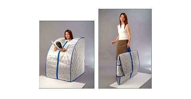
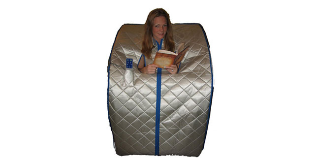
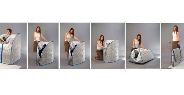
Want to read naked in a sauna but attached to your privacy? Travel often but don’t want to skip your daily sauna moments? This Unique High Quality Portable Infrared Sauna is affordable and can be used in privacy of your home or apartment or any living environment without large spaces & special wiring. Read naked anytime, everywhere.
update 14 Feb: oldskool video
06 january 2011 — publications
Read naked essentials
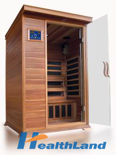
Dear sir/madam,
Have a nice day!
I am Cindy, from Xuzhou healthland sauna equipment Co., Ltd here. Do you import sauna from China?
