04 september 2016 — fonts in use
Repeal the mural
Who doesn’t know Maser, the street artist who grew up in Ireland? We wrote about Maser’s noticable murals before on this blog. One of his murals has been making the news again this summer.
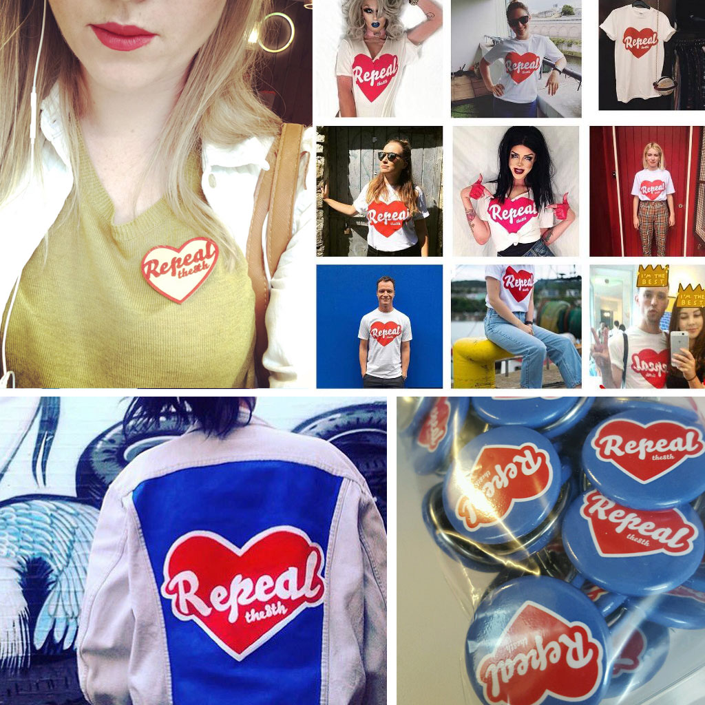
During the current campaign for repeal of the Eighth Amendment (abortion ban) in Ireland, things got wild this summer after the Dublin City Council Planning Department demanded a mural from the Irish street artist Maser to be removed. His work would violate planning regulations, so they decided to paint the wall blue again.
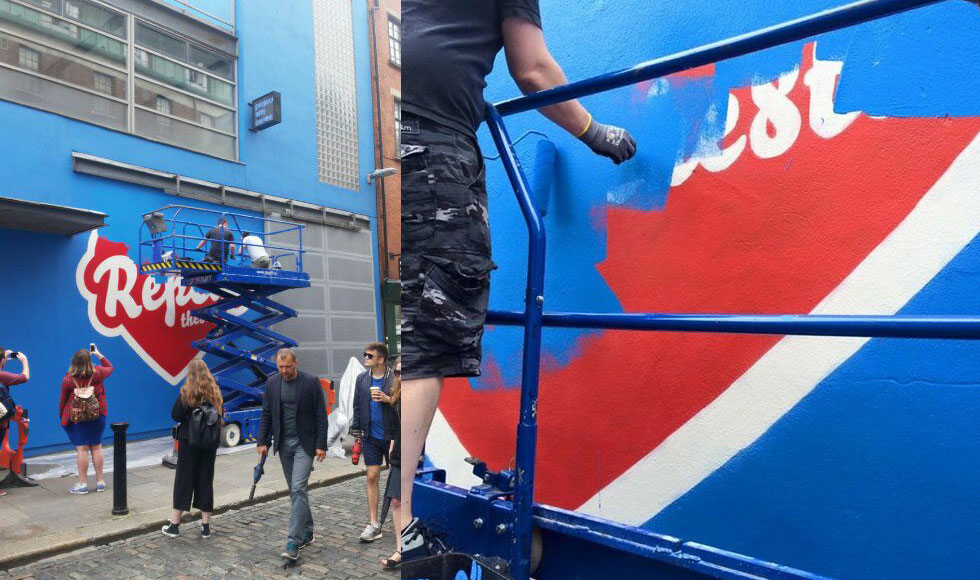
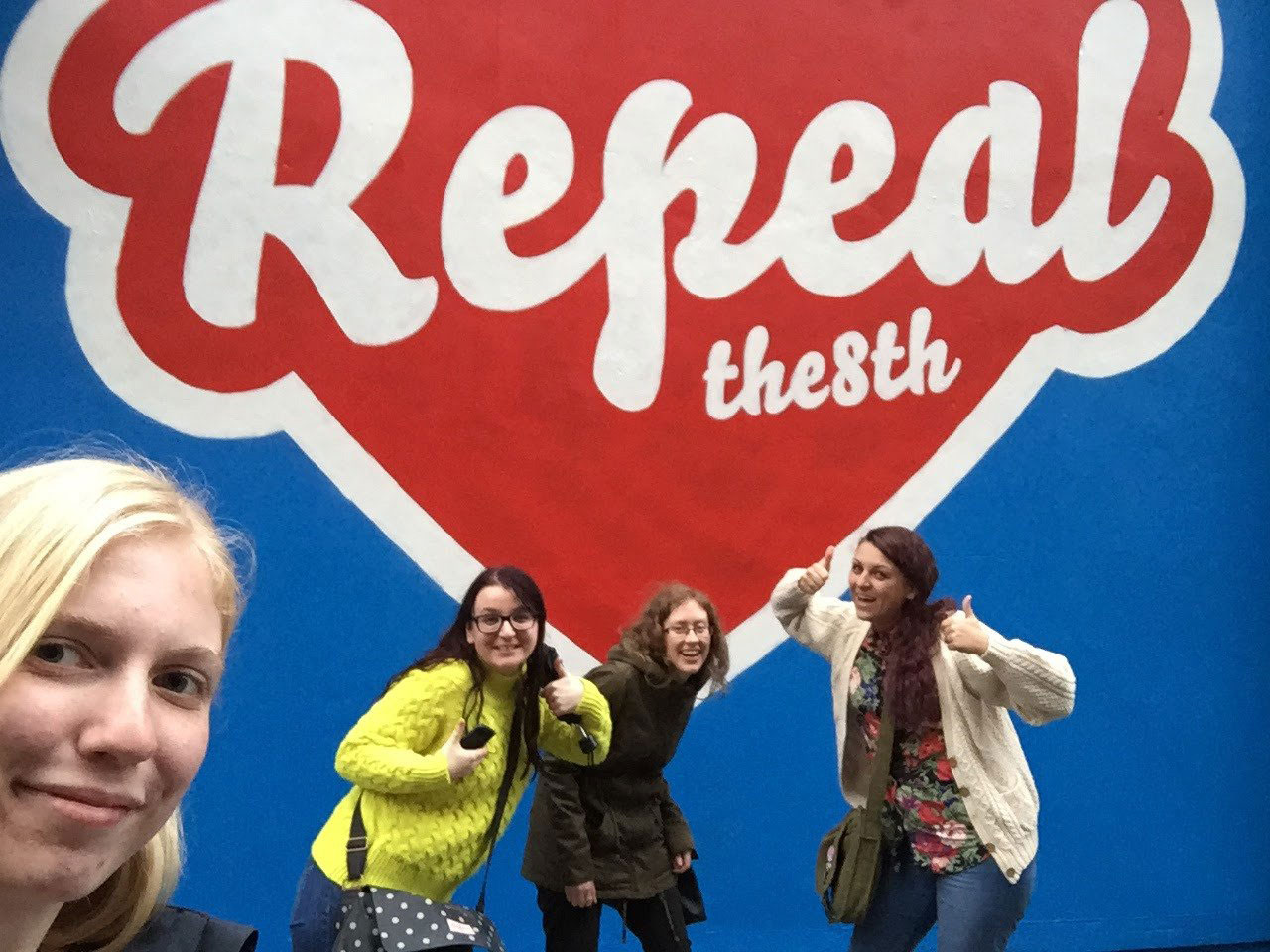
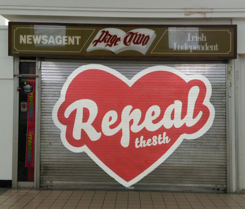
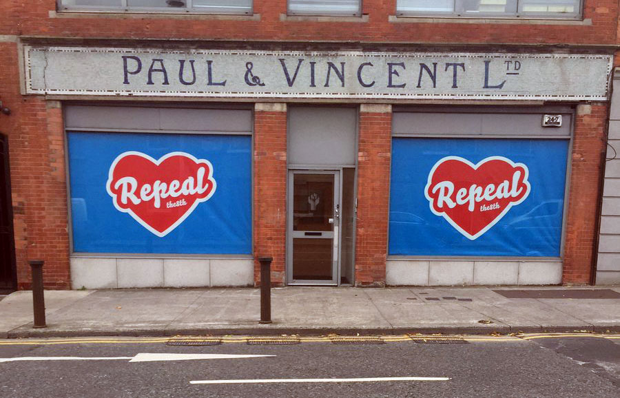
In the short time before being painted over, the mural had enough impact to stir up controversy and debate. Well, actually removing the mural and painting the wall blue again resulted in a strong and widely supported counteroffensive. Various people started to recreate the mural on other locations throughout the city, and later on throughout the country. Seriously, how many murals or grafittis have that honour?
Some replicas of the removed mural:
Some other people were clever enough to bring the mural back to its original wall, but then through augmented reality. On the pretext of “You can’t paint over an issue”, a QR-code brings back the mural if you point your phone to the meanwhile completely blue wall. Even better, the mural can virtually appear everywhere, once somebody glued the QR-print to the wall. 8mural.com: Technology for the win.
The mural ban paved to way for mementos, nicknacks, t-shirts, bumper stickers, buttons, people changing their social media profiles, all showing the removed mural. Anything which helps to keep the campaign alive and raise awareness for the 8th Amendment suddenly popped up. We don’t have any political voice in Ireland, but we are more than happy that Bello is helping the campaign with its visual voice. That feels like a small contribution after all.
More images at our fonts-in-use section.
09 may 2016 — out now
New Font: Liza Lettering

Lately we were wondering about the fact that despite the concept of a typewriter dates back at least to 1714, not much changed in the meantime. Why is that? Why do we accept digital type to be as primitive as it is? Why don’t we just make a lettering ourselves, instead of pressing keys?
As soon as we do not accept things to be as they are, everything becomes possible. Just try it out yourself. Say hello to Liza Lettering™.
09 february 2016 — walhalla
Love & Fonts
We all know that it’s not money but love which keeps the world turning. And fonts of course. Therefore we want to reward all orders placed this week (8.02 — 14.02) with an extra free font of your choice for the person you love. No worries, everything is super-simple: Just place any order this week in our shop and we will get in contact with you to arrange the additional free license.
31 january 2016 — walhalla
We love Lucy

After supporting us with office work and the shipment of publications for over 10 years, it was definitely time to affirm our love for Lucy with her own logotype stamp. Lucy’s reaction: From now on no document will leave the office unstamped. Thank you for everything Lucy!

10 december 2015 — walhalla
Handmade typographic presents
Giving presents is nice (for both sides), but giving presents you made yourself is even nicer. In such a case you give a little bit of yourself. If you love drawing letters like we do, it’s pretty predictable that these presents are build up out of letters. Here are a couple of typographic presents we made recently.
Autobahn
When our friends of Autobahn celebrated their 10th anniversary, they asked some fellow designers and type-lovers to design them one letter of the alphabet. What do you do when you get asked by two guys which are deep into type to make the letter “S”? Right, you give them what they are: 2 guys deep into type.


Abel
Arriving on earth is a milestone in everybody’s life. When Abel was born, he got an almost abstract poster which actually looks much better if rotated 90 degrees. Hey, he can’t read anyway yet.

Rigoberto
Every artist needs his own monogram. So when we discovered that Rigoberto had to do without one for almost 80 years already, we sat down and send him a stamp.

We received a drawing in return, of course signed with his meanwhile inevitable monogram. Thanks Rigoberto!

Tijl
Tijl, well, when Tijl was born last year we gave him a quickly painted poster that neither Tijl nor his parents could read. That’s okay. It can still be a nice wallpaper decoration thingie for the baby’s bedroom. Shiny nice colours are half the job anyway.

Kees
Every carpenter has his own habit. Kees, who helped us a lot this year, tends to write “Made by Kees” on everything he builds. His eternal fame is however mostly deeply buried underneath layers of concrete or wood. This skilled woodworker deserves more eternal fame, so we made him a stencil. Now he can spray his characteristic motto on everything he builds. Fast and easy. Yes, even his own kids will not be safe anymore with his new stencil.


03 december 2015 — out now
Love is stronger than hate

Is there something you only love, without hating it a little? Can you hate something completely, without any love? Can love exist without hate?
Exactly 100 years after Edgar Rubin created his famous Rubin’s vase – the godfather of all figure-ground illusions – this poster is published as a typographic tribute to the Danish professor of psychology. If cannot read anything, you still have a nice heart to look at. Silkscreen printed in a super bright red color, this übersized poster requires some empty wall space. Seriously, this poster is pretty big.
This poster is an example of a (typographic) figure-ground illusion. These kind of optical illusions have a long history, we didn’t invent the concept. Read more about these kind of optical illusions in Everything is black and white.
30 november 2015 — fonts in use
Maintaining style in rough times
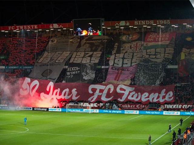
Sometimes our fonts are being used big and bigger. As type designers we create our work on computer screens, and therefore especially enjoy the large scale of some applications. This weekend Bello was used in a large banner at the Dutch football club FC Twente. It ain’t easy to be a fan of FC Twente at this moment. Although the football level radically collapsed this season at FC Twente, and the organisation is currently a disaster, the typographic taste of the fans still stands strong. (The fans of Twente are for example typographically known for their use of Roger Excoffon’s Banco typeface.) Culture in rough times. Our compliments!
We ♥ Twente!
24 september 2015 — publications
Tripper stencil set
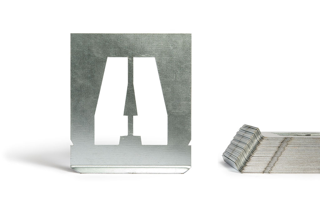
Some stuff makes us sooooo happy. Ever since we released Tripper earlier this year, we have been playing around with real Tripper stencil sets ourselves. We decided to take them in production, so everybody can play around. Here it is: the let’s-not-fake-it-this-is-the-real-Tripper-stencil-set.
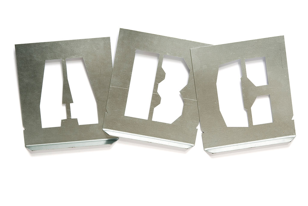
We know you’re sitting behind a computer screen now, and we know you are completely clean. Probably you are totally clean seven days a week, no? But look what can happen if you are willing to get your hands dirty. Go ahead, surprise your lover. Surprise your colleague. Surprise yourself.
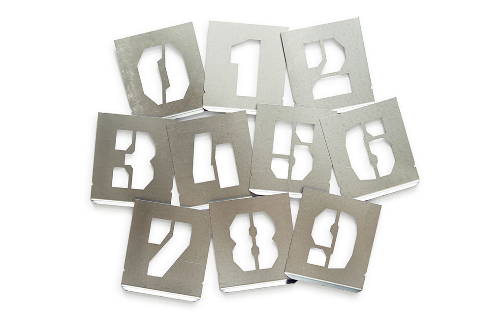
Tripper stencil set
size: 120 x 140 mm
pieces: 36 (A-Z 0-9)
material: Sendzimir
price: €124,–
23 september 2015 — presentations
We love graphic design

In case you want a sneak preview of our upcoming font release, catch us all three in Copenhagen next week at the We Love Graphic Design conference.
Saturday 3 October, Den Sorte Diamant, Copenhagen.
Speakers:
Annie Atkins
Jean Jullien
Julie Katrine Andersen
Lust
Underware
See you there. More info:
welovegraphicdesign.dk | Facebook
15 september 2015 — walhalla
Brand New Conference 2015

The fine folks of Brand New Conference went all the way for this year’s conference in New York. If you say: “we set our texts in Tripper and then cut them by hand, one by one, and manually spray those stencils”, then we say: “respect!” Boy, they didn’t stop halfway. They went the whole hog.
What they didn’t know: we’re currently producing real stencil sets of Tripper. It could have made their life a little easier. Visitors of the conference will be the first to experience the real Tripper stencil set. Take it home, and put it next to your bed. If you’re at the conference next week, keep your eyes open.
See more images of Brand New Conference 2015 at fonts in use.