Tahoe South
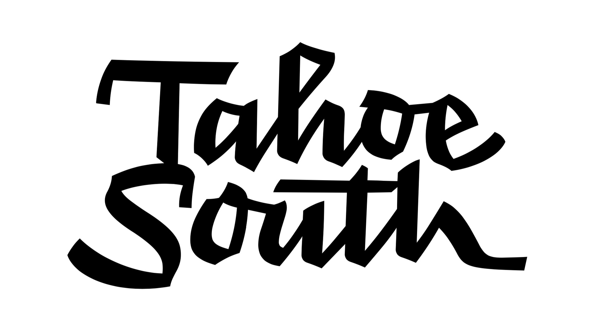
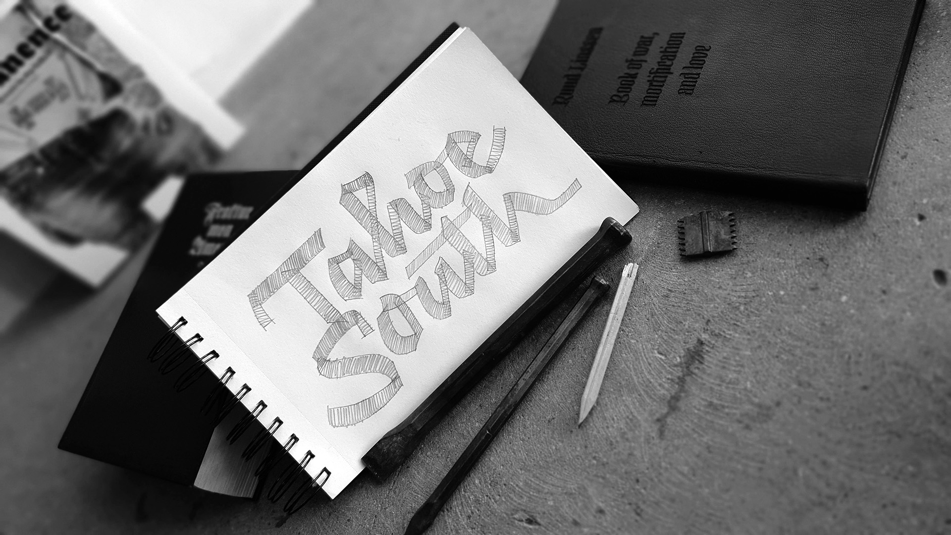
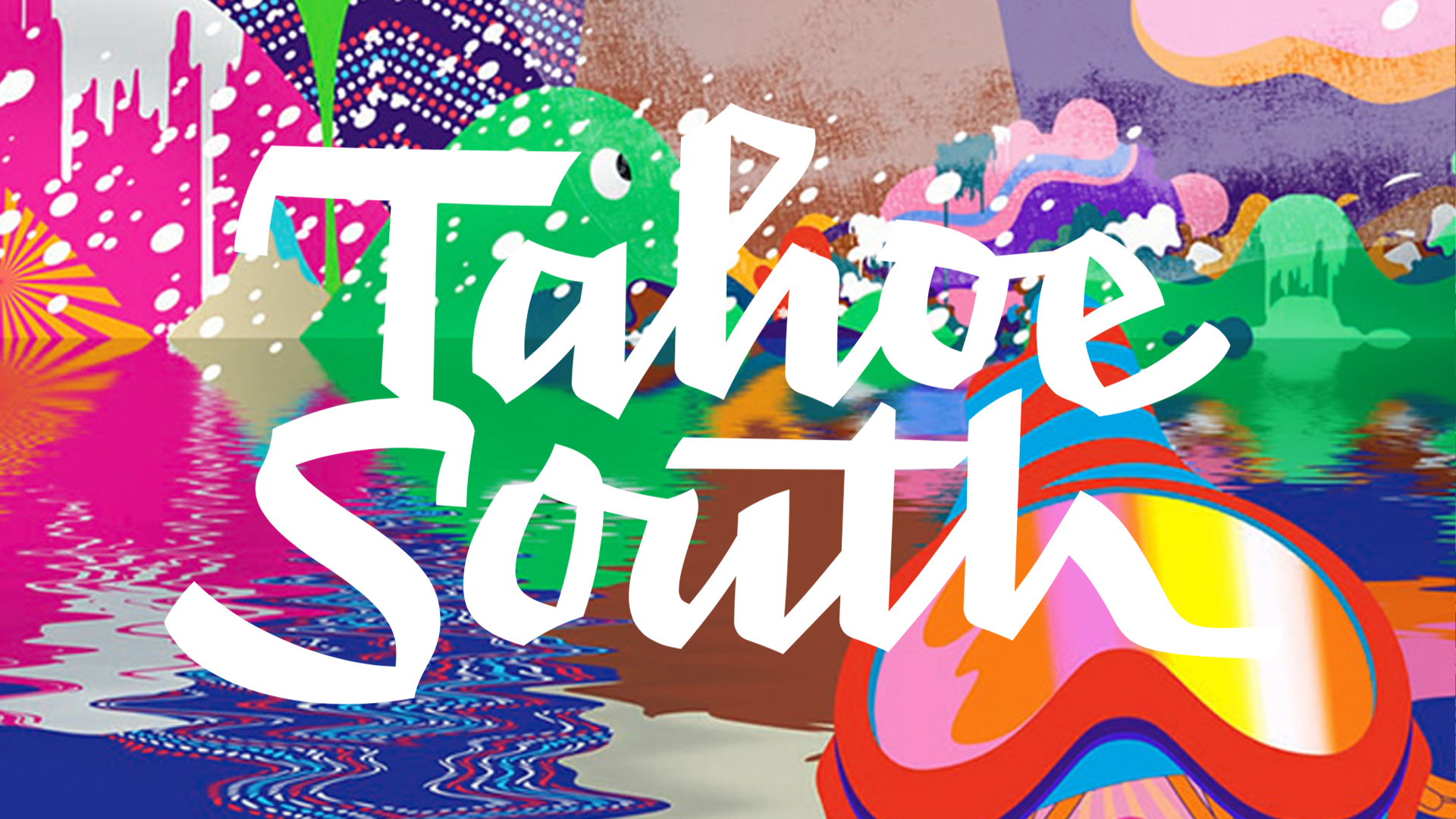
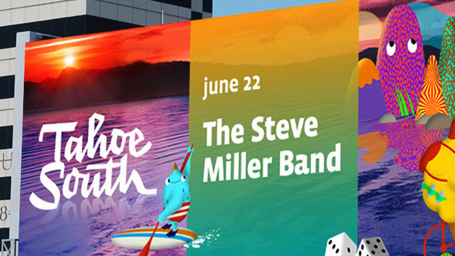
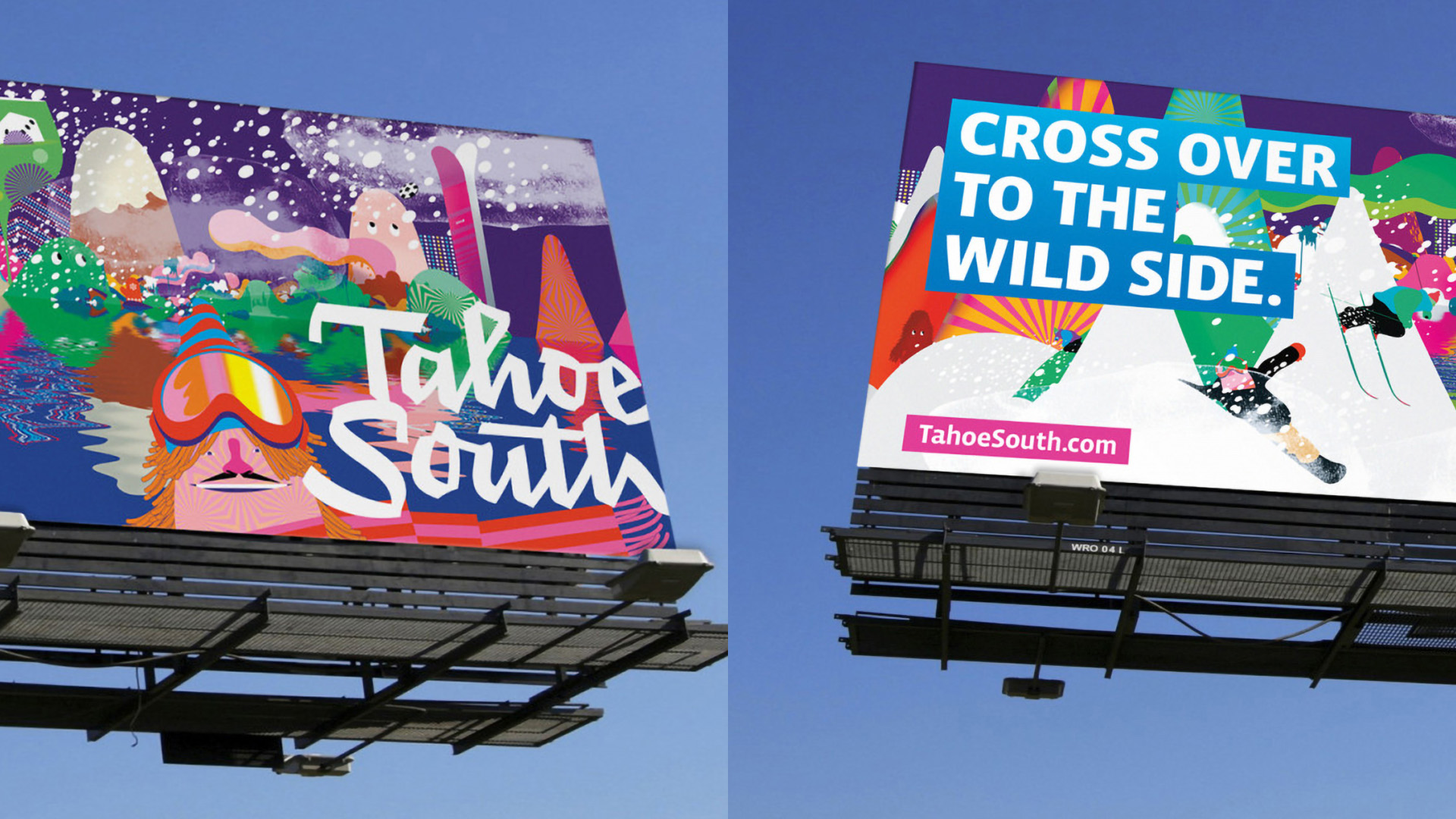
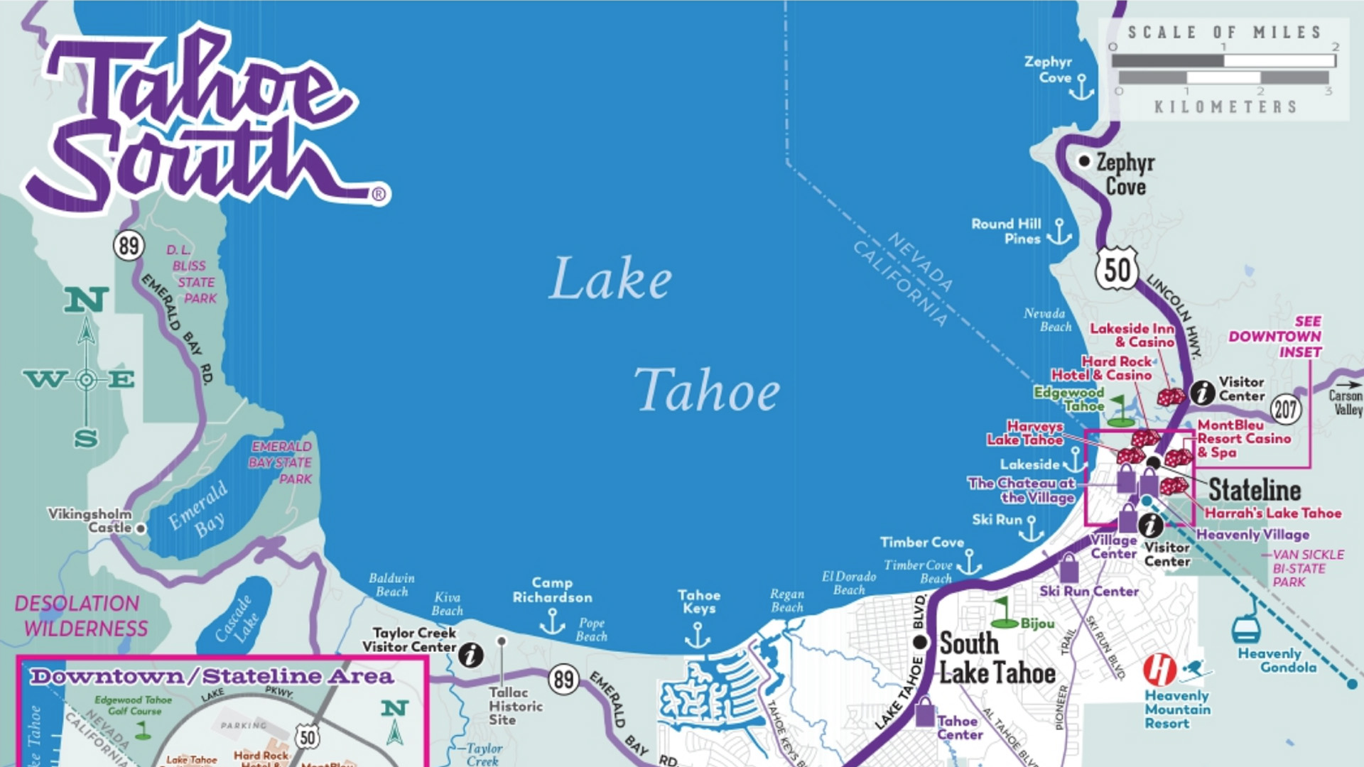
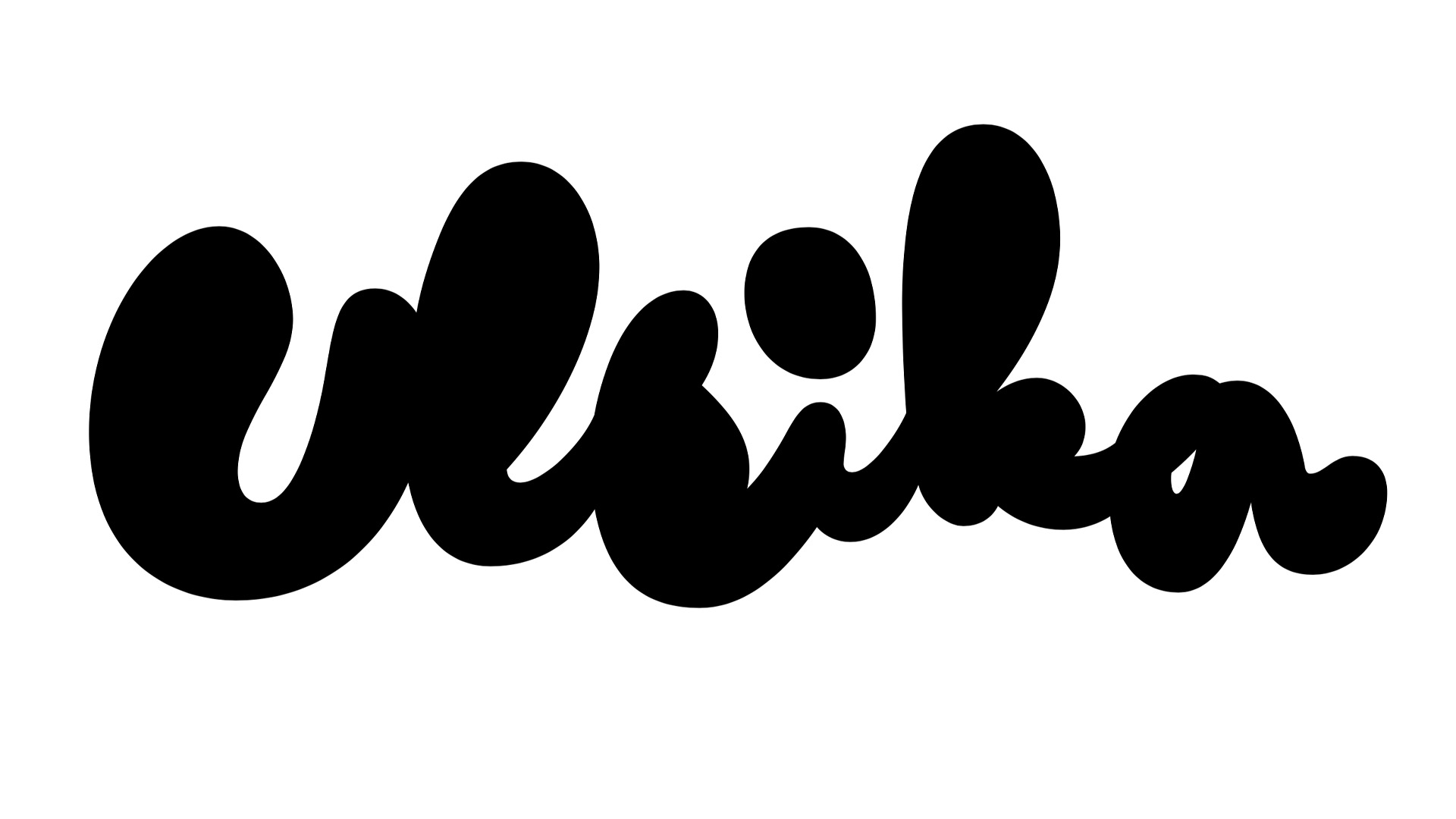
When Duncan/Channon created a new identity for Tahoe South, they asked us to make a new, vibrant wordmark. Tahoe South presents the south shore of Lake Tahoe. This large lake and its surroundings in the Sierra Nevada (USA) are a serious tourist magnet. A couple of different cities across several states are now represented by 1 name, 1 look, 1 logotype.
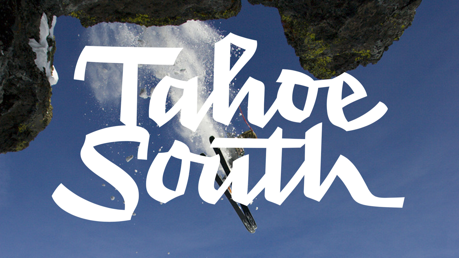
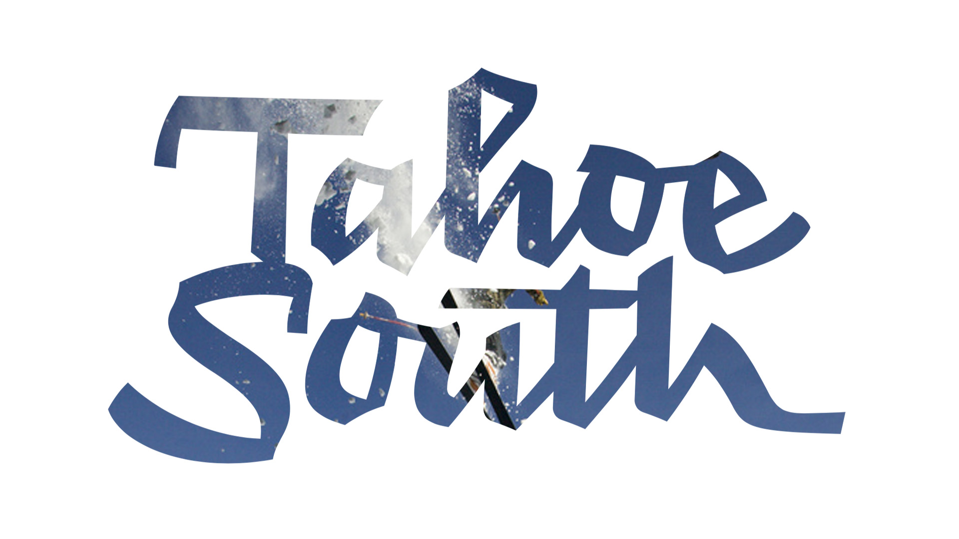
We've drawn them a fun and spirited logotype, which serves as a steppingstone throughout all their manifestations. Young at heart it is.
When Duncan/Channon created a new identity for Tahoe South, they asked us to make a new, vibrant wordmark. Tahoe South presents the south shore of Lake Tahoe. This large lake and its surroundings in the Sierra Nevada (USA) are a serious tourist magnet. A couple of different cities across several states are now represented by 1 name, 1 look, 1 logotype.
We've drawn them a fun and spirited logotype, which serves as a steppingstone throughout all their manifestations. Young at heart it is.