12.2021
Dynamification of typography
Dynamification of typography
Dynamification of typography (12.2021)
05.2021
KONE custom fonts
KONE custom fonts
KONE custom fonts (05.2021)

10.2020
Grammatography
Grammatography
Grammatography (10.2020)
Higher Order Interpolation (04.2018)
06.2017
Subpixel ASCII+ Art
Subpixel ASCII+ Art
Subpixel ASCII+ Art (06.2017)
12.2015
Everything is black and white
Everything is black and white
Everything is black and white (12.2015)
03.2015
Webtypografie klinkt goed, maar ziet er niet uit
Webtypografie klinkt goed, maar ziet er niet uit
Webtypografie klinkt goed, maar ziet er niet uit (03.2015)
11.2014
Notes on Latin Plus
Notes on Latin Plus
Notes on Latin Plus (11.2014)
03.2010
Randomness versus Cleverness
Randomness versus Cleverness
Randomness versus Cleverness (03.2010)
01.2009
New logotype for MyFonts
New logotype for MyFonts
New logotype for MyFonts (01.2009)
12.2007
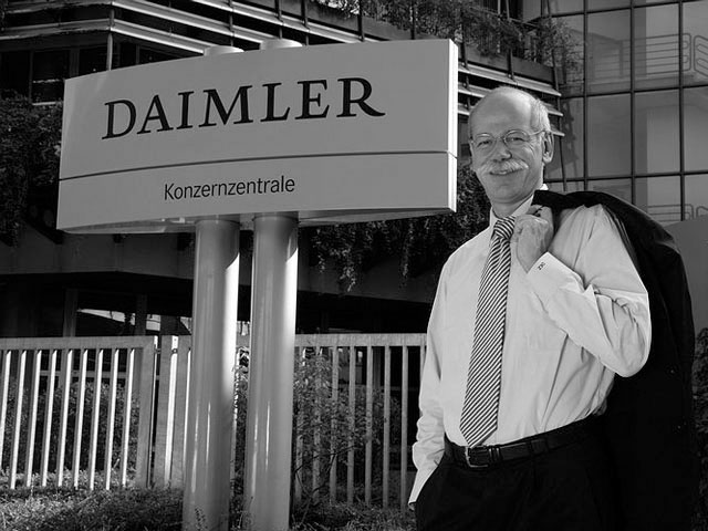
New logotype for Daimler
New logotype for Daimler
New logotype for Daimler (12.2007)

05.2007
Customized fonts for European banks
Customized fonts for European banks
Customized fonts for European banks (05.2007)
Case study: Higher Order Interpolation for Variable Fonts
The basic principles of more advanced interpolation in variable fonts, explained without the complicated math.
Underware — April 2018
Published under CC BY-NC-ND license
“A straight line is a dead line”
– Jan Vermeulen (1923–1985)
1. 21st century typographic problem
Lines are the foundation of type design. Not only of the outlines, but also of the correlation of weights within a family for example. In that sense one could say that a typeface is a collection of lines.
There are two kinds of lines: straight lines and curved lines. A typeface can contain both. A letter can have beautiful curves, – sometimes even full of inflections – but it can also have firm, straight lines.
This hasn’t always been the case, in the past there have been situations where only straight-lined typefaces could be created. Typefaces without any curved lines are still created today, but mostly for aesthetic reasons. However, straight-lined typefaces have a long history, quite often born out of technical limitations. One of the problems in the early days of digital type design was how to turn a straight line into curve.
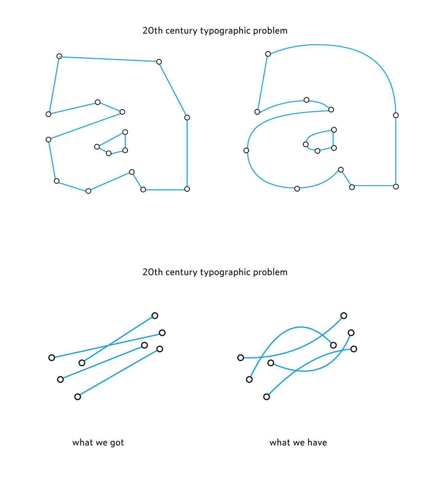
Now some 50 years later, we are faced again by the same problem due to variable fonts. The most primitive techniques demanded straight-lined typefaces. These limitations have disappeared meanwhile for outlines, but not for interpolating those fancy outlines. That’s rather strange, because what’s the difference between a line which is used to display a letter and a line which is used to interpolate those letters?
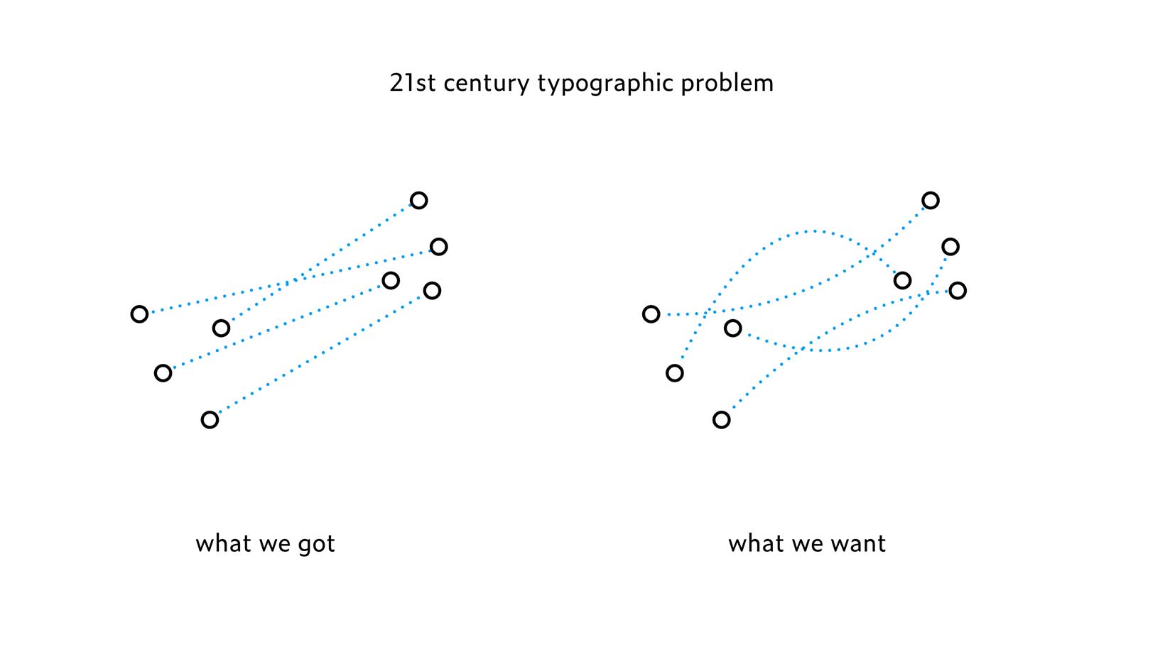
We came across the limitations of current interpolating techniques while creating the SuperFont™ in 2017, a variable font which contains all fonts ever made, as well as all fonts which will be ever made. While making the SuperFont™, a typeface as a library of Babel, we found out about HOI (Higher Order Interpolation).
PostScript fonts are defined by the connections between the points on an outline. Variable fonts are defined by the connections between the points of different outlines. Although this description gives the impression they are almost identical, the first can have fancy, curved lines, while the latter currently only consists of primitive, straight lines. With Jan Vermeulen’s motto in mind – “A straight line is a dead line” – one could say that an interpolation is currently a dead interpolation.
Interpolating has become more important since the introduction of the variable font format in 2016, because variable fonts are above all defined by the correlations between the points of an outline. Therefore it makes sense to re-evaluate the current interpolation technique. Should interpolation always happen along a linear line in a technology which got rid of straight lines already more than 30 years ago? Why can’t two outlines be interpolated following a curved lines? Or following another, more complex path full of inflections? Can we apply non-linear interpolation to variable fonts?
2. Béziers curves
First we need to understand the principles of curves in digital font technology. TrueType and PostScript are the outlines which are in use today. While most type designers draw fonts digitally with PostScript outlines, we first gonna have a look at the TrueType outlines. Or better said: a quadratic curve. It’s easier to understand the principle of digital curve techniques by starting with a quadratic curve, because it only uses 2 oncurve points, plus 1 offcurve point (which is also known as a control point).
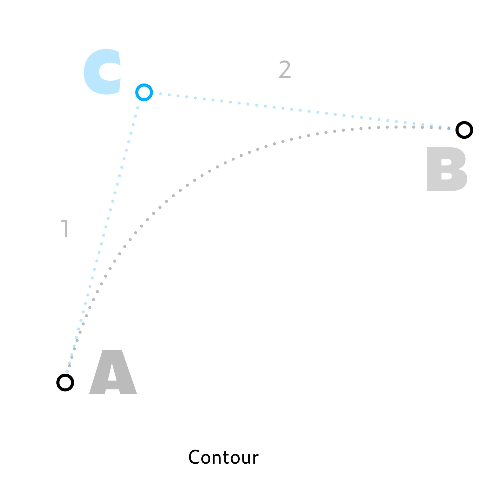
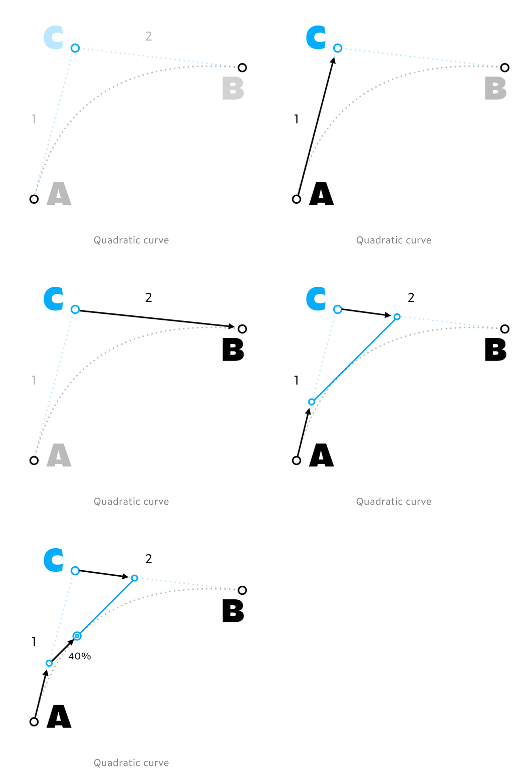
The math behind the desired curve AB is pretty straightforward. First of all there is the offcurve, control point C, creating the lines AC and CB. Then a new, travelling line is drawn between AC and CB. One side of this new line is at x % on AC, the other end of this line is on the same percentage at CB. The point which is then at the same percentage of this new line, is exactly on the desired curve AB. Let’s take for example 40% as a percentage. The beginning of the new, travelling line is at 40% on AC, the end of the travelling line is at 40% of CB. The point which is on 40% of this travelling line is then exactly on the desired curve AB. Instead of 40%, you can also take any other percentage. If you would have drawn this with every possible percentage, you would have drawn the desired curve AB.
Now let’s move one step further in Bézier outlines: PostScript outlines work almost the same as TrueType outlines, but just one order higher. If TrueType outlines are of the 2nd order, then PostScript outlines belong to the 3rd order. PostScript outlines, or better said cubic Bézier curves don’t have 3, but 4 points to create a curve. Next to the same 2 oncurve points – which any curve requires – cubic outlines have 2 offcurve points instead of 1 (like TrueType). The path from A to B now works slightly different.
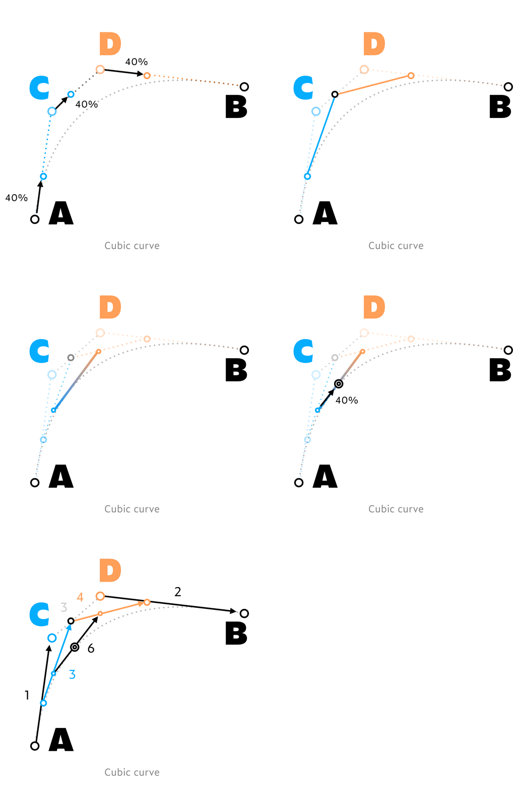
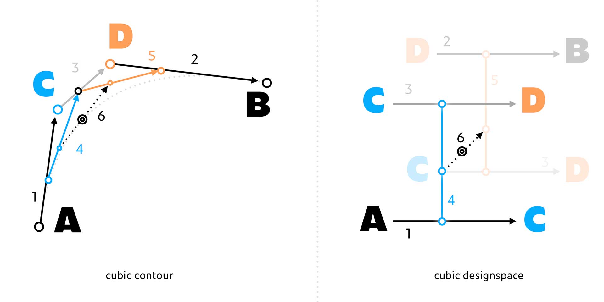
With cubic curves a travelling line is drawn between AC and CD. Another travelling line is drawn between CD and DB. Another, third, travelling line is then drawn in between the first two travelling lines. This construction is almost identical to quadratic Bézier curves, just one extra step, one order higher.
This is in very short the principle of the Bézier curves currently used in digital fonts. Much more detailed and accurate information about this subject can be found elsewhere, we’re not aiming to explain Bézier curves in detail here. This is just enough to understand the principles of the following steps.
Higher Order Bézier curves
Until here nothing is new, this is old news, and already implemented in early digital font technology many decades ago. In this perspective you could say that a straight line only has a beginning and an end point, without any offurve, or control point (1st order). If you go one order higher than that straight line, you get a TrueType outline, a quadratic curve. It still has the same 2 oncurve points, but now has 1 offcurve, control point too (2nd order Bézier curve). If you go one order higher again from there, you end up with a PostScript outline, a cubic curve with 2 offcurve control points (3rd order Bézier curve). But it’s easy to imagine that you can also go another order higher, and make an outline which is build up using 3 offcurve control points (4th order Bézier curve). And why not going another order higher, using 4 control points for a curve (5th order)? Or 5 control points? Or 6? Etc. You can go one order higher all the time, and easily create Higher Order Bezier curves this way. The curves could become more complex, full of inflections.
Here is an example comparing 1st to 15th order Bézier curves:
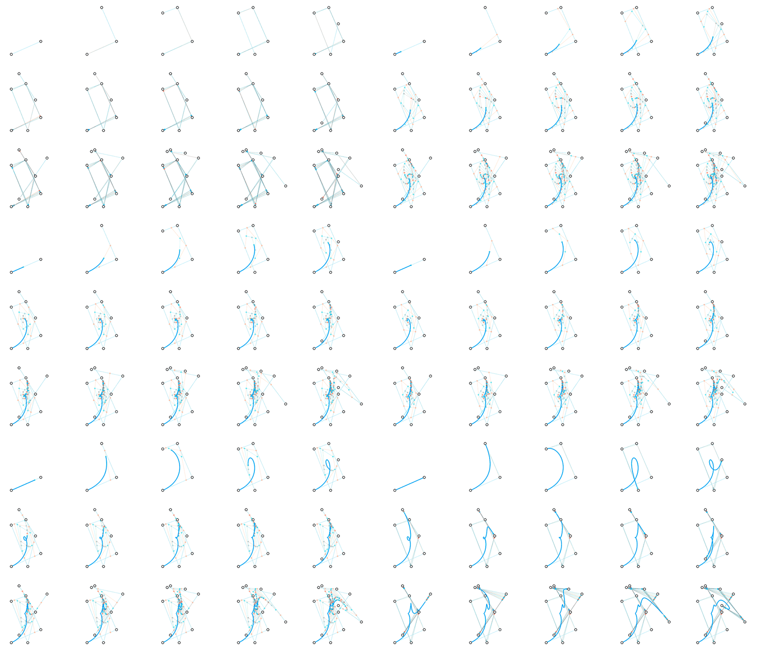
The 15th order is not end of course for making higher order curves. Theoretically there is no limit. Here is an example of a 100th order Bézier curve. Chances might be very small you’ll ever need this, it’s just to show the concept of higher order Bézier curves:
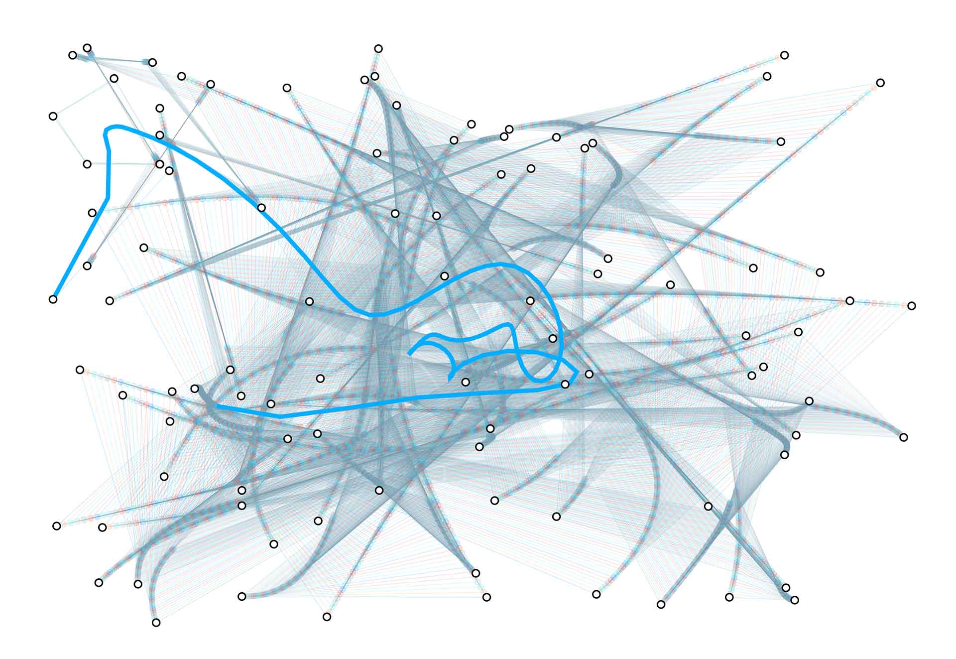
Note that also this ultra-inflected line is still just one single curve, only going from A to B, only having two oncurve points. All the other points are offcurve, control points.
3. From outlines to interpolation
Now this is all cool of course, but we’re not here for outlines. We came for interpolation. Especially something else than the linear interpolation we use today. Can the same principle of Higher Order Béziers also be used to create Higher Order Interpolation? The answer is: yes, of course. Let’s start simple with a 2nd order interpolation.
Gemowespace
Non-linear interpolation can be achieved by creating another kind of designspace. A similar predefined curved line as which is used to describe outlines, could also be used for interpolation. Current interpolation techniques always go straight from A to B, following a straight line (1st order). However, that shouldn’t be the only option, there are occasions where this linear interpolation isn’t sufficient. Luckily you can also make a non-linear interpolation, following a precisely predefined curve. With the quadratic principle in mind, you could interpolate from A to C, and simultaneously from C to B (2nd order). In a 2-dimensional design space this would create the following gemowespace: A (0, 0) to C (1, 0), as well as again C (1, 0) to B (1, 1). Note that C is used twice within this 2-dimensional designspace.
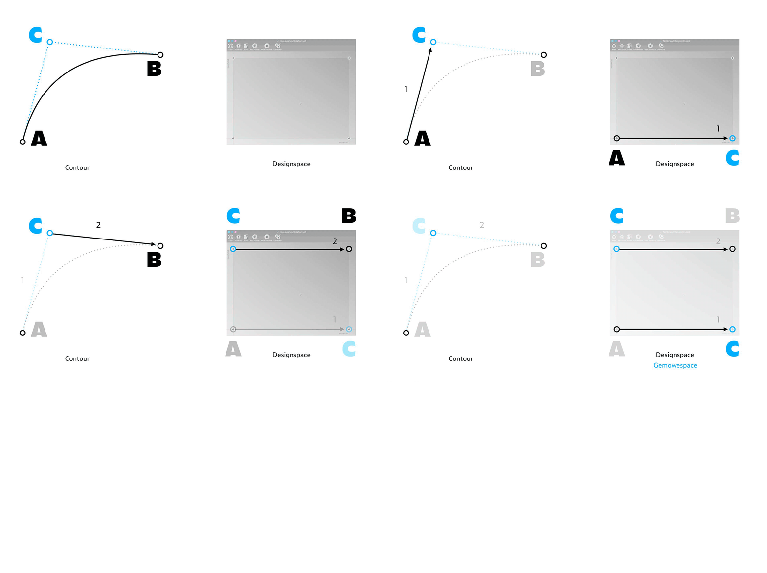
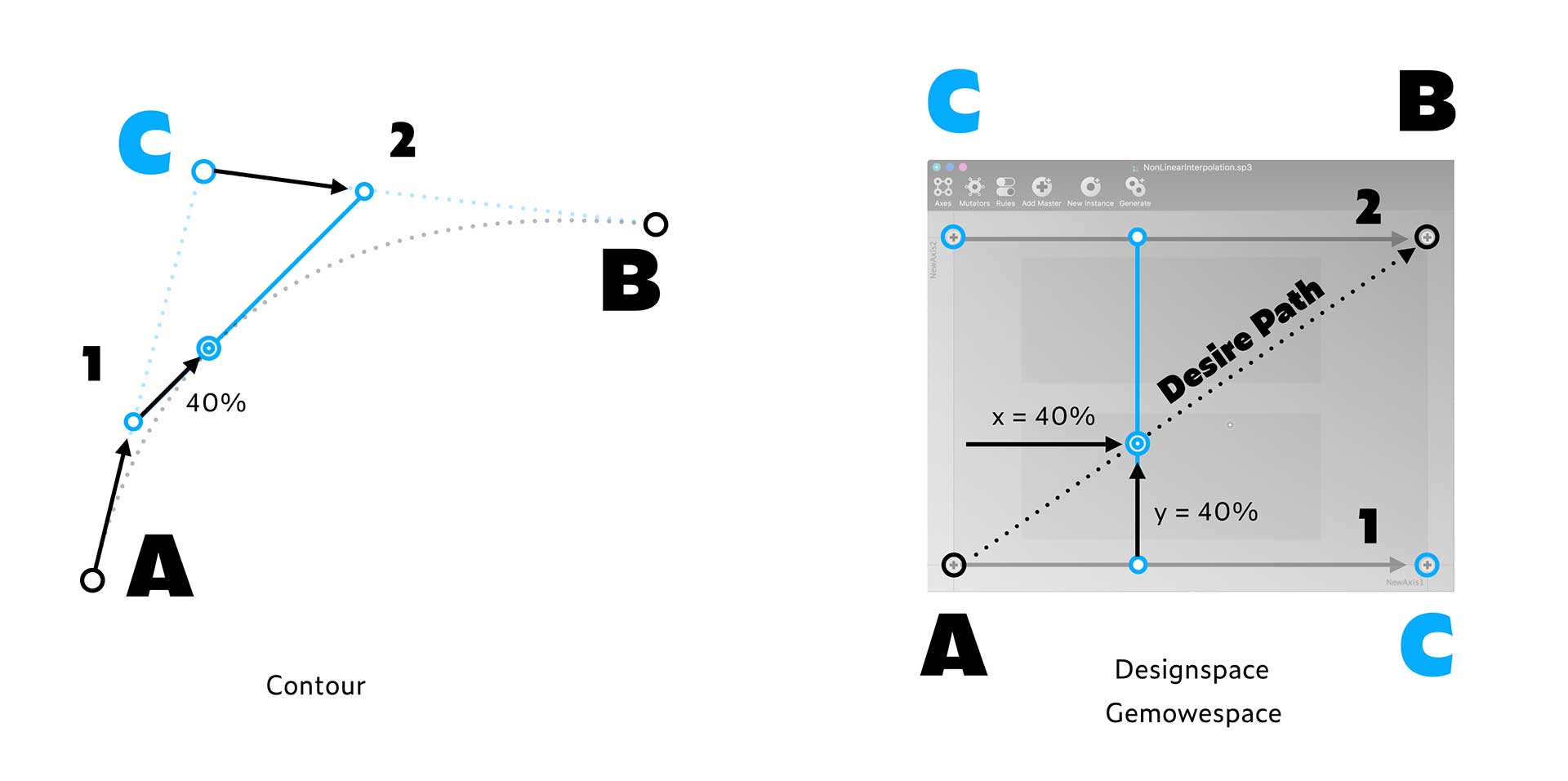
The principle of the gemowespace is simple. The desire path goes from A to B. However, this is achieved in 2 steps, by simultaneously moving on the x-axis & y-axis in this designspace. For example: The position on the horizontal x-axis could be moving 40% on AC, and – because it’s on the same axis, so therefore this also means – moving 40% on CB. At the same moment the position is also 40% on the vertical y-axis. This vertical position is comparable to the travelling line in a quadratic Bézier curve.
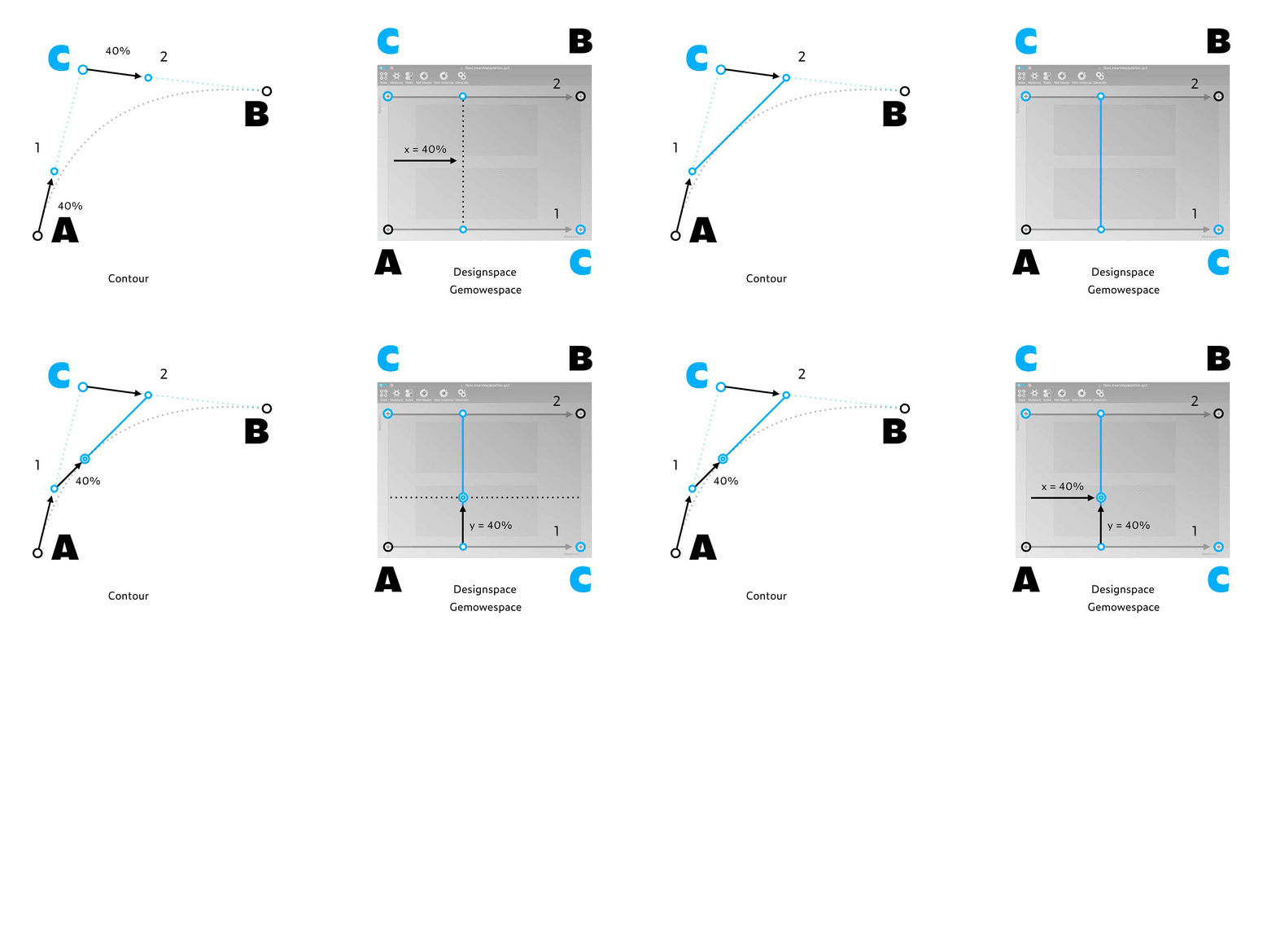
Again, if you draw this graph for every possible percentage, you end up with the desire path AB, a straight line in this gemowespace. But as we now know, the principle of this calculation is identical to that of a quadratic Bézier curve. This means that the straight line AB in this gemowespace, in practice is not a straight line, but a predefined curved line.
Note: The core principle of Higher Order Interpolation is to use the same source file multiple times. C is used twice in this example. While interpolating type designers use the word Master sometimes for two different things: a master in the designspace which is used for interpolation, as well as a source file (UFO) itself. But these are not necessarily the same thing. As we’ve just seen, a source (UFO) can be used multiple times within the same designspace for example. Maybe these different kind of masters should have two different words: a “design-master” and an “interpolation-master”? Or just “source” and “master”? Or “file” and “location”? If the outline within a source (UFO) changes, it means the design-master changes. But if the location of masters are changed within a designspace, then the interpolation-masters have changed, but the design-masters remained untouched. To avoid confusion, different words should be used to distinguish these different kind of masters. Suggestions for a proper terminology are welcome, for now we stick to masters (source files) and locations (interpolation masters in designspace).
Higher Order Interpolation
In the same way as a cubic outline is just one order higher than a quadratic outline, interpolation can also be achieved on a higher order. Let’s move the interpolation from quadratic – the 2nd order – to cubic – the 3rd order.
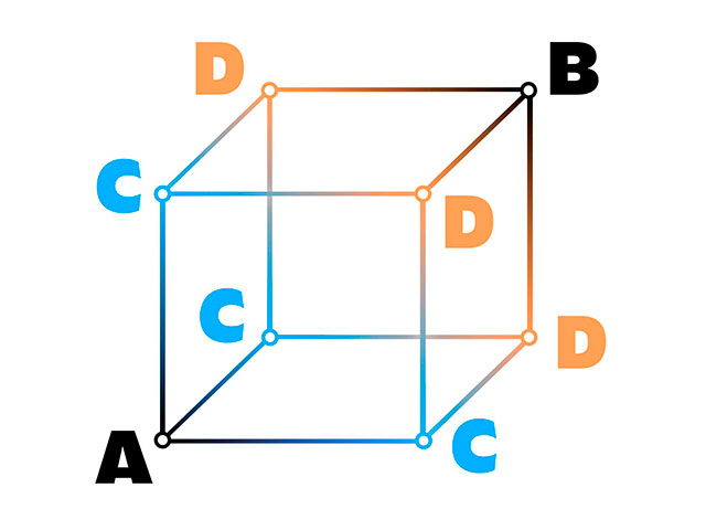
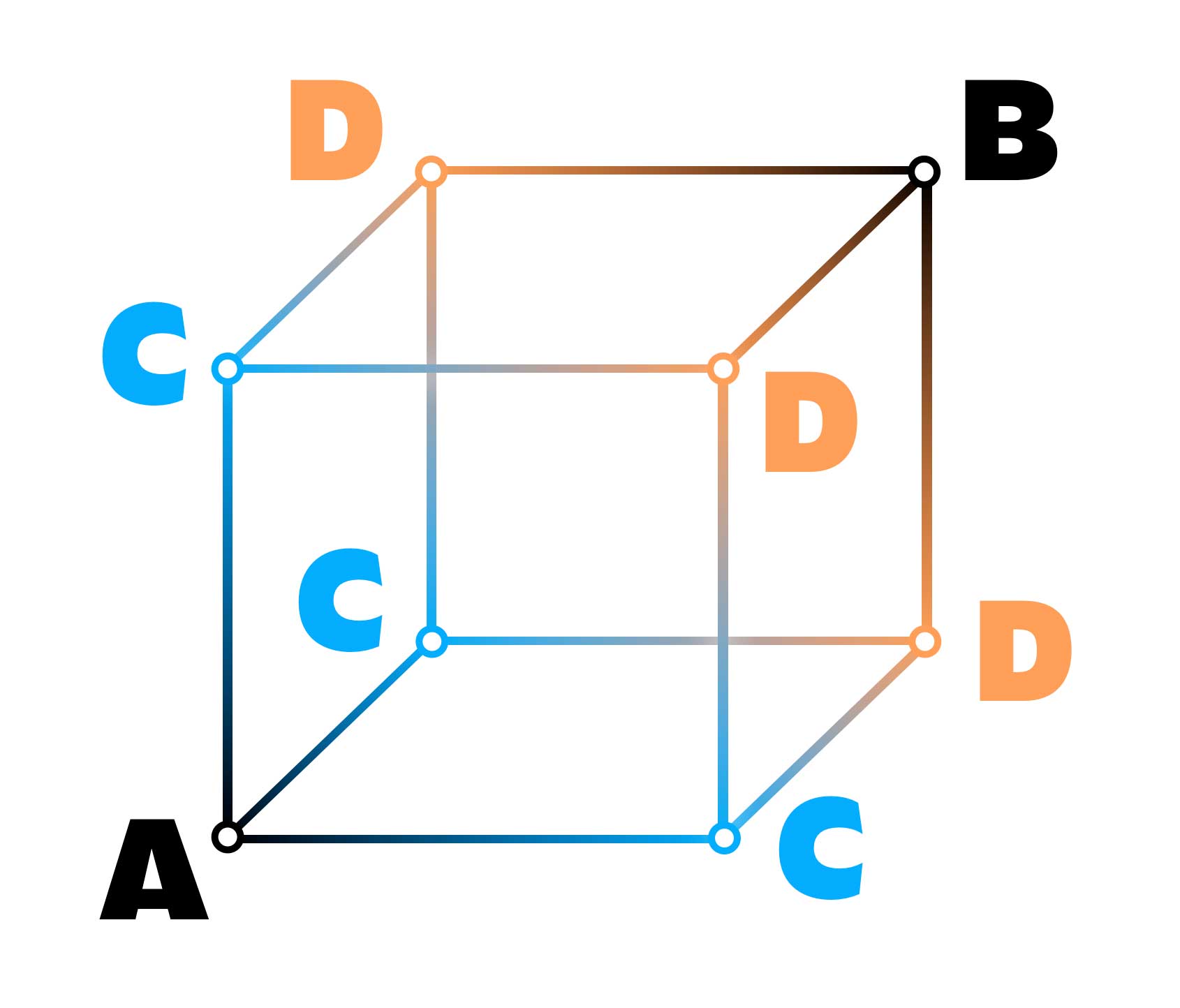
In that case the 2-dimensional designspace becomes a 3-dimensional designspace, a cube. The desire path still goes straight from A to B, but it uses C and D to arrive at B. This cube is using exactly the same principle as a cubic Bézier curve. Note that in this cube C is not twice, but three times included; at (1, 0, 0), at (0, 1, 0), and at (0, 0, 1). D is also 3 times included, and the final point, B, just once.
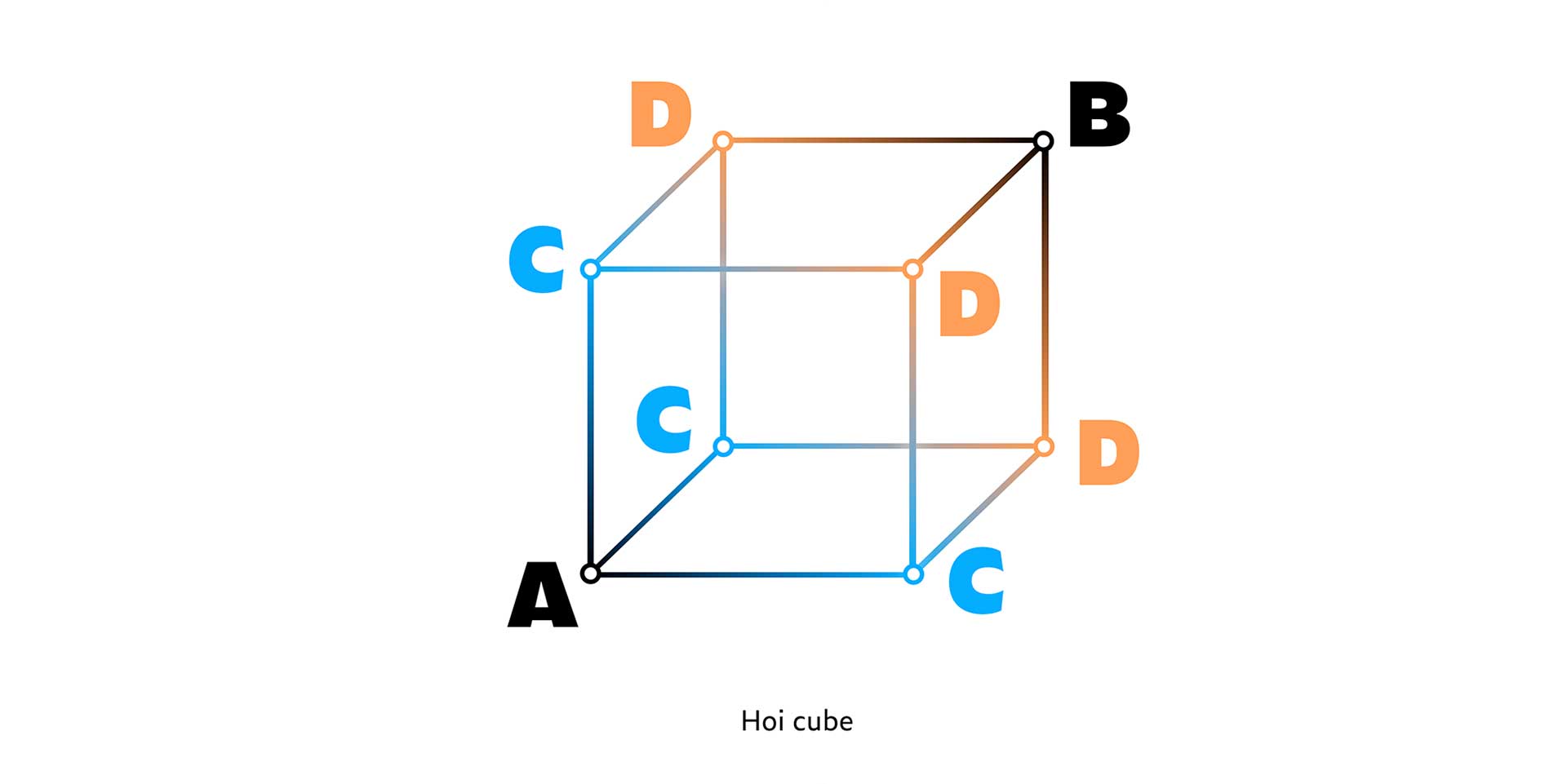
In exactly the same way the 4th order can also be achieved, just one order higher again. It would require that C is now included 4 times, instead of 3 times. C would now be located at (0, 0, 0, 1), at (0, 0, 1, 0), at (0, 1, 0 , 0), as well as at (1, 0, 0 ,0). Visualising that 4th order designspace is challenging in a 2-dimensional image, it could be a cube within a cube for example. Just following the logic of Higher Order Béziers is maybe a much easier way to imagine what happens on a higher order level of interpolation.
All corner points listed for each order:
1st order = A B
2nd order = A C C B
3rd order = A C C C D D D B
4th order = A C C C C D D D D D D E E E E B
Etc.2nd order = A C C B
3rd order = A C C C D D D B
4th order = A C C C C D D D D D D E E E E B
The same, but written differently:
1st order = 1, 1
2nd order = 1, 2, 1
3rd order = 1, 3, 3, 1
4th order = 1, 4, 6, 4, 1
Etc.2nd order = 1, 2, 1
3rd order = 1, 3, 3, 1
4th order = 1, 4, 6, 4, 1
And that’s just exactly Pascal’s triangle:
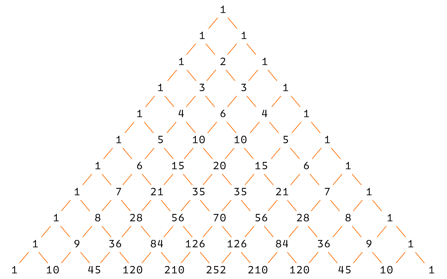
Here is an overview of the amount of locations & the amount of masters included in different orders of interpolation:
HOI 0 > 1 locations in designspace > 1 master
HOI 1 > 2 locations in designspace > 2 masters
HOI 2 > 4 locations in designspace > 3 masters
HOI 3 > 8 locations in designspace > 4 masters
HOI 4 > 16 locations in designspace > 5 masters
HOI 5 > 32 locations in designspace > 6 masters
HOI 6 > 64 locations in designspace > 7 masters
HOI 7 > 128 locations in designspace > 8 masters
HOI 8 > 256 locations in designspace > 9 masters
HOI 9 > 512 locations in designspace > 10 masters
HOI 10 > 1024 locations in designspace > 11 masters
Etc.
So the amount of locations in the designspace is 2 raised to the HOI-order power.
In a 2-dimensional designspace it’s clearly visible that the interpolation is “parallel”. AC is parallel to CB: [A C] == [C B]. Therefore this designspace is a gemowespace. But every designspace for Higher Order Interpolation is parallel. Also a 3-dimensional designspace has parallel interpolation: [ [A C] == [C D] ] == [ [C D] == [D B] ]. But also a 4-dimensional designspace has parallel interpolation, although a bit more complicated to visualize. For any order of interpolation, the designspace is a gemowespace.
2-dimensional:
[A C] == [C B]
lines: AC is parallel with CB
3-dimensional:
[ [A C] == [C D] ] == [ [C D] == [D B] ]
lines: AC is parallel with CC, CD & DB
planes: AC/CD is parallel with CD/DB
4-dimensional:
[ [A C] == [C E] ] == [ [ [C D] == [D D] ] == [ [D D] == [D E] ] ] == [[C E] == [E B]]
lines: AC to CE, CE, ED, CD, DB
planes: AC/CD with CE/EB, CD/DD, DD/DE
cubes: AC/CE//CE/EB with CD/DD//DD/DE
Some results of Higher Order Interpolation
In case you wonder what HOI is good for: the results of Higher Order Interpolation can be radically different than those of traditional, linear interpolation. In this example traditional linear interpolation is compared to higher order interpolation with 2 masters:
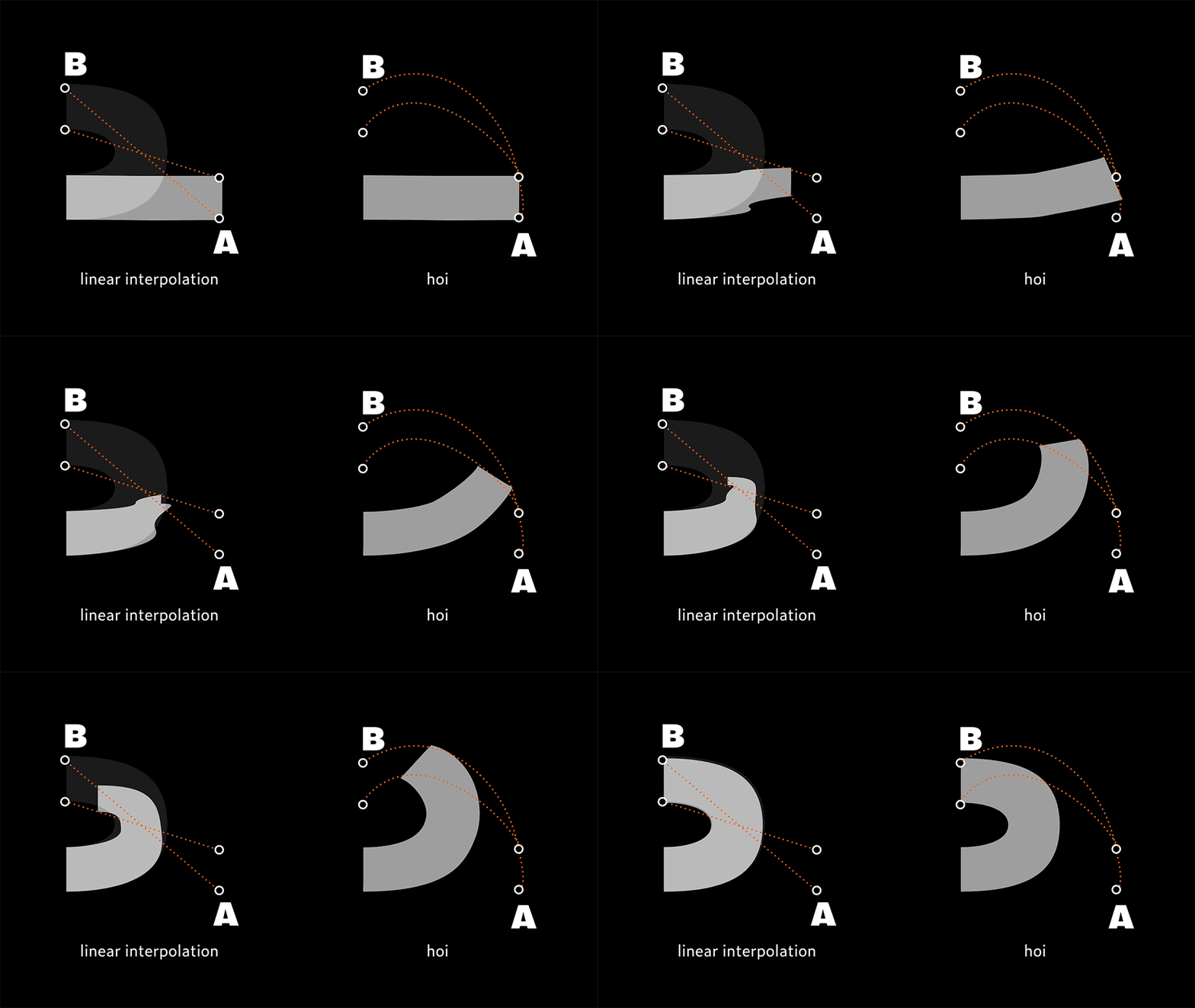
Or look at this example of a rectangle rotating within a circle. Normally dozens of masters would be required to simulate a more or less fluent rotation. With a Higher Order Interpolation only 4 masters are required, which saves a lot of time and a lot of data:
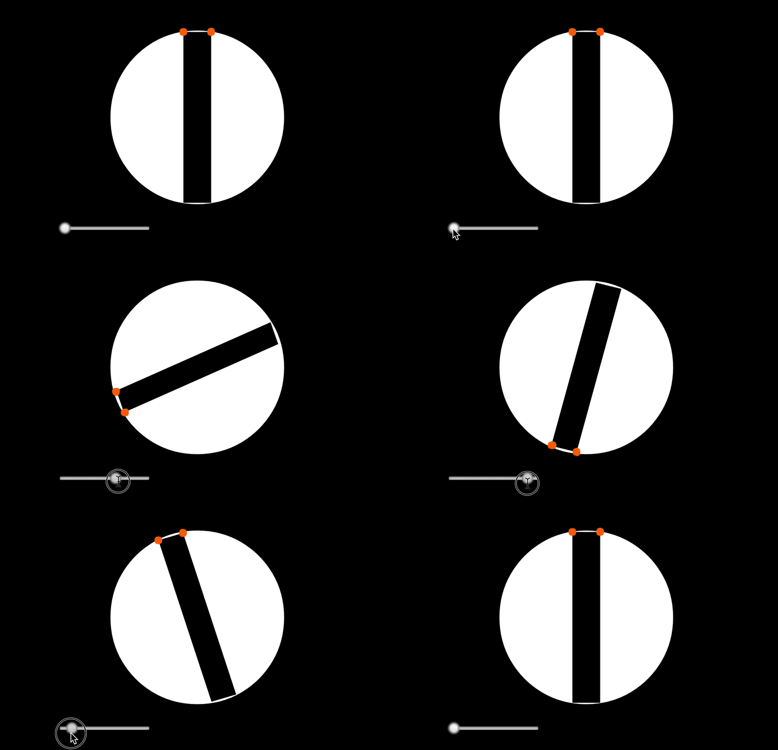
4. A future for Higher Order Interpolation?
Will there be a future for a Higher Order Interpolation? It’s hard to predict the exact consequences of Higher Order Interpolation for type design. However, a couple of possible outcomes are easy to foresee. But likely HOI can also have other consequences. You know, the unknown knowns.
HOI could already be very welcome for creating animated fonts in a much more advanced way. Variable fonts with a time axis could function as shown in the example above, “bending” outlines around a curve instead of crudely just shifting the points of the outlines. This would not only reduce the amount of required masters on a time axis, but also lead to much more fluent transitions. Those crude stop-motion animations can now play smoothly in slow-motion for example.
HOI could also change or influence the type design process. Until today type designers have always been drawing outlines of static fonts while designing type families. But while designing variable fonts the designer isn’t drawing outlines any longer. Instead, the interpolation curves are actually being designed, the outlines of a static font are just a result from this. This requires a different mindset and approach to the type design process. Currently a variable font could contain a Light weight for example. The related Black weight would be included in the font format as deltas, as a reference from the Light weight. So actually such a variable font doesn’t contain the Light and the Black weight, but only the Light weight plus directions where to go from there. Those directions are currently always linear directions. HOI allows those directions to be something else than linear directions. With Higher Order Interpolation variable fonts can be designed in a different way. Imagine a Light weight plus directions where to go which are non-linear. That could lead to spectacularly different other styles, with very different mutual relations. Probably it requires type design tools to implement Higher Order Interpolation before type designers can make it an essential part of their design process. But from that moment on type designers can start designing correlations between letters, instead of designing the outlines of letters.
