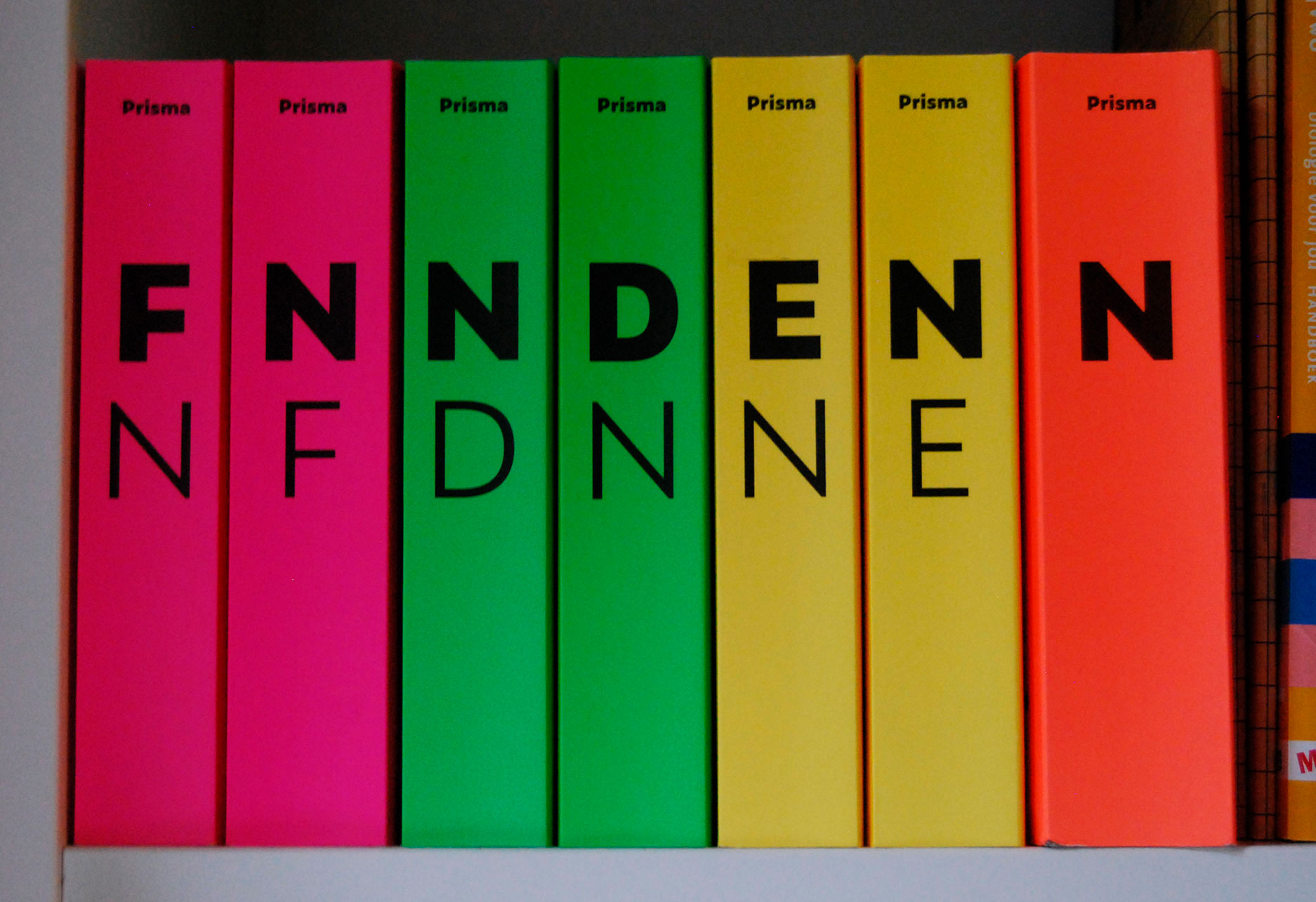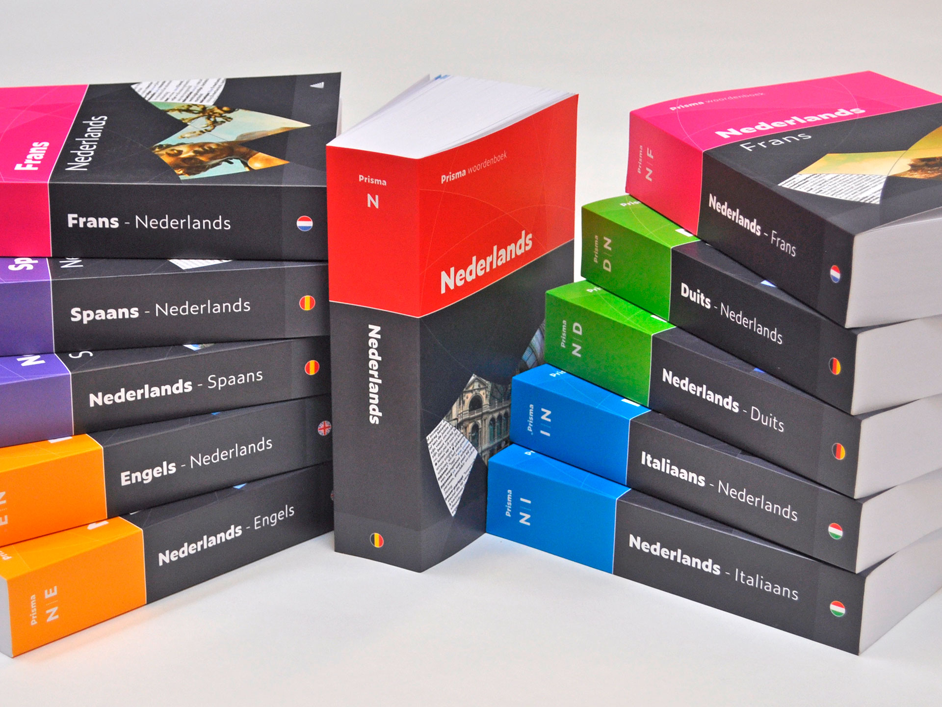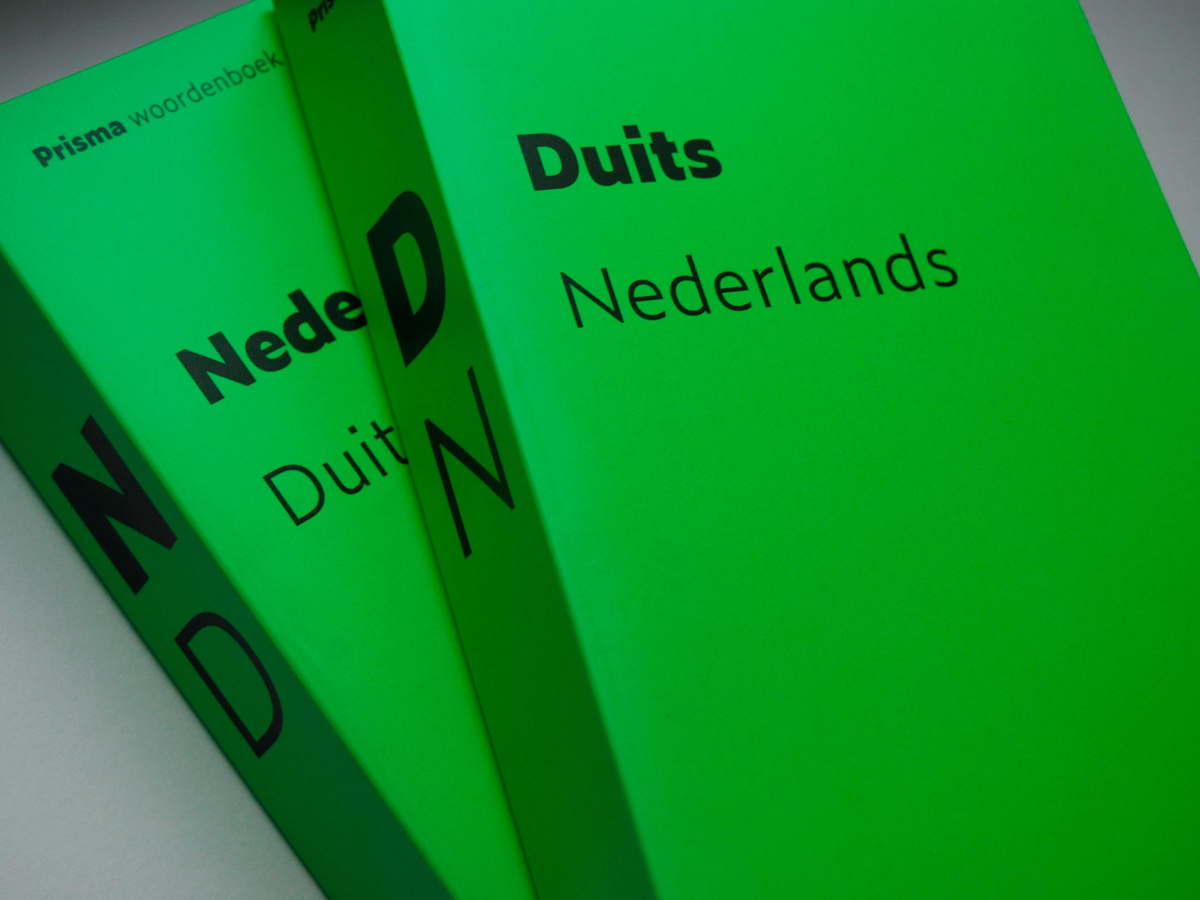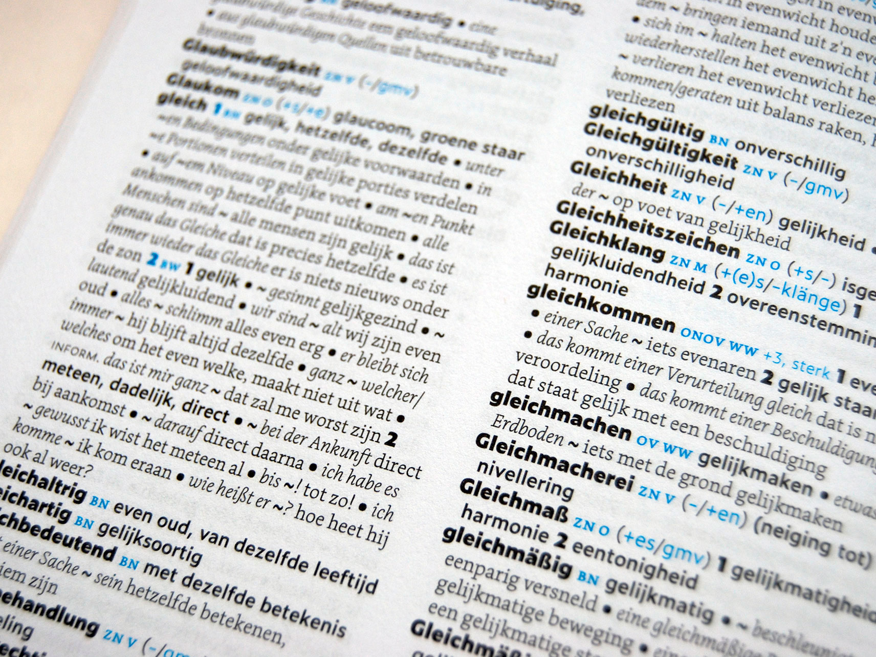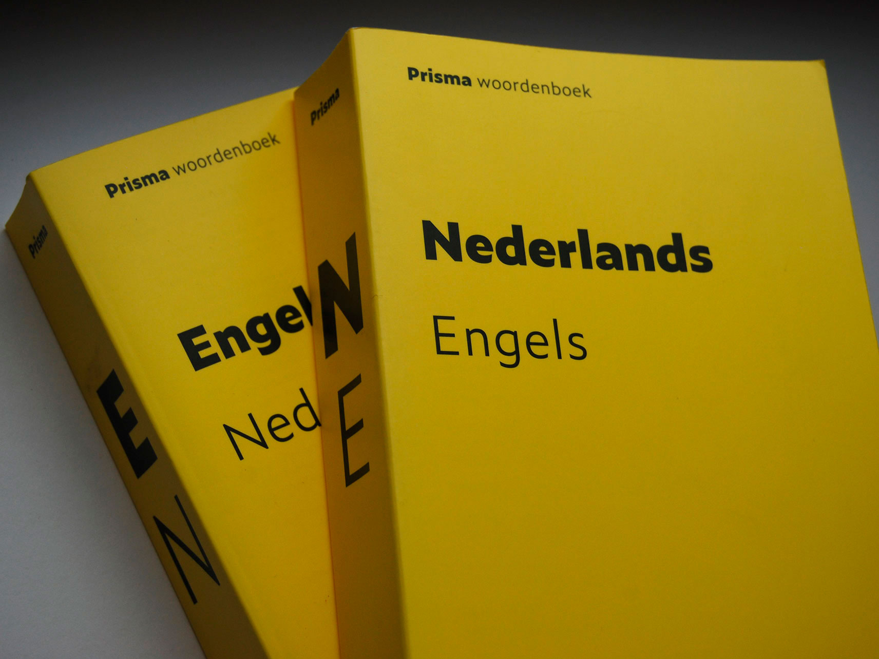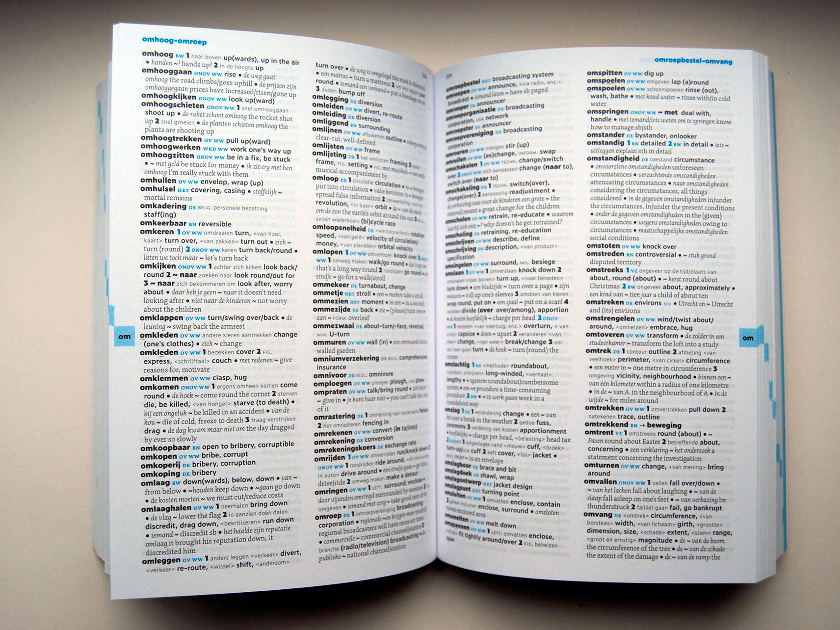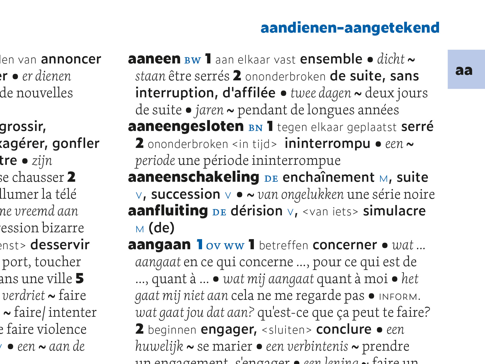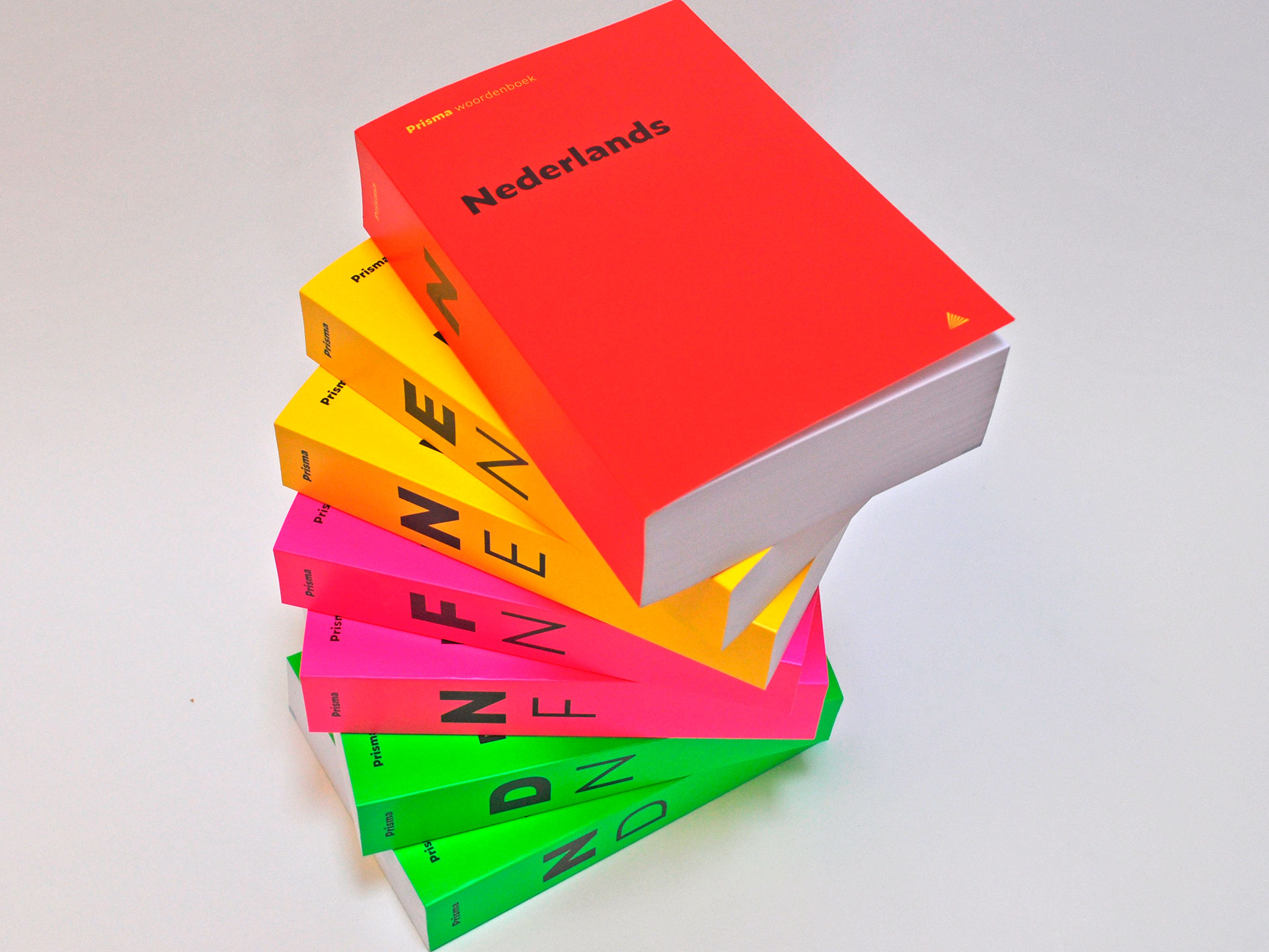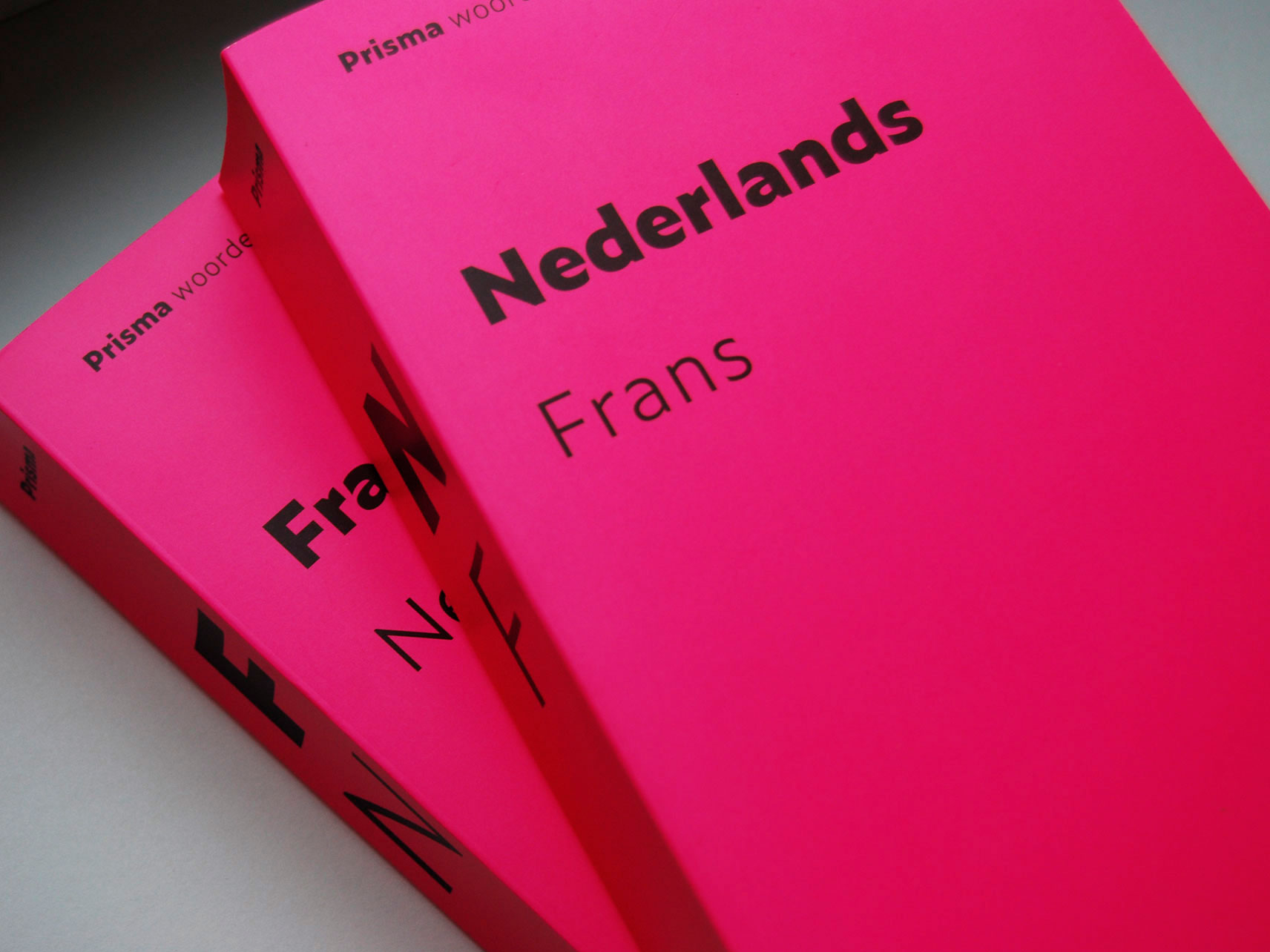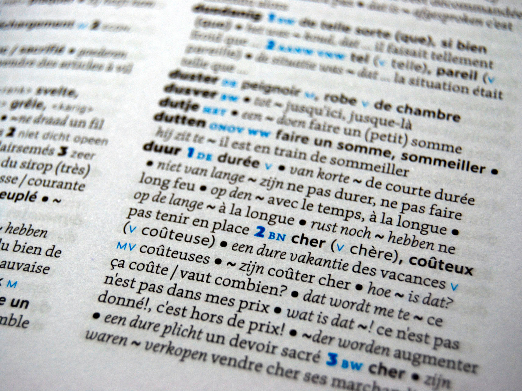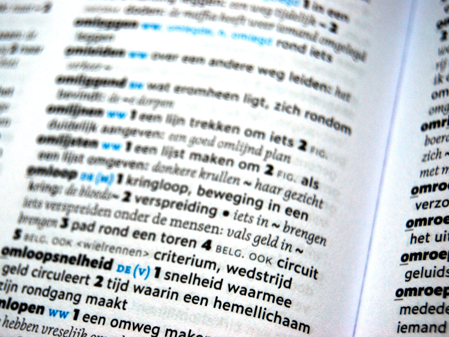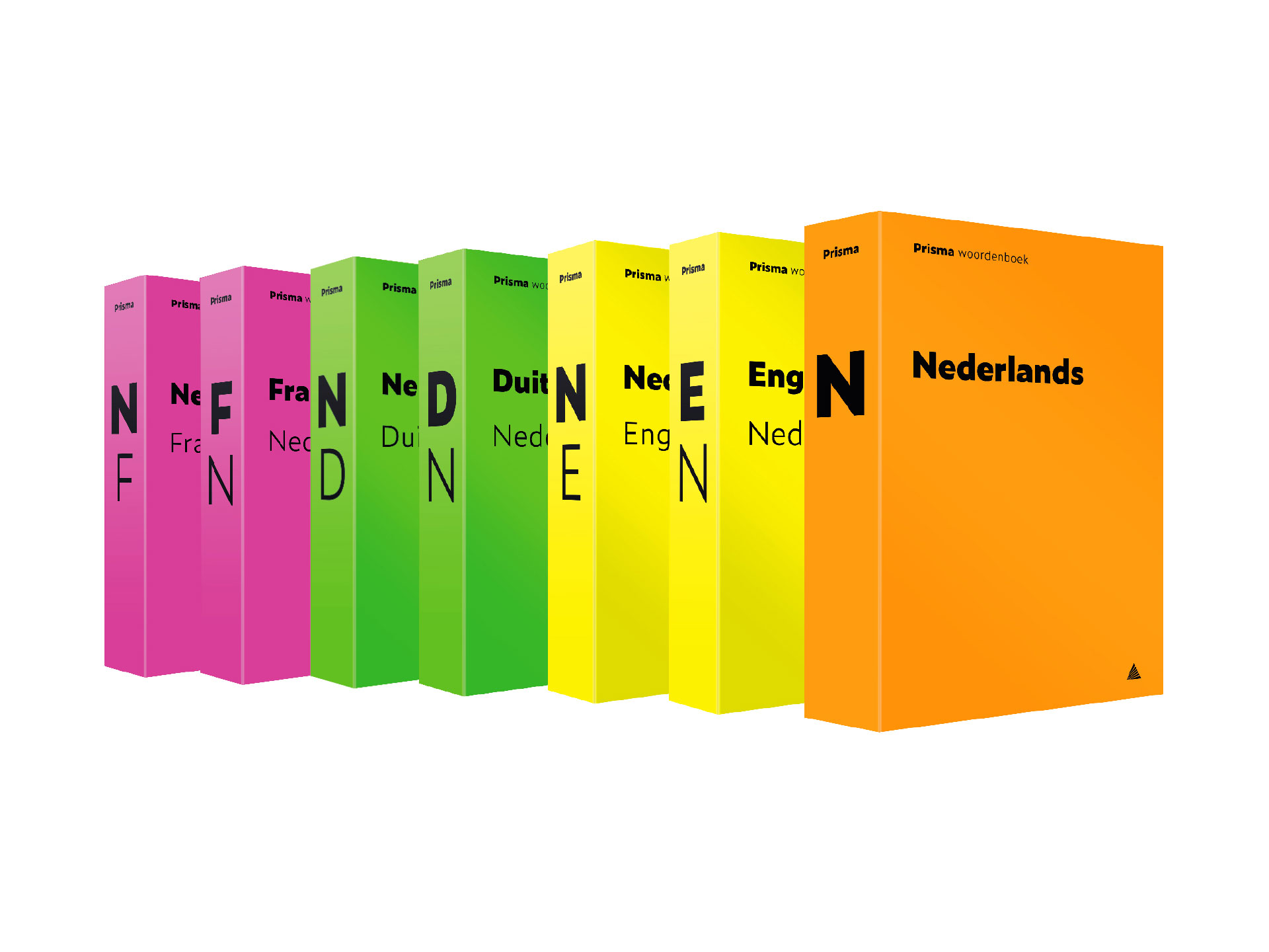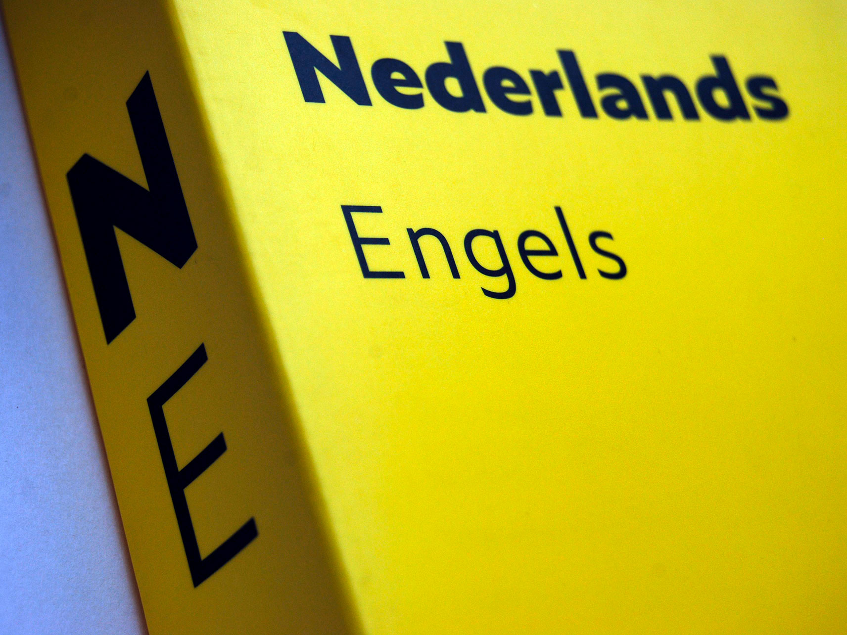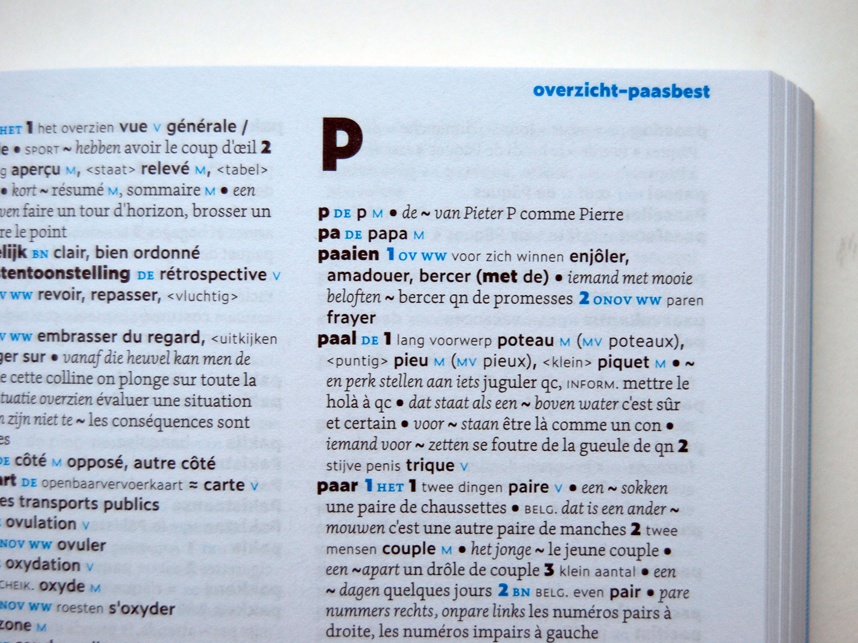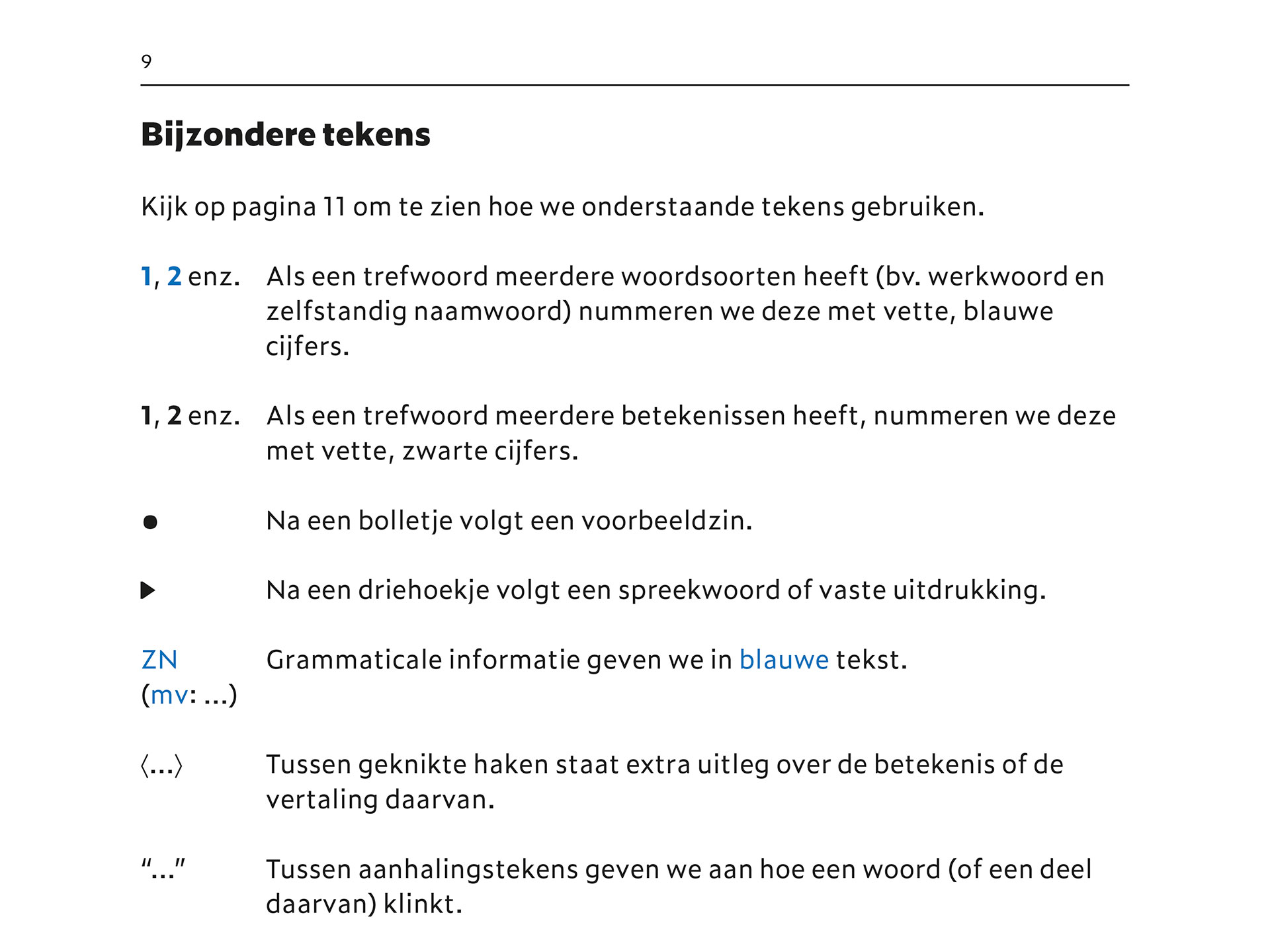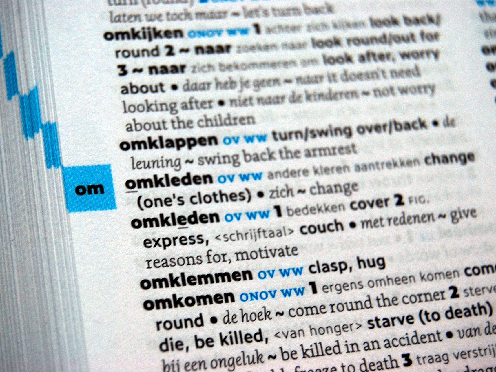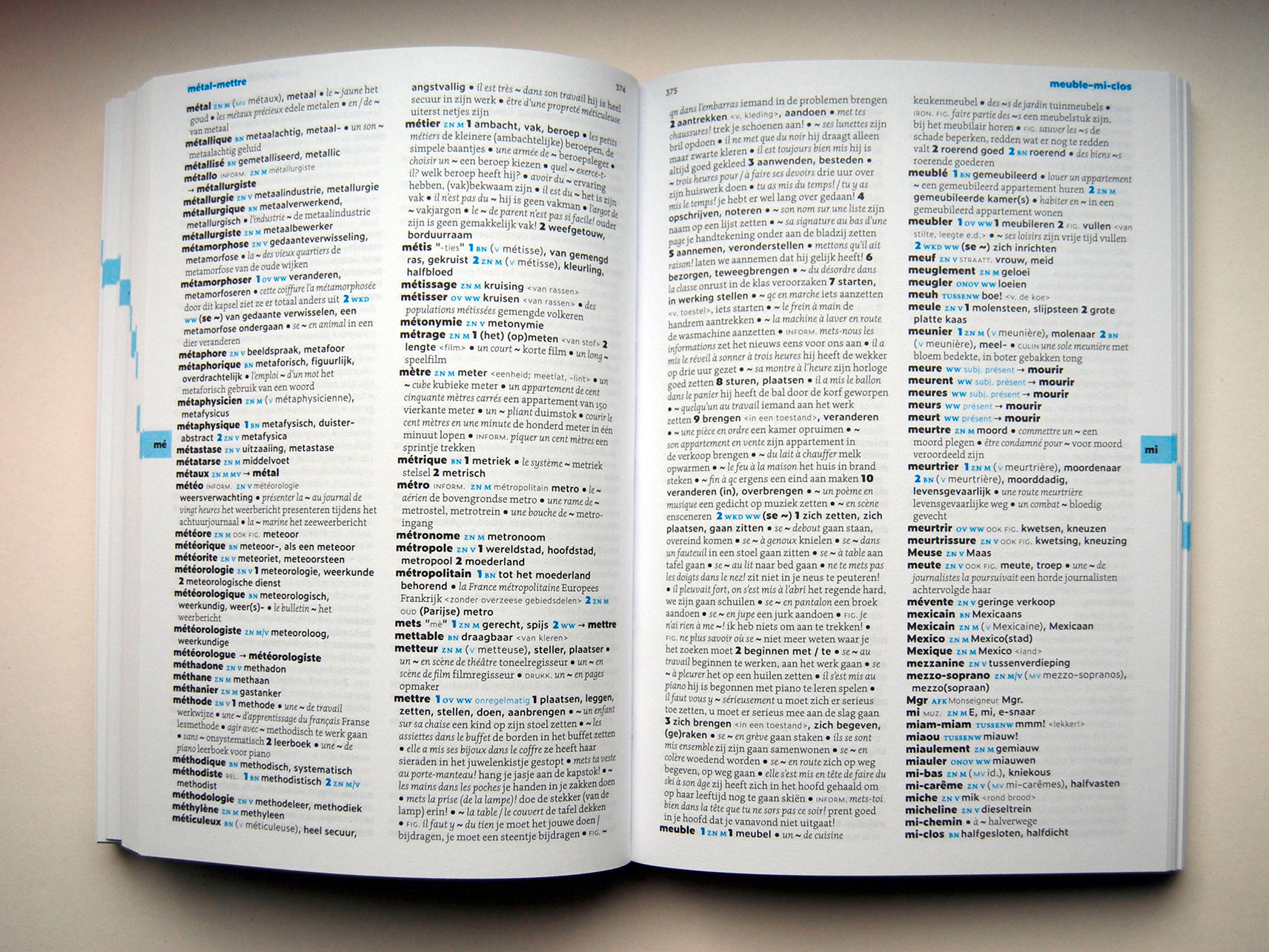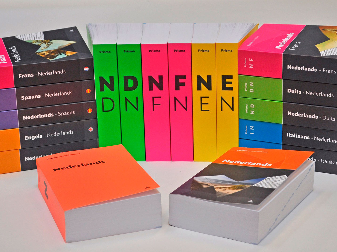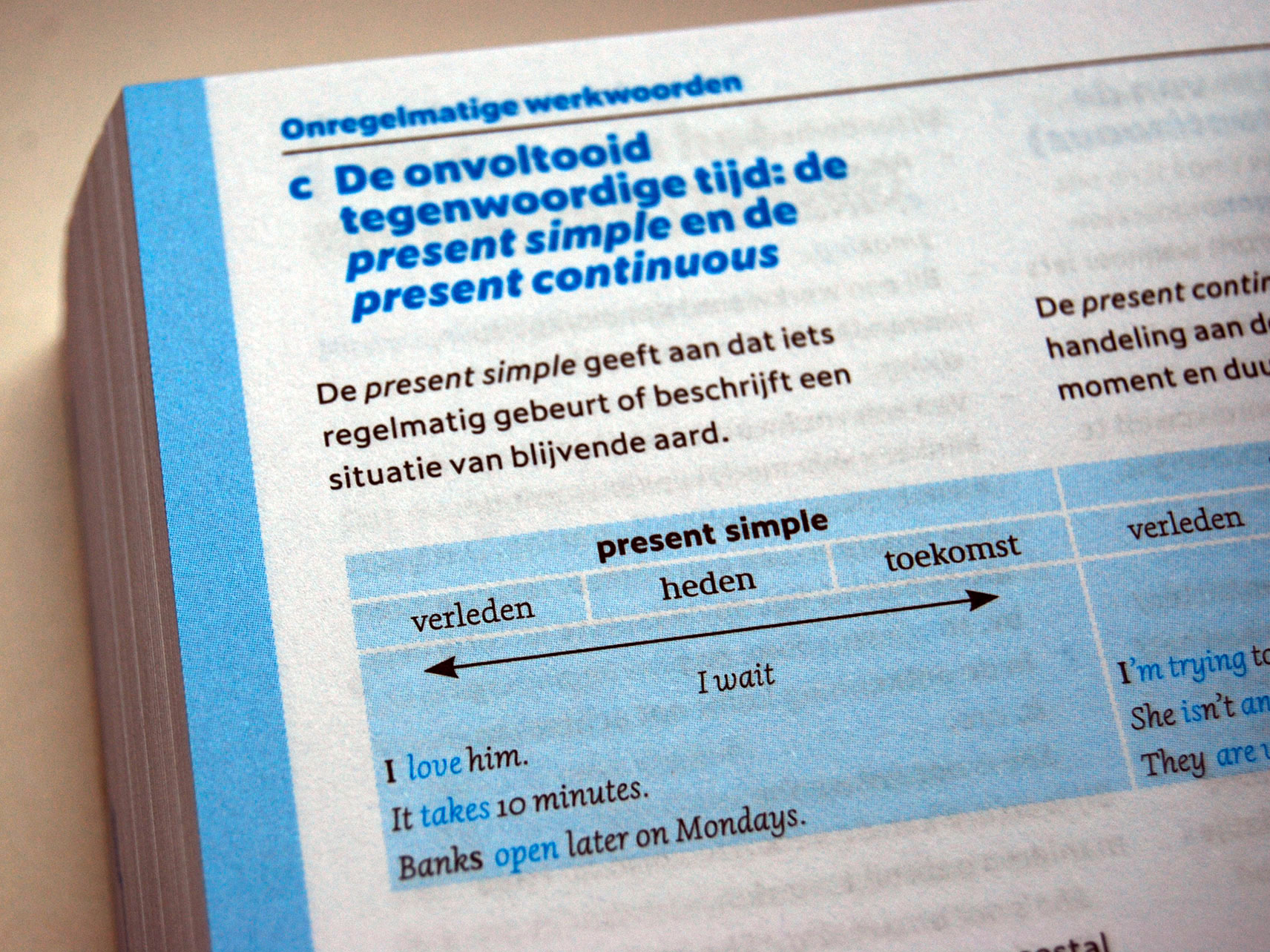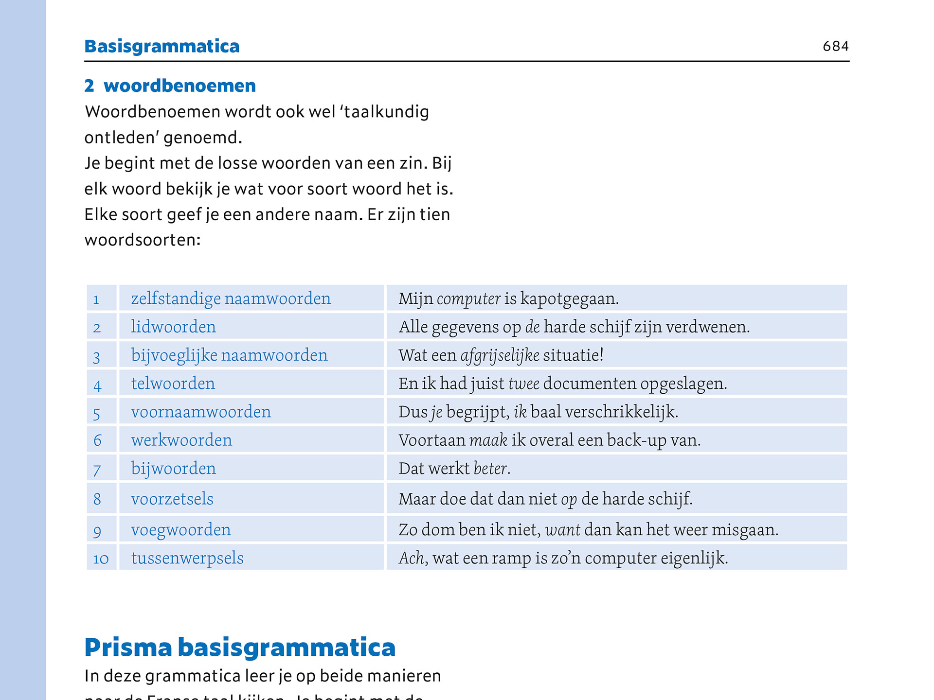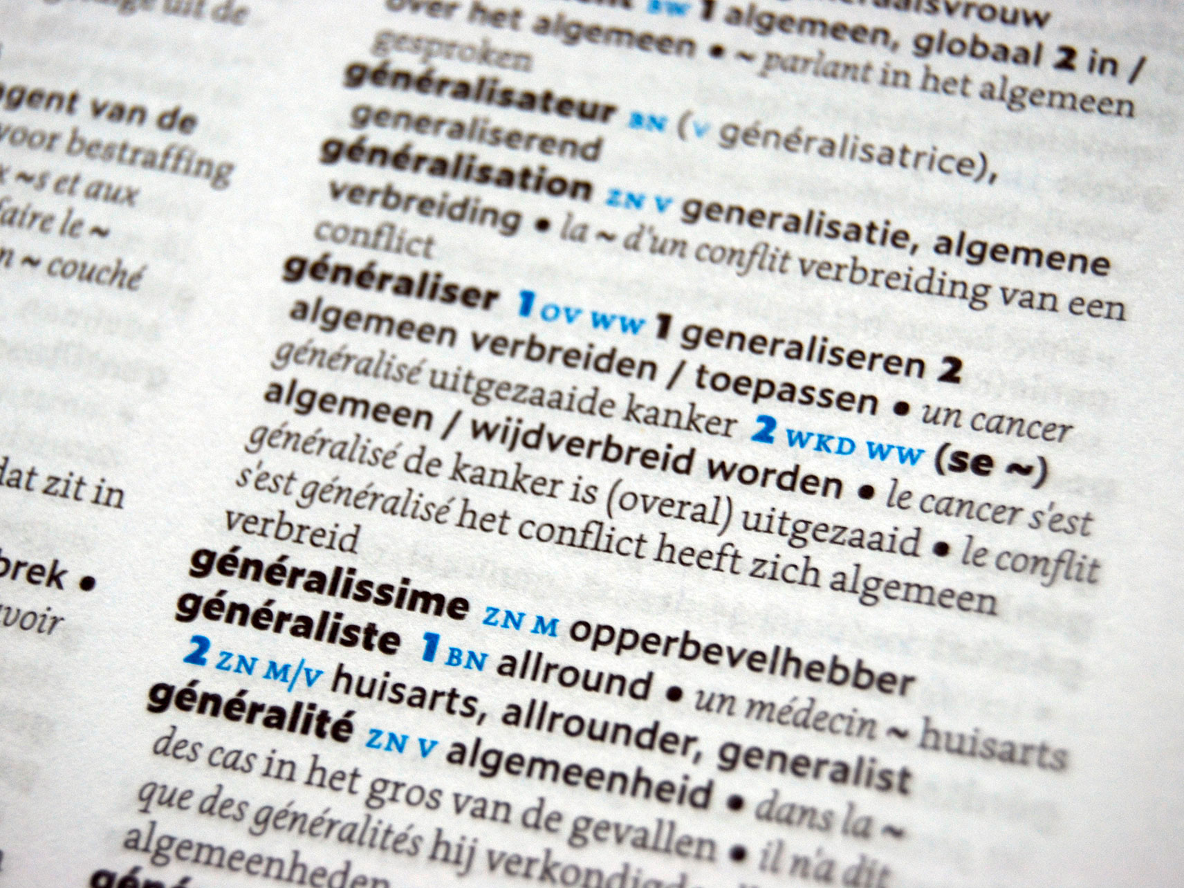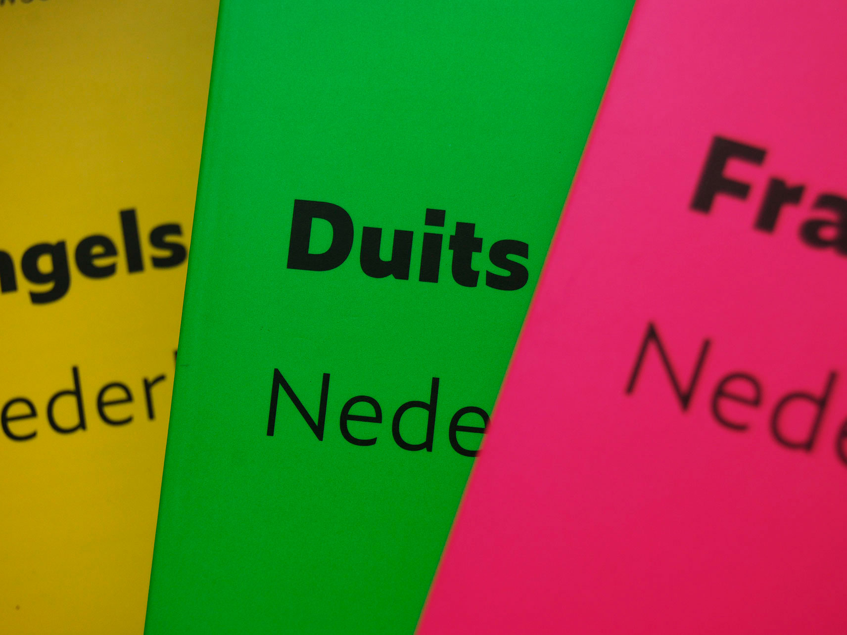
In 2018 Prisma provided a fresh look for their pocket dictionaries. Who doesn’t want to have these shiny bright fluor covers, designed by Studio Raak, on their bookshelves? The interior typography was completed revised by Underware. The content has been reorganised with a different hierarchy for a better structure. This makes it much faster to find the words you’re looking for. Many other micro typographic changes have been introduced to focus just on the important information, despite the large amount of other information also present in these pocket dictionaries. This is also the first usage of Dolly Light, which is required to create another hierarchy in the presented information. The exterior as well as the interior of these dictionaries have been set in Zeitung and Dolly, which form a good contrast to each other. Because Zeitung has optical sizes, the Micro cuts come in ideal for long pieces of text in small sizes, perfect for dictionaries.
