


concept

tour

OpenType features

make it work

webfonts

character set

language support

making of

type specimen

PDF

FAQ
Q: What’s the difference between Liza Std and Liza Pro?
Liza: Liza Std is a very simple, basic A-Z version: no OpenType code, no intelligence, no randomness, no alternates, no fancy ligatures. Where Liza Pro contains tons of ligatures & alternates and always looks different, always looks perfect. If you have the Pro version, you don’t need the Std version.
Q: Grüß Gott, my name is, äh... Boris. What means Contextual Alternates in Deutsch?
Liza: Dear Boris, it means Kontextbedingte Variante.
Q: There is this loopy d in the front banner on your site. When I type lettres d’amour on my computer I do not see it. Is this glyph part of the font?
Liza: Yes, it is. Whenever you are looking for a specific variation of a glyph, just use the Glyph palette of your application (if you click+hold on a letter in InDesign's Glyph palette, you'll see all available variations I can imagine).
Q: Does the name Liza come from the famous, sexy & charming Typeradio DJ Liza?
Liza: Is this a cheap trick to get me into bed? Ask her, not me.
Q: Hi, my name is Andie from Großsachsen. Does Liza run in Freehand?
Liza: You mean functioning? Yes I do. But all my special features are unfortunately not supported by Freehand. Read more here. For an overview about OpenType support, please check the make-it-work section.
Q: The features of Liza are not working in Illustrator CS4. Is this a bug in the typeface?
Liza: Hmm, there is nothing wrong with me. Illustrator is the strange guy. Just deactivate and activate the Contextual Alternates feature, and all works fine. It is a known bug in Illustrator CS4. I am sorry for this.
Q: Ciao, my name is Giacomo from Venice. I am 23 years old, and highly popular by the girls in town (hope you get what I mean). Unfortunately my financial situation is not so well at the moment, so I am wondering if I could get a free license?
Liza: Dear Giacomo, how can you dare to ask such a question? Good luck with your girls.
Q: Hey Liza, this is Axel from Berlin. I like your curves. I think we should have a date?
Liza: Mais oui Axel! Just click here.
Q: I made this logo with Liza which looks really very cool. But after a small text correction from my client the whole logo changed. Why is that?
Liza: Because I am not stupid. Do I really have to explain this for you? Okay. Did you ever ask for a vegetarian meal in a French restaurant? What would you say if the answer would be: I can make the cordon bleu for you without the meat? Get it?
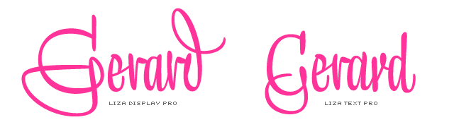
Q: Hoi, I'm Gerard from Holland. What’s the difference between Display and Text?
Liza: Well Gerard, let me tell it that way: it's up to you what style you prefer (if you get what I mean). I am flexible. We can also do Caps if you feel like.
Q: Hey, does Liza work well with Fakir?
Liza: Yes I do. Just like Auto, Bello, Dolly, Sauna & Unibody, Fakir is a good friend of mine. Of course he is not as clever as I am, but he is a very nice guy. And good looking.
Q: My name is Ric66. How many glyphs & kerning pairs does Liza have?
Liza: Hey Ric66, I think you spend way too much time behind your computer. You never ask such a question for a lady. Shame on you!
Q: I think the out-of-ink feature is pretty bold. Can you give me some background info?
Liza: Sure, I love to do this. Basically it is rather simple: never take too much ink in first instance, otherwise you will get into trouble and your letters will become too plump. So if a word gets too long, you have to get some new ink at a certain moment. But never do this while writing nice ligatures. In situations like these, it is a good idea to get more ink beforehand. You know, basically it is a question of practising, and after a while you are good enough to make these little out-of-ink gaps part of your typographic design.
Q: Why did you split the typeface into 4 different fonts. Why didn't you put the whole stuff into one gigantic OpenType font?
Liza: This is a good question. As much as I would like to be, it is not possible for me. I am too excentrique for this. Putting all the glyphs into one font file, would mean that I could not do what I like to do: superlooping, penetrating, t-topping, protoshaping and all the other stuff which is mentioned here. So I had to choose between getting an ordinary girl by loosing many glyphs, or splitting myself into 4.