29 june 2017 — walhalla
Subpixel ASCII+ Art
![]()
A new monospaced font* and Responsive ASCII* are a nice start to celebrate the ASCII+ week, so let’s get one level deeper. Notice the differences between these 2 trees? The image on the left is old school ASCII art, the one on the right is made with our subpixel technique. The resolution is nine times higher, although the point size of the text based visual art remains identical. Pretty sweet, if you ask us. How this is achieved is explained in the article From ASCII Art to Subpixel ASCII+ Art, a must-read for ASCII art & monospaced fonts lovers. No time to read all that? Get your hands dirty with the ASCII+ Art Generator, and play. This tool has been optimized for Zeitung Mono, so the results will always need to be displayed in Zeitung Mono.
Read ▶ From ASCII Art to Subpixel ASCII+ Art
Play ▶ ASCII+ Art Generator
28 june 2017 — publications
New publication: Zeitung newspaper

We’re happy to announce the latest news on web typography. Every wondered how to recognise poor web typography? Why is it that micro-typography on the Internet lags centuries behind? What is the connection between text lines and Laurel & Hardy? Why is web typography actually a misleading designation? This newspaper tells in a nutshell what designers should keep in mind when deciding on typography for web users, including key design-elements and often overlooked facts.

24 pages full of typographic wisdom and experiments. Everybody who designs for screens should read why web typography sounds good, but looks awful, so get your own Zeitung newspaper.
27 june 2017 — walhalla
Responsive ASCII
Why wouldn’t ASCII art, being over 50 years old, adapt itself to modern times? We are all familiar with ASCII art and we all know responsive websites. What happens if these 2 are combined?
We released a monospaced version of Zeitung yesterday, and we all know that monospaced fonts & ASCII art are a match made in heaven. Therefore our website has a new homepage, using responsive ASCII. Resizing the window will offer the full experience: the text size which displays the ASCII art remains the same, independent of the window size. As a consequence: the resolution increases once the window enlarges.
26 june 2017 — out now
New font: Zeitung Mono
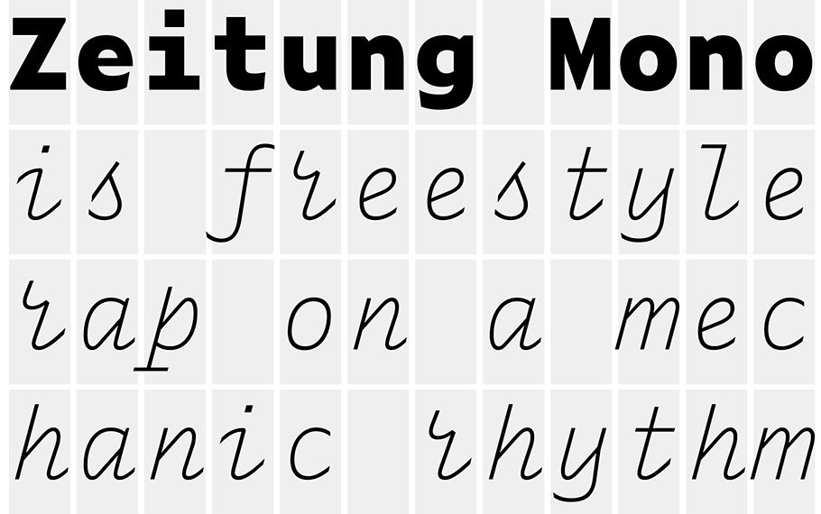
Zeitung Mono is the monospaced companion to the Zeitung family, a sans serif which works well in small sizes on screen. This monowidth font family increases the functionality of the Zeitung font family, resulting in happy programmers, smiling ASCII-kids, razor-sharp journalists and finally: worldpeace.
Zeitung Mono is everything a contemporary monospaced font needs to be. A good monospaced font has a fancy italic for unmistakable distinction & lots of weights which supply a broad typographic palette. So you may guess once what Zeitung Mono has. Right, exactly that. Say hello to Zeitung Mono.
Introduction offer: Let’s Mono Together
Order Zeitung Mono complete, and get a free license for a friend.
This introduction offer runs until 31 July 2017.
22 june 2017 — walhalla
ASCII+ Week

26-30 June 2017: ASCII+ Week
For all ASCII lovers, and those who love to be surprised: next week, from 26 to 30 June 2017, it’s Underware’s ASCII+ Week. Microsoft wrongfully declared ASCII dead in the end of the 1990s. As real ASCII-kids it’s finally time to show our love. Every day some ASCII news. Stay tuned, more on Monday.
15 may 2017 — presentations
Upcoming presentations

Four countries in four weeks. We’ve got a couple of presentations coming up, where we’ll present our latest findings. Hope to see you in of these cities:
18 May: Plug & Play, Porto, Portugal — plugandplay.pt
25 May: TYPO Berlin, Germany — typotalks.com/berlin
1 June: BNO Zwolle, the Netherlands — facebook.com/bnozwolle
10 June: IS Type conference, Istanbul, Turkey — istype.com
27 april 2017 — read more
How Bello became the typeface of protest

The associations a font has and the emotions it can evoke, are culturally defined. They change through time, vary around the world, and sometimes vary from one country to another. Recently our typeface Bello became associated with politically progressive movements in Ireland. The reason why this happened has been described by Robin Fuller in this article in the Dublin InQuirer: How Bello Became The Typeface Of Protest.
© photo Gerry Mooney
13 april 2017 — walhalla
Underware loves the internet

The Internet = cats. Pictures of cats. Videos of cats. GIFs of cats. Whatever, as long as it’s cats. Since a while all 3 our studios have The Internet at home. Our studios in Den Haag & Helsinki had a cat for some time, but in Amsterdam it remained pretty silent. But when the kids & partner vote for a cat, and Bas votes against, it’s a good democratic habit to end up with 2 cats. Because the difference between 3 pro votes and 1 against, is exactly 2. Yep. Those same kids don’t have a clue what Twitter (our only social media behaviour) or Facebook is about, but think that The Internet = cats = Instagram (or Snapchat). Because we have The Internet now everywhere, we decided to create an Instagram account, just to add some cats photos. And some lettering.
11 april 2017 — presentations
Hallelujah Variable Fonts

These are exciting times in the font world. “Variable fonts” are the magic words in type technology these days, and interpretations of its meaning interpolate from one extreme to the other. This new, evolving technology offers as many possibilities as well as challenges and problems. Therefore this is the right time to question future conventions. At least, this is what we tried last Saturday in our talk If you want something new, you have to stop doing something old at TypoLabs, Berlin.
Within less than an hour we’re exploring the options of just 1 interpolation axis. And what happens if there are 26 axes to play with? And hey, what happens if we put 241 axes in the game? You probably can’t imagine yet what these possibilities are. And what can happen if you add the remaining 63759 axes to the game? How much could actually fit in a font? How intelligent can letters be? And aren’t there any other ways to design type? Or to use type? Questions, questions.
Note: because the word ‘variable’ should of course be differently pronounced every time, we’re already practising for next time.
31 january 2017 — publications
We love shop windows 5


Safari Typo Amsterdam at Athenaeum bookstore, Amsterdam
The new Safari Typo Amsterdam publication is currently on display in the Athenaeum bookstore at Spui square, right in the middle of the heart of the middle of the city centre. So very very very central in Amsterdam. It’s very touristic there as well, a perfect location to display a tourist guide. We love shop windows. We really do. In case you question this, no need to Google that, just search for shop window on this site. Tourists can now expand their mind by exploring the typographic side of the Dutch capital. This 50-year old legendary bookshop is a nice starting point.