20 february 2019 — presentations
Printemps de la typographie lecture

Tomorrow the 2-day conference Printemps de la typographie will take off in Paris. This is the 10th edition, organised by École Estienne, featuring 14 lectures in just 2 days. Our most recent lecture “The end of self-evidence” has evolved, and so has the accompanying publication (which will be free for all attendants). Both will be presented in Paris coming Friday, so we hope to see you there. You can find more information about the conference on the website of École Estienne: ecole-estienne.paris
18 july 2018 — presentations
HOI Tour 2018

After presenting the basics of HOI (Higher Order Interpolation) earlier this year at the TYPO Labs conference in Berlin, we’re making a tour this summer to spread HOI around the world. Come and say HOI.

HOI Portland, 4th of August
HOI for beginners. In a very condensed session at TypeCon in Portland, we’ll show the basics of HOI, what HOI can mean for you, and why your text isn’t HOI enough. typecon.com

HOI Los Angeles, 7th of August
We’re gonna HOI the Otis College of Art and Design in this lecture. Also: ask us anything, we’ll HOI it out together. otis.edu

HOI San Francisco, 9th of August
Live at the Letterform Archive in San Francisco, we’ll answer questions but we’ll also have questions in return; if variable fonts are very able fonts; if new techniques require new ideas; if fonts really need all those letters; and of course: how HOI can you be? letterformarchive.org

HOI Antwerp, 11-15 September
At ATypI 2018 we’re gonna clarify once and for all misconceptions on HOI, and show what HOI really is. Say a Flemish HOI and join us in Antwerp, Belgium. atypi.org
26 june 2018 — out now
New fonts: Duos In-N-Out and Duos Write

Two new, very able, fonts!
The variable font format offers new typographic possibilities for type designers. Instead of creating separate static fonts, font families can be combined into a single font file for example. But this new font format has much more to offer. Type designers can also design typefaces specifically for this new format. New ideas for new technologies, instead of old ideas wrapped into those new technologies.
Our most recent font family Duos was already a technological tour de force, but is now expanded with 2 progressive variable versions.
(more…)
26 june 2018 — out now
very-able-fonts.com

If you’re into type, you probably have heard the new buzzword recently: variable fonts. Everybody is talking about, some people are doing it. So are we.
But the more we get involved in making variable fonts, the more questions come to our minds. What is actually a variable font? We mean, really is? And what does it really mean? The most obvious application of the variable font technique is the weight-axis. Putting all fonts from Light to Black into 1 single variable font is something everybody can imagine, and maybe therefore also the thing everybody does. But isn’t that the same as using the marquee tag –which everybody did– in the early days of the internet? Don’t we realize by now that the internet is something else? Isn’t the Light-to-Black slider the same as the blinking marquee tag for typography in 2018?
So before we accept that this is what variable fonts are about, we should wonder what other possibilities this new font format offers. This is the moment to ask fundamental questions. Maybe this font format is actually something completely different? Maybe you can put all existing fonts into a single variable font? Maybe you don’t need all those separate glyphs, because one glyph can vary into any other glyph? Maybe you can have a legibility slider, or one from Braille to Latin? And maybe the question is not how to make variable fonts, but how to make fonts variable? And shouldn’t the interface be part of a typeface instead of depending on what an application offers or supports in its interface? Variable fonts are vari-able-fonts, so very able fonts. But what are they really capable of? Maybe the variable font format is a beginning of a new era in digital typography, where the letter is finally freed from its historical limitations? And what does it mean when information becomes dynamic at the level of the written word?
Enough questions to launch our own playground for variable fonts, which will be as much in development as the variable fonts themselves: very-able-fonts.com
22 may 2018 — publications
The Tale of the Cat

Written words always exist within the three dimensions of the maker (the type designer), the user (the designer) and the consumer (the reader). But what does it mean to be a type-maker, -user or -consumer? How is language working anyway? Together with Dutch composer Jacq Palinckx and writer Kees ’t Hart, we investigated into an expanded understanding of typography. Attendees of our lecture at the TYPO Berlin conference last Saturday, could afterwards continue to observe language with the publication The Tail of the Cat.
18 may 2018 — publications
Ten Commandments of Type

Do we still have shared beliefs? Last Sunday we gave a lecture at the All Eyes on Type Festival in Rotterdam. What to do on this very early Sunday morning, at a time when people used to go to church? We’re happy to see that it’s still possible to bring people together on Sunday morning. People who have shared beliefs and get together, luckily that still exists. So we were all in Rotterdam that day to celebrate type. Because all attendants belief in type. In a time when hand lettering became more popular than other religions, it’s important to reflect on the craft of making letters, and think about what we are actually doing. That Sunday we wanted to share some thoughts on how to communicate. Some thoughts on making letters. This service is a story in which we worked towards the ultimate celebration of type. Towards the end, everybody, every individual, received his own sacred typographic host. Because this is the only true way to celebrate something you, us, we all believe in. It became a service which was taking of with live organ music, and ended with a sacred host in the form of a tiny printed publication: Ten Commandments of Type.
01 may 2018 — presentations
All eyes on type

Next week all eyes will be on type in Rotterdam. A 2-day festival on calligraphy & typography will host many workshops & lectures. We’ll give a lecture on Sunday 13 May at 10:30 o’clock. But with a beefy line-up (Martin Majoor, Maria Doreuli, Luca Barcellona, Job Wouters, Bernd Volmer, Peter Winkel, Bruce Tsai-Meu-Chong, Hans Schuttenbeld, Guido & Vincent De Boer, Analphabetics, Jeroen Erosie & Just van Rossum) we had to bring in cerberus-power: for this occassion all 3 Underware heads will be present, a rare moment. Sami, Bas & Akiem will talk as a three-headed monster. And to top all pleasure: Typeradio will be present in Rotterdam as well. Type lovers know where to go next week.
14 april 2018 — walhalla
Say hi to hoi

Say hi to Higher Order Interpolation. Since the introduction of variable fonts in 2016, interpolation became increasingly important. During the TYPO Labs 2018 conference in Berlin we briefly reevaluated the current interpolation technique and demonstrated another way of interpolation typefaces. Until today interpolation in type design has been linear, but this limitation should belong to the past. In case you are interested in the technical side of making (variable) fonts, read the case study: Higher Order Interpolation for Variable Fonts. The basic principles of more advanced interpolation in variable fonts, explained without the complicated math.
14 april 2018 — publications
Font Fiction
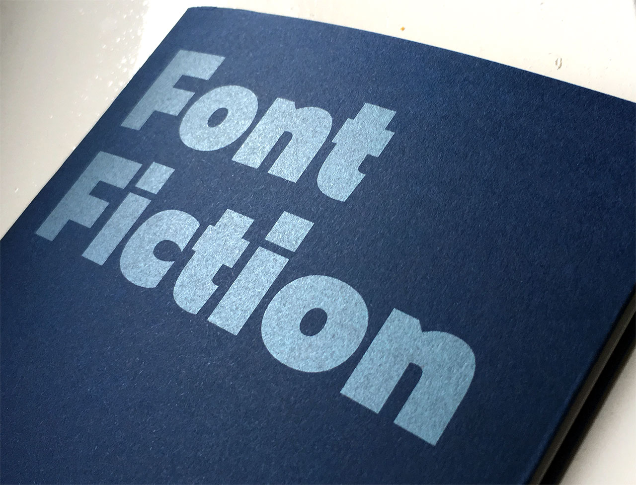
Ladies and gentlemen, may we introduce Font Fiction, tomorrow’s fonts designed today. Visitors of the TYPO Labs 2018 conference in Berlin received a – pretty future-proof – printed copy of this manifesto. The rest of the world can read it online at fontfiction.com.
04 february 2018 — walhalla
Now or never typeworkshop
Our typeworkshop website may still be in coma at the moment, the workshops themselves have always continued and are alive as never before. Last year we gave 5 typeworkshops, from Baltimore and Detroit in the USA, to Wrocław in Poland, and São Paulo & Rio de Janeiro in Brazil. This week our first typeworkshop-stop of 2018 is at Sint Lucas in Ghent, also known as the Berlin of the Belgian type scene. We hope to make some new people enthusiastic about letters. It’s gonna be Now or never on the 5th and 6th of February.