03 december 2012 — walhalla
Commitment

Hand drawn envelope in our inbox today. Emails should be send with the same dedication.
23 october 2012 — custom type
Elevator typography
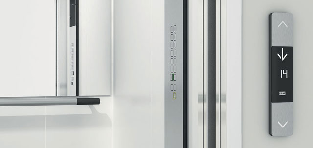
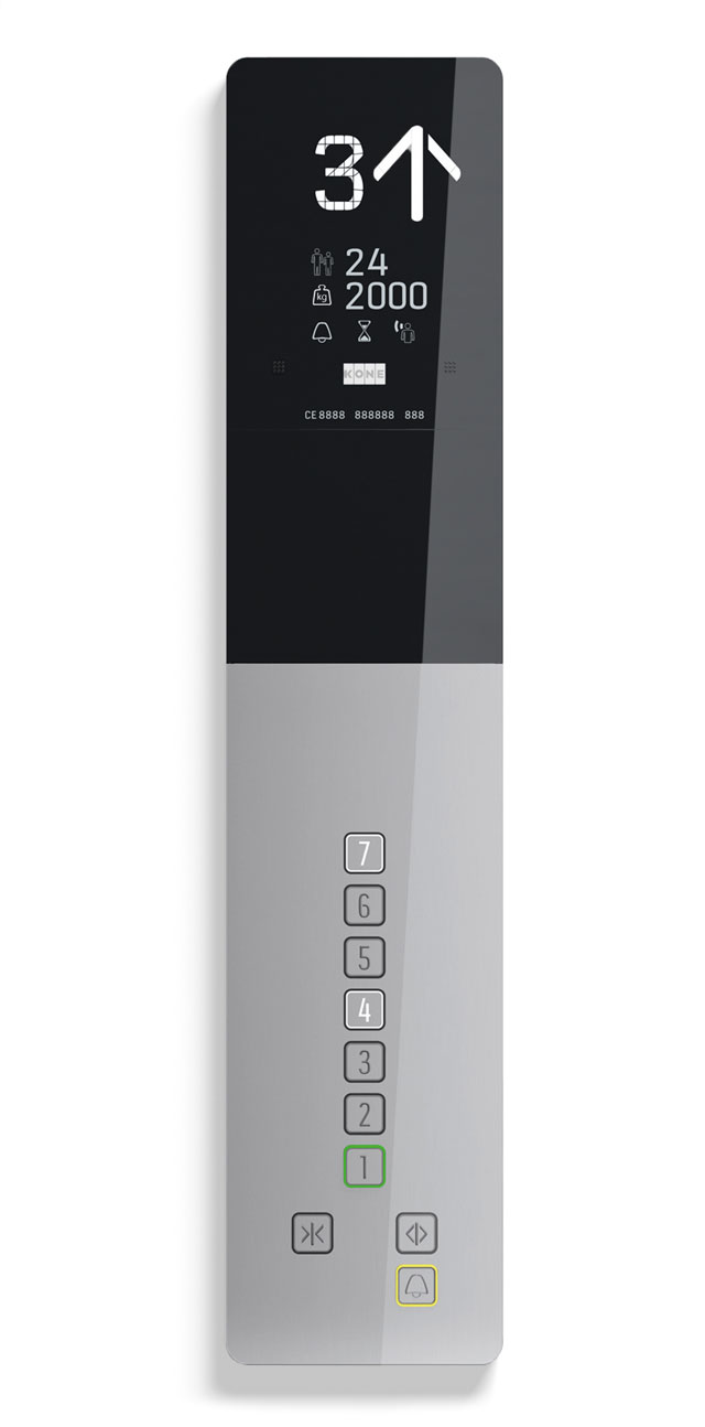
Because different elevator models are usually made by many different parties and departments, they quickly loose harmony. Recently we created some custom typefaces for Kone, who wanted to match their different models of elevators and escalators.
This was a fascinating project for us. Not only is there a bunch of typographic laws (those lawyers!) on elevator typography, each part of this project also had very specific requirements and applications. Creating segments which can display every number as well every capital, is a challenging assignment for example. A puzzle with so many limitations your head starts spinning.
See more of this project: Kone, elevator typography
06 september 2012 — read more
Just imagine…
How often has been asked: what is design? And how often was the answer solving problems? The idea that designers are problem solvers was taught in the 90s at art academies throughout Europe. But designers should not just be looking for solutions. They should at least be looking for new solutions. So they have to come up with new ideas. But how do you come up with new ideas? Not by going from A straight to B, where B is your final destination. Just look at airline logos, how many times didn’t that end up with a bird? Countless times. They all solved their problem. Original? No. Does it work? Yes, problem solved. But is this what design should be? No.
(more…)
04 september 2012 — presentations
Wordmold
Why is it that always the night before we give a presentation, we get new ideas for the presentation? This movie was made with the mirror in the hotel room the night before our presentation at the Type Directors Club in New York, June 2012. Actually, the lecture started and ended with Bas his dad, who has trouble making good letter shapes.
03 september 2012 — fonts in use
Fonts in the fictive world
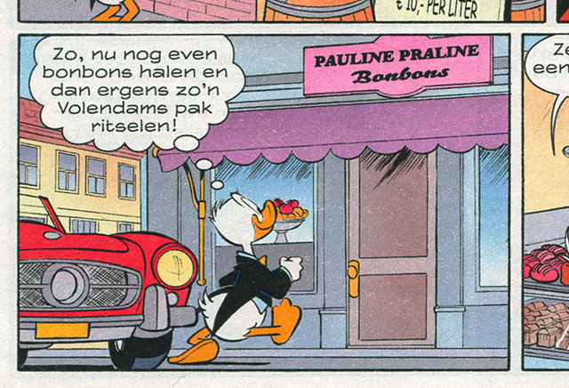
Even more enjoyable than spotting fonts in a parallel word, is spotting fonts in a fictive world. Bello goes squooosh with Donald.
29 august 2012 — fonts in use
Mountjoy prison
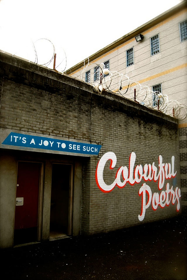
It’s a joy to see such colourful poetry. This is a project by the Dublin based graffiti artist Maser, which he created together with the inmates of the horribly deprived and overcrowded Mountjoy prison in Dublin. Texts are set in Bello, and were painted by the inmates during a period of 2 weeks on the inner walls and at the prison yard. Considering the fact that they are on a 23-hour lock-up due to escalating conflicts between drug gangs, this was painted in their very rare spare time. There aren’t any toilets in a 4 man cell, and that small cell is occupied by 6 inmates. So 2 sleep on the floor. You urinate and shit into a bucket in the corner of the cell. Chillin’.
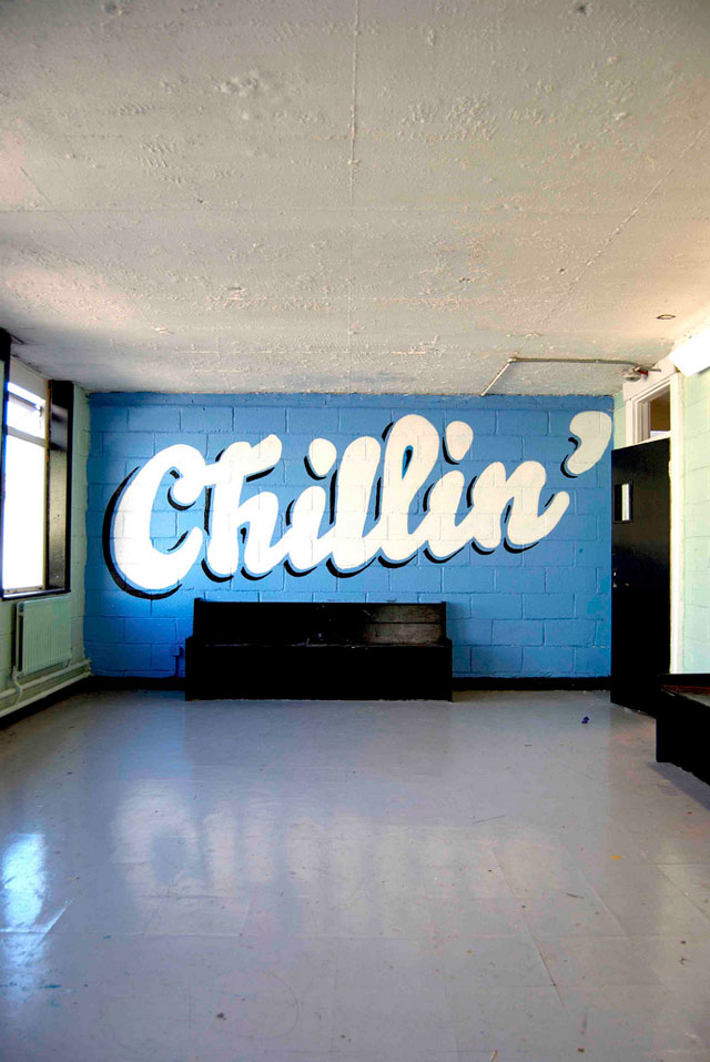
See more pictures of this project at fonts in use.
23 july 2012 — fonts in use
François Hollande 2012 Presidential Campaign
Vivement Mai avec François Hollande.
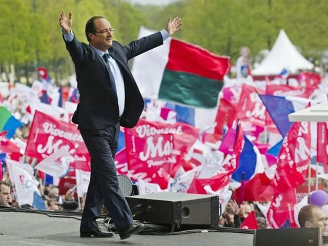
In May 2012, François Hollande was elected President of France. The identity of his campaign was build around the typeface Bello, a rather uncommon choice for a presidential campaign. After the electoral victory some loony French people nicknamed Bello the French Gotham, but hey… don’t believe all rumours.
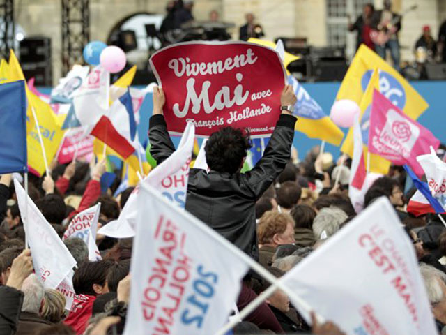
See more pictures at fonts in use.
18 may 2012 — walhalla
One cut, two numbers

When the Type Directors Club of New York asked 65 designers for a contribution for their upcoming book ‘Celebrate 65’ – celebrating 65 years of TDC –, we were happy to have a nice opportunity to apply our cutting hobby. We just love to cut letters out of paper. Scissors are one of our favourite writing tools.
For the number 35 you only need one single cut in a rectangle.

Now, try that with all integers up to 100.
As simple as possible.
Enjoy.
29 march 2012 — presentations
Tour Du Champagne
Our Tour Du Champagne is coming to a city near you soon. Coming months we’ll leave our caves for a couple of public appearances. Some workshops and lectures. Dates, locations and times might change, so keep an eye on this spot for the latest info.

01 April — Tokyo
The Type Directors Club of Tokyo will take it to the max this day with 6 hours of typographic lectures. Be prepared. Hosted by the Joshibi University of Art and Design, Suginami Campus. More info at the website of TDC Tokyo.

21 May — Hong Kong
On our way to Bangkok we will do a short stop at A122 Courtyard, School of Design, Hong Kong Polytechnic University. This event is made possible with the local support of Keith Tam.

21 May — Stockholm
The Swedish design magazine Cap&Design organizes a one-day journey in the contemporary typographic landscape. Let’s talk type for one loooong afternoon. Check Cap&Design Live for more details.
22 May — Göteborg
The Swedish design magazine Cap&Design organizes a one-day journey in the contemporary typographic landscape. Let’s talk type for one loooong afternoon. Check Cap&Design Live for more details.
26 May — Bangkok
Presentation ‘Everything that can happen in a day’ at BITSMM, 1:00 PM at Alliance Française de Bangkok. Because of the floods the event had to be cancelled at the last moment some months ago. But nothing is gonna stop us now.

02 June — West Michigan
A one day type workshop, followed by a lecture on Saturday evening. No love. No happy. Survive like Robinson Crusoe at the streets of Grand Rapids, just by using your typographic skills. While not being allowed to talk, you have to collect as much kisses or smiles as possible. Use your creative skills to collect your surface and writing tools for your text, and make the most appropriate lettering. Most kisses/smiles = win win win. More details at the website of the AIGA West Michigan.

05 June — New York
18:30 Lecture ‘Keep dreaming’ at the Type Directors Club of New York. Just imagine…
06 June — New York
Type workshop ‘Keep it straight’. If you think you’ve got enough energy to be part of this internet-free ants’ nest for one day, you’ll experience that type design can be a thrilling experience if everybody kicks the same ass. We’re gonna make 1 font, and that can be as electrifying as Sylvester Stallone in a B-movie. Especially when there are 20 captains on board and when the real KISS principle will be executed: Keep It Straight, Stupid.

08 June — New Orleans
One-day workshop ‘I give you my word for it’, exploring unknown typographic territories in cooperation with Nicholls State University, which is in Thibodaux, just outside of New Orleans. Subject: Altered meanings through typographic interference. Give an object or location a different function or meaning, by creating your lettering on it. The lettering needs to have an appropriate shape, which fits to the object/location and its new meaning. Leave your laptop at home, get ready for dirty hands. While you are making your brilliant new creation, the basics of type design will be discussed.

24 january 2012 — fonts in use
Fonts in the parallel world
Nice way to waste our time: spotting our fonts in the parallel world of Google’s Streetview. Where fonts live somewhere between eternal and ephemeral. Already gone in the real world, still alive in this period piece. Or sometimes the other way around.

