03 june 2013 — font update
Behind the font upgrade
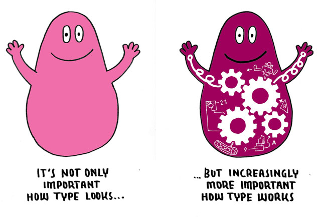
“Why did it take you sooooo long?” Brrr, let us explain why it took us ‘sooo long’ to upgrade our library, because if you’re not into making type you probably don’t have a clue. To many people the new upgraded fonts will look identical to their previous versions. And they are basically right, visually they didn’t change a lot. Still the same fonts. Right. Although the fonts visually improved a lot in details, upgrades like these are also focused on usability.

A decade ago most people still understood it was a headache to add German text on a Mac to a Polish document created on Windows. Lots of things would probably go wrong: strange accents, fucked up documents, etc. Meanwhile technology changed, we’re taking it much more for granted. We expect everything ‘just to work’, from our tablets, phones to our laptops and switching between them. So we expect the fonts to work accordingly, and not having ‘technical font issues’ within our digital lives. A correct Unicode support in all fonts is the first step in this direction, but more technical aspects need to be correct to make fonts as fluently operating as possible in a contemporary environment.
14 may 2013 — font update
Upgrade available

Today we released an upgrade of our complete library. All licensees can upgrade to this new version for free. Which means: anybody who ever bought a font directly from us receives a free upgrade, also when you purchased more than a decade ago.
Everybody should have received an email today which contains an upgrade-link. In case you didn’t receive this, please email us: support@underware.nl

Most notable changes of this upgrade:
• improved screen performance of webfonts
• broader language support (200+ languages)
• more OpenType features included
• all fonts come in .otf format
• webfonts are now synced with desktop fonts
• improved cross-platform compatibility
(in case you want more technical details, read Notes about the library upgrade)
13 may 2013 — font update
Notes about the library upgrade
The complete Underware font library has been upgraded in May 2013. Previously our fonts all dated from different technical eras. From today on, all our fonts are technically from the same date. And we plan to maintain that in the future.
Here are a couple of notes about these new font files.

Notable changes for all fonts:
 • All desktop fonts come by default in .otf format. These OpenType fonts can be installed on OSX as well as Windows computers. (.ttf formats are available on request, just send us an email after you purchased/upgraded)
 • This is Pro. Because of all major improvements and expansions, these fonts are so pro that their names also carry the Pro addition. So in case you’re in doubt whether you have the latest version: just look if the font file is named “Pro” or check the version number. New fonts have a version number 2+. You can see the version number in the Finder > Info [Mac] or double-click [Windows].
 • Much better screen performance of all webfonts. Crack, they even look good in InternetExplorer 8 on Windows. And while we were busy with that, we also made the desktop fonts look much better on screen.
 • All fonts support 200+ Latin languages, allowing you to reach an estimated 2.134.923.711 speakers worldwide. Find an overview of all 213 supported languages in the support section. (One exception: Liza is already loaded to the max, and unfortunately can’t handle more characters. Luckily she still supports 195 languages, including all Western and Central European languages)
 • A bunch of new OpenType-feautures. Not only the not very often used ‘Slashed Zero’, but also some other more useful features. See the font specific overview below.
 • Optimized the cross-platform compatibility between OSX and Windows. The fonts are as cross-platform as possible, but please note that there is one known technical issue with MS Office.
 • Desktop-safe and web-safe metrics, as cross-app and cross-platform safe as possible. Clipping issues were already history, but contemporary metrics settings vary from 5 years old ‘best practices’. These new metrics are as safe as it can get, and are different for web than for desktop fonts.
 • These new fonts are not style-linked at all anymore. Which means that in applications which use the ‘Bold’ and ‘Italic’ buttons, you need to select every style through the font menu instead of clicking [B] and [I].
• Some minor technical issues were fixed (like PDF-export problems in exotic environments).
Please note: these new fonts are not (100%) backwards compatible with their previous versions. If you replace the old version of a font with the new, updated version, be aware that text in your documents might reflow, you might experience differences in metrics (different linespacing and different width of some characters) and x-heights, and not even to mention that many glyphs have different (= improved) outlines too. This difference varies per font, per app and per platform.

Additional notable changes per family:
• Auto now has all 4 figures styles as an OpenType-feature (Tabular and Proportional & Old Style and Lining) and some other new OpenType-features. Instead of having 3 different families (Auto 1 & Auto 2 & Auto 3), these new Auto styles have been reorganized into just 1 family called “Auto Pro”. Depending on the amount of styles you have got installed, they will all appear in a nice order in the submenu of Auto Pro. And Auto now talks Anutan, Cimbrian, Hopi, Tokelauan and 200 other languages.
font format
Supported languages
# OT-features per font
# glyphs per font
# kerning pairs per font
Old
Mac PS T1
25
0
247
1140
Mac PS T1
25
0
247
1140
Old
.ttf
39
0
387
2481
.ttf
39
0
387
2481
New
.otf
213
8
513
6189
.otf
213
8
513
6189
• Bello now has an extensive language support, and by default has the script and caps font separated. Both fonts now support real fractions as an OpenType-feature. The multi-layered glyphs in Bello Words became easy to use due to a clever OpenType-feature (Discretionary Ligatures).
font format
Supported languages
# OT-features per font
# glyphs per font
# kerning pairs per font
Old
Mac PS T1
25
0
247
3050
Mac PS T1
25
0
247
3050
Old
.ttf
39
0
387
4123
.ttf
39
0
387
4123
New
.otf
213
13
653
8478
.otf
213
13
653
8478
• Dolly has a bunch of new ligatures (Th, fb, fh, fj, ffj, fk, ft, etc.) in the Ligatures feature & and some more fancy ligatures (eg. ch, ck, ct, sp, st, etc.) accessible through the Discretionary ligature feature, some extra ampersands, large language support, and Dolly now contains 2 figures styles (Old Style and Lining, both proportional). [note: A future version of Dolly will have more weights, styles and also more figure styles]
Supported languages
# OT-features per font
# glyphs per font
# kerning pairs per font
Old
25
0
247
1903
25
0
247
1903
New
213
9
495
8608
213
9
495
8608
• Fakir didn’t change a lot. However, the complete family now supports over 200 languages and has some new OpenType-features. Some minor bugs got fixed, a couple of OpenType features added.
font format
Supported languages
# OT-features per font
# glyphs per font
# kerning pairs per font
Old
Mac PS T1
25
0
230
2506
Mac PS T1
25
0
230
2506
Old
.ttf/.otf
39
0
387
7524
.ttf/.otf
39
0
387
7524
New
.otf
213
4
437
10954
.otf
213
4
437
10954
• Liza is basically a technical update, no visual consequences for desktop fonts. Liza was already loaded to the max, additions were not possible. However, a modified GSUB code was necessary to make our über-intelligent Liza also look rather smart in a browser due to technical restrictions of browsers. This modified, little bit simplified code is only included in the webfonts. The desktop font have the original, super intelligent version. But remember: in the best cases the webfonts will still look different than the desktop fonts because of this different OpenType-code.
• Sauna, oh oh Sauna, the swashy ligatures (ch, cl, fb, kk, sh, zz, etc, etc.) are inserted by default because they are now build into the Ligatures feature of all Sauna Swash-fonts (an OpenType-feature which is activated by default). Sauna speaks Abenaki till Zulu, and 200 other languages in between. The multi-layered glyphs in Sauna Dingbats became easy to use, due to a clever OpenType-feature (Discretionary Ligatures).
Supported languages
# OT-features per font
# glyphs per font
# kerning pairs per font
Old
25
0
249
991
25
0
249
991
New
213
5
459
10189
213
5
459
10189
• Unibody, our oldskool-pixel-classic, now supports over 200 languages but nevertheless remains as free as it used to be.
Supported languages
# OT-features per font
# glyphs per font
# kerning pairs per font
Old
25
0
251
396
25
0
251
396
New
213
5
437
1458
213
5
437
1458

So long. Enjoy these new versions.
19 april 2013 — presentations
Hinting is the new kerning

On May 03 the first edition of the Kerning conference will take place in Faenza, Italy. A two-day conference on typography; one day of workshops, another day packed with presentations. There are presentations by Luc[as] de Groot, Richard Rutter, Aral Balkan, Marko Dugonjic, Nina Stössinger, The Standardistas, Yves Peters, and our own Bas Jacobs. So join us for a nice day and meet some interesting new people. And talk type. And web. And software. And also talk hinting, as hinting is the new kerning.
There are still some tickets available, so last chance to combine type with nice weather.
11 february 2013 — presentations
Nijmegen wiggle-waggle

Coming Monday, 18 Feb, at Lux in Nijmegen (NL). #ietsmetletters. Presentations by Martin Majoor, Job Wouters & Gijs Frieling and Underware. Eclectic evening. Something about type. Or not. Well… let’s see. Anyhow, we’ll bring a mystery guest. Doors open 19:30.
21 january 2013 — walhalla
Sketch, sketch, sketch
For those who want to learn to design type:
- You can study the type-basics on typeworkshop.com. You can read this pdf and try to gain knowledge.
- You can learn from tons of online resources these days, lucky bastards.
- You can read dozens of good books on type.
- But the most precious treat is time for practicing. Quit the internet, shut down your computer, switch off your phone, put your books back to the shelf. Silence and concentration. Get paper and some tools (pencils, pens, whatever), and start sketching, drawing, writing. It’s the best way to learn and discover your own direction. Do it.
05 december 2012 — walhalla
UNDERWARE LOVES SINTERKLAAS

We love local culture. Sinterklaas means sweet stuff. Found in our archives (around 1999?): apparently we bought 25 chocolate letters to do what? Spoiling our stomachs with 6 kg of chocolate for a nice piece of typography. Pff, what were we thinking?
03 december 2012 — walhalla
Commitment

Hand drawn envelope in our inbox today. Emails should be send with the same dedication.
23 october 2012 — custom type
Elevator typography

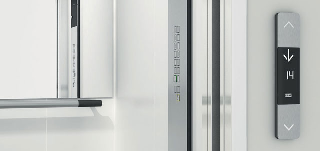
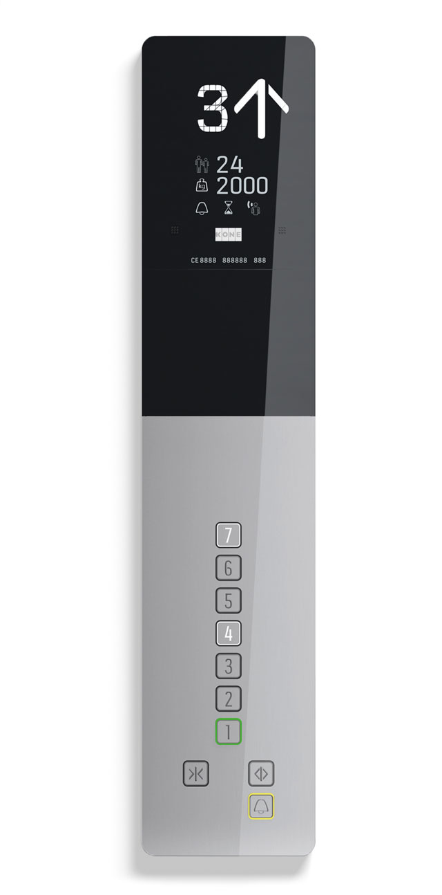
Because different elevator models are usually made by many different parties and departments, they quickly loose harmony. Recently we created some custom typefaces for Kone, who wanted to match their different models of elevators and escalators.
This was a fascinating project for us. Not only is there a bunch of typographic laws (those lawyers!) on elevator typography, each part of this project also had very specific requirements and applications. Creating segments which can display every number as well every capital, is a challenging assignment for example. A puzzle with so many limitations your head starts spinning.
See more of this project: Kone, elevator typography

