07 october 2013 — read more
Letter to Jan van Krimpen
Amsterdam, 07 October 2013
Dear Jan,
I should have probably saluted you with ‘Dear Mr. Van Krimpen’, but since you are dead anyway it doesn’t really matter. There is one question I would like to ask you, although I realize I’m 55 years too late.
First I’ve got some news for you. This year’s ATypI conference will take place in the Krasnapolsky hotel, at the Dam Square in Amsterdam. You would have loved to be there, enjoying heated discussions with many of our colleagues. Not sure whether you remember ATypI, because it was founded one year before your death: a Freemasonry for typophiles. It would probably (secretly?) have filled you with pride that the National Monument is in front of the conference venue. All our colleagues and friends who come to the ATypI conference this year cannot avoid this monument which carries your lettering. So despite your death, you are still guarding all of us coming week. That’s a nice feeling.

National Monument. Krasnapolsky hotel on the right side. © Stadsarchief Amsterdam
02 october 2013 — presentations
Underware goes Rio
Workshop
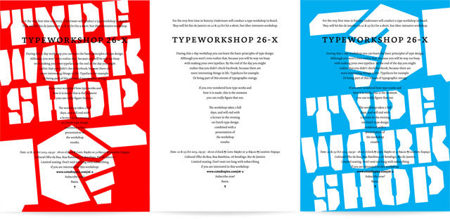
For the first time in history, Underware will conduct a type workshop in Brazil. They will hit Rio de Janeiro on 22 & 23 Oct for a short, but über-intensive workshop.
During this 2-day workshop you can learn the basic principles of type design. Although you won’t even realize that, because you will be too busy with making your own typeface. By the end of the day you might realize that you didn’t check Facebook, because there are more interesting things in life. Typefaces for example. Or being part of this stream of typographic energy.
If you ever wondered how type works and how it is made, this is the moment you can figure that out.
The workshop takes 2 full days, and will end with a lecture in the evening on Dutch type design combined with a presentation of the workshop results.
Date: 22 & 23 Oct 2013, 09:30 – 18:00 o’clock
Costs: R$580 or 3xR$220
Location: Espaço Cultural Olho da Rua, Rua Bambina, 06 – Botafogo
Limited seating, so don’t wait too long with subscribing if you are interested in this workshop: subscribe or email typeworkshop.x26@gmail.com.
Lecture
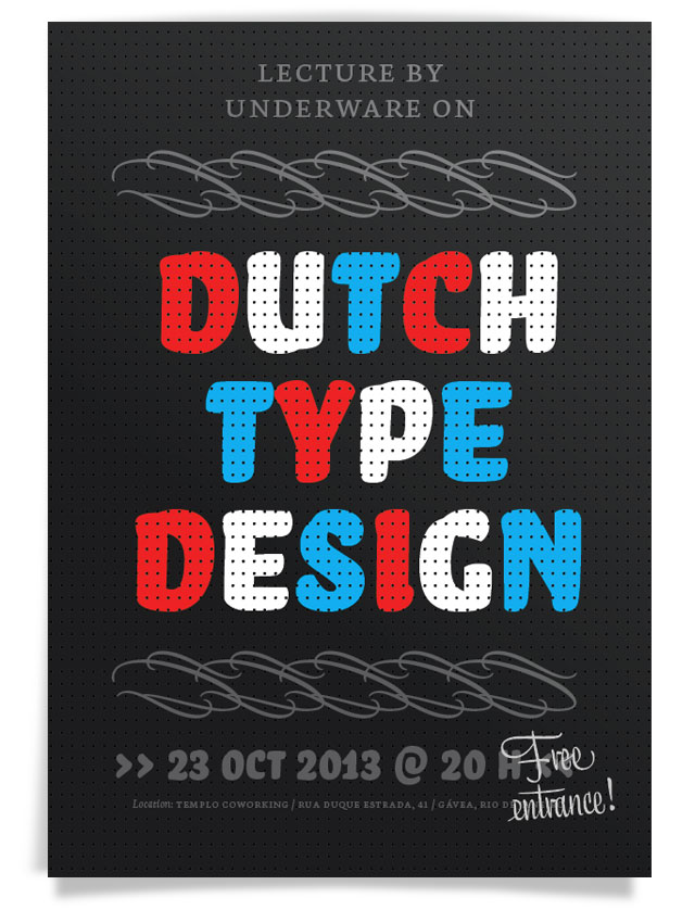
Let’s show the Brazilians why the Dutch are too much. Summarizing 5 centuries in less than two hours? Yeah, right. Because type from the Low Countries is as good as Dutch football: 90 minutes of gallery play.
Lecture by Underware on Dutch Type Design.
23 Oct 2013 at 8 pm.
Free entrance, registration necessary.
Location:
Rua Duque Estrada, 41
Gávea, Rio de Janeiro
01 october 2013 — walhalla
That little thing

Can’t remember anymore how often we had to explain the user interface of InDesign to our customers. It’s our top 1-support question. Yes, all the magic of OpenType fonts is very well hidden in a sub-submenu of a palette. Every time we explained the menu, their reaction is the same: ‘WTF, that little thing?’. No wonder that the majority of the font users is not aware of the possibilities of OpenType fonts. Even worse, they often think the small caps are missing because they can’t find them. After more than a decade of OpenType magic, it’s about time that Adobe (but also other developers) improves the OpenType user interface within their applications. Maybe it helps if every Adobe employee is obliged to wear the “triangle plus stripes”-t-shirt until that is fixed?

OpenType features need to be as easy to understand and apply as the Bold & Italic buttons in good old MS Word. Here is one simple suggestion for a possible UI-improvement. But we need more suggestions, so start sketching. Please make and share your OpenType interfaces, and let’s strive for a better UI.

[slides from our “It’s so technical, so let’s tell it with a comic story”-presentation at Kerning Conference earlier this year in Italy. ]
25 september 2013 — walhalla
Typotentie A
Today in “Stuff you can’t find on the internet”: printed collectors items. How cool is that, receiving an email 16 years later? Recently we received an email from Minotaurus – specialized and antiquarian bookseller in Amsterdam – that they discovered a handprinted magazine from Bas in their store: Typotentie A. Honestly, we forgot about this magazine already. So we should thank our local bookshop for preserving some labour intensive specimens. Chapeau for their unscrupulous administration.
Typotentie is hand printed typographic magazine, combining various printing techniques, hand bound, published in a tiny edition. It was our early mini-adventure in self-publishing while studying. Originally intended as a non-regular typographic publication, Typotentie got already stuck at the second issue. The cover of issue B has already been printed, the interior paper is cut and prepared, but a lack of space for setting up the printing press after moving caused a sad ending of this magazine. A sorrowful destiny in true DIY-spirit.
If anybody is interested in a Korrex proofing press, let us know. The press is stored, unused, waiting for new adventures. And if you are ever in Amsterdam, visit Minotaurus bookshop at the Sint Antoniesbreestraat 3d in the city centre of Amsterdam. They still have a copy of Typotentie A in stock, as well as many other books on typography, bookbinding, book history and poetry, as well as many hand printed, bibliophile books. It can’t be stressed often enough how luxurious it is that such a bookshop exists. Take that, internet.
24 june 2013 — out now
New font: Sauna Mono

Sauna Mono, one size for all
As from today the type family Sauna has a monospaced companion: Sauna Mono. Unlike most monospaced typefaces, Sauna Mono has a lot of flair. Although every character has the same width, Sauna Mono doesn’t feel forced into a box. Instead every character remains as warm and characteristic as the other Sauna typefaces. Some swashy characters give a lot of charm to this typeface, especially the italic lowercase characters. Their strokes fly all over.
Monospaced fonts are nowadays mostly used by programmers for coding, or to present complex information in a well-organized table. And mostly you need a timid, clear typeface for that. As a consequence most monospaced fonts are… well, timid and clear. Sauna Mono is everything except timid and clear. It’s expressive jazz on a dubstep beat. It’s Tarzan on a Swiss grid. Who said monospaced fonts are boring?

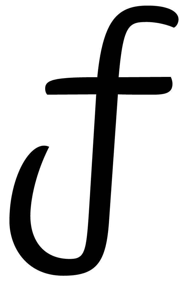
If you look for a reason to fall in love with Sauna Mono, we’ll give you a helping hand: just look at the long, swashy strokes of some lowercase letters. Those give a lot of charm to the family. Who wouldn’t like to fall in love with an f like this?
With this new addition of 4 monospaced styles, the Sauna family grows to a total amount of 15 styles. These additional fixed-width fonts make the Sauna family utilizable for more complex tasks. Typesetting tables of an annual report made within a knotty corporate identity for example.
Introduction offer
Sauna Mono is now available as a desktop font as well as a webfont in our shop. You can save €25,– by ordering all 4 styles at once. Even better: because Sauna finally has a new buddy, you can give one Sauna Mono for free to one of your friends if you buy the complete Sauna Mono package yourself. This introduction offer runs until 12 July.
Wanna know more? Find further information about the type family on our website: underware.nl/fonts/sauna_mono. Enjoy.
14 june 2013 — font update
More licensing options
Recently we did not only update our fonts, but simultaneously updated our licensing models. Of course the print & web license are the two most common licensing models. But the kind of font license an organization needs varies a lot between single, individual designers and a global enterprise. Therefore we developed 11 other licensing models for the most common situations in our daily practice. Fonts in mobile apps, in eBooks, educational licenses, etc. You can find a condensed overview at our website, accompanied by brief pricing information. Every licensing model is summarized within a couple of lines, but the complete small print has been included too.
www.underware.nl/support/licensing
Only the desktop and webfont license are included in our webshop. The sales of all other kind of licenses are processed manually, on request. If you want to use our fonts within an app for example, just send us an email. And oh ja, find easy and complicated answers on licensing here.
11 june 2013 — walhalla
Dolly loves Storm
Storm in our inbox today. Storm The Indestructible. Storm The Disbeliever. Storm is the one-and-only Dolly impersonator. Remember Storm from winter 2008? Storm is still going strong. Storm bro, Dolly says woef.
06 june 2013 — font update
Single fonts
 More good news: we started offering single fonts. Next to buying font packages, you can also just buy a single style if that’s all you need. However, we will keep on offering font packages as the bundle-discount can go up to a whopping 60% compared to buying those fonts as single fonts. You don’t wanna miss that discount, right?
Good news makes us happy. So earlier this week we gave our bundle-buying customers a “present you can’t refuse”: pick any single font of your own choice for free.

If you previously bought a font package directly from us, but didn’t receive a free font voucher yet: email us.


03 june 2013 — font update
Behind the font upgrade
“Why did it take you sooooo long?” Brrr, let us explain why it took us ‘sooo long’ to upgrade our library, because if you’re not into making type you probably don’t have a clue. To many people the new upgraded fonts will look identical to their previous versions. And they are basically right, visually they didn’t change a lot. Still the same fonts. Right. Although the fonts visually improved a lot in details, upgrades like these are also focused on usability.
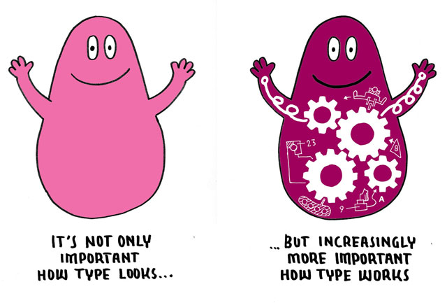
A decade ago most people still understood it was a headache to add German text on a Mac to a Polish document created on Windows. Lots of things would probably go wrong: strange accents, fucked up documents, etc. Meanwhile technology changed, we’re taking it much more for granted. We expect everything ‘just to work’, from our tablets, phones to our laptops and switching between them. So we expect the fonts to work accordingly, and not having ‘technical font issues’ within our digital lives. A correct Unicode support in all fonts is the first step in this direction, but more technical aspects need to be correct to make fonts as fluently operating as possible in a contemporary environment.
14 may 2013 — font update
Upgrade available

Today we released an upgrade of our complete library. All licensees can upgrade to this new version for free. Which means: anybody who ever bought a font directly from us receives a free upgrade, also when you purchased more than a decade ago.
Everybody should have received an email today which contains an upgrade-link. In case you didn’t receive this, please email us: support@underware.nl

Most notable changes of this upgrade:
• improved screen performance of webfonts
• broader language support (200+ languages)
• more OpenType features included
• all fonts come in .otf format
• webfonts are now synced with desktop fonts
• improved cross-platform compatibility
(in case you want more technical details, read Notes about the library upgrade)


