22 june 2017 — walhalla
ASCII+ Week

26-30 June 2017: ASCII+ Week
For all ASCII lovers, and those who love to be surprised: next week, from 26 to 30 June 2017, it’s Underware’s ASCII+ Week. Microsoft wrongfully declared ASCII dead in the end of the 1990s. As real ASCII-kids it’s finally time to show our love. Every day some ASCII news. Stay tuned, more on Monday.
13 april 2017 — walhalla
Underware loves the internet

The Internet = cats. Pictures of cats. Videos of cats. GIFs of cats. Whatever, as long as it’s cats. Since a while all 3 our studios have The Internet at home. Our studios in Den Haag & Helsinki had a cat for some time, but in Amsterdam it remained pretty silent. But when the kids & partner vote for a cat, and Bas votes against, it’s a good democratic habit to end up with 2 cats. Because the difference between 3 pro votes and 1 against, is exactly 2. Yep. Those same kids don’t have a clue what Twitter (our only social media behaviour) or Facebook is about, but think that The Internet = cats = Instagram (or Snapchat). Because we have The Internet now everywhere, we decided to create an Instagram account, just to add some cats photos. And some lettering.
22 december 2016 — walhalla
One more thing to Zeitung
Some more words on Zeitung in the OpenType Variable Font format, about Automatic Optical Size and Automatic Glyph Substitution.

The OpenType Variable Font technique is still in development, tools for making these fonts are still in development, implementation and support for these fonts are still in development. However, if you want to experience our recent release Zeitung as an OpenType Variable Font, visit our homepage www.underware.nl in a browser that supports this font format. At this moment that’s only Webkit Nightly, which explains the “Webkit Nightly Bonus” subtitle for a special section completely at the bottom of our homepage.
One more thing
The nerds, the lucky bastards and some geeks, anybody with that browser will see a demo at the bottom of the homepage which is invisible to other visitors using a less advanced browser. They can play with the tuners and experience how changing the size will automatically select the correct optical size of the font family. That’s what you’ve been waiting for, no? Some glyphs, eg. &, will automatically change shape when the point size becomes rather small. Additionally, changing the weight of the font will result in a change of shape of some other glyphs. See how the € swaps from 2 to 1 cross bar when the weight increases. Or how the tail of the Q suddenly doesn’t enter the counter anymore when its weight is too dark. This happens automatically while playing with the tuners, and happens live your browser. No fake news, no fake type. Man, this is 2016 and this is live. Not everything is bad this year.

Automatic glyph substitution depending on weight, live in your browser.

Automatic glyph substitution depending on size, live in your browser.
20 december 2016 — walhalla
The end of the lucky bag

A typeface like Liza is fully packed with technological novelties. At the time when Liza was released (July 2009), many of these were not supported everywhere yet. For example, only a couple of months after being released, Liza’s contextual alternates finally behaved nicely in TextEdit. (more…)
26 november 2016 — walhalla
Mailing list update

Recently we experienced some unwished-for developments at our mailing list subscriptions. During the last 6 months we sometimes saw multiple email addresses from a single company domain that subscribed all at once. Because we hate spam as much as you do, we decided to clean up our mailing list subscriptions over the last half year.
In case you didn’t receive yesterday’s newsletter, you have been unsubscribed accidentally. If so, please subscribe again. We only send a newsletter a couple of times a year, only when there is something interesting we want to share with you. Hopefully you won’t regret your subscription.
24 november 2016 — walhalla
Black Friday offer

In a world full of discounts & dark horses, Underware’s Black Friday offer seems to be inevitable.
5 Black fonts for €99,–
This offer is only valid for 1 day, and ends at the end of Black Friday 2016, 25th of Nov.

29 september 2016 — walhalla
There we go

Yesterday Ben Mitchell wondered if there are examples of nice manicules which are drawn in the same style as the rest of the font.
Wanted: examples of typefaces with exceptionally nice manucules drawn in keeping with the style of the letters.
— Ben Mitchell (@OhBendy) September 28, 2016
What many people don’t know, because it’s not easy to spot, is that many type designers enjoy refining many details of their fonts. For example by creating manicules which fit to the style of a font family. A special pointing hand allows extravaganza typographic subtleties in your book, website, identity or whatever you are making.
Also our fonts are equipped with matching pointing fingers. Because we enjoy drawing them, this is a nice moment to put them in the spotlights. No manicule is the same, or even close to being similar. Because no font is the same either.
The sturdy stencil font Tripper has a sturdy stencil index:

The female hand is clearly visible in Liza:

Fakir’s manicules are as edgy as the black letters themselves:

Bello & Sauna are typographic mates, and share manicules:

09 september 2016 — walhalla
Bello goes freestyle 4
It’s been too long to remember probably. Therefore we will help you out. We had some previous episodes of Bello Goes Freestyle on this blog in the past. It all started with episode 1 in 2007, where Dutch graffiti artists interpreted Bello on a wall. This freestyle interpretation of Bello was followed 2 years later with episode 2. Then 3 years ago we posted episode 3, about a selfmade lettering in a bikeshop in Toronto. And today, oh boy, it’s 2016, we are happy to present the 4th episode of “Bello Goes Freestyle”. There are quite some do-it-yourself versions of Bello around, but this one especially appeals because of its dedication. In last weeks post you could read about the consequences of removing a mural, originally made by graffiti artist Maser. One of the consequences was that the removed mural was resurrected at other locations throughout Ireland. That’s hipper-dipper for graffitis or murals, which are temporary by nature. This mural is not vanishing, but multiplying. Some of the replicas were very smooth. This one however is a bit fluffy and chubby, but painted with lots of love. Disguised, but still Bello.

09 february 2016 — walhalla
Love & Fonts
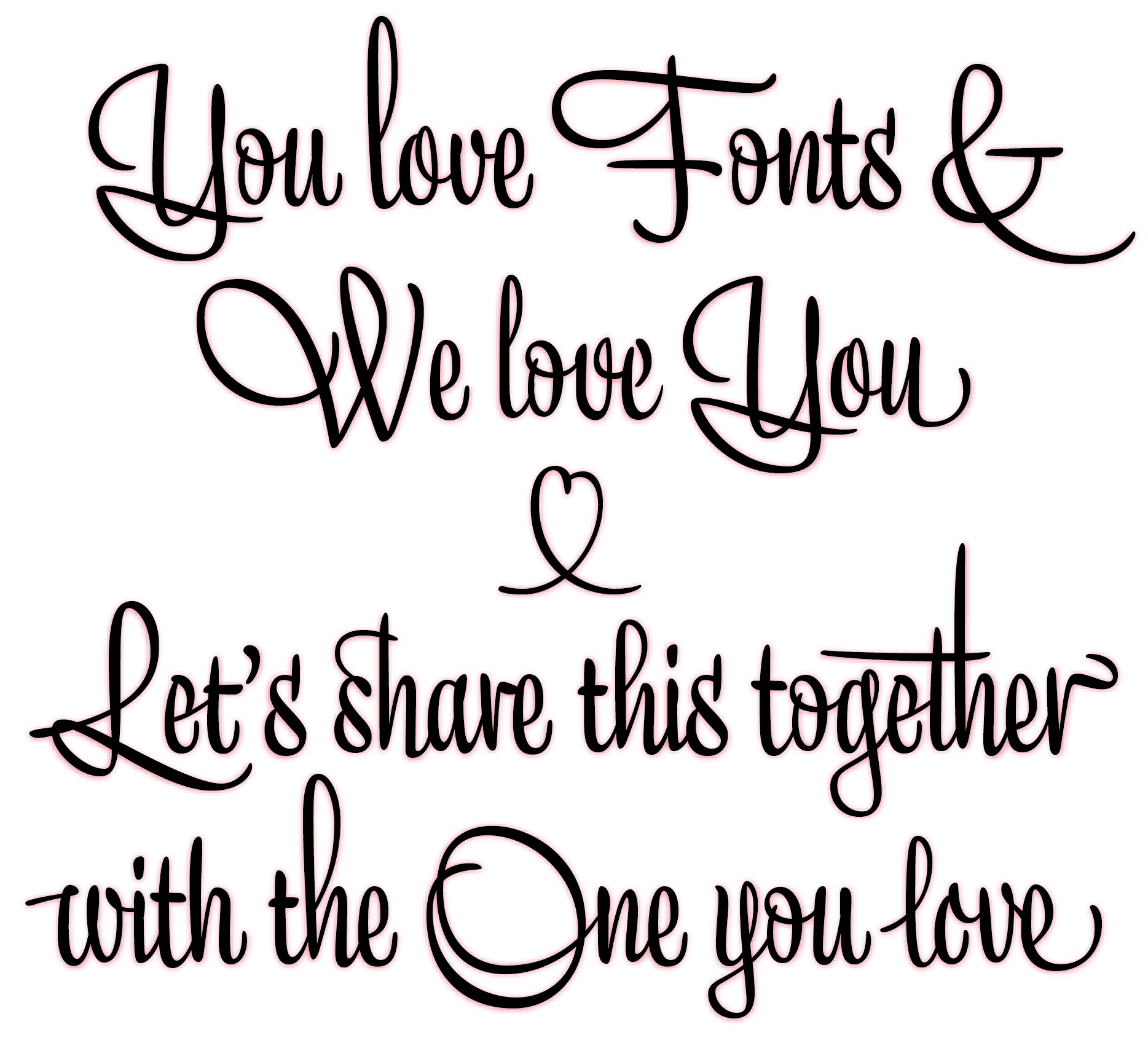
We all know that it’s not money but love which keeps the world turning. And fonts of course. Therefore we want to reward all orders placed this week (8.02 — 14.02) with an extra free font of your choice for the person you love. No worries, everything is super-simple: Just place any order this week in our shop and we will get in contact with you to arrange the additional free license.
31 january 2016 — walhalla
We love Lucy

After supporting us with office work and the shipment of publications for over 10 years, it was definitely time to affirm our love for Lucy with her own logotype stamp. Lucy’s reaction: From now on no document will leave the office unstamped. Thank you for everything Lucy!
