06 october 2017 — presentations
Bis bald. No ba.

Catch us the coming weeks in Germany and Poland. Next week we’ll be at HAW Hamburg (10 Oct), and the next day we’ll be the Hochschule in Wismar (11 Oct). At the end of the month we’ll do a workshop at Eugeniusz Geppert Academy of Art and Design in Wrocław in Poland (30 Oct). Our evening lecture will also be the end of the Wrocław Type Forum (30 Oct, 11:00 – 19:00), one day jam-packed with type. Join us if you’re around.
25 september 2017 — presentations
Underware reads from a newspaper

In two days, the 27th of Sept, we’ll read from a newspaper at Type Amsterdam. Other speakers include Rob Saunders (Letterform Archive), Liza Enebeis (Studio Dumbar), Janno Hahn, Pieter Boels (Antwerp Type Society) & Aleksandra Samulenkova, and hopefully Gerard Unger will also be present. Six short presentations about typography and type design in a compact afternoon. As this events always sells out quickly, tickets cannot be acquired anymore. But do sign up for their mailing list in case you don’t want to miss out on the next Type Amsterdam.
15 may 2017 — presentations
Upcoming presentations

Four countries in four weeks. We’ve got a couple of presentations coming up, where we’ll present our latest findings. Hope to see you in of these cities:
18 May: Plug & Play, Porto, Portugal — plugandplay.pt
25 May: TYPO Berlin, Germany — typotalks.com/berlin
1 June: BNO Zwolle, the Netherlands — facebook.com/bnozwolle
10 June: IS Type conference, Istanbul, Turkey — istype.com
11 april 2017 — presentations
Hallelujah Variable Fonts

These are exciting times in the font world. “Variable fonts” are the magic words in type technology these days, and interpretations of its meaning interpolate from one extreme to the other. This new, evolving technology offers as many possibilities as well as challenges and problems. Therefore this is the right time to question future conventions. At least, this is what we tried last Saturday in our talk If you want something new, you have to stop doing something old at TypoLabs, Berlin.
Within less than an hour we’re exploring the options of just 1 interpolation axis. And what happens if there are 26 axes to play with? And hey, what happens if we put 241 axes in the game? You probably can’t imagine yet what these possibilities are. And what can happen if you add the remaining 63759 axes to the game? How much could actually fit in a font? How intelligent can letters be? And aren’t there any other ways to design type? Or to use type? Questions, questions.
Note: because the word ‘variable’ should of course be differently pronounced every time, we’re already practising for next time.
30 january 2017 — presentations
Safari Typo in Paris
Currently the Safari Typo documentaries of Thomas Sipp are on show in the Musée des Arts Décoratifs, located in western wing of Palais du Louvre, Paris. In case you didn’t have the opportunity to be present at last week’s presentation in Amsterdam, the Graphic Design Festival in Paris might be the right opportunity for you. Accompanied by a small exhibition of our printed Safari Typo Amsterdam guide, all episodes can be viewed until 5 February 2017. Mais bien sûr!

And in case you hadn’t been able to make it to Amsterdam or Paris in time, the internet will save you. The French TV channel Arte has released all Safari Typo documentaries of Thomas Sipp at its own website: arte.tv/safaritypo
Amusez-vous bien!
16 december 2016 — presentations
Safari Typo Amsterdam
An evening full of short documentaries about typography in public space & book presentation

We all know the famous HOLLYWOOD lettering, but what makes these letters unique? Can the character of a city be told by the letters in public space? In which aspect is the typography in Barcelona different than in Berlin? And why do those strange, unorthodox geometric and decorative display letters perfectly fit to Amsterdam? Join us 20 January 2017 for an evening full of short documentaries about typography in public space.
23 september 2015 — presentations
We love graphic design

In case you want a sneak preview of our upcoming font release, catch us all three in Copenhagen next week at the We Love Graphic Design conference.
Saturday 3 October, Den Sorte Diamant, Copenhagen.
Speakers:
Annie Atkins
Jean Jullien
Julie Katrine Andersen
Lust
Underware
See you there. More info:
welovegraphicdesign.dk | Facebook
18 february 2015 — presentations
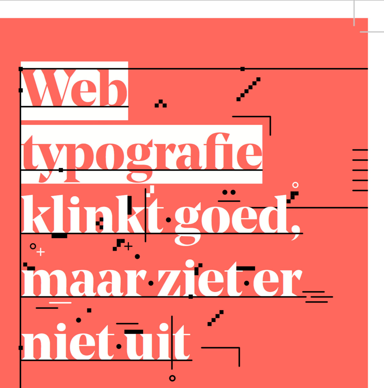
Web typography sounds good

Coming monday we will give a lecture at a seminar on the future of web typography. This seminar takes places at the Brakke Grond in Amsterdam. In our lecture ‘Web typography sounds good, but looks awful’ we will highlight some often overlooked elements of web typography. The unsurpassable Frederik Berlaen will also give a presentation, and you can do a crypto typeface game with the madmen of Autobahn. If you are Dutch, concerned about type, screens, interfaces and ergonomics & want to flex up your brains, come over. Organised and presented by Grrr, what else should we say? Be there or be square.
Monday 23 Feb, 20:30 o’clock
Beeldmakers #1; with Frederik Berlaen, Underware, Autobahn, Jort de Vries (Blendle)
Vlaams Cultuurhuis de Brakke Grond
Nes 45, 1012 KD Amsterdam
Entrance at door €7,– / Online €5,–
07 april 2014 — presentations
Wo-Wo Polski Tour 2014

This spring we’re gonna travel towards the Polish borders for some lectures and workshops during our “Wo-Wo Polski?” roadtrip. But we will not enter Poland. We repeat: we will not enter Poland. We are only gonna wave to the Poles. Miło cię spotkać! Four cities in three countries in one month, let’s hope our van won’t let us down.

22–25 April: Vilnius (Lithuania)
What’s up?
In this 4-day long typeworkshop at the Vilnius Art Academy you’re gonna create a typographic toolbox for social media. Short letterings which represent your different moods, which can be used to communicate your status in social media. You can use these letterings for your most favorite social media application. Letterings can be animated as well, just keep them pure typographic, black & white, without illustrative elements. Digital outline drawing of typefaces will be introduced, as well as some foundations of type design and lettering.
Thursday 24 April: lecture by Underware at the Vilnius Academy of Arts, Maironio str. 3, Vilnius. Be in room 312 not any later than 18:00 o’clock, as Sami will then start to unravel the invisible research behind designing typefaces.

23 April: Plzeň (Czech Republic)
Lecture at the University of West Bohemia, as part of the DE.SIGN 2014 project. Faculty or Art & Design, 16:00 o’clock, sharp.
The iceberg called type design
Type design is maybe the most subconsciously observed visual human creation. Most people will read a text without notifying the typeface itself, and that’s totally legitimate. Only a happy few will notice the typeface which is used. You can call them graphic designers with a job-related disability if they can tell the name of the font, including its designer. But even those happy few will mostly not be aware of the kind of research which is involved in making those typefaces. The pan-European type design studio Underware will reveal the research behind their typefaces, and demonstrate that type design is like an iceberg: 90% is hidden under the water. A design lecture told from the submarine. Be aware: it can be dark below sea level…

24-25 April: Prague (Czech Republic)
24 April: Thursday at 19:00, lecture “The iceberg called type design” (see above) at Instituto Cervantes, Na Rybníčku 536/6, Prague. Open for public, so drop by if you’re around.
25 April: Type workshop at Prague College, School of Art & Design. One day to explore the foundations of type design, and offer yourself a kickstart in a new territory.

24 May: Leipzig (Germany)
The folks from Leipziger Typotage invited us to talk about type. In the end, type is about language. In the beginning too. And somewhere in between that language needs to get a certain shape. Therefore we present a message from the language engine room. “Occidental is dead. Now what?” Ten speakers in one day, so Akiem and Bas will do their best to get to the point quickly.

Do zobaczenia później!


