28 may 2020 — walhalla
Underware in motion
At Underware we often talk about stuff. And that stuff could be anything, it’s whatever we discuss at that moment. This is probably born out of our lack of mastery of the English language 20 years ago when we called almost everything stuff, but the word stuck in our conversations and became useful in some sense too. So let’s talk about stuff here.
In this case the stuff could be an identity, or a brand, a company, a group, an organisation or institution, or just a text. Lots of different stuff, basically anything which is graphically (re)presented. While representing this stuff, motion has become a default part of the characteristics of this stuff in digital media. Half a century ago designers had to consider the visual representation mainly only in static media. When a designer had created a poster/corporate identity/book/other media with a strong own identity, that stuff could have a successful life of its own. But in today’s world, this isn’t always the case anymore. There can be more to the stuff today. As anything can move in unstable media, it’s important to define how stuff moves. Your move is different than my move, in the same way as your dance is different than my dance, and your handwriting is different than mine.
The importance of motion might be obvious for interface and website designers, app developers, and social media influencers, who have been dealing with this for many years already. But it’s relevant for anybody involved in visual online representation. Of anything. The way stuff moves on your website or app is no longer limited to how you navigate from one page to the other. The complete interaction has evolved in the past decade, making also the motion of a logo, or other design elements of an identity, part of the entire experience. It adds to a richer, more complete character of the stuff. It’s obvious that designers of movie leaders don’t only draw a static lettering of the movie titles, but also consider its appearance in time.
The importance of motion is not limited to movie leaders or app developers. For branding agencies animation has become a default part of developing an identity. For designers the characteristics of movement have become a default part of their job while designing a logo. Motion is as much part of the character as shape.
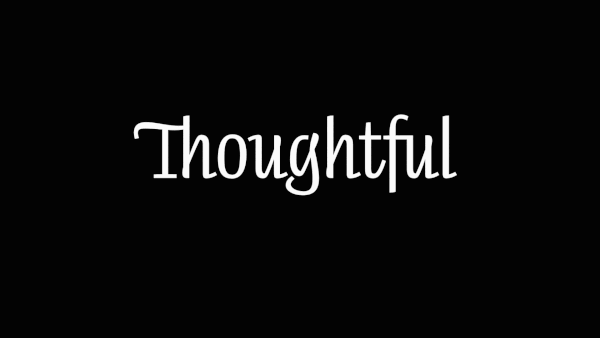
Back in 2004 we created a logotype for the British ad agency Thoughtful. Instead of creating a static wordmark, which was common at that time, we created a living organism to represent their firm. The way this living organism breaths and grows, is all part of the visual image. In case a static logotype was required, for example for their letterheads or business cards, an instance from the animated wordmark would be taken. Technical crude, but hey, it works.

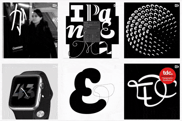
Since then we’ve created quite a few logotypes in which motion was at the core of the design concept. The Thoughtful logotype was followed one year later by the animated wordmark for the 2005 ATypI conference. Other, more recent examples are the logotype for Duncan/Channon, or the logotype and some lettering for the online marketplace for video courses Udemy. You can find some of them at our logotypes section. We also experienced it can be hard to explain clients that their logo is not a static single shape, but a dynamic shape which doesn’t have just one, original, true shape. All shapes are true. It happened to us that a client was totally impressed by our presentation of his new dynamic wordmark, and in the end asked: “Nice, but where is now my logo?”. Well, everything was the logo, but he didn’t get it. So type in motion doesn’t only require a different way of thinking for the designers, also commissioners need to have another awareness.
You could say that defining the motion of shapes as in an animated logotype is just a small section of a much bigger prospect. Instead of designing only a specific kinetic logotype, any digital text could be in motion. Due to the dynamic nature of text, the designer can’t control the final output. Therefore characteristics how letters should animate should be included in the design of the letters, and are an integral part of the design concept.

Technological developments of the past decade also allow for much more sophisticated movements of shapes. In the same way as a branding agency currently considers the motion while working on a new identity, type designers can define exactly the way their letters move and include that in their font files. The included movement can not only provide more attention for a text, or add aesthetic value, but can also enlarge the understanding of certain scripts. In Chinese education for example, the order of the strokes and the direction in which each stroke is written, are important for learning the language. The motion can also contribute to a larger expression of text. In the past years we developed our own technique for this, which can be seen in the animation above. The Chinese character shown here is biáng, “one of the most complex Chinese characters in modern usage”*, is now displayed as a .gif animation on your browser. However, this .gif is not ideal. Originally this is of course not made as a .gif, but as a variable font. It’s a typeface which can be used to type text just like any other typeface. But in addition, our typefaces have the possibility to write itself. This technique is scalable because it’s style- and script-independent, it works with Latin, Cyrillic, Greek, Arabic, Hebrew, Hiragana, etc. etc. A simple Latin version can be seen in the top header on this page, where “Underware in motion” is written in the style of Bello. But even when a character consists of 58 strokes in Chinese, this technique works as you can see above. However, what you’re actually watching on this page is a screencast from a variable font that is displayed in a browser. Subsequently that screencast is converted to a .gif just to make it work in this crude WordPress blog. So you’re not watching the thing, but a picture of the thing. Admitting, this sloppy .gif is a very crude way to demonstrate an advanced technology. This technology is now offered as a service to others. In case you’re interested to see this technology live in a browser, or to know more about this, please visit grammato.com and see how handwriting and typography can be combined into grammatography. The advantage of this technology is not only that it can be applied within various styles and scripts, but even more that the animated text remains *text*, and is not converted to a movie (or a .gif). The animated text has all the advantages any other digital text has. This means that the input can be dynamic, the text can be copy-pasted, and the animated text is still searchable, translatable, and exportable.
We’ve created much more animated type in the past than can be shown here. Besides of Grammato and animated logotypes, we are often occupied with animated type on other projects too. You can find more stuff at our Instagram page @underwarefoundry with the hashtag #underwareinmotion. However, this is all just the beginning. The most important developments of text in motion are still to come.