29 may 2020 — out now
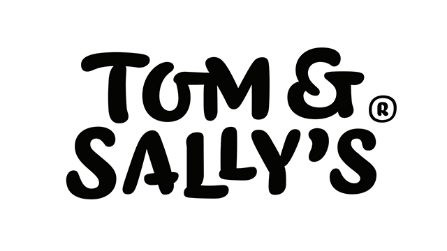
Hand-drawn logotypes
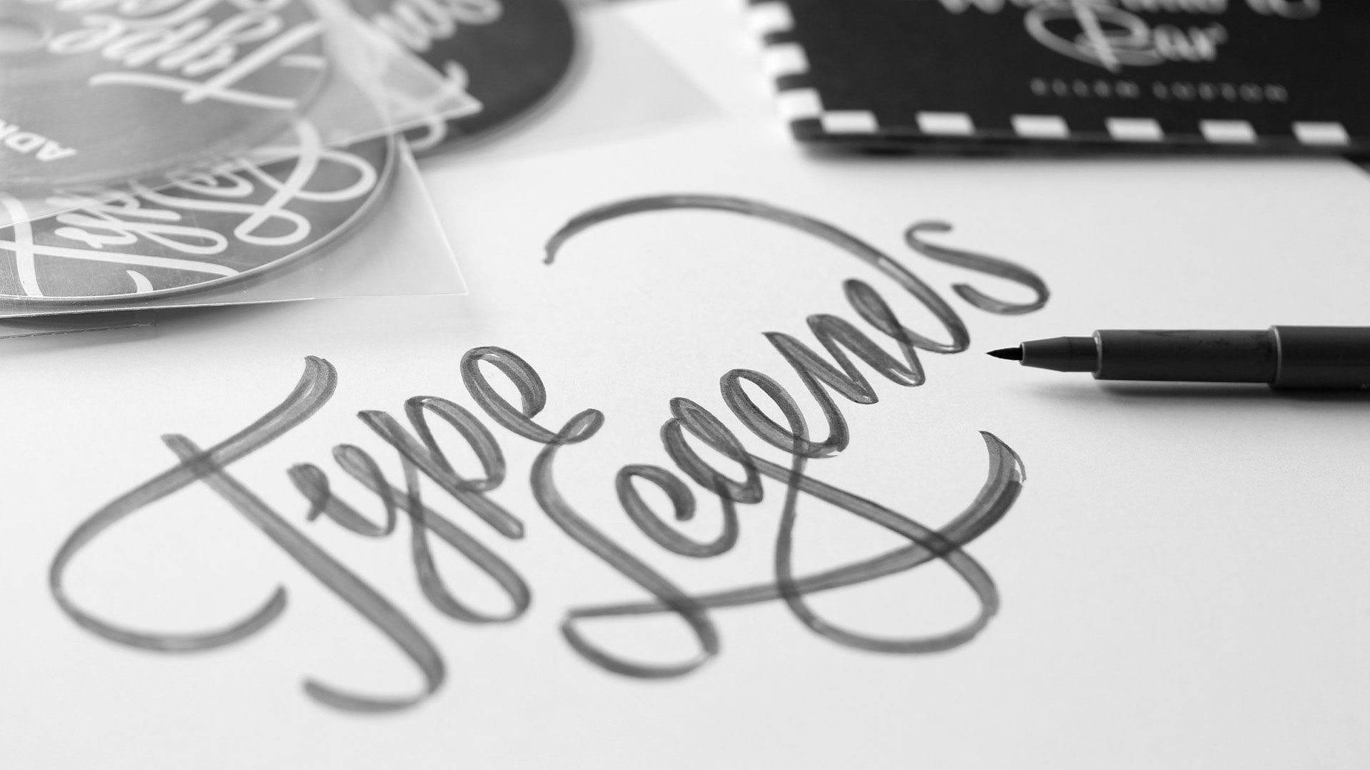
Every thing has a name. What’s better to visually represent this thing than writing that name in appropriate letters? Our projects usually start with hand sketching, and end up and black and white shapes made out of bezier contours. We make lots of hand sketches, from doodles to detailed sketches, but almost none of them are directly visible in a digital end result. That’s not necessary at all, and even the digital lettering can be considered drawn by hand.
During the “stay at home & but also homeschool your kids & stay healthy at the same time” challenge of the past months, we found some time to add a whole bunch of new logotypes, letterings and mastheads to our website. The range of these applications is rather wide: from boat lettering to magazine mastheads to business logotypes. Some logotypes are in motion, others are static. Some required a months-long process, others were done in an afternoon. They can be for a large multinational, but also for an individual. Some of them are meant to build a brand, others are there for pleasure. The lettering itself might contain a secret visual bonus, and sometimes they are as easy as ABC. Sometimes they are made in cooperation with designers or art-directors, in other cases they are made directly for a client. But they all have at least two things in common: they all consist out of letters only, and we’ve drawn them all by hand.
We just love drawing letters by hand. This was also a good moment to update the logotype section of our website. Find 15 new projects which we made in the past years at underware.nl/logotypes