23 october 2012 — custom type
Elevator typography

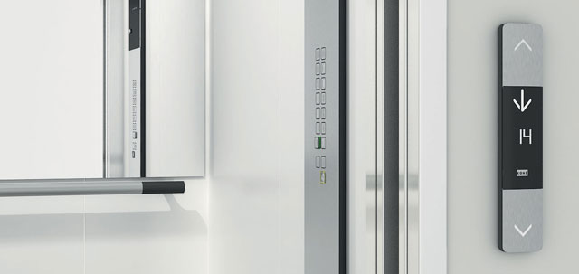
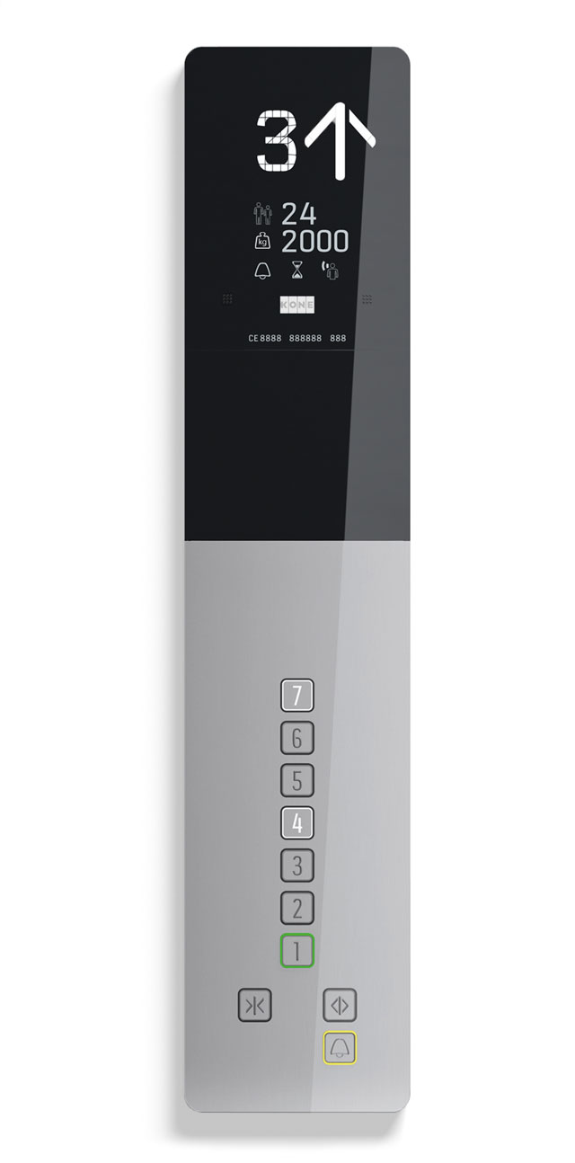
Because different elevator models are usually made by many different parties and departments, they quickly loose harmony. Recently we created some custom typefaces for Kone, who wanted to match their different models of elevators and escalators.
This was a fascinating project for us. Not only is there a bunch of typographic laws (those lawyers!) on elevator typography, each part of this project also had very specific requirements and applications. Creating segments which can display every number as well every capital, is a challenging assignment for example. A puzzle with so many limitations your head starts spinning.
See more of this project: Kone, elevator typography
