08 october 2014 — walhalla
Typesetting the Dutch IJ
Now. You are a typographer and do your best to achieve ultimate precision in details. You want to set a text in Dutch, as good as possible. You need to master the curious case of IJ.
The Dutch IJ

There is a difference between typesetting Dutch and other languages regarding the ij. In Dutch the ij is a digraph, or – if you prefer – a ligature. We don’t care how you call it, as long as you consider the IJ as one letter. So in case you set a text vertically, you’ll have to put the I and the J on the same line.
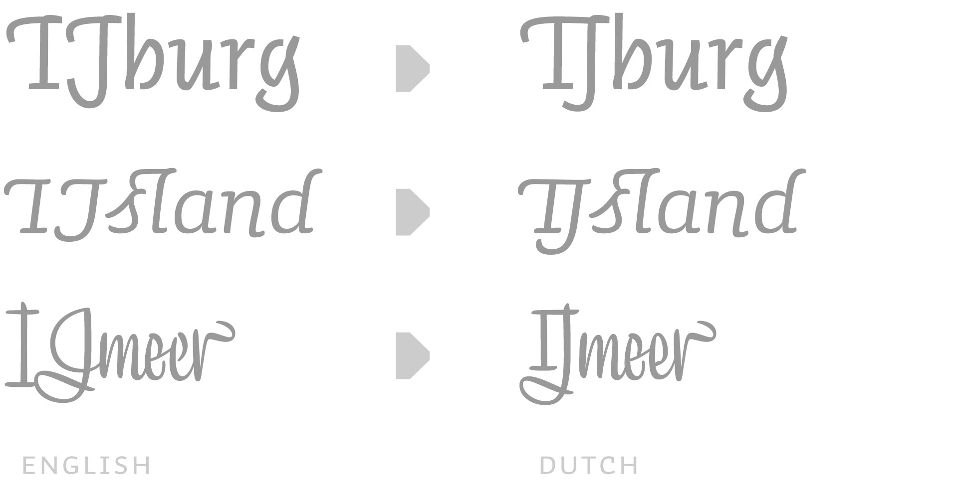
This Dutch IJ might require a special design, depending on the design of the font. Most roman sans serif fonts can live with a regular ‘I’ and ‘J’ combination. Although not always perfect, that’s quite often acceptable. But in swashy fonts the need for a specially designed ‘IJ’ is obvious. A swashy I followed by a swashy J is a nightmare for the Dutch IJ. It needs a special glyph included in the font. And please remember to select the right language for your text, as these IJ’s only (should) show up in Dutch texts.
The missing dot
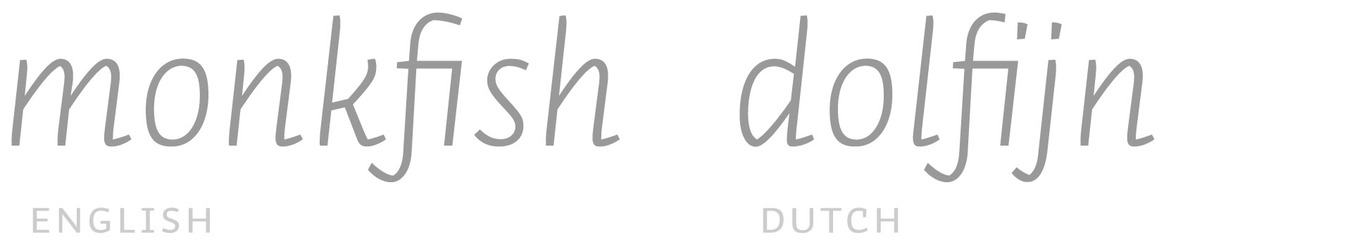
Okay, the ij is cleared. From now on you only work with fonts which have a special glyph for IJ and ij. But then the trouble starts in lowercase. Because fi-ligatures often remove the dot on i, the ij does not look like ij anymore in Dutch. In case the lowercase ij shouldn’t look like a handicapped, amputated lunatic, it needs two dots. To be able to have a nice f+i connection as well as two dots on the ij, you’ll need an additional ligature in your fonts: f+ij

Because some people love to cook their own words, an additional bonus ligature could be included to make sure any imaginable Dutch word looks perfect: f+f+ij
Oh, oh. Exceptions
However, not every i+j in Dutch should become ij. There are some Dutch words which would have their hyphenation in the middle of i and j. There is currently not a beautiful solution for this, so all official exceptions have to be hard coded in the OpenType code of the font.
IJ-acute
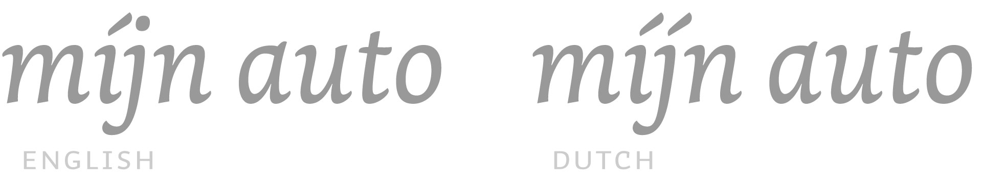
In case you want to stress a word, both letters of ij need an acute. Although one cannot enter a j-acute on a keyboard, the typeface should automatically create both acutes once an i-acute is followed by a j. This should of course only happen in Dutch. So make sure you’ve got your text set to the correct language, and you will have the ij-acute in your Dutch texts.
Our recent library update takes all these Dutch sensitivities into account, making all our fonts suitable for precise Dutch typesetting. All goes automatically, you don’t have to think about all this. Which means you can forget everything you just read.