27 june 2017 — walhalla
Responsive ASCII

Why wouldn’t ASCII art, being over 50 years old, adapt itself to modern times? We are all familiar with ASCII art and we all know responsive websites. What happens if these 2 are combined?
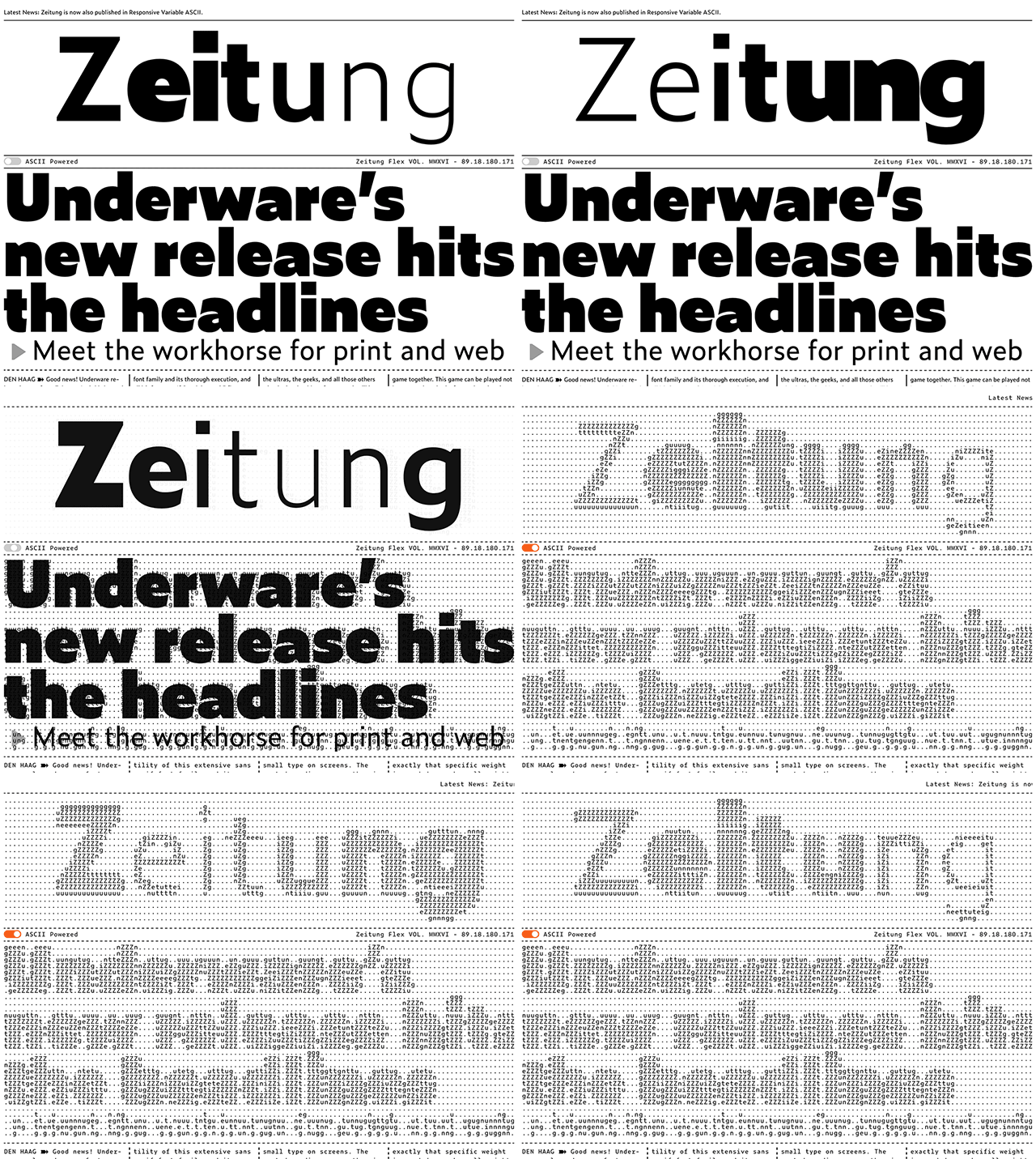
We released a monospaced version of Zeitung yesterday, and we all know that monospaced fonts & ASCII art are a match made in heaven. Therefore our website has a new homepage, using responsive ASCII. Resizing the window will offer the full experience: the text size which displays the ASCII art remains the same, independent of the window size. As a consequence: the resolution increases once the window enlarges.

Our homepage features the typeface Zeitung with all its variable weights. If that ain’t enough, you can now browse our homepage in two modes: normal view & ASCII powered view. After activating the ASCII Power button, the website remains the same but will just be displayed in true ASCII style. Everything is rendered live, everything is interactive.

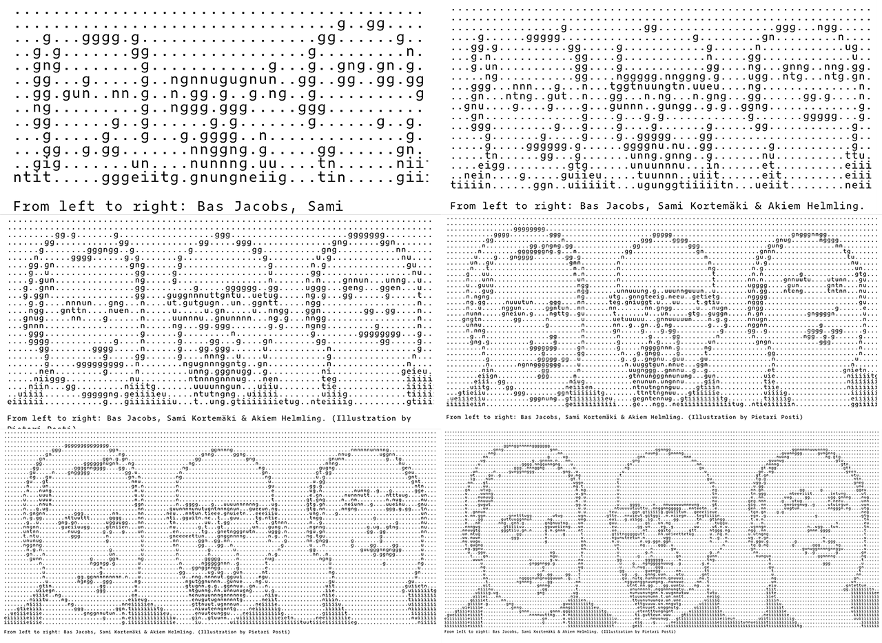
Resizing the window will automatically display the portrait shown above in optical sizes. In the example shown here, all variations are scaled to identical widths to demonstrate the effect. However, for the real experience you should visit our homepage yourself. Don’t forget to resize windows to experience true responsive ASCII: www.underware.nl