Vihrea Lanka 2016
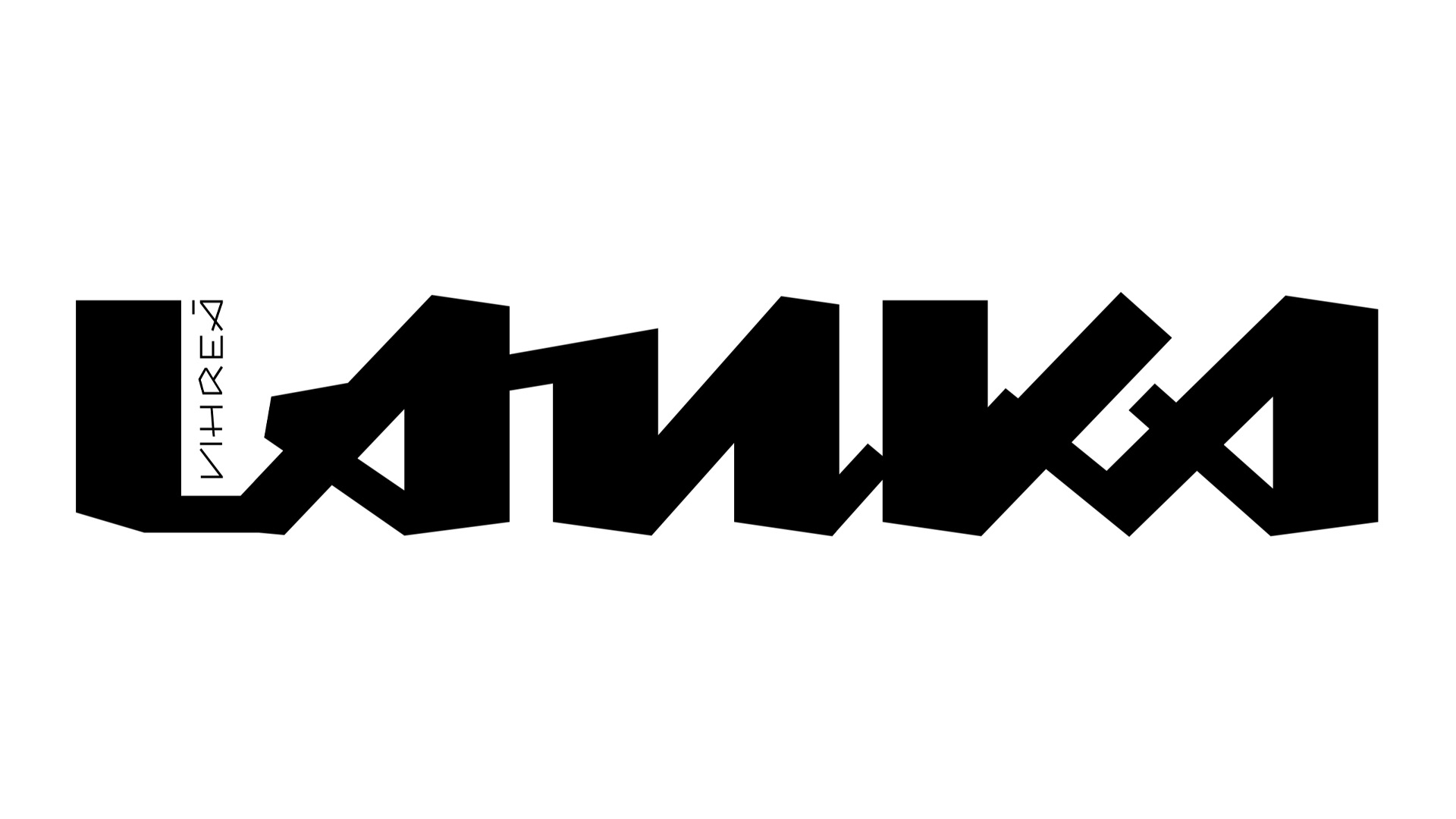
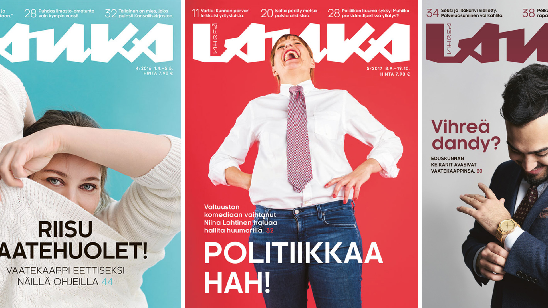
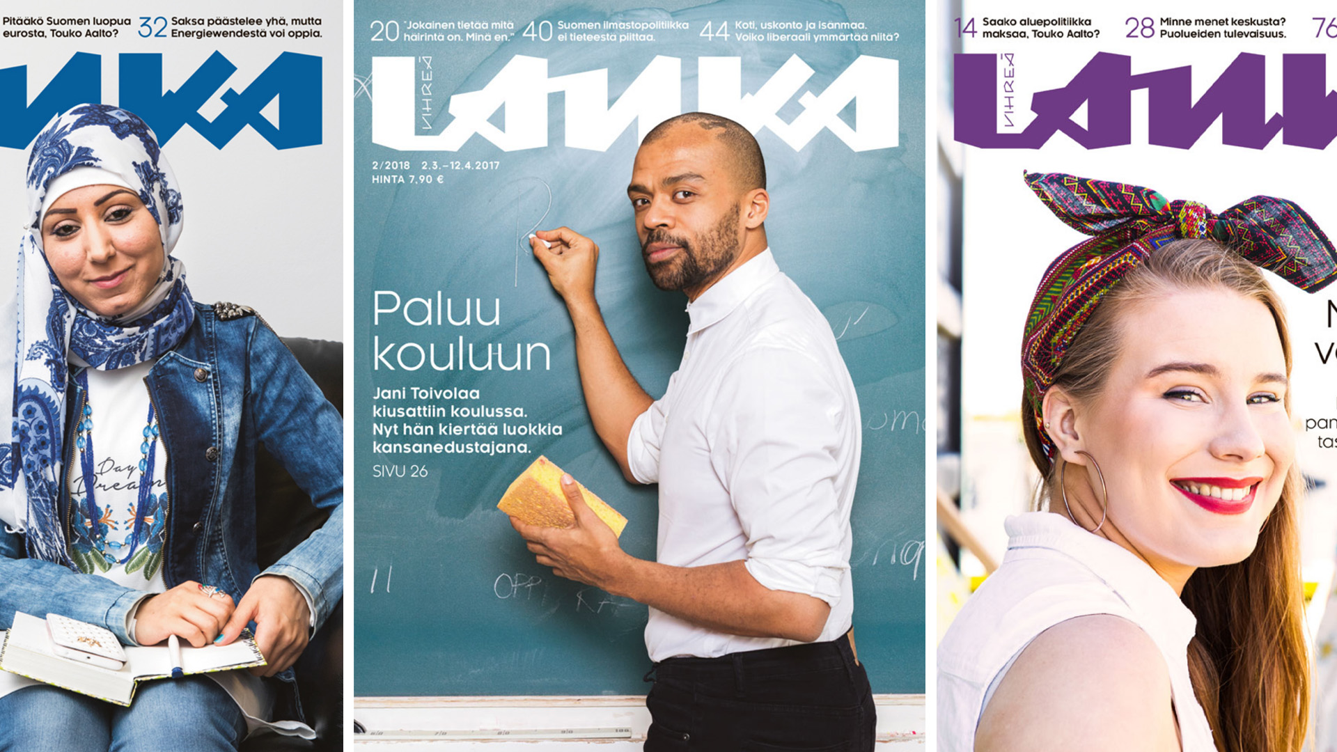
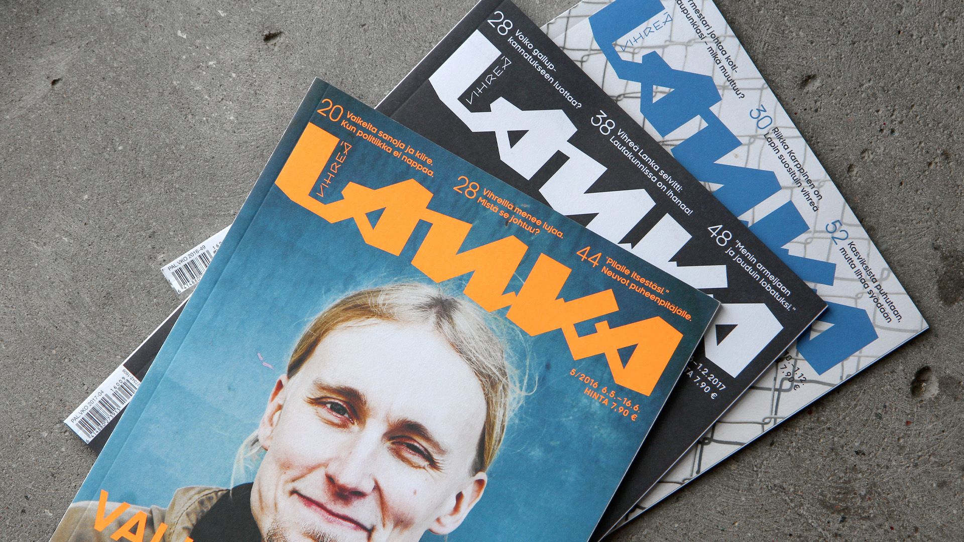
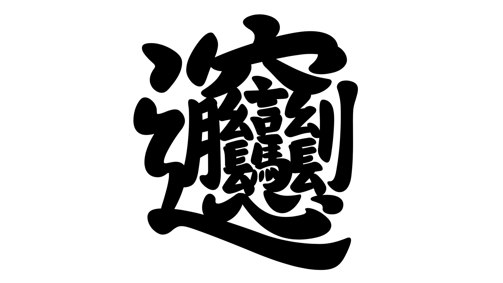
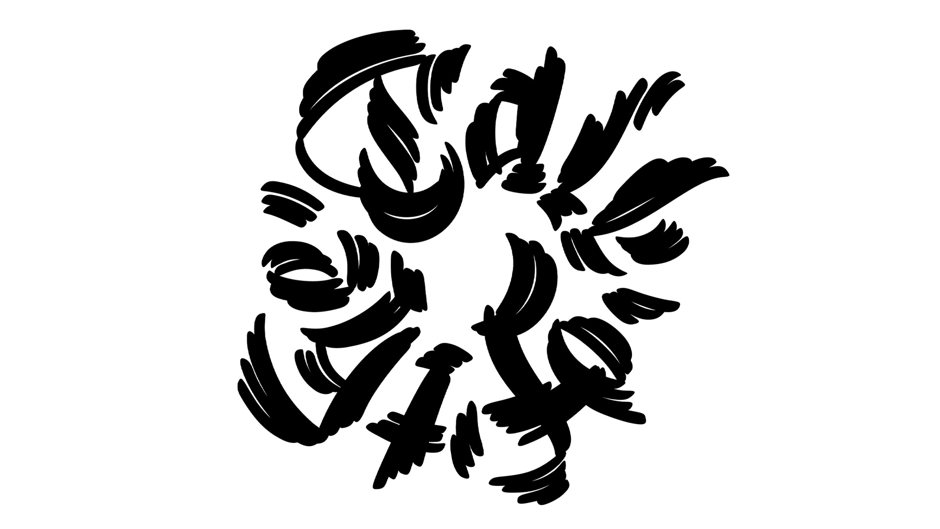
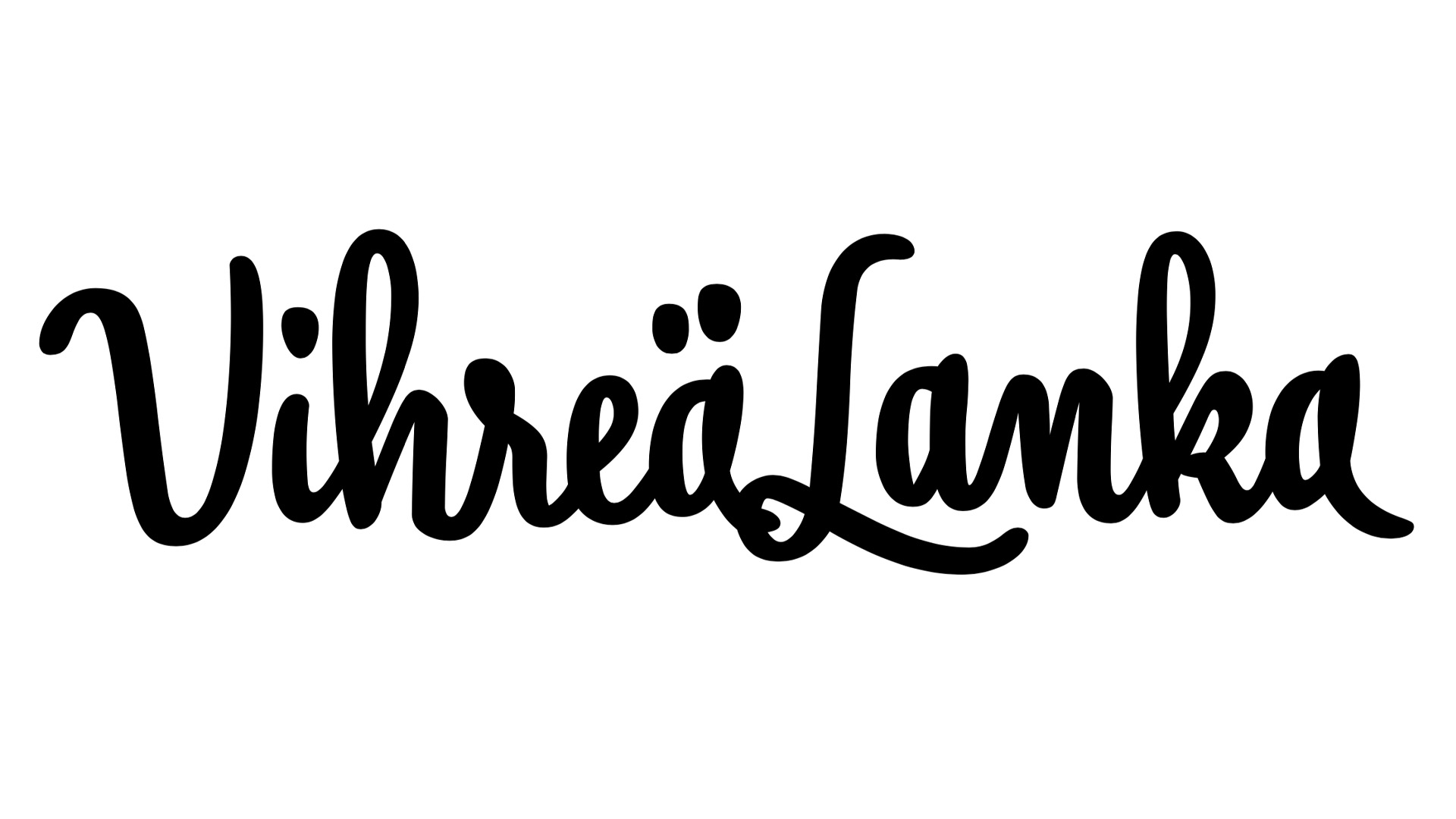
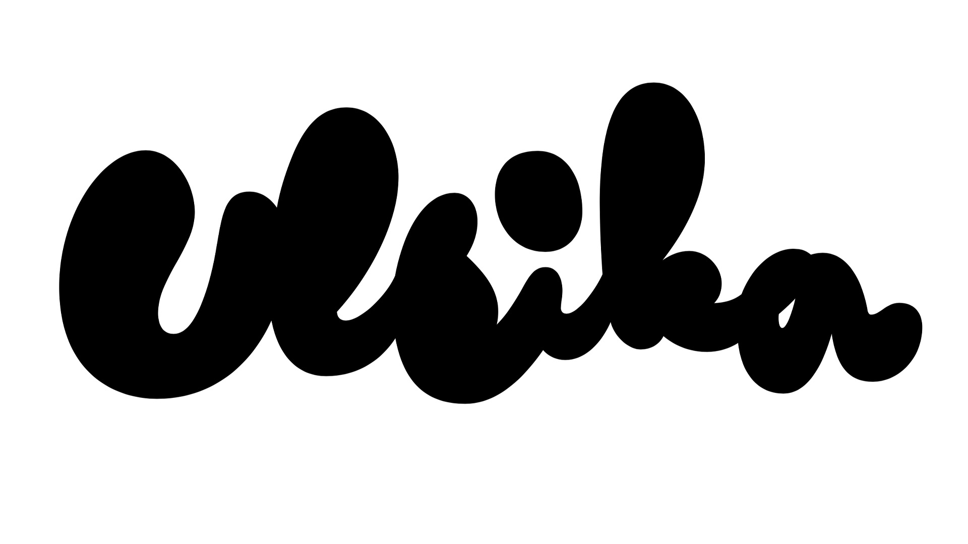
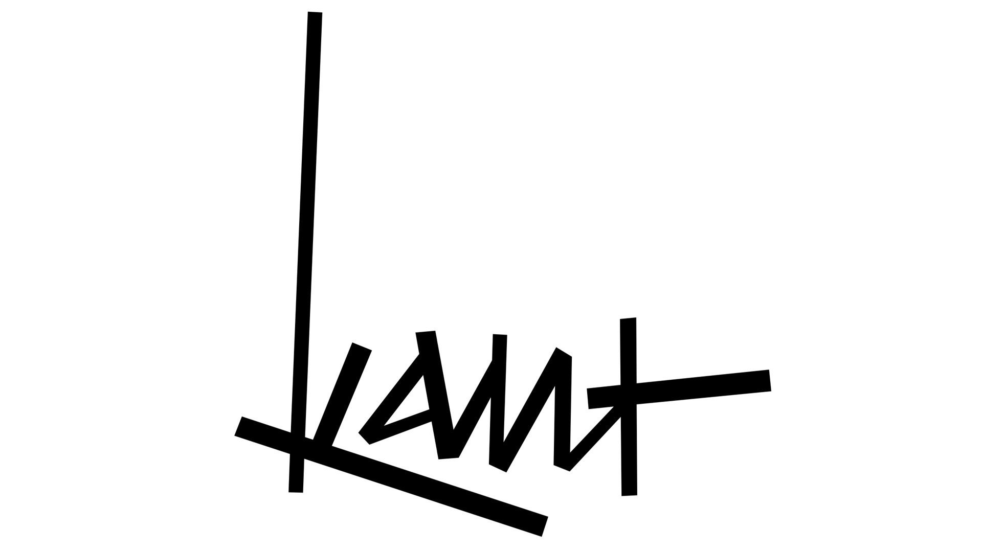
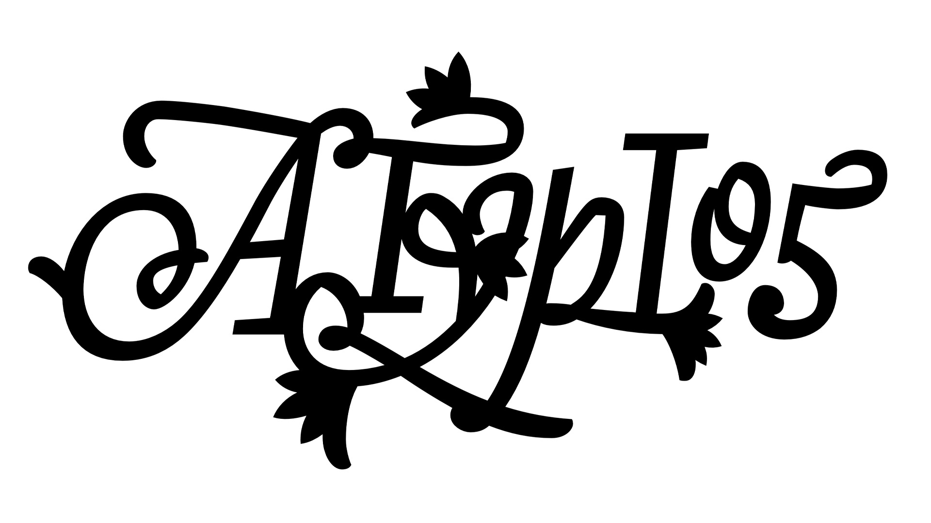
From tabloid to magazine format. As the size of Vihreä Lanka got smaller, the editorial team wanted more punch for the masthead in order to win the attention at kiosk windows. The concept behind this edgy and admitedly pretty illegible wordmark: see just a glimpse of this logotype and you'll know for whom it belongs. Riikka Suominen and Iiro Törmä, you had a lot of courage to pick just this approach, respect!
From tabloid to magazine format. As the size of Vihreä Lanka got smaller, the editorial team wanted more punch for the masthead in order to win the attention at kiosk windows. The concept behind this edgy and admitedly pretty illegible wordmark: see just a glimpse of this logotype and you'll know for whom it belongs. Riikka Suominen and Iiro Törmä, you had a lot of courage to pick just this approach, respect!